Designing a small shop or restaurant requires a different thought process than designing a home. With the strides that products and technology have made though, what can we learn from the former that could inform the latter? And are they becoming more similar than ever before?
It’s easy to spot the differences between residential and commercial design approaches, but professionals working in both fields see the two roads crisscrossing. As interior designer Jane Cunningham of Room Resolutions and lighting designer Annette Hladio of Architectural Lighting Design (ALD) tell us, elements more suitable for commercial projects only are appearing more and more in residential spaces.
Light the Way
When it comes to commercial spaces, residential interior designers often have their own ideas about what commercial lighting looks like.
“They think that commercial lighting tends to be very cold and harsh,” says Hladio, “and I think that’s just a throwback to when fluorescents were invented back in the 50s.”
Hladio’s firm handles mostly commercial spaces, such as higher education buildings, hospitals, offices and religious buildings. Her firm also designed the look of Wawa, a popular convenience store chain in the Mid-Atlantic region. On occasion, Hladio will take high-end residential clients, and she sees much of her commercial designs transferring to residential spaces.
For commercial, lighting is all about purpose first and atmosphere second — the opposite of most residential design — but that may be changing. Lighting in dining rooms, Hladio notes, is becoming more like a boardroom.
“Those two spaces are very similar,” she says. “They cross over very easily so you can use the same design concepts.”
More people use their dining rooms as home offices and homework centers, Hladio says, so they need lighting over the table, similar to a boardroom, to provide task lighting. Dimmers used in a boardroom to adjust light for presentations would help create atmosphere for dinner time in a dining room.
“In commercial,” she says, “it’s more about the light levels and them being appropriate. Atmosphere is second.”
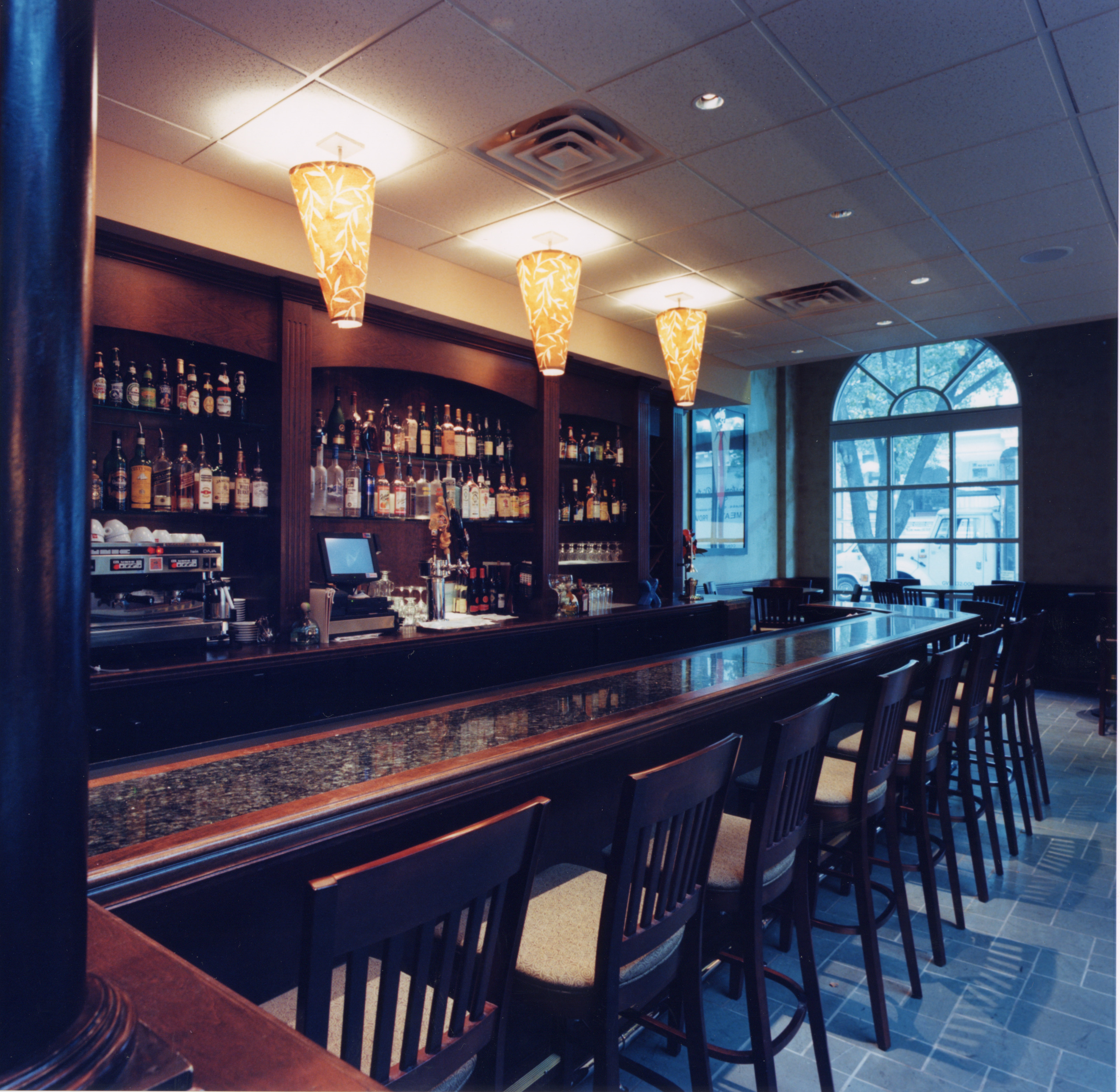
The 821, which ALD designed but is now closed, follows Hladio’s purpose-first-atmosphere-second rule of lighting. The semi-flush mounts above the bar, which was located in Wilmington, DE, make it easier for bartenders to mix drinks. The recessed lighting ensures patrons aren’t blinded. “There could be a bar area in any house,” Hladio says. “Not necessarily one with alcohol, but a bar/counter in the kitchen or a playroom.”
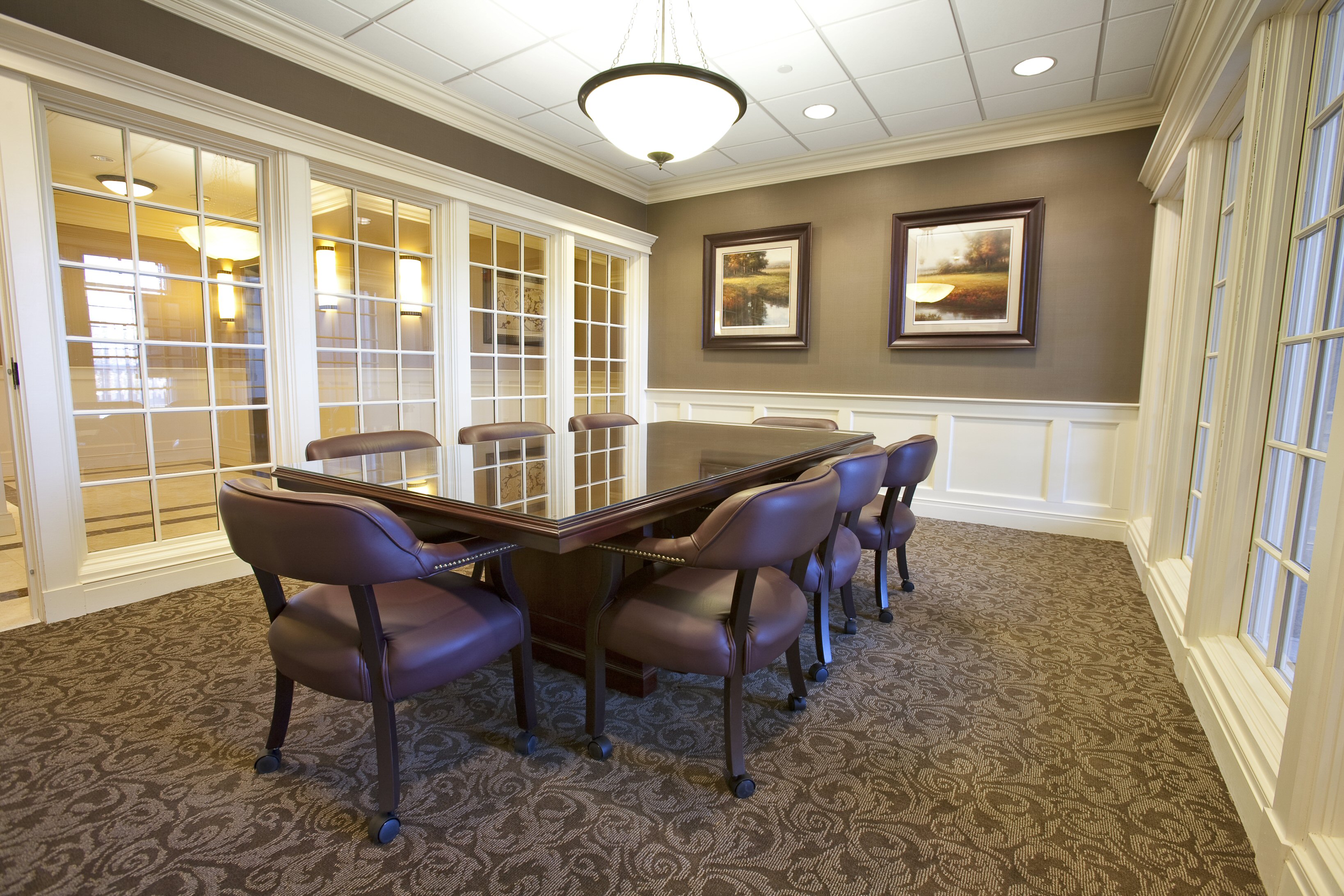
When Hladio teaches a commercial lighting class at Drexel University, she tells students that lighting a boardroom is a lot like lighting a dining room. At the Audubon Savings Bank (pictured above), the bowl pendant above the table shines brightly, while the recessed lighting above makes it easier to control the amount of light provided at any given time.
Rethinking Home Decor
Cunningham’s firm, Room Resolutions, works with both commercial and residential clients in Las Vegas. She calls her company’s work “the complete design service” because they focus on all of the parts and pieces that fit into designing an entire space.
Though their approaches for commercial and residential projects do differ, Cunningham’s team uses their commercial design skills when planning a residential space. With commercial designs, everything from the foundation up must be carefully planned to comply with the space’s purpose as well as building and fire codes. While there is more flexibility with residential decor planning, thinking more about purpose than aesthetics alone often leads to better designs and a more effective choice of product.
“You know [a commercial product] has been scrutinized by a lot of people and can last through perhaps hundreds of people in a space, so it’s definitely going to do well in a residential space, perhaps even for a longer period of time,” Cunningham says.
Working between the two gives her a unique perspective on the home decor trends that are becoming more androgynous, and it helps her predict how trends will evolve. In the kitchen, for example, residential clients are choosing restaurant-style booths instead of a kitchen table and chairs. The reason could be the feelings that the booth evokes: good food, good conversation and closeness.
“We’re putting that same look and feel into homes so that people feel really good about sitting and conversing,” Cunningham explains. “You’re in that same intimate environment, and we’re putting that especially into eat-in kitchens.”
Another surprising design entering the residential sphere is indoor waterfall walls. Commonly seen in lobbies and indoor gardens, the waterfall wall may become a popular fixture for foyers or bedrooms. Cunningham says the sound of running water gives her clients the feeling of sleeping near the ocean — better than any sound system can do.
“A lot of people want it because it’s calming,” Cunningham says. “It’s that water sound. It’s a natural, peaceful feeling.”
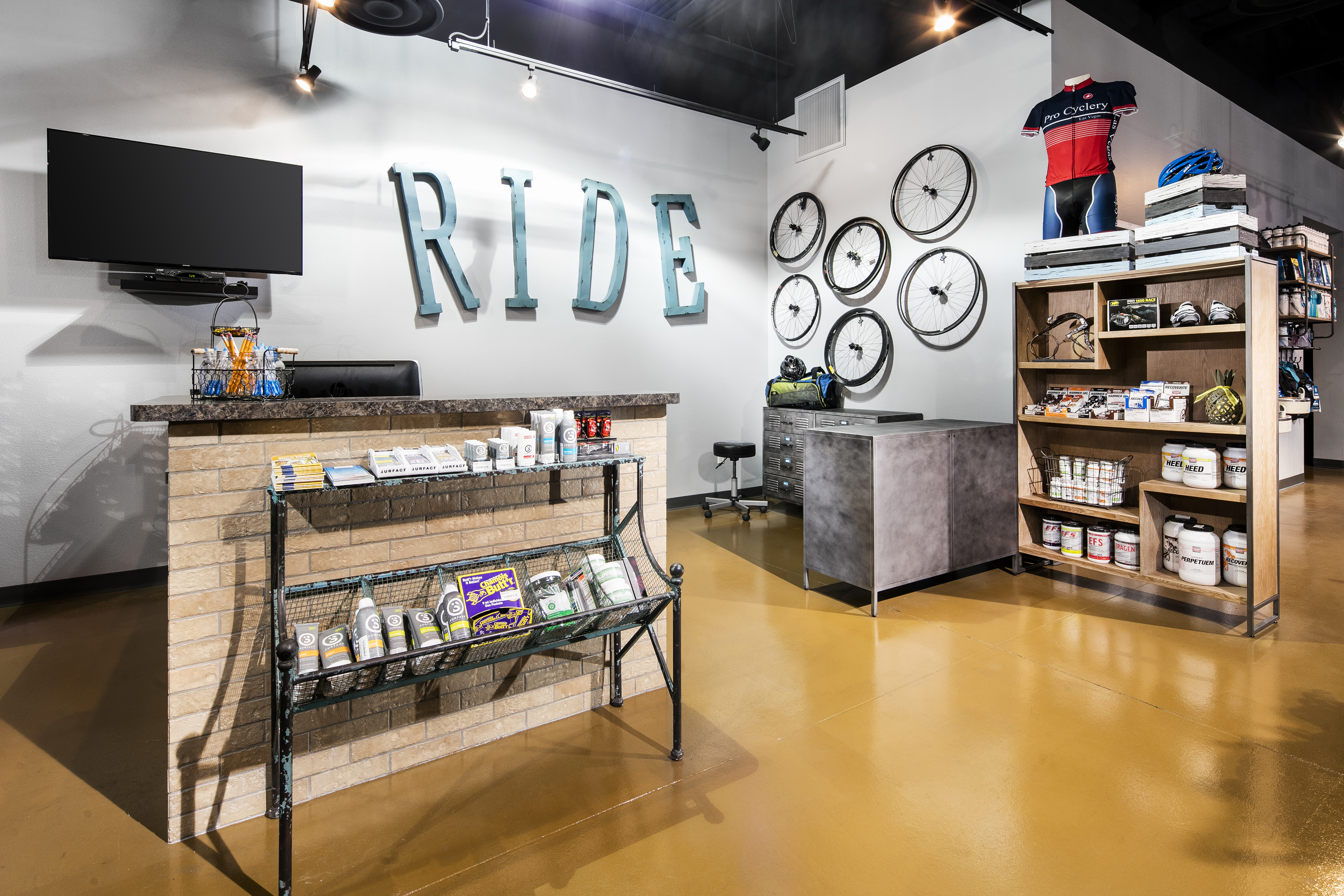
Room Resolutions designed the Pro Cyclery bike shop in Las Vegas with a residential approach. The entryway space is open and friendly, inviting customers into the store. “It’s equivalent to a homeowner’s entryway — inviting and comfortable, yet stating who you are.”
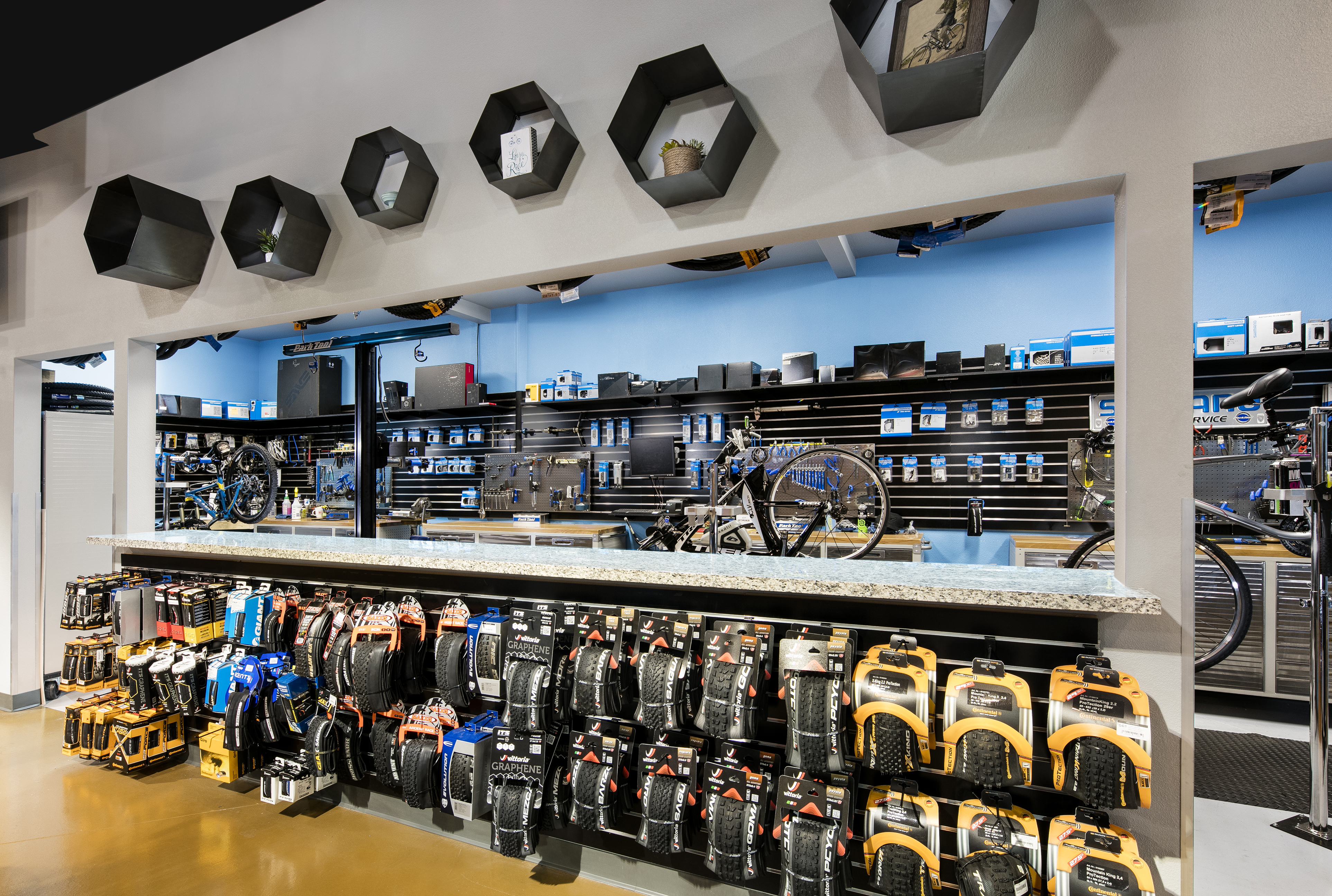
The repair center at Pro Cyclery in Las Vegas is designed like an open-concept kitchen. “You’ve invited guests over for dinner and perhaps have them sit around your island or counter area while you complete the preparations, yet you’re able to participate in the conversation,” Cunningham says. While the owners repair bikes on the counter, they can still talk with customers, and customers can ask questions as they watch their repairs from a safe distance.
Two Roads
Good design is good design, and both Cunningham and Hladio see commercial influences becoming more applicable to residential projects. LED, Hladio says, is one reason for this merger.
LED lamps make a world of difference in rooms with high ceilings, as they last for so long and save money. In Hladio’s work, she uses them in churches and synagogues with high ceilings, and recently, her high-end residential clients are requesting LED lamps and fixtures for their own high ceilings. Lamps that last for years — even a decade — make a major difference.
“You’re going to be using a lot of the same fixtures because LEDs can have warmer light and also color for commercial,” Hladio adds.
Hand in hand with LED lamps, commercial lighting fixtures may become more accessible for residential. These fixtures, which were traditionally built with stronger materials because they would be handling burning lights for most of the day, were too expensive for the home. Now though, they’re becoming more affordable for residential clients.
“The better we get at incorporating our lives into design, they’re going to continue to stay together,” says Cunningham.
The lighting in Rocco Restaurant, a Philadelphia eatery that is now closed, blends purpose and atmosphere. The track highlights art and the color of the wall, while recessed lighting helps hungry patrons relax. “This is very similar to a living room or any other gathering space in the home,” Hladio says.
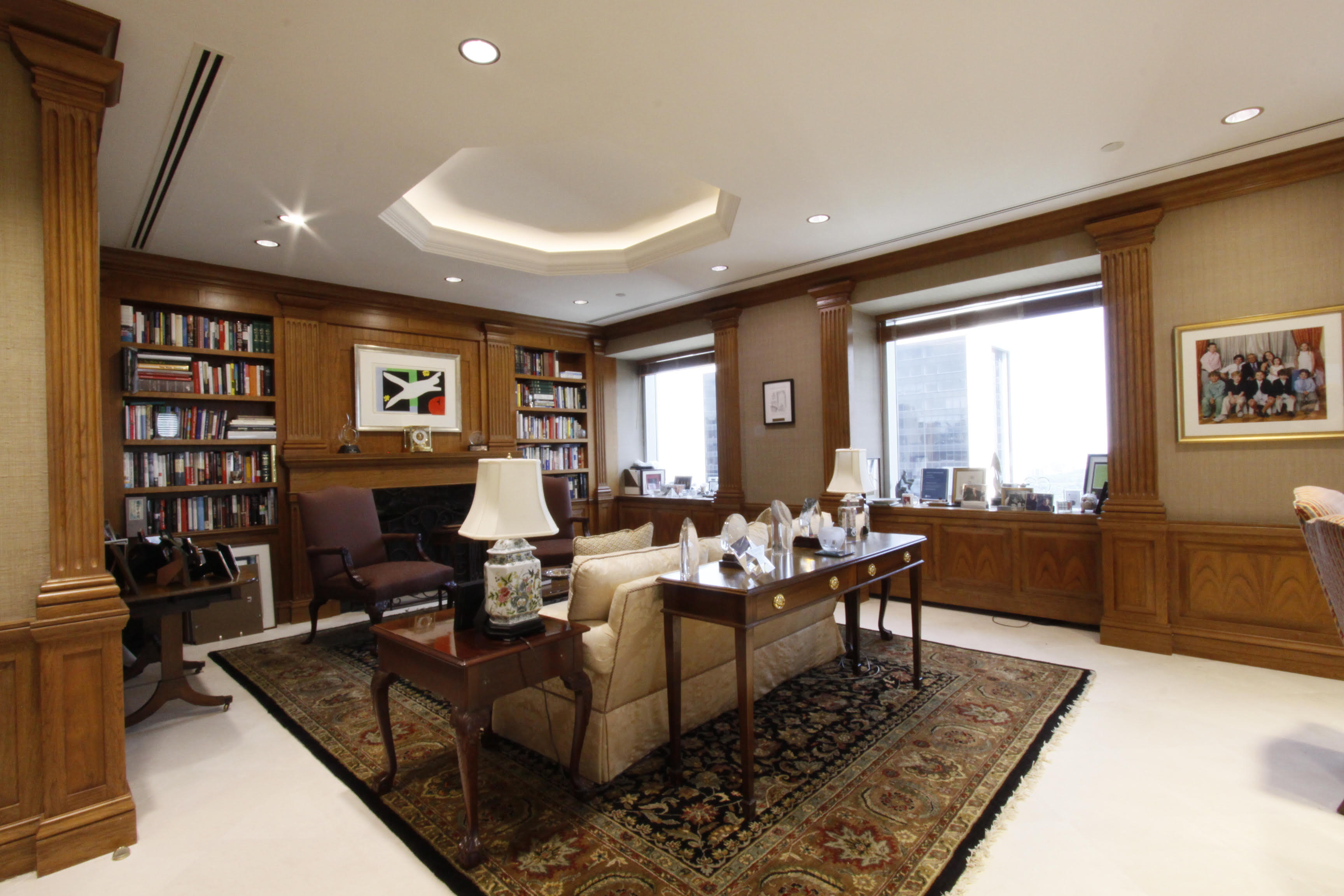
This private corporate office, designed by Hladio, layers light depending on the amount needed, similar to that of a home living room. The recessed lighting above allows for easy overhead illumination while the two table lamps serve as task lighting. The cove lighting above the sitting area provides additional ambient light as well.

