Have you ever walked into a vendor showroom at a market only to see an item positioned front and center that made you do a double take? Maybe you walked in to get a closer look, or maybe you snapped a picture through the window for your Instagram story. Whether it’s a sofa upholstered in a bold print, an extravagant oversized lighting fixture, or a bronze animal head mounted on the wall, these pieces can be eye-catching conversation starters that beckon us into showrooms for the full experience. Once we’re in, we often spend more time looking around.
Applying this logic to a retail showroom should be a no-brainer, and manufacturers are ready and willing to work with customers to optimize their displays with bold pieces that draw customers in from the outside.
Making the Investment in a Showroom Display
Investing in riskier pieces can be a tough sell for retailers who want to move inventory. Often these pieces are chosen for their impact and not necessarily their selling power. Tina Nicole, Co-founder of Nathan Anthony Furniture, says to think of these investments as marketing expenses.
“You have to have that sacrificial item that draws people,” she says. “So you have to buy things, especially now with Instagram. You have to have something in your windows or in your store or on your Instagram feed that draws people in, whether it’s a coffee day or live entertainment or a chair made out of ostrich feathers. It’s part of marketing your brand and part of getting your name out there that you have these unique pieces that not everyone next door is going to have.”
“We’re in the business of selling high-impact design,” says Jason Phillips, Vice President of Phillips Collection, a brand that has won dozens of product design awards and is known for pushing the envelope when it comes to home decor.
Phillips finds case studies to be a motivating way to encourage his customers to invest in some of Phillips Collection’s more out-there pieces. He shows his customers photos and examples of non-competing retailers who have had success with funky window displays. But despite the brand’s reputation for products that push the envelope, a majority of customers are not choosing Phillips for the shock value.
“It’s really not the focus of the transaction for us,” he says. “These are kind of hiccups and happy accidents and surprises when somebody says, ‘I want to use your product in this way.’”
Where Does It Go?
Once retailers make the investment, they then have to make the best use of their new pieces. The front of the store is a logical choice for this type of display, but if retailers are investing significant time and money, they should make it stand out above the rest of their inventory.
“Within two seconds you’ve got to grab them and you want them to come in to touch it or see what else is in there,” Nicole says. “I think the best way that our retailers have done it is they’ll put them on a pedestal. Sometimes you’ll see a beautiful piece and it’s on a pedestal in the room or in the store. You can place something in the front window, and then when you walk in, you’ll see something again, maybe in the middle of the store that draws them back.”
Phillips suggests deferring to a professional for the optimal store layout, touting the value of professional merchandisers who really analyze the brand and the space to determine the best layout. But ultimately, everything should have a purpose and that purpose should be obvious. He also agrees that showstopping displays should be set apart from the rest of the merchandise.
“I think a consumer walking in should have an immediate sense of why that decision was made to put that product where it is,” Phillips said. “There should be an investment not only in the decision to take that risk, but also how you set it up. I think the riskier you get, the more considerate you have to be aware of where you put it. Paint the wall a different color. Create a custom pedestal for the piece. Promote it, make it a social media moment. Make sure it ties into what’s happening in your store.”
An Instagram-Worthy Showroom Display
Creating this social media moment can essentially lead to free word-of-mouth marketing if retailers play their cards right. Designating a selfie station around a display and encouraging customers to take photos, share them online with a designated hashtag, and tag your store can spread the word far and wide.
“I think it’s important for companies to do that,” Phillips says. “Even just catering to the kid who comes into the store with their parents. Not everyone’s going to want to take a selfie and post it. You have to have a pretty compelling reason. It’s kind of like you want to be in on the club, in on the cool.”

Nicole encourages Nathan Anthony’s retailers to consider accessories like neon signs with cheeky phrases that are begging to be Instagrammed.
“I love neon signs with cute phrases on them,” she says. “A lot of our furniture, the back sides are really as beautiful as the front side, so I like to have a sign that says, ‘Cute Backside,’ or just ‘Good Vibes’ or something. Not all stores are going to do that because neon signs are expensive, but you can’t just blend a piece in with your other things.”
Showstopping displays can and should be special and stand out from your usual merchandise, as Nicole says, but she said in general a display shouldn’t deviate too much from a store’s general aesthetic. If it does, it should be done correctly and intentionally.
Phillips agreed that intentionality is key.
“I think it’s important not to do something crazy,” he says. “Not to let the junior showroom manager have carte blanche.” But, he says, older companies are starting to realize that the status quo is no longer cutting it, and risks need to be taken.
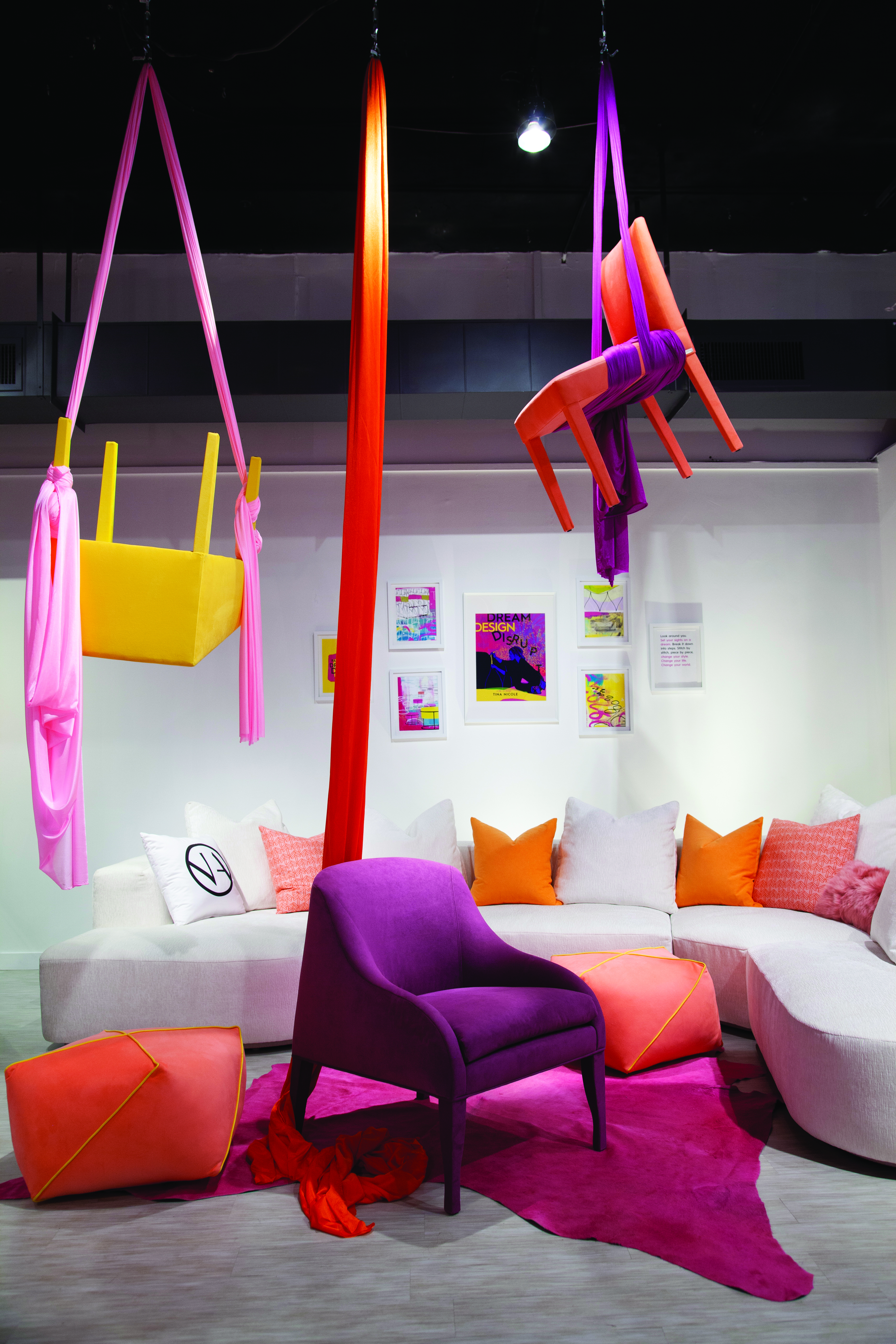
These high-impact pieces have the same effect on customers in retail stores as they do on retailers in market showrooms. At a recent market, Nathan Anthony upholstered regular dining chairs all over, in bright colors, and suspended them from the ceiling using aerial silks. People took notice, came inside to get a closer look and browsed the showroom.
Retailers shouldn’t be intimidated to think outside the box, as customers increasingly want the experience that comes with an interesting display. As design styles evolve and customers are surrounded by myriad aesthetics, they are becoming desensitized, Phillips said, so retailers shouldn’t be afraid to get creative.
“If you were maybe more traditional in your aesthetic and you went to a hotel and your hotel room had some really risky pieces, it’s not like you’re going to leave the hotel,” Phillips says. “It’s different than a designer trying to put a high-impact design in someone’s home or for a store making a decision to do something crazy in the window. High-impact design is making every consumer familiar with it. You can be anywhere in the country, and if there’s a purple gorilla that’s 8 feet tall in a store, it might be surprising, but it’s no longer shocking.”


