Danny Russo of Daniel Russo Home understands the balance between incorporating upcoming trends and a timeless perspective. Russo’s compositions strike the perfect chord: his work is risky, yet safe enough to stand the test of time while remaining fresh, bespoke and innovative.
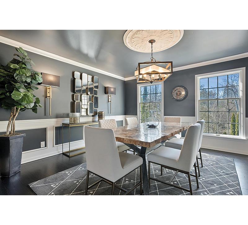
1. Combining an array of these specific textures and patterns accomplishes a natural, organic ambience and flow throughout the space, which was a priority for the client. With the permanent botanical and no window treatments, my approach was to bring the outside in. The paint color is soft, but the room maintains dimension and a dramatic effect with the wainscotting, mirrors, sconces and mixed metals in the furniture and chandelier. I incorporated the ceiling medallion to elevate the aesthetic of the space by bringing in traditional elements to complement the other more modern pieces.
2. I opted for a long credenza to adorn the back wall instead of a traditional buffet for both logical and design reasons. The house had more than enough storage, and traditional-style pieces like buffets oftentimes create heaviness in a space. I wanted the dining room to exude a light airiness to it. The open-faced table accomplishes that and lifts the space to a more timeless look. While some of the other furniture pieces are unique in their own right, the room maintains cohesiveness with the mixed metals throughout — from brushed brass on the walls to forged iron on the table base and dining chairs.
3. Lighting with shades automatically creates an ambient, cozy atmosphere. From the iron chain and supports, to the softness of the fabric of the shade and the weathered wooden box around the entirety of the fixture, the mixed textures of the room manifest in the chandelier alone, making it the perfect compliment. By lowering the chandelier to eye level, the designer is controlling the line of sight so guests are instantly drawn to the room’s most important inflection points.


