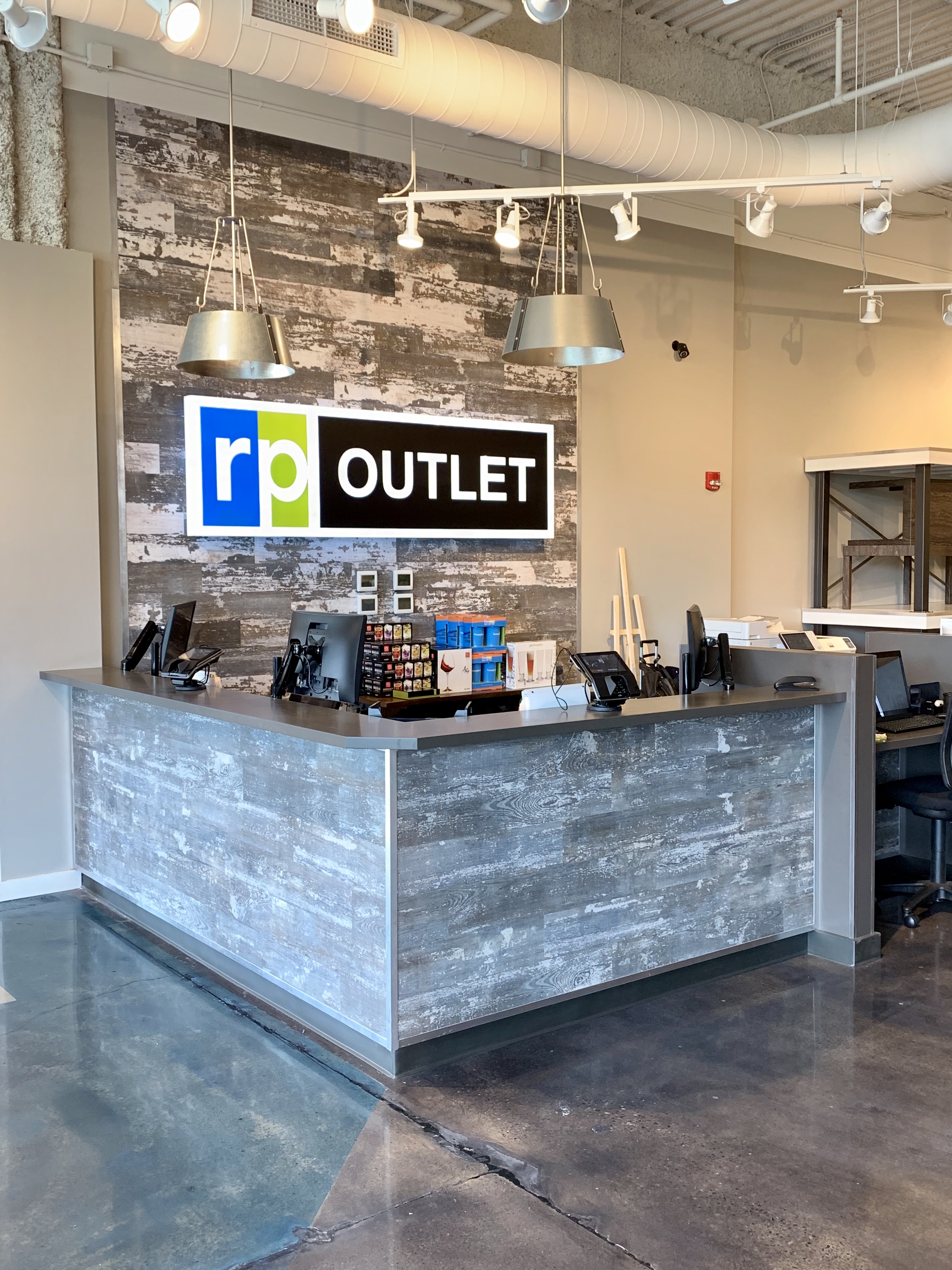
Retail strategist Connie Post has designed a new format for The RoomPlace aimed at broadening the merchant’s appeal with a new shopping experience focusing on value-priced product. Branded RP Outlet, the first iteration has opened in Peoria, IL, one floor below a thriving, mall-based, 65,000-square-foot RoomPlace store there, also designed by the well-known industry disrupter.
“We have opened RP Outlet to increase our share of starting price points,” relates Bruce Berman, owner and Chairman, The RoomPlace. “As time has gone on, we’ve found that a very high percentage of our business at The RoomPlace is coming from much higher price points. That’s not a bad thing, but we felt that we had abandoned the so-called $399 sofa customer. We believed that we would be in a better position to grow that part of our business if we opened a dedicated store.”
According to Berman, plans are currently in the works to open additional RP Outlets, with the next location on the list in Lincolnwood, IL. Additionally, he notes, “We’re also rebranding all the departments in our stores that carry these price points as RP Outlets.” And, Post notes, while the initial prototype is connected to a RoomPlace store, where demographics and location warrant, the concept can also function as a stand-alone format.
Post was the obvious choice for the assignment. Renowned as a retail design strategist, author, trend translator and developer of both product and brands, she has built a career on understanding where consumers are, what they want most and where they are going next. As the standard bearer of visual marketing in the home furnishings industry for the past three decades, Post is responsible for the look of more than 25 million square feet of retail and wholesale space around the globe.
“In this world where people are all talking about how we have to make brick-and-mortar stores more experiential, Connie brings excitement and way more color to the displays. It’s more of an experience than walking into a furniture store where the stuff is just lined up and that gives you more ammunition and your customers more of a reason to want to come to your store, because it’s nicer than the other stores in town.”
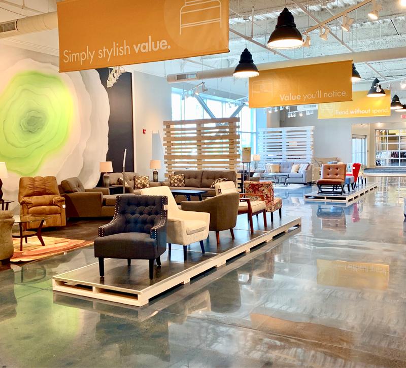
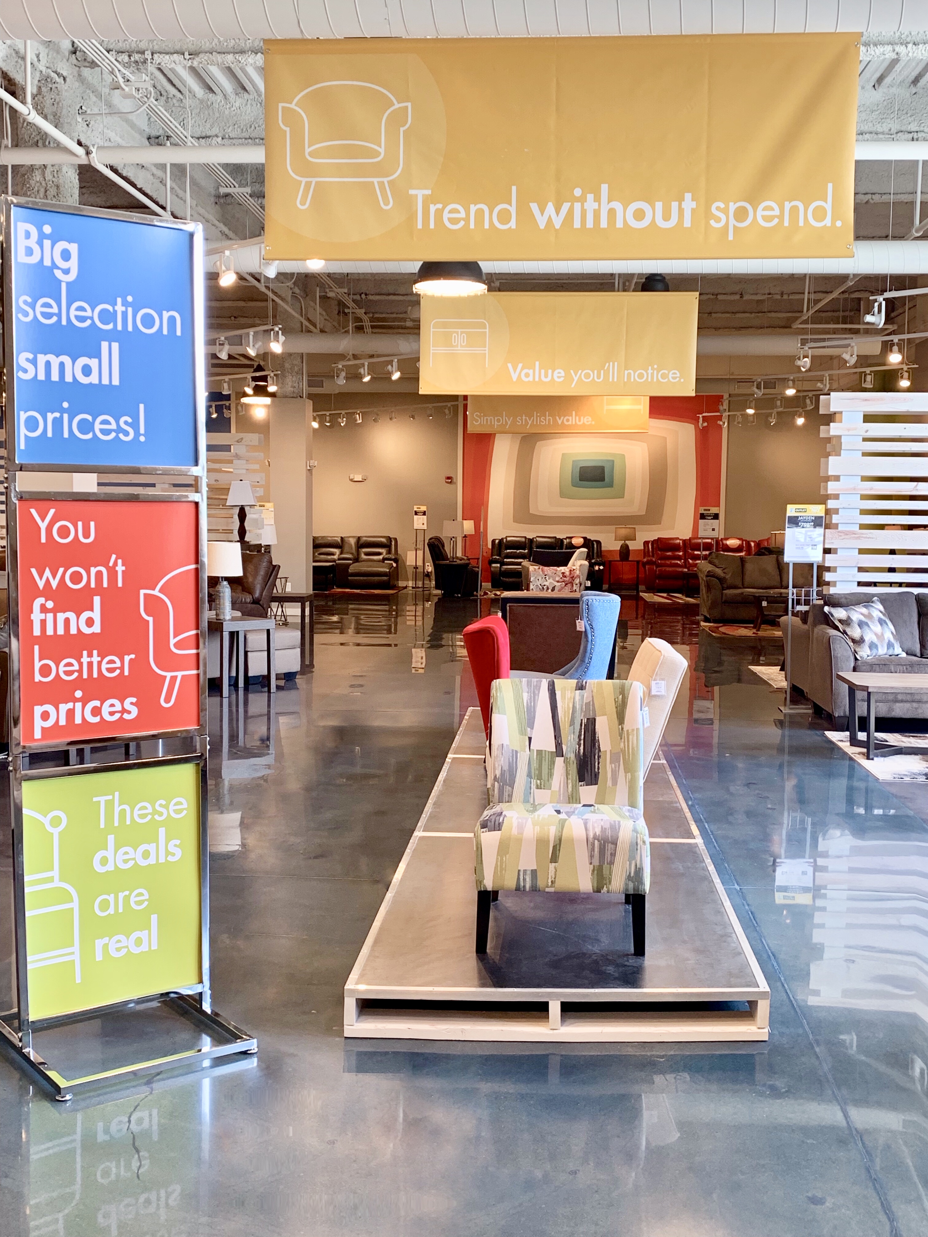
In keeping with an outlet atmosphere, unlike The RoomPlace store situated above it, there are no build-outs here other than sales stations. Indeed, Post explains that RP Outlet is devoid of the typical trappings of a full-line furniture store, with no window grids, decorative accessories, wall art or wallpaper used in decoration. Instead, shoppers encounter simply displayed upholstery, bedroom sets, dinettes and a limited selection of mattresses in a cool setting with a fresh, modern vibe.
Entered via a glass-fronted garage door, the industrial chic space is designed to be “fluid,” she says. “We’re leading with upholstery now, but because the entire space is flexible, that could easily change to bedroom if we choose.”
Floors are sealed concrete punctuated by a wide aisle stained blue in line with The RoomPlace brand’s colors. Overhead, shoppers are greeted by brightly colored banners touting messages like “Trend Without Spend” and “Simply Stylish Value.” Beyond the graphics, oversized artist-created murals with a crisp, modern aesthetic and movable, slat walls on wheels set off the product and make for eye-catching backdrops.
“The idea,” Post says, “was to make value product look better for the same price offered by retailers like Value City and Bob’s, in a space that makes shoppers feel good about their purchases. I wanted it to feel like an outlet obviously, but also for RP Outlet to make a better impression than say, Saks Off Fifth or Nike. Shoppers here understand that what they buy will contribute to a beautiful life at a price point they can afford.”
Post relates that RP Outlet’s value-driven customers range from 20-year-olds furnishing their first apartments to downsizing seniors. “One of the most important lessons learned from my work at HOM in Little Canada, MN, is that customers today are not fitting neatly into our industry’s little boxes. They shop high and low to satisfy whatever their need is at the time. The HOM customer, for example, shops Dock 86 and Gabberts all under one roof and we know they buy from all three.”
The store opened last month to “huge customer turnout and a very positive response to the new value equation and retail format. While it’s too early for numbers, the entire RoomPlace team is thrilled with the initial response and sales,” she says.
Post and her team designed the prototype, mall-based RoomPlace store above a former Macy’s space opened in May of 2018 as part of the retailer’s strategy to capitalize on the lower dollars-per-square-foot and high traffic offered by mall-based real estate. “Now, the additional 20,000-square-foot RP Outlet on the floor below the main store enables customers to shop both formats seamlessly.”


