There was a time when a shadow called e-commerce loomed large over brick-and-mortar home furnishings retailers. As it grew in size and power, launching a website that would capture and engage shoppers quickly became a business imperative for traditional stores, a do-or-die proposition in the battle for survival.
Soon enough the phrase “omnichannel experience” was added to the industry’s lexicon. Yet the actual practice of creating a seamless shopping experience both on and offline turned out to be much more difficult than simply adding a shopping cart function to a store’s site. What to do, for example, when despite substantial expenditures in time, talent and treasure, a website didn’t actually click with shoppers? When instead of driving foot traffic toward a retailer’s bricks, the online experience actually turned them off?
Jeff Edgeworth, Executive Vice President of Dufresne Spencer Group (DSG), the merchandising force behind Stash Home, had an answer for that question: Shut it down and start over.
While every retail-focused website is an evolving entity, Edgeworth’s decision to shut down the Stash Home site in February 2019 “wasn’t terribly popular” in the view of the retail division’s larger corporate entity, which, with 124 stores, is best known as the country’s largest Ashley Home Store franchisee.
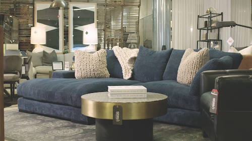
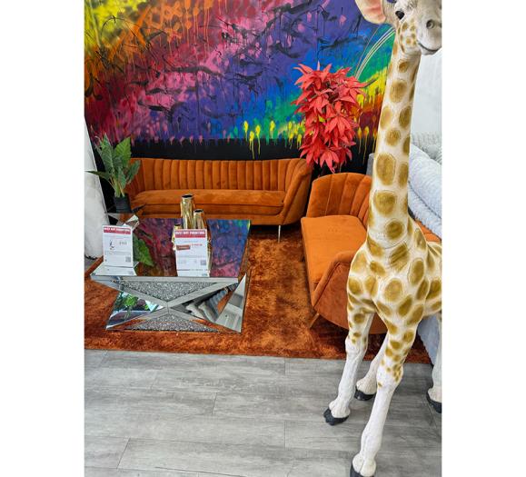
With three stores, located in Memphis, TN; Kirkwood, MO; and Oxford, MS, Stash Home represents the higher end of DSG’s business. “Stash means ‘secret find.’ So, everything we do at Stash has the word ‘unique’ wrapped around it, from our environment to our sales approach to delivery and the way we love on our guests,” he says. “Love” is a core value, exemplified in numerous ways, but chiefly in the donation to charity of $1.27 for every piece of furniture sold (inspired by James 1:27 in the Bible, the passage that talks about feeding the poor, the widows and the needy).
As a brick-and-mortar retailer, it’s fair to say Stash Home stores are beloved by customers, not only for this deep sense of corporate responsibility, but also for a cutting-edge aesthetic, design-trained sales associates who personify the stores’ sense of casual cool, and a unique, laid-back vibe that allows patrons to dream. And according to Edgeworth, they dream big. Average tickets on free, in-home design services currently average $18,000 with a 32 percent conversion.
With stores ranging from 20,000 to 30,000 square feet, Stash Home has the intimate, personalized, gush-worthy feel of hip, welcoming design studio/boutiques. The distinct point of view is backed by the better pricing of DSG’s Top 25 buying power and the DSG network of distribution centers that enable the retailer to offer free white-glove delivery on its own trucks.
It’s a winning combination one leading better-end manufacturer went so far as to call “the future of high-end retail” — with one, not-so-little problem. As Edgeworth explains, “We did what most retailers did at first and put up an e-comm site that we had spent $100,000 to develop, and it just wasn’t consistent. There was such a disconnect between the website and what our retail stores actually look like.” So much so, that “people would walk into our store and be shocked. They were like, ‘Whoa! This is so much cooler than I thought it was going to be.’” And then, Edgeworth and his team began to notice there just weren’t as many walking in.
“Being as large a company as we are, we literally track every KPI (key performance indicator), and in 2017/2018 our store traffic was trending downward. So, we tracked back to almost the day we launched our site and added e-comm to it and found that within 30 days our traffic started going backward. And the facts and data just kept coming in. Just as they do with restaurants, people do mobile search and look up pictures of a place, and read reviews. What we found was that when they looked us up, the perception was, ‘Oh, it’s just another furniture store.’ When we saw double-digit decreases in our traffic, we knew the site was a deterrent, and I knew I had to pull the plug. I said, ‘Let’s halt everything, and get our systems to correlate so we can give a great experience to guests on the website that matches our retail vibe. And let’s just stop loading pictures that are inconsistent with our brand. So, we went back to the company that had developed it for us and re-tweaked everything and made it an inspiration website, not a selling website.”
Back to the Drawing Board
Photography was key. Edgeworth reports it took about three months to re-do, to go into the stores and shoot to better reflect their look, and to procure shots from manufacturers that better coincided with the brand’s message. (DSG owns a production company, “so we do a lot of our own photography,” he notes). The move paid off. “When we kicked the site back off in August, store traffic slowly started trickling in the right direction. The bleeding had stopped. And I will tell you that since the end of December, we’re seeing double-digit increases in traffic to all of our stores.”
Little wonder. Today, the content-rich Stash Home website is focused less on promotion than inspiration, in many ways resembling the look of a shelter magazine packed with high-style photography and engaging information, including (regularly posted!) blogs rivaling those of the industry’s leading style influencers.
Though Edgeworth says that DSG’s secret sauce is hiring great people and that the company works hard to “match up with third-party companies that have the same belief system that we do,” it’s clear where the inspiration for the site originates. A former rep for Lane Furniture, Edgeworth is “continuously studying and looking at who’s doing things right, and who I can learn from. I love being cutting-edge and I always try to stay ahead of the curve and to do something different. Every single thing we do from our promotions to what I buy has got to be unique, and if a product is in other stores in town, I usually don’t buy it or even add something that looks like it. When you visit our stores, it’s very casual; the salespeople aren’t lined up at the front door like a lot of chain stores.”
While there is still no shopping cart on the website, the feature will be added back mid-month. “Now that we’ve got all our ducks in a row and our traffic is moving in the right direction, you’ll be able to shop hundreds of pieces on the site. And we’re currently in negotiation to offer nationwide delivery by summer of this year. We just had to slow down to go fast. It wasn’t fun to do, but it had to be done to do it right.”
Expect, too, to see more bricks along with the clicks. Edgeworth, who counts among his responsibilities at DSG real estate and design of all the stores, says Stash is “trying to add three more right now. We’ve got a couple of LOIs (letters of intent) out in Nashville to grow there, and our plan is to grow where we already have our network of distribution centers and stores.” (Think Chicago, Detroit, Indianapolis, St. Louis, Louisville, Dallas, Houston). “Nothing is stopping us now from growing the brand.”
Staying Closer to Home
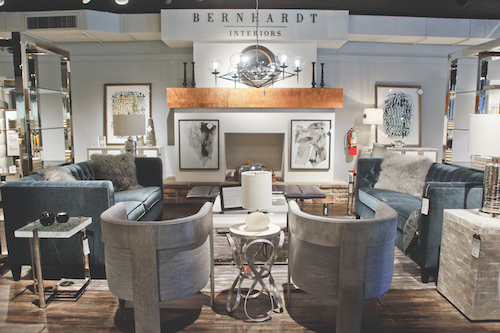
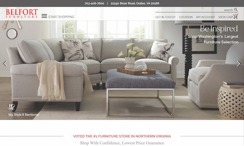
Though it’s possible to shop Belfort Furniture without ever visiting the multi-showroom complex in Dulles, VA, and many do utilize the retailer’s shopping cart feature on its website, Katrina Guzman, Website and E-Commerce Manager says the focus here is on website “as an extension of our showroom. Bottom line, we want to service the customers in our local area the best that we can. We’re kind of a destination, and if they don’t have the time to come visit us because the traffic around here is so difficult, or they’re a busy bachelor in Washington D.C., then they can purchase online, but my main focus is get them in the door and drive traffic to the store because that’s where they get the best experience.”
Guzman, who joined Belfort as Website Coordinator in the spring of 2012 added a shopping cart feature to the site that fall. “It was a little slow in the beginning,” she remembers, noting how the site has evolved to meet customer expectations. “When I started, we had somebody who would answer the emails and enquiries from customers on the website Monday through Friday, and that was it. If somebody was online on a Saturday, and put in a request on Saturday, we got back to them on Monday. And back then, it was fine. People weren’t frustrated or angered by that. That was also back when we had very few prices on the website because retailers were kind of scared about posting prices. They wanted to get that lead.”
How things have changed: “We’ve seen customers grow extremely frustrated with the lack of pricing over the years, and today we have a full-time person — our Website Coordinator — who is solely dedicated to answering customers and placing online orders. She has enough design background that she can help customers with their questions, and if she feels the customer’s project needs to be elevated, she will refer it to the design team. The good thing about it is that most of the time, the conversation happens in email, so if she needs to find a little bit more information to answer a customer’s question, she has the time to do so.
“Most of the time,” Guzman relates, “if she gets a design-focused lead from a webchat, it ends up being a short conversation, and she’ll say, ‘Let’s continue this over email. Send me some pictures,’ and we’ll go back and forth that way. A lot of times customers send a picture and want opinions. ‘What do you think of this?’ Or, ‘Do I need more color?’ If she doesn’t have the information, she’ll say, ‘Let me do the research and get back to you with the right information. And customers appreciate that. They don’t want someone to try and fake it.’” On her days off, “we have other team members fill in. Over the years, I’ve had my own team members fill in, and now I’m supplementing with sales staff and allowing them to take
the lead.”
Though Belfort is known for its special-order capabilities, the majority of orders that come through the shopping cart on the website are lower-level casegoods or upholstery, shown in a simple fabric at a simple price. “If they are looking for custom anything, we highly encourage them to come in and visit the showroom to view the samples in person,” Guzman says. Most importantly, “the ability to check out via the shopping cart on the website without speaking to us is based on zip code so we can determine what their delivery fee is, and whether it will be a Belfort delivery. Exceptional service on the delivery side is one of our strong suits, and while we do offer delivery outside of our local area through a third-party carrier, those are on a case-by-case basis. We have a lot of restrictions and we don’t do a ton of it, especially on anything that can be damaged in transit. We find that difficult with a third-party carrier, because if they can’t easily touch it up before it gets to the customer, or we can’t get a tech out there to touch it up, we end up losing the sale. It’s just not the best experience for the customer, and it’s not profitable for us.”
In other words, Belfort’s web strategy sticks close to home. “I think when I came on board and we added the shopping cart feature, the thinking was ‘Wow! This is going to be this great extra stream of revenue,’” Guzman says. “Eventually we may try some drop-shipping, it’s not completely off the table as a supplemental part of our business, but right now we want to service the customers in our local area the best we can.”
The website’s content, which consistently drives traffic to the store has steadily improved with time. “What makes Belfort great at bridging in-store and online is that they really understand the process their customers go through to make a purchase and they deftly address the customer’s needs at every step along the way,” comments Alex Kirsch, Vice President of Client Solutions at FurnitureDealer.net. “They understand that customers don’t think in terms of in-store shopping and online shopping. To them,
it’s all just shopping. They do an excellent job of providing assistance to their customers both in-store and online and access to assistance is always at hand.”
“We know that customers are doing more research online, so we’ve worked hard to improve our merchandise presentation on the website and to have it accurately displayed,” Guzman says. So well, in fact, that many just “print it out and say ‘I’m looking for this’ when they are walking in the door. They say, ‘I found this on your website, and I wanted to come see it.’ ”
As Belfort’s website has grown more sophisticated, morphing to a kind of online magazine rich in information and inspiration (all the content is produced internally) and customers have grown more confident shopping online, Guzman says the prevailing wisdom that most online purchases are accomplished in more promotional goods no longer holds true. “The purchases have changed from oh, a $99 dining chair, to dining room sets and dining groups,” she notes. “We still get a lot of one-offs, but where $399/$499 sofas used to be very popular purchases in our shopping cart, now people are purchasing leather sofas in the $1,599 range without even talking to us.”
Big Data, Big Rewards
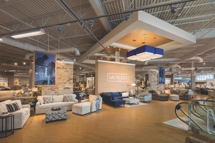
Kirsch points to Dayton, OH-based Morris Furniture as another industry standout when it comes to marrying the online and store experience. That effort is led by Marcus Moore, Vice President of Marketing and Advertising. Doing both online and in-store well, he says, requires “synergy across the two. Really, our website is a digital storefront so we treat it just like we would a brick-and-mortar location. Generally, everything you can get in-store you can get online. And we try not to do a lot
of in-store-only promotions, because we’ve found that people are more and more receptive to shopping for furniture online.”
Moore believes that today’s consumers are driven by two things: price and quality. “With the rise in competition and the space fragmenting more every single day, whether it’s pure-play e-commerce players like Amazon or Wayfair, or just local mom-and-pop shops, consumers really have their pick of who they are going to shop with, and I hate to say that sometimes it’s a race to the bottom. We try to differentiate by playing up the local angle to say, ‘We’ve been serving the Greater Miami Valley for 72 years, and you’re dealing with people who live and work in your community.
“Our approach is about making things personalized and relevant, especially from a communications standpoint,” he says. “We live in the age of technology and we leverage that to be smarter about who our shoppers are, or who our shoppers could be, and we use all the different data signals available to us whether it be sites that our shoppers are visiting or physical locations that they are shopping (because everyone has a GPS on their phone, and you are beaming that information to a cloud somewhere). We’re leveraging all those data signals to know who our customer is, and what they are interested in, and then we’re personalizing all of our marketing to those people based off of those signals.
“We may be saying it’s President’s Day and 50 percent off, but if I know that you’re in the market for dining room furniture, I’m putting dining room ads in front of you. If I know you’ve got an affinity for researching sleep issues online through searching for back problems, sleep problems or getting a better night’s sleep, you better believe that I’m going to hit you with a mattress ad. We use all the different signals that we can gather from our partners and we’re leveraging that to become smarter, to make sure that we’re as relevant as possible, so that when somebody is ready to buy, we’re going to be top of mind.”


