Designing a brick-and-mortar retail store’s layout is not an exact science, and what works for one store might not work for its neighbor. There are, however, some best practices that are effective for many stores, and below are five tips home furnishings retailers should consider for their own floor plans.
1. Don’t overlook the threshold
Known among retailers as the “decompression zone,” the 5- to 15-foot space between the outside world and the rest of the store is the key spot for retailers to make their first impression and for customers to make judgments.
“Chances are, merchandise placed in the decompression zone will largely go unnoticed,” says Sarah Pelton, CSM, Senior Consultant for BRP Consulting. “Instead, focus on perfecting the lighting and highlight warm neutral tones that contrast with the outside environment. This space is the retailer’s opportunity to create an environment that allows customers to acclimate into the right shopping mindset. Customers should feel at ease with an open, clean, and uncluttered introduction to the store. Promotional signage should be placed beyond the decompression zone and sales associates should suppress the urge to approach guests in this space.”
2. Have the ‘right’ mindset
Retail experts commonly believe that most customers turn right upon entering a store, so the power wall (think popular products, a new promotion or inspiring vignettes) should be located directly to the right to ensure maximum exposure.
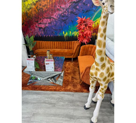
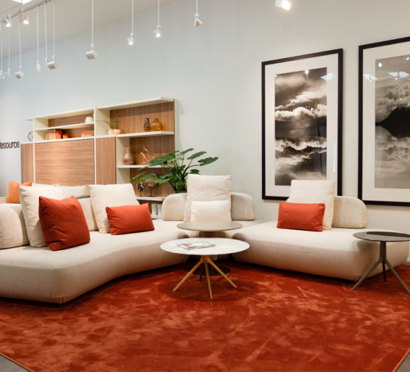
“Perhaps it’s the holiday season and there are stockings hung over a roaring (electric) fireplace next to an inviting brown leather sectional with a Christmas tree in the corner and a soft area rug,” Pelton says. “Or, it’s spring and a plush white slipcovered living room set with a round blue cocktail ottoman and black anchor lamps on distressed end tables is featured. Whatever the design, it should create a ‘wow’ moment for the guest and encourage them to keep browsing.”
3. Consider customer comfort
Consumer behavior expert Paco Underhill coined the phrase the “butt-brush effect,” which happens when customers — typically women — will avoid an overcrowded area of the store where they could possibly brush against another customer. Be sure merchandise displays are arranged to give customers enough personal space and room to browse.
“Retailers can have the best assortment of optimally arranged merchandise, with a predefined compression zone and strategically placed speed bumps, but if the showroom shows signs of uncleanliness, damaged merchandise, narrow aisles or cluttered vignettes, all your hard work will be lost,” Pelton says. “Make sure the retail space and shopping experience are comfortable and inviting and you are already on the path to success.”
4. Slow them down
With an effective path, it might be too easy for customers to get through the entire store in a short amount of time. The more time they spend in the store, the more likely they are to spend money.
Much like on the road, speed bumps can be effective retail tools to control shopper speed. These strategic displays should be eye-catching enough to make shoppers stop and browse, but not completely distract from the merchandise around them.
“Many home furnishing sales associates are instructed to approach the customer within seconds of entering a store; leading guests to utter the infamous, ‘Just looking,’” Pelton says. “By placing a speed bump just past the decompression zone you can combine the traditional concept of a speed bump with a less intimidating way for associates and guests to interact.”
5. Create a flexible path
Observing customers to see where they are naturally drawn, where their eyes go, and the path they take can provide insight into what layout is most natural for your customers.
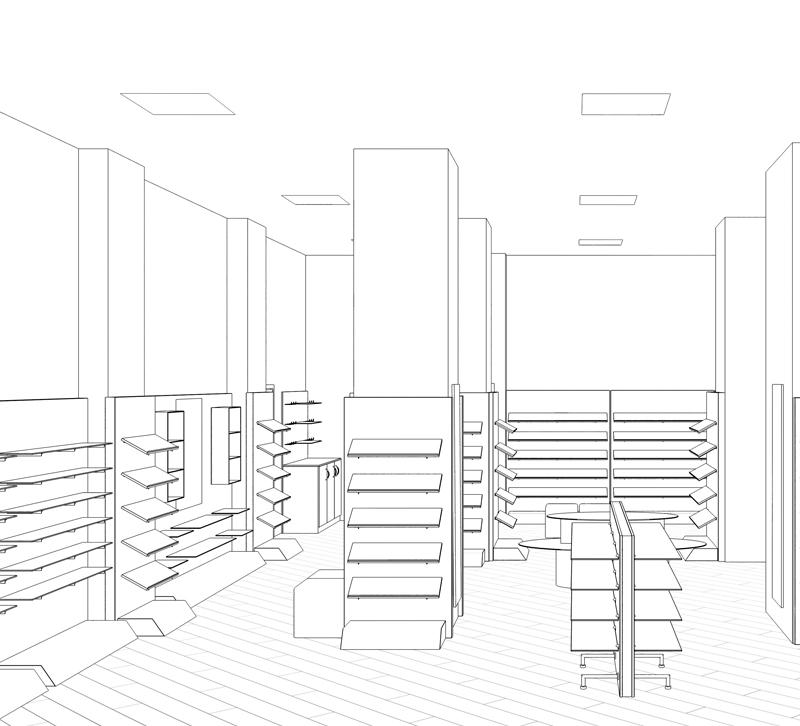
While grid layouts are perfect for shops with a large, diverse inventory, lighting and home furnishings stores benefit from having product out in the open. Rather than utilizing a structured floor plan, focus on making your store an experience with a fluid, free-flowing layout.
“Free-flow layouts allow for more creativity and flexibility in designing vignettes,” Pelton says. “For example, in the spring, the store may want to showcase home furnishings designed with smaller vacation homes in mind. That same space might be better served in the fall to highlight the latest dining options prior to the holiday season. The free-flow layout gives designers the creativity to completely change the look of the showroom without the constraints of a grid.”


