Set Up Your Buying Plan for Successful Merchandising
Good merchandising starts with a solid buying plan. Here’s what our showroom experts want you to know.
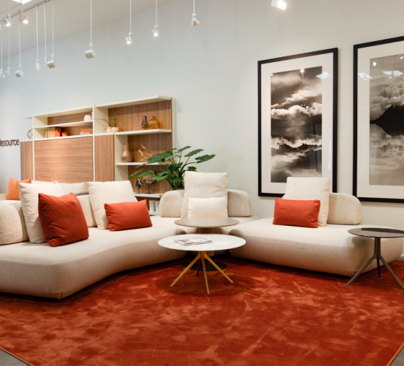
Determine your lifestyles, then add subcategories based on color, material or function. Handley Drive’s Rick Janecek says color is the easiest product unifier, and it also creates a strong visual impact. Then add in products of different sizes, materials and price points.
Consider your floor space, focus and customer. When her customers ask for merchandising advice, Serena Martin, Marketing Coordinator at Zuo Modern, always asks for these three factoids.
To stand out, look for unique products doing well, but not bestsellers. Martin says these products will give showrooms a competitive advantage by having something cool that others do not.
Visit other showrooms for inspiration. Zuo Visual Merchandising Director, John Perez, attends ICFF every year to see what cool displays other manufacturers are creating. Scope out the competition by visiting other local showrooms and look for gaps in their merchandise that you could fill.
Play With Space
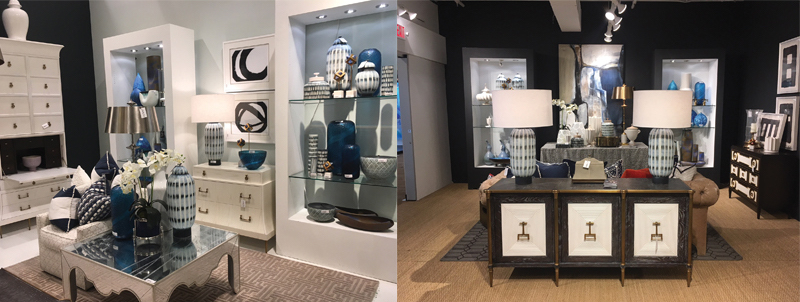
Rick Janecek, co-owner and Creative Director at Handley Drive, takes wall and tabletop styling seriously, and he doesn’t set up any arrangement without thinking about the showroom as a whole. For tabletop space, Janecek recommends placing a larger, more expensive accessory in the middle of the table to grab the customer’s attention. Then mix in accessories of coordinating colors, textures and sizes, but don’t overcrowd the space. Allowing for empty horizontal space on each side acts as a frame and lets the customer interact and rearrange the products, Janecek says.”If a customer reaches to study or touch a piece, the sale is already half complete.”
Go Over the Top
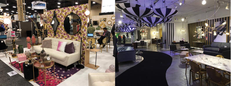
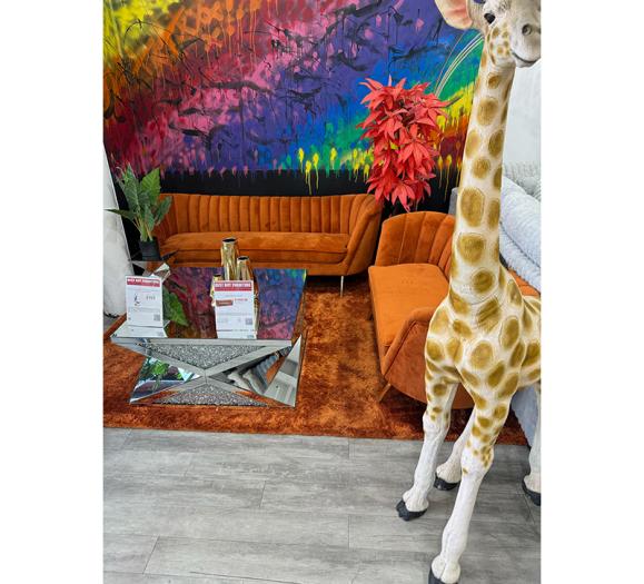
As they say, go big or go home. That’s the design philosophy of Zuo Visual Merchandising Director John Perez, a veteran of the industry. Perez uses movement in his designs to draw customers into the showroom. Last October, he used black-and-white striped umbrellas on spinners and attached them to the ceiling, creating a whimsical Alice-in-Wonderland effect. In April 2016, he added live fish to a water feature that ran through the showroom. “His goal is to really wow the people when they come in to give them an experience,” Serena Martin, Zuo’s Marketing Coordinator, says. The experience creates a memory and ensures customers will stop back in if only to check out the latest design.
Build From the Ground Up
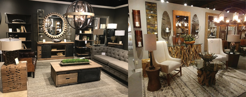
Uttermost’s showrooms feature a diverse selection of themes from Hollywood glamour to modern farmhouse, but the company’s approach to vignette styling remains simple. Karen Franklin, designer and product developer at Uttermost, says the furniture goes in first. Once it’s all laid out on the floor, she and her team will add wall art, mirrors, clocks and other decor, some bestsellers and other new additions. “After we decide what to hang on the walls of each vignette, we then decide on what lamps and accessories to use and we try to feature new and top sellers,” she explains. Mixing the bestsellers and new introductions uses the star power of the bestsellers to draw attention to the new introductions, which might have otherwise been overlooked.


