I have recently returned from a trip to Ireland. It was my first time, and it was wonderful to travel the countryside and see the cities and towns. Of course, checking out the lighting was my MO. It cannot be helped. This is simply part of my professional DNA. And who knows? This trip could be turned into a tax write off.
Happily, there were some really shining examples of well-done lighting…along with a few misses.
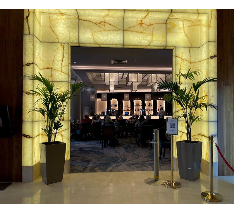
Let’s start with this hotel entry. The portico is surrounded by a backlit alabaster detail. It is very inviting. LED panels were used to provide even illumination. This would never have been as successful if fluorescent or incandescent sources were used. Using fluorescents source may have given the even illumination, but they don’t have a color rendering index rating higher than 80 which would have given the alabaster a greenish tinge. They could have used strips of incandescent lights, such as halogen or xenon. This would have offered us visual warmth, but with the lamp life of around 2500 hours these fixtures would have constantly needed relamping. Additionally the heat would have browned the alabaster over time.
LED was definitely the right way to go. I’m sure they were probably tempted to do color changing LEDs, but luckily, they didn’t. There is something alluring about the natural color of the stone. The diodes were 3000° Kelvin with a 85 CRI. 2700° Kelvin and 90 CRI would have been better, enhancing the warmth of the stone.
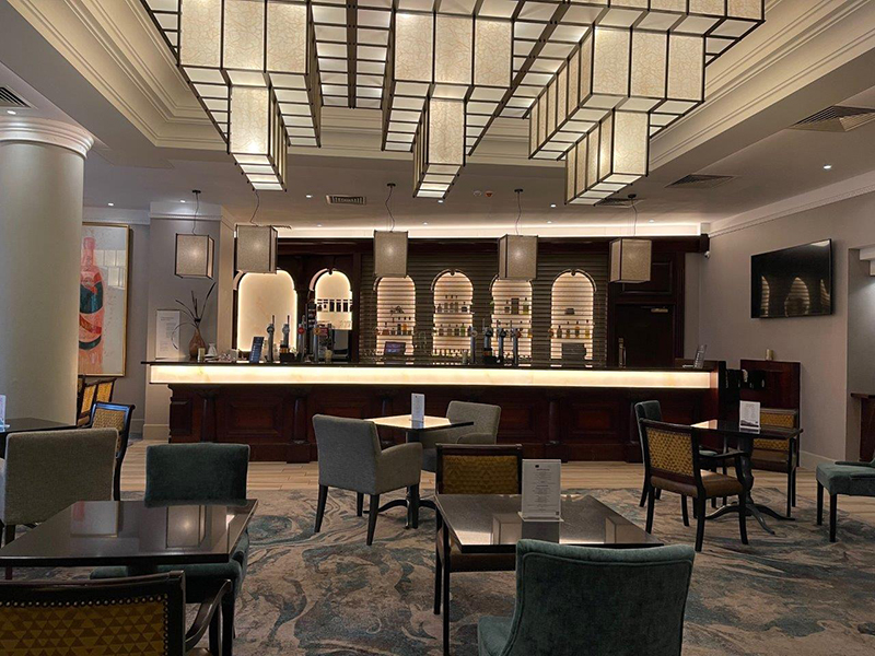
At the same hotel was a bar. That is probably not surprising to many of you. The space was dominated by this huge cubist inspired ceiling fixture. The scale was impressive. It was illuminated, using a series of recessed LED fixtures. The fixture itself was non-electrified. It was just mounted to the ceiling below the luminaires. The smaller tiles at the top of the fixture were set into place like panels in a T-bar ceiling. This allowed easy access to the recessed fixtures when they needed to have their diode modules replaced. The color temperature was 3000° kelvin, and the CRI was 85, this created just a slight dullness to the color. If they went to 2700° Kelvin with a 90 CRI then they would match the warmth of the alabaster entry.
I also liked the scale of the rectangular fixtures over the bar, but here again, a warmer color temperature would\ probably draw more people in. There is a backlit strip of faux alabaster below the bar top and above the bottle display. This does help to pull people in, but a warmer color temperature would help.
Although there are a few accent lights, the overall effect feels a little bit clinical. It has the appearance of a waiting room more than that of a cozy bar you want to hang out in.
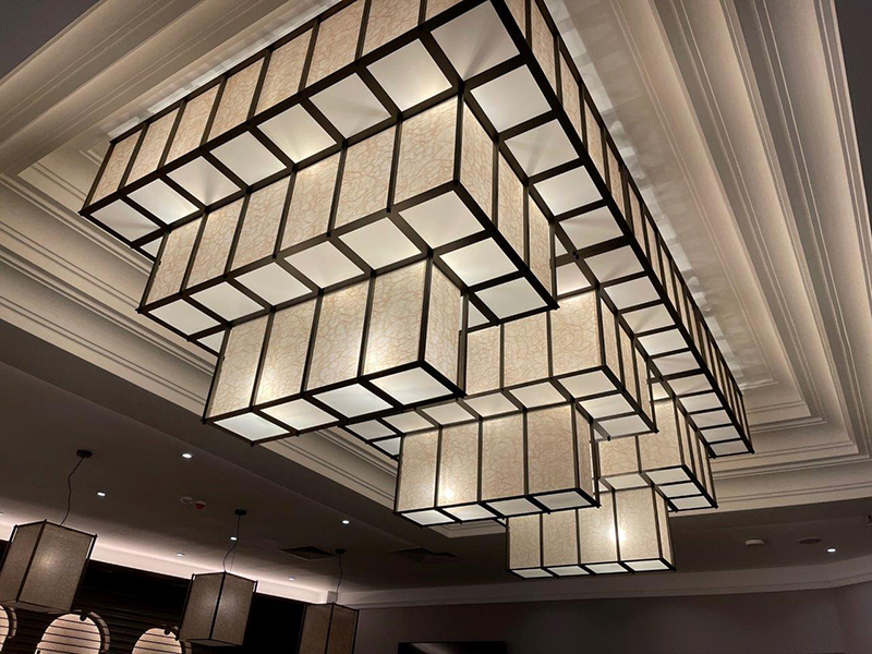
Here is a close-up shot of the ceiling fixture. As you can see, it hangs down about 4 inches off the ceiling detail. It is nice how the glow illuminates the cove molding around it, helping to integrate it into the architecture of the space. The translucent panels are made of resin, not glass for easier maintenance and weight considerations.
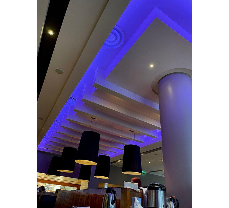
Here is the breakfast bar area. I do like the tall conical pendant fixtures which are situated over the food area. They have a regressed lens to help hide the light source and also help defuse the illumination. They are made of metal and have a matte finish which is relatively easy to maintain.
They did succumb to color changing LEDs around the perimeter of the ceiling detail. It slowly changes color over a 20 minute period. It was particularly unappetizing when the illumination turned red or green. They used an RGB linear strip, which did not allow for any subtle colors. They should’ve used an RGBW version to get some of those rich, warm incandescent hues.
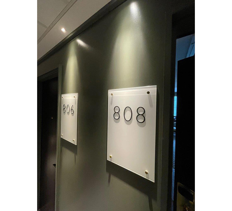
I did like the hotel room numbers were large. The recessed pinhole LED down lights kind of missed the mark. The hotspots above the signage are not good. It would’ve been much more dynamic if these translucent plexiglass panels were back lit or edge lit with LEDs.
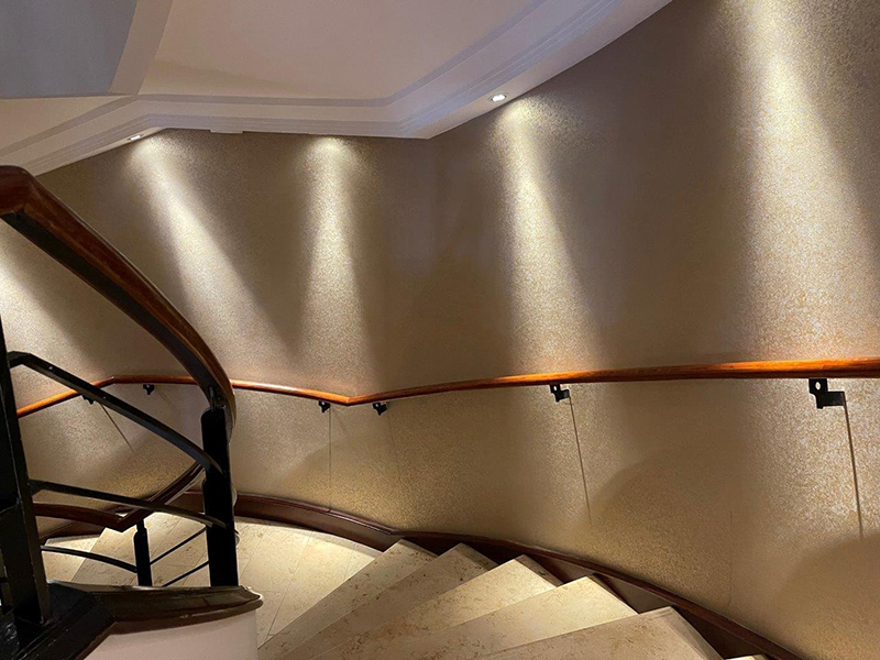
The stair lighting had a wonky drunken feel to it. Fixed recessed LED downlights were installed on both the flat ceiling detail as well as the sloped ceiling. I think someone was looking at this on a reflected ceiling plan without checking the elevations or sections.
One of the coolest places was the Guinness Storehouse. It was like a playland for adults. They very creatively take you through the ingredients and the process of making their famous brew.
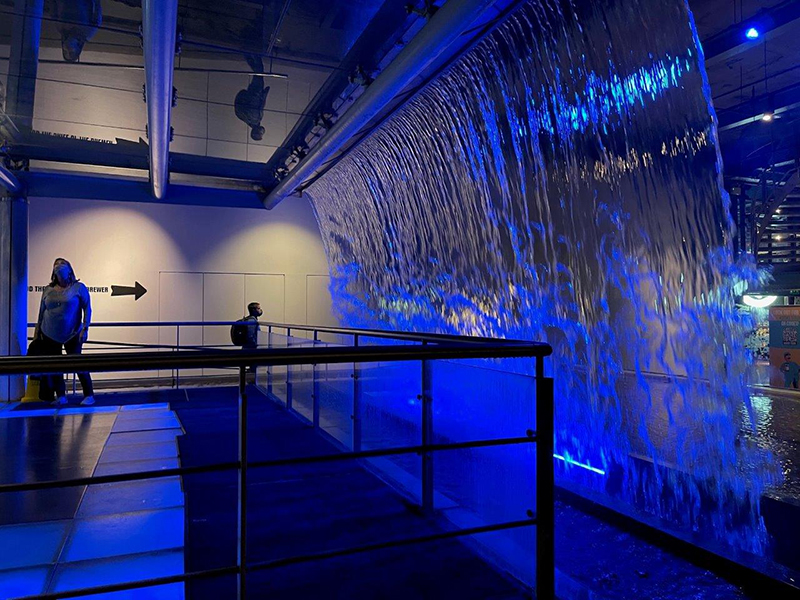
It was very exciting to walk alongside a free flowing waterfall. The rich azure blue LED, installed along the base of the waterfall, creates a dazzling light effect.
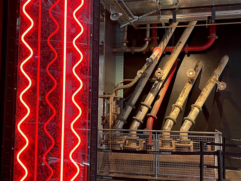
In other parts of the facility, you can see the exposed pipes were a part of the filtration system. They are lit like sculpture, which was pretty cool. Alongside the pipes, neon was installed in complementary colors.
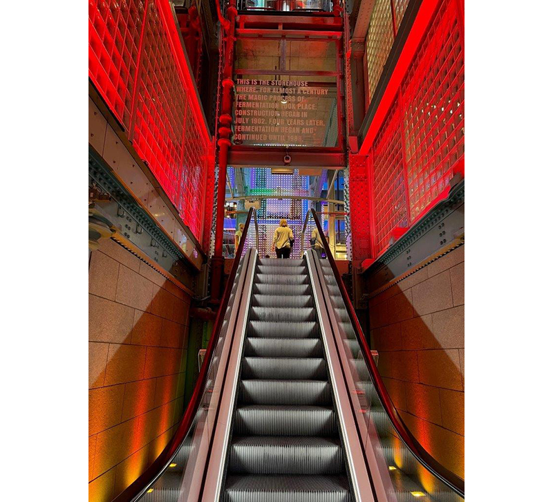
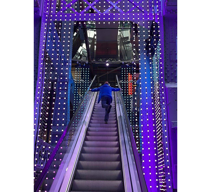
Visitors start on the ground floor and slowly work their way up to the pub on top. Here, you see the escalator that starts the ascent. People move through these suspended LED panels that chase colors upward from the bottom to give the feeling of effervescence.
As you ascend to the next level, you realize that the building is a reclaimed fermentation warehouse built in 1902 and was actively used until 1988. Indirect linear red LEDs wash the metal structure and glass block.
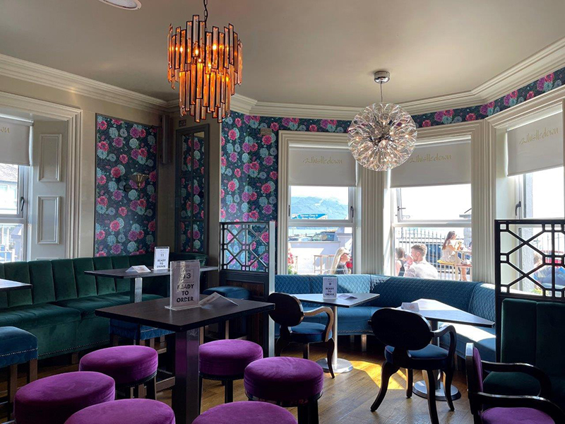
Later on in the trip, while sitting in this lakeside restaurant, I noticed the two chandeliers that hadbeen installed. On its own, each one was attractive, but together they were very mismatched. I don’t mind at all mixing styles and fixtures together, but they should have something that unifies them. That could be the materials that are made of, the finish, or the type of glass.
Looking at the cool colors of the interior, it seems like the clear glass ball-shaped pendant with the chrome detailing fits in better than the pendant with the amber glass and black metal finish.

