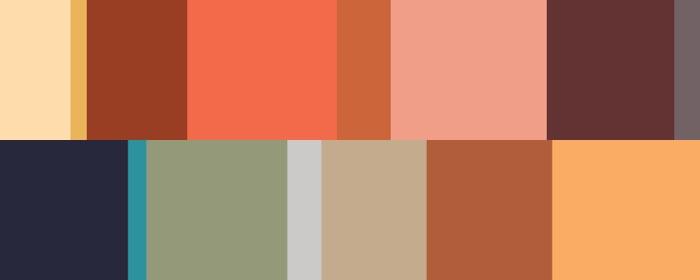
As the year winds down, color and trend experts are on high alert, predicting what colors will be trending in 2020. We spoke with Stacy Garcia, surface pattern designer, color guru, trend forecaster, and creator of the blog Life-Styled by Stacy Garcia, to get some insight into the colors and palettes designers and retailers should have on their radar this year.
What Colors and Palettes Will We See?
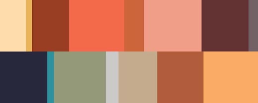
“We’re being pulled to ocean blues, navy, soft blue, amber and sunset-inspired hues. Grounding earthy colors such as clay, sienna and mineral green will continue to be important as well as warm, rich neutrals.”
Where Are These Trends Coming From?
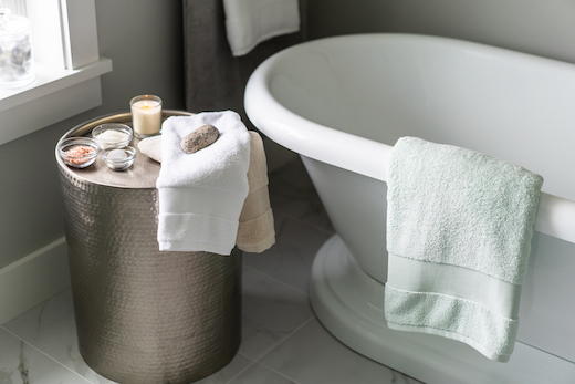
“The color palettes we’ve been responding to are both grounding and centering, and driven by the need to escape overstimulation. Wellness as an ongoing, overarching trend has majorly impacted what we surround ourselves with including color.”
Where Will We See Them?
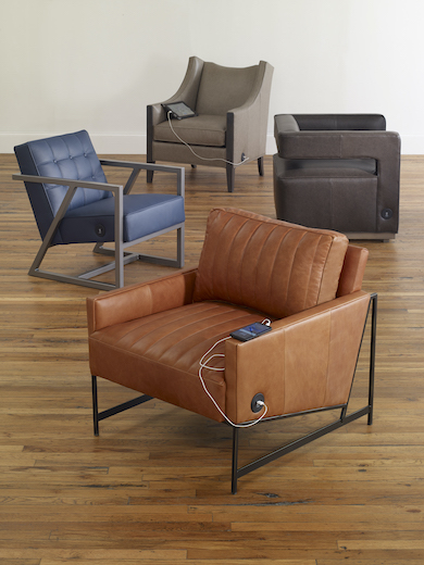
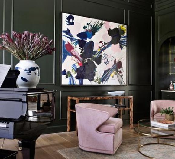
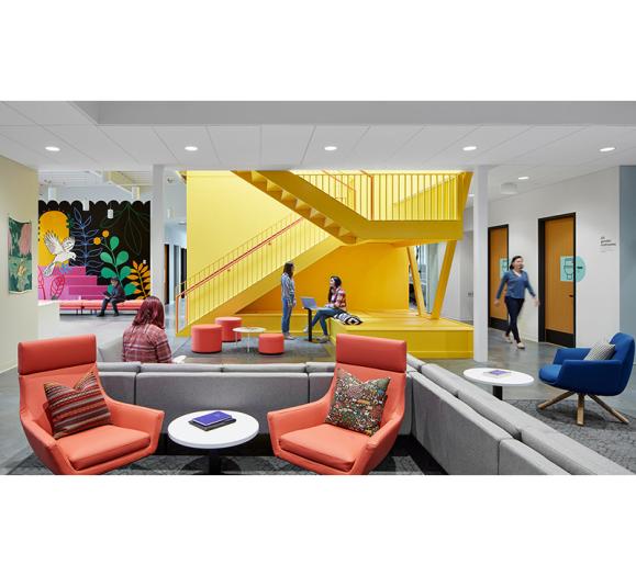
“Grounding colors such as deep ochre, clay, emerald green and navy blue are typically used on larger furniture pieces as these hues have been widely adopted as ‘new neutrals,’ while pops of bright, saturated colors may be reserved for smaller accent pieces. It is easy to add brighter colors in accessories and pillows that you can swap out or layer from season to season.”
What is Paint’s Role in Design?
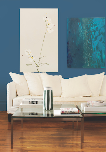
“Paint generally acts as the backdrop to the color story. A cool backdrop can be warmed up and layered with complementary colors or it can set the mood for a cool, analogous palette. For example, a rich, deep sea blue paint color for the walls may call for a clay accent chair, but can just as easily have a green sofa set against it. A dark backdrop can be contrasted with light finishes or light walls with dark accents, both work.”
How Should Designers and Retailers Respond?
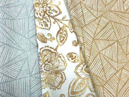
“Color is something that evolves over time. Color trends don’t typically pop up out of nowhere. Whether you’re a retailer or designer, you may want to try the ‘wait and see’ approach. Try testing out the new color on a smaller accent piece to see if it takes hold in the market. If it becomes universally adopted, then it’s safe to hop onboard with the color trend. For a smoother transition, new colors should layer in with existing color palettes.”
Paint Points
While our focus is typically on furniture, lighting and decor (it’s in the name!), a home’s wall color can also make a dramatic design statement. As major paint brands begin to announce their 2020 colors of the year, designers should take note. This year’s paint colors of the year trend toward cool and calm, offering an escape from technology and a connection to nature. Below are some of the announcements made as of press time.
Sherwin-Williams

Naval (SW 6244): The paint brand describes the rich navy hue as “the glamour of Art Deco meets the serenity of a yoga studio, pairing the contemporary desire to treat ourselves with the practice of self-care.”
Behr

Back to Nature (S340-4): This biophilic shade of green embodies the desire to get back to nature. It “captures the emotion of wilderness landscapes and indoor gardens, while being subtle enough to serve as a new neutral,” the company says.
Glidden

Whirlwind (PPG1013-3): In a potentially controversial move in the world of color, Glidden opted not to announce a 2020 Color of the Year, instead asserting that this bluish gray was popular in 2019 and will continue to hold court for years to come. It offers a cool alternative to traditional whites and beiges.
PPG

Chinese Porcelain (PPG1160-6): Blues are hot at PPG, with 34 percent higher engagement than neutrals on the brand’s website. Chinese Porcelain, which the company describes as “a blend of cobalt and moody ink blue that imparts calmness and restful sleep while also offering the spirit of hopefulness,” was the most engaged color.


