

In recent years, the industry has seen a significant uptick in color and patterning within home decor. While other parts of the world have already widely adopted color, print and pattern, homeowners in the states have remained somewhat neutralized — until now.
Following the pandemic and our urge to “refresh” our living spaces, designers and retailers are beginning to see these elements become increasingly common. Color has begun to surface in all corners of the home: from peel-and-stick wallpaper to throw pillows, area rugs and home accessories.
“I think consumers are feeling more confident and more empowered to have fun, and give personality to their homes,” says Stacy Garcia, Creative Entrepreneur and Founder of Stacy Garcia Inc., a design company with a collection of global lifestyle brands.
Bright Color on Trend
In 2022, industry experts are beginning to see an overall “warming” of the home through color. Various unique hues are now trending — vegital greens inspire homeowners to bring nature inside, blurring the lines between the outdoors and in. Botanical and earthy colors continue to be some of the most requested palettes in interiors. Warmer colors including marigold yellow and rust-like reds are also among top choices.
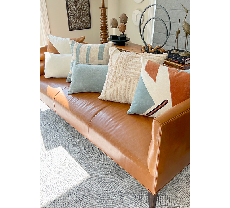
“Some of these rust colors almost look like a sepia brown, which looks gorgeous when paired with leather and wood,” says Garcia. “There are a lot of wood trending materials right now as well.”
Different ranges of terra cotta continue to be important, but with the optimistic punch of brighter oranges that are a bit warmer than they’ve been in the past. Pops of bright coral are also making an appearance.
“With the coral, it’s almost like a fashion color — like lipstick,” Garcia says. “It’s one of those colors where it ‘looks good on every skin tone.’ You can’t look bad in this color. We’re also doing both navy and royal blue as accent colors, but we’re seeing them get a little deeper and more saturated. Much more rich.”
Patti Carpenter, Global Trend Ambassador for Maison & Objet and Principal of Carpenter and Company, has seen this as well, observing that the industry has recently begun returning to the “basics of color.”
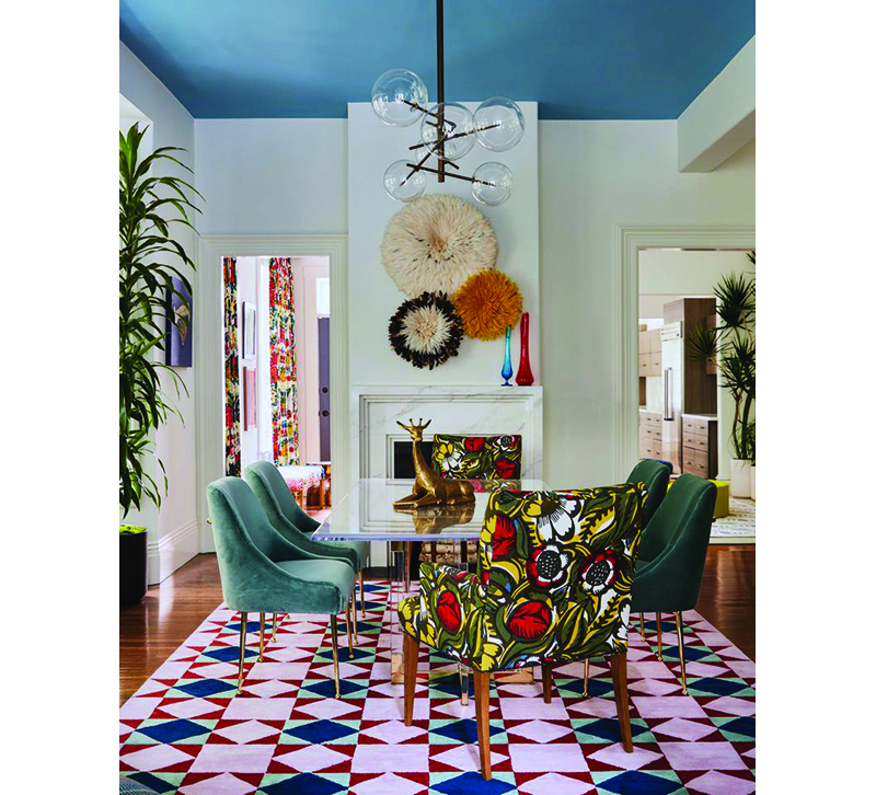
“We see very intense reds, blues and yellows, which are sort of our primary colors,” she says. “Yves Klein blue, which is a staple in Europe, has made a huge appearance recently. Especially in the groups of products that are influenced from the world of art.”
With color intensifying and brightening in recent years, hues such as “absinthe green” also hit the Maison & Objet decor and design fair in Paris earlier this year. According to Carpenter, green as a color “family” is still seen as one of the most important.
“I don’t think essential greens are going away,” she says. “But I think they’re being enhanced by this newer, brighter group.”
Even beiges and browns are making a comeback, now outpacing grays, which are considered an industry staple. Garcia says designers have begun incorporating color into these neutral “backgrounds.” Sand, brown and beige tones insert themselves perfectly between bold colors, offering a nod to the natural materials popularized within the decor world.
“We see the warm side replacing gray tones,” Carpenter says. “They just feel a little better, and they play so nicely with all these colors. We think that will continue well into 2024, 2025 and beyond.”
Softer pastels are also trending within the market, mixed with both dark and rich colors. Stacy Garcia Inc.’s Rayas Rosewater Area Rug, for example, incorporates dusty coral pink with a light blue. Both colors feel part of the pastel palette.
“We’re pairing pastels with these other colors so it doesn’t feel ‘baby,’” Garcia says. “It feels very sophisticated. We use a darker rust with black as an accent so it ‘lifts’ the look of the palette and overall feeling of the design. It doesn’t feel like it has to go into a baby’s room just because it’s pastel if you anchor it with some darker, richer colors.”
Maison & Objet trend watcher Elizabeth Leriche told Houzz there would continue to be an increase in pastel colors, particularly in the mauve to violet spectrum. Violet was everywhere among the new products on the stands this year, according to Houzz. It is also used in contrasting palettes alongside pinks and green.
Patterning As Art
Patterning in products has begun recalling art, infused with influences from around the world. According to Carpenter, art is one of the biggest drivers for print and pattern, pushing the envelope for how products are designed.
“I’m seeing these great new geometrics through the art influence, and some of them could almost be an Art Deco pattern but recolored and rescaled,” says Carpenter. “There were several incredible graphic patterns that were coming through during my time in Europe that I thought looked fresh and was excited about.”
Simple shapes inspired by Brutalism have also begun making an appearance within accent pieces like vases, and decorative accessories.
“I’m also seeing a lot more mobiles, with a flat kind of shape inspired by Calder [an American sculptor],” Carpenter says. “I’m also seeing a lot of Mattise [a French painter] inspiration – big, flat, paper-cut-out looks to patterning.”
Garcia seconds this, seeing a surge of artisan technique and global inspiration for home accessories. With global interiors, brilliant hues are often combined within the home without restraint. Intricate and ornate textiles showcase vibrant colors in skillful embroidery and dazzling prints that enhance one another.
“I’m seeing beautiful handmade baskets out of Africa, beautiful textiles coming in from India, pottery from Mexico,” she says. “I think that’s a jumping off point where you see some of that handicraft. It’s a one-of-a-kind story, and it has great patterning.”
Clean checkered patterns in different scales and techniques are also rising in popularity. Whether black and white or used in colors, traditional or contemporary, this pattern can infuse spaces with a chic charm, “whether they’re manufactured or hand-drawn by an artisan, or even in clothing,” Carpenter says. “I started to take pictures of people on the street in checkered suits from head to toe, because that’s something we see very important as a pattern — I called it ‘off the grid.’”
Linear structures that are cut apart and repositioned very rigidly have also surfaced, bringing more life to lined patterns.
“We’re seeing a lot more brocades, jacquards and textured fabrics that really call you to touch and engage with them,” Carpenter says. “These are now showing up in modern patterning, they’re not retro looking. If it is in a retro pattern, it incorporates a modern color combination.”
Similarly, Garcia has seen some lined patterns in multicolored pillows. “I have a pillow from Morocco that has a beautiful stripe with all of the colors,” she says. “If you place that in your home alongside bright, bold artwork, you’re having even more fun with color.”
Floral print has also come a long way, offering updated patterns on a range of products, from rugs to walls. Depending on how they’re used, floral patterns can soften angles and add a hint of flair to otherwise bland spaces.
“That’s not going away,” Carpenter says. “Out of those we see a newness in the florals — where we had big blossom patterns before, now we’re seeing the stems and stalks of florals.” Along similar lines, reimagined animal print has come to the forefront. In addition to unexpected colors, familiar animal patterns are now available in a range of textiles.
“We see animal prints in different colors that are bolder, brighter and fun,” Carpenter says. “Maybe a zebra or tiger stripe but not in those neutrals. We’re seeing them in bright two-tones. The same goes for leopard spots. It’s sort of the nouveau animal print.”
As for the future of “bright and bold” in home decor, Garcia says a new rug collection update and pillow line is currently in the works, set for launch at October market. The collections showcase bold graphic design with an artisan flair.
“They’re made with more of a ‘hand drawn’ technique, so there’s no hard edges,” she says. “But it’s done in this very bold graphic, like black and cream. It wasn’t computer done from the get go. They started out as watercolors. Those have had really great feedback.”
Both Carpenter and Garcia agree that nowadays “home” is much more than a place to sleep at night. It’s become a form of self expression, much like fashion. Consumers today will continue to design their home as a place to showcase personal style.
“I think people want to see the humanity in products,” Garcia says. “Consumers are doing it in a more contemporary way now. It’s really about putting a modern, eclectic twist onto your home and making it yours.”
")


