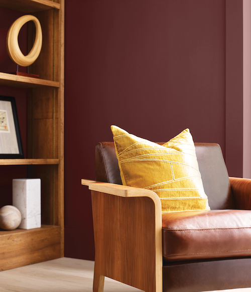
Sherwin-Williams introduces the Colormix Forecast 2023 TERRA, a collection that embraces regeneration, creativity, care, connection and joy. The forecast encompasses curated palettes that are inspired by the natural interweaving of people and their spaces.
“We are on an intentional journey to experience beautiful, living color as we evolve,” said Sue Wadden, director of color marketing at Sherwin-Williams. “Our connection to the Earth, fondest memories and future hopes are what will influence our global outlook in the months to come. These influences affect our commercial spaces as much as they do our homes. Embracing the idea of TERRA in design inspires a new way of living that will be defined by balance, presence, support and the enduring joy that awaits us.”
Wadden and the Global Forecast Team of color professionals at Sherwin-Williams conduct extensive research each year individually and then come together in an intensive workshop to build the forecast and set the stage for the conversation around color in the year to come. All kinds of trend topics are considered – from climate change to mental health – and emerging trend topics are then thoughtfully translated into defining colors and cohesive palettes. The 2023 Colormix Forecast features rich earth tones, natural clays, sunbaked sands, restful neutrals and powdery pastels.
Colormix Forecast 2023 TERRA Collections
The main forecast features 40 hues within four curated palettes: balanced Biome, passionate Lore, serene Nexus and vibrant Origin.
Biome
Drawing on the components of an ever-changing ecosystem, the Biome palette celebrates the similarities between an abundant Earth and a quest for balance. This palette finds its inspiration in biophilia, organic minimalism and symbiosis. The delicateness of Threshold Taupe SW 7501 complements the down-to- earth tranquility of Urbane Bronze SW 7048, among other peaceful and sophisticated pairings.
|
|
Lore
The Lore palette draws inspiration across cultures and centuries. This palette’s hues invite reconnection with an intricate mix of ancient reds, powdery pastels and rich jewel tones. While Studio Mauve SW 0062 whispers soft beauty, Blue Peacock SW 0064 prompts bold expression.
Nexus
Hidden places can often be the most healing and the Nexus palette lends a hand to help consumers find these realms of restorative energy. Grounding browns and soft, soulful whites complement various warm tones that exude love and kindness. Influenced by daily well-being rituals, Nexus incorporates natural clays and the sunbaked desert, like Reddened Earth SW 6053 and Likeable Sand SW 6058, which highlight serenity and restoration.
Origin
From mixing and matching to embracing hybrid living to the notion of metamorphosis, the Origin palette demonstrates the power of layering fond memories with future hopes to feel vibrant and joyful in the present moment. Hues like Fabulous Grape SW 6293, Peppery SW 6615 and Goldfinch SW 6905 are magnetic, free-spirited and bold.
|
|
Commercial Colormix Forecast 2023
The 2023 Commercial Colormix Forecast contains six distinctive commercial palettes using the 40 forward-looking colors of TERRA. These palettes can be explored and embraced when designing inspiring spaces for commercial, hospitality, new residential, healthcare, education and multi-family settings.
The Commercial palette evokes a casual and earthy vibe, whereas the Hospitality palette finds its inspiration from hyper-localization and mindful luxury with deeply saturated colors. Influenced by inclusive design elements, the Education palette shows how spirited colors and natural wooden materials can be used to create holistic surroundings, while the Healthcare palette encourages bio-immersive environments to enhance the patient and caregiver experience. Welcoming colors and warm tones define the Multi- Family and Residential palettes to help residents feel at home in multi-functional spaces while promoting relaxation, focus and comfort.
The palettes capture themes of resourceful ingenuity, pushing boundaries, embracing community and diving into a new way of living, reflecting how these ideas will continue to influence the commercial design landscape in 2023 and beyond.
Color Exploration and Selection
All 40 colors in the forecast are available at Sherwin-Williams stores nationwide and are available to order online for in-store or curbside pick-up. Sherwin-Williams color chips and Peel & Stick also are available in store and online at swsamples.com. Learn more about Sherwin-Williams Colormix Forecast 2023, Commercial Colormix Forecast 2023 and other color selection resources at swcolorforecast.com.


