
Since its first appearance in the middle ‘90s, Maison & Objet has grown into one of the top trendspotting venues in the world. The September show confirmed that this reputation remains well-deserved. At the autumn fair, several directional looks hinted at trend colors, materials and motifs to come.
Mixing it Up
While mixed-media combinations remained relevant, mixed finishes proved to be more interesting. The real innovation came when boundaries between textures and finishes seemed to blur. For example, oxidized areas appeared to be creeping into plain ones. Matte ceramic might be touched with a random pool of glaze. Colored and metallic areas, speckled and corroded elements or perfect and irregular glazes created a mix of two or three finishes that fits the consumer’s “more is better” mentality.

A pool of glaze on Jars Céramistes’ matte dinnerware highlighted a mixed-finish trend. www.jarsceramistes.com
Chasing Rainbows
When metal was shiny, it was not always plain. Rainbow-finished aluminum, which started with solid gold and then transformed into a continuum of color, offered a lustrous gradient unlike any other. This new metallic effect also popped up in ceramic and porcelain and looked spectacular in glass. Emerging in so many materials simultaneously suggested that rainbow effects have plenty of room to grow.
A rainbow effect updated aluminum Vase Rainbow pot (right) at Dôme Deco. www.domedeco.com
Back to Memphis
Memphis, the short-lived 1980s design movement, formed a countertrend to Mid-Century-Modern style 30 years ago. Introductions from key companies at Maison & Objet suggested that it’s about to play that role again. Memphis is a playful style, with quirky geometrics that made forms and surface designs stand out. Lines and triangles appeared randomly placed, or even scattered. Saw-tooth edges and partial discs seemed to bounce and dance. Color was either punchy and primary (directional for 2020), or it took a graphic, black-and-white approach that worked well with colored pieces but could also stand on its own.
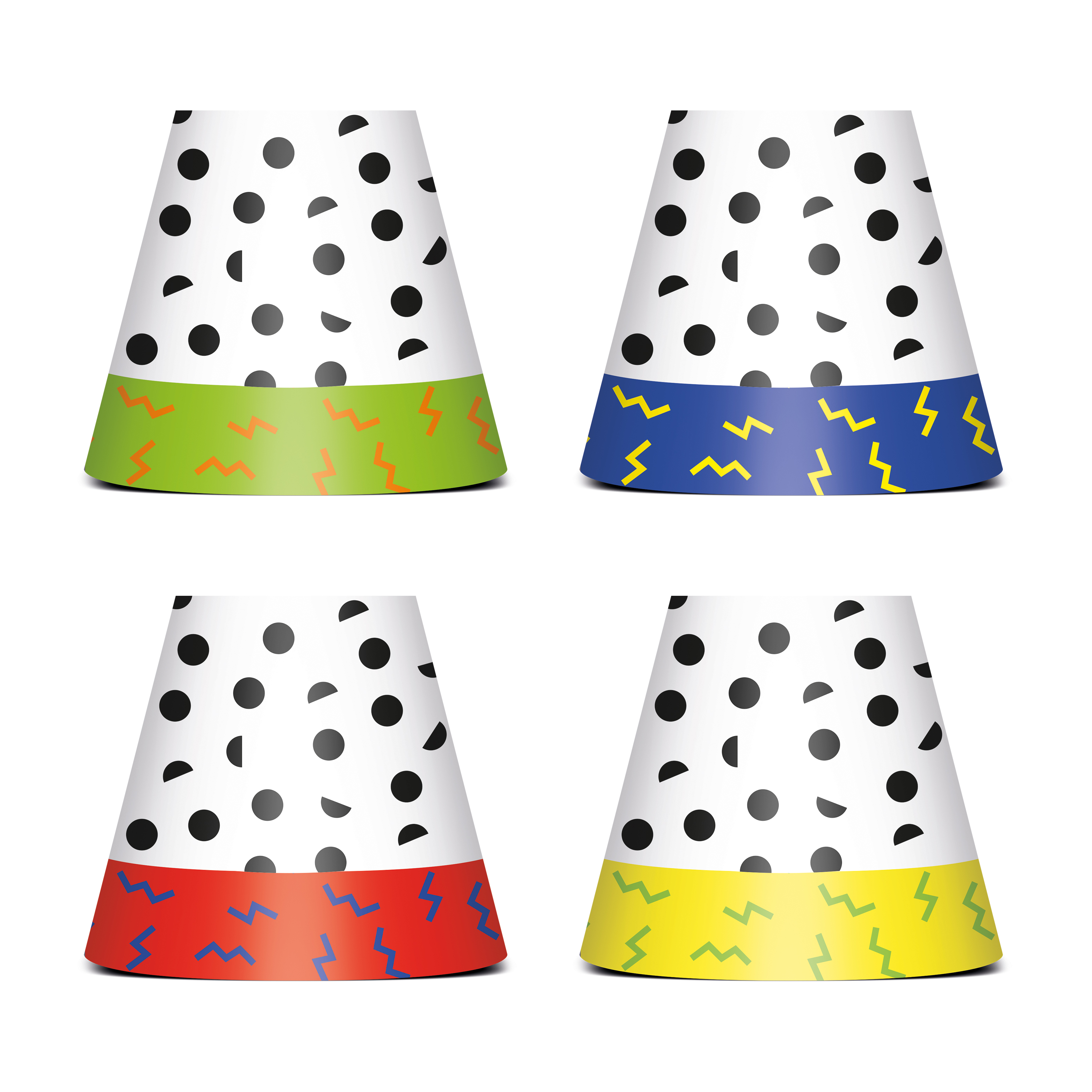
Fatboy combined dancing geometrics with primary colors in new shades for their Party Polonaise series. www.fatboy.com
New Roles for Wood
The most popular wood varieties did not change at Maison & Objet. While a preference for walnut may have slipped a bit, it was still a major factor in this category. White oak gained what walnut lost, adding to its already dominant share. The newest look for wood played an accent role. It was oxidized oak, a black-finished wood, that was most notable in items used for serving, like trays and cheese boards. Introducing trend-focused wood looks to the table was not limited to items with oxidized finishes either. In fact, after achieving success in the entertaining category via serving boards, wood migrated into plates, bowls and platters. Some of them came with primitive carving, while others included a light gold metallic rim for a touch of lustrous elegance. Several companies favored organic shapes, allowing this hard material to feel soft.
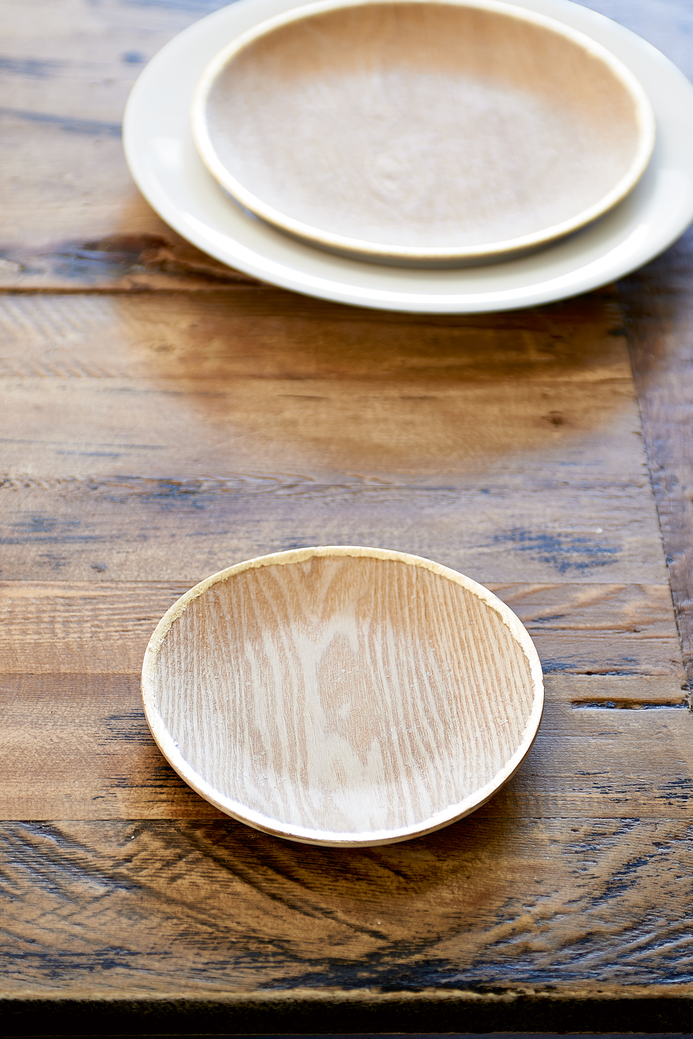
Rivièra Maison dressed up wood for the table with an organic gold metallic rim on the Lancaster Decoration Plate Gold S. www.rivieramaison.com
Deco Designation
This fair takes place in Paris, so it should never come as a surprise to see pieces in Art Deco style. This time, however, there were even more than usual as Art Deco has started to trend. Although the scale and legs are very 21st-Century, inlays and hardware on Ana Roque’s Scalla cabinet evoked steam-liner and locomotive motion, making an unmistakable connection with pieces from the original Art Deco era.
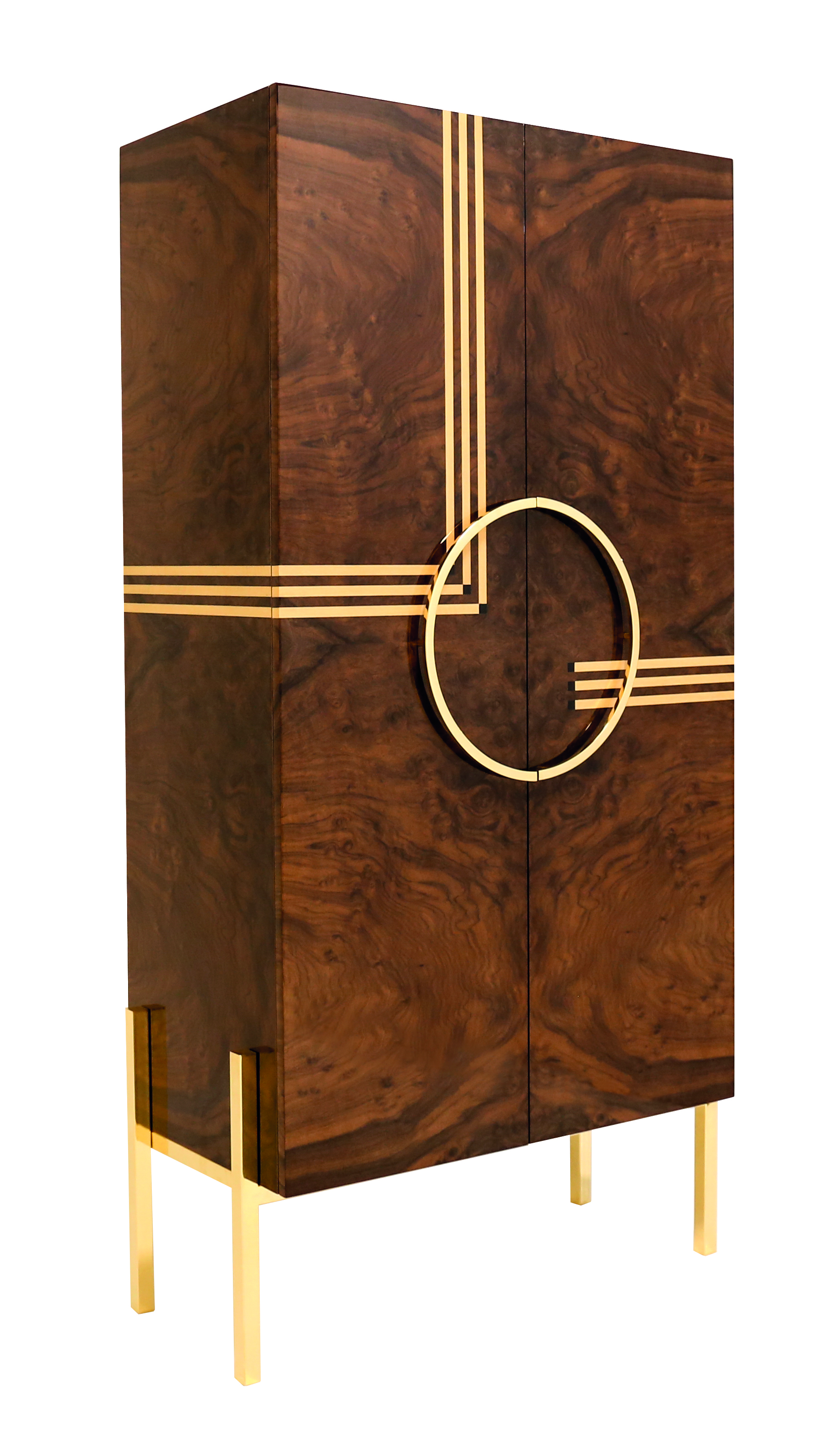
Hardware and inlays in Ana Roque Interiors’ Scalla cabinet suggest motion. www.ana-roque.com
Bordeaux
Pink’s massive (and still growing) popularity created a knock-on effect in Paris, seen in the directional emergence of a warmer and darker Bordeaux. This hue added richness to color combinations that included other deep-value colors, like already established greens and petrol blues. But it really made a trend statement in analogous combinations with pinks and other dark reds, or when it was teamed with gold metallic.
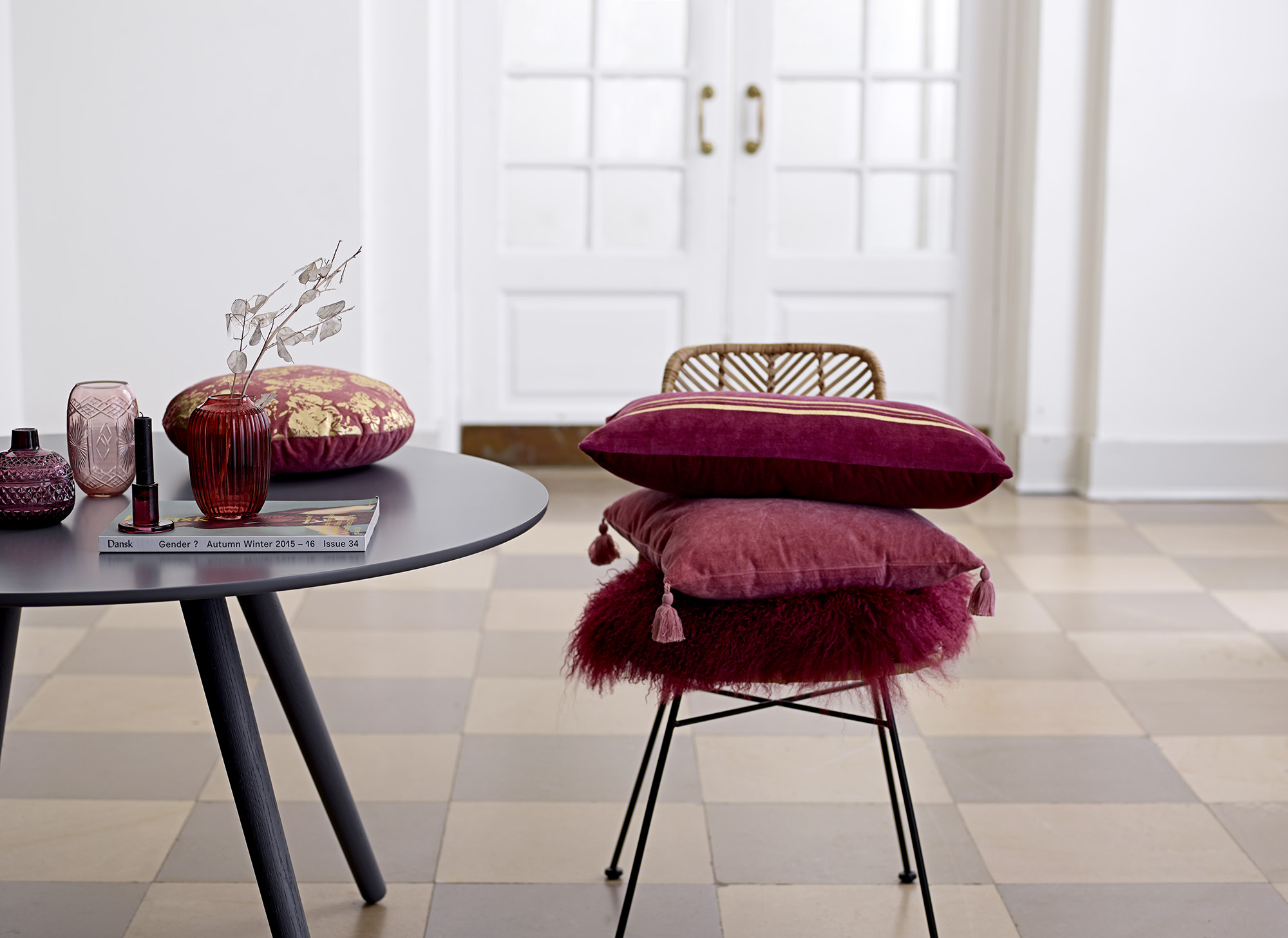
Bordeaux was equally directional in hard and soft materials. Photo by Bloomingville. www.bloomingville.com
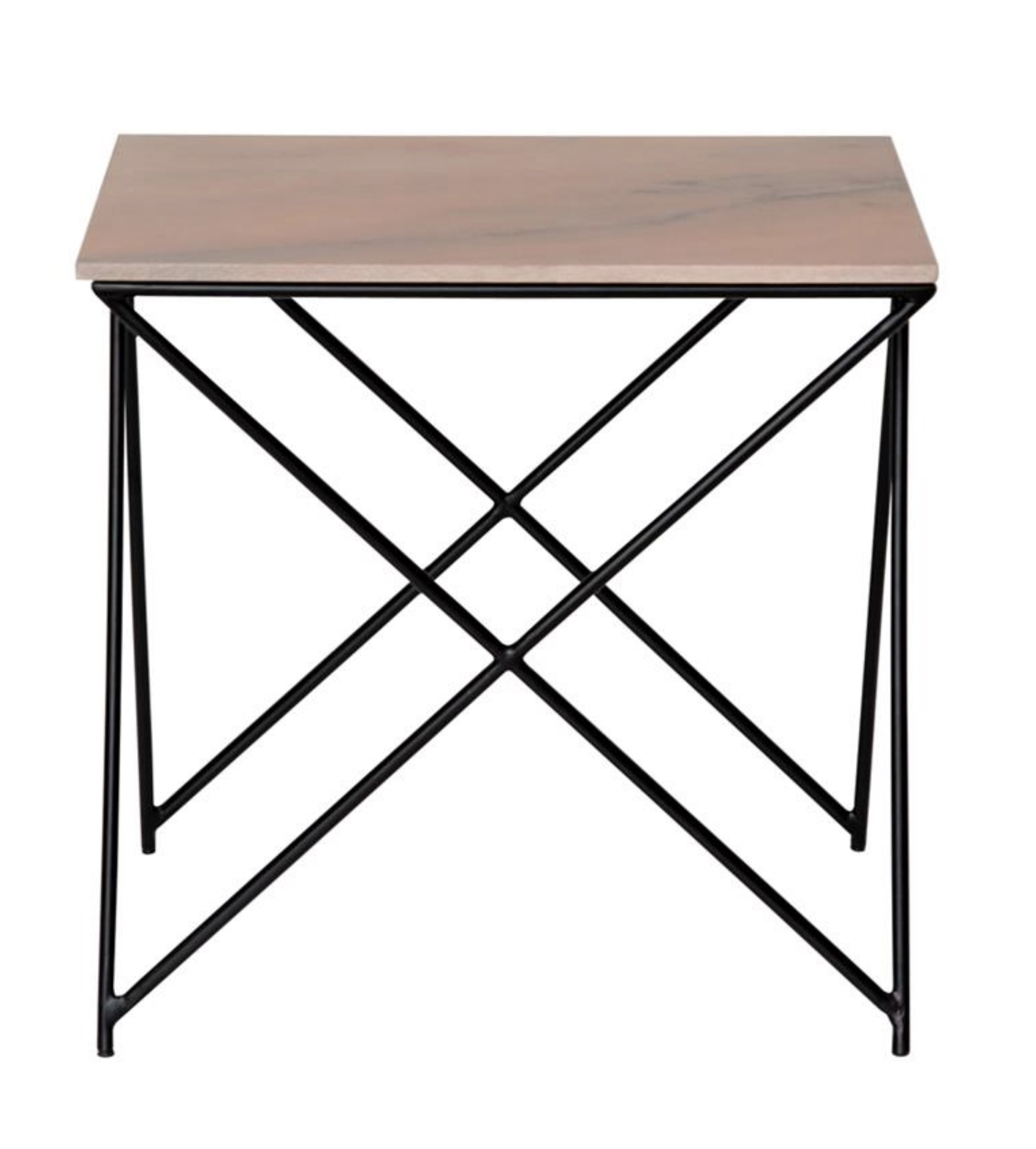
Going With The Flow
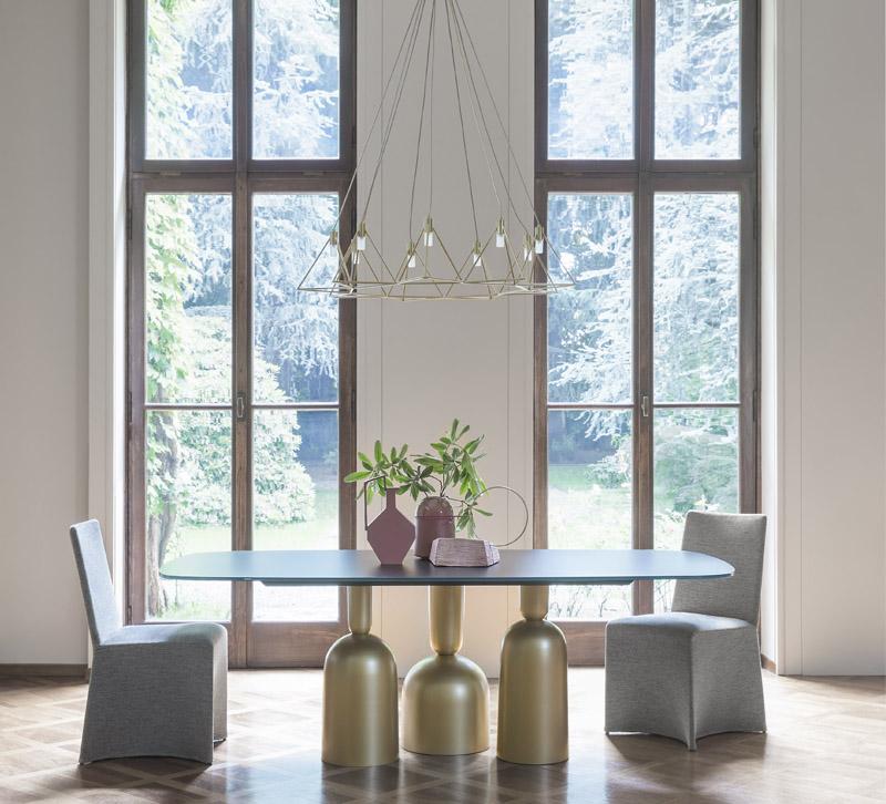
As the tendency toward organic shapes that emerged at the January fair strengthened, articles with an amorphous quality moved front-and-center. Most of these pieces were simply imperfect, but others mimicked the wavy edges of a raw egg when released from its shell, and some referenced swirling, folding and dripping. All these shapes brought edges with a fluid sensibility closer to the norm, especially for tableware, but also for decorative accessories. In addition, they made undulating surfaces—even in unexpected areas like the top of a table—acceptable.
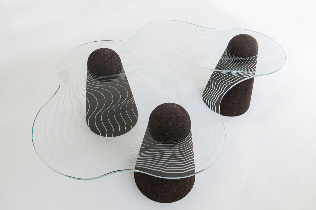
Organic sensibility in the Maddi table, designed by Joan Tarrago Pampalona for Éditions du Coté. www.editionsducote.com
Golden Glow
If you’ve been thinking that gold has been around for so long that there’s nowhere left for it to go but down, think again. It was still building in Europe and repeatedly referred to as the trend metallic. The best looks for metallic finishes on materials like porcelain and wood was dull: matte, brushed or satin. However, for metal objects themselves, luster was also in the picture. In fact, vignettes looked the most updated when both dull and polished surfaces were present.
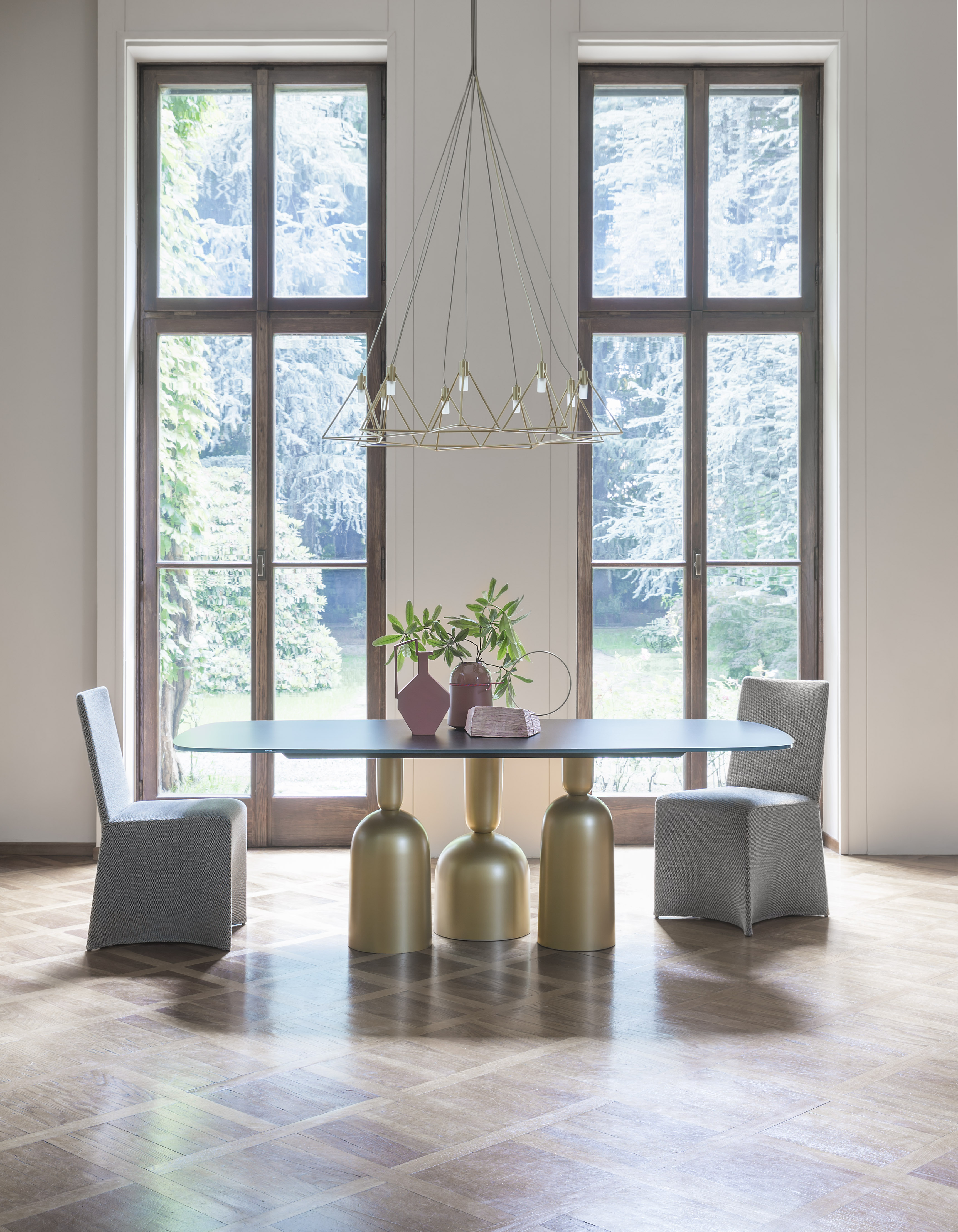
Overturned objects become the base of Bonaldo’s Cop table in metallic-painted metal. www.bonaldo.it
Suede Surprises
As the quest for metallic expressions grew over the past few years, pearl effects (both subtle and obvious) gave leather a trend boost. Suede, with its matte finish and dry hand, was left behind. Get ready for all that to change. Suede had already been accepted (along with yarn or rope) in macramé wall hangings and pot hangers. When Maison & Objet opened in September, the number of wrapped handles, cushions and covered boxes became the latest indications that we’ll see much more from suede in the two years ahead.
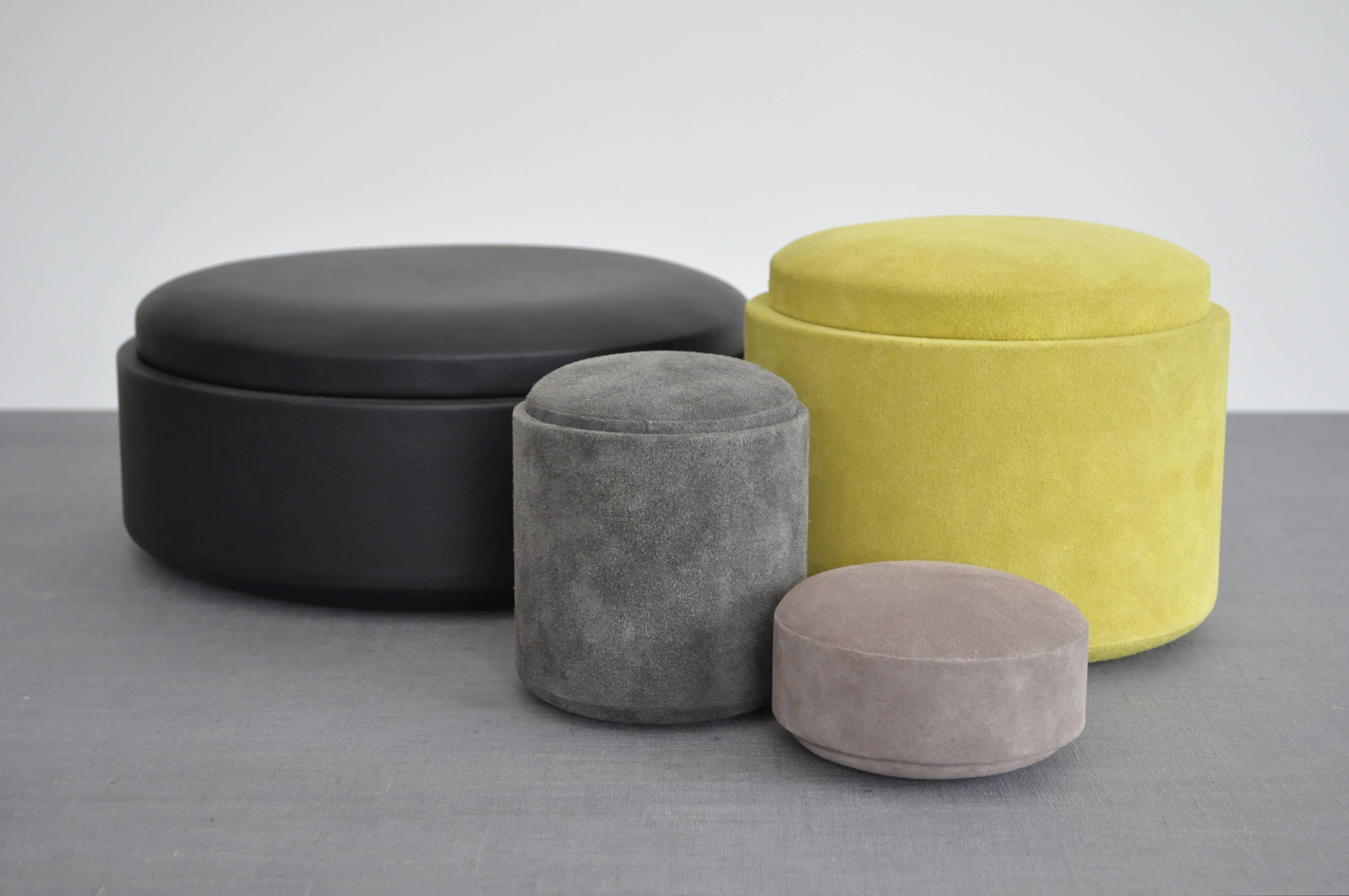
Michaël Verheyden’s Pastille S boxes, covered in suede. www.michaelverheyden.com
Newly Neutral Pink
Marble has been on the scene for about four seasons, but at Maison & Objet it looked completely fresh again — that’s because several companies introduced it in pink for the first time. Pink is no longer a surprise in small, decorative items made of rose quartz, yet there has been virtually no exposure for pink marble so far. Seeing applications like tops for cocktail tables — items typically found in spaces used by both men and women — seemed to confirm pink’s recent designation as home decor’s newest neutral.
In Au Maison’s Marble Side Table in Old Rose, the company added pink as an option. www.aumaison.dk


