Striking a balance between honoring tradition and embracing contemporary innovation is no easy feat. Yet, prominent players within the industry have managed to achieve just that. With a mission dedicated to reinventing captivating styles for the modern age, designers and manufacturers seamlessly meld traditional influences with a fresh and modern twist. Their latest collections and additions have breathed new life into familiar aesthetics, incorporating elements from legacy movements in art and design, as well as forward-thinking trends.
Various product designers have mastered the art of taking traditional influences and infusing them with a modern flair. From legacy movements to future trends, companies such as Varaluz are making it their mission to reinvent captivating styles for the contemporary age. In Varaluz’s latest endeavor, it introduced Memphis and Pop Art design elements into lighting, wall art and decor collections.
“We are all about instilling a playful, rule-breaking idealism into the design process,” says Rob Henderson, Founder and Creative Director of Varaluz. “By re-envisioning retro objects and decor, Varaluz and Varaluz Casa manage to update them boldly while remaining relevant and accessible to a broad customer base.”
Varaluz’s approach embraces a sense of whimsy and rebellion, creating pieces that are both captivating and functional. Color also plays a pivotal role in the lighting and home decor company’s designs, drawing inspiration from the past while adding a contemporary twist.
“Just like Pop Artist James Rosenquist, who blurred the boundaries between ‘high’ art and ‘low’ culture, we embrace color even if it is shades of gold, black and white,” Henderson says.
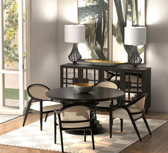
Varaluz’s Kato collection, for instance, artfully combines this color scheme in chic configurations, offering a balance between classic elegance and modern functionality.
Zuo Modern, another proponent of color in designs, has carved a niche by reimagining traditional furniture and decor influences with a modern take. Zuo draws inspiration from a variety of retro design eras, with a particular fondness for the ‘50s Scandinavian and Italian influences when the company first started. However, as fashion evolved, Zuo has adapted to a more glamorous ‘60s-’80s look.
“Retro comes with many middle names now,” says Luis Ruesga, Zuo’s CEO. “Retro glam, retro boho, retro granny. However, this is all based on the nostalgic elements of the era we are looking to bring back. I think we’ll always have a new interpretation of retro because, let’s face it…we had some great old designs in furniture that need to be brought back to life.”
When it comes to updating retro pieces, Ruesga believes both power and functionality are paramount. The group’s Deco Sofa, for example, screams ‘Miami’ in the early ‘40s but with a twist on the legs, adding gold to give it a touch of glam.
“A chair or a sofa can only be invented once, but fashion keeps changing,” says Ruesga. “No one thought velvet or boucle was going to be ‘hot’ again, but here we are — doing a complete twist on materials that were popular 50 years ago.”
He applies this method to various products within the Zuo line.
“A desk cannot be just a desk; it has to be great-looking,” he says. “Incorporating Mid-Century Modern aesthetics with contemporary gadgets, for example, we create furniture that captures the essence of the past and caters to the demands of modern lifestyles.”
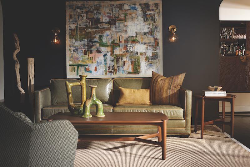
Showcasing a curated assortment of upholstery silhouettes and complementary occasional items, the new M brand, from Hooker Furnishings, also exudes an upscale and timeless aesthetic. Drawing inspiration from a range of influential design periods, the M brand incorporates classically modern style elements into its creations.
“You’ll see references to Mid-Century Modern, tambour design elements — and even echoes of the Roaring ‘20s,” says Becky Weber, Executive Director of M. “While referencing these classic styles, you’ll see that we edited them through an updated lens. Modern furniture is all in the details of proportion, scale and finishes; it’s never over-embellished or fussy.”
The group’s Raine sofa, for example, offers a nod to an updated tuxedo arm silhouette, believed to have been designed in the ‘20s. This classic design is characterized by the arm height being the same as its back.
“We celebrated and accentuated this design feature by using contrasting welt around the arms, back and base in a continuous line of impeccable tailoring,” says Weber. “Much like a tuxedo!”
M brand’s Harlow tables also clearly call on vintage style as an inspiration.
“The beauty of this table collection is the unique construction method where the legs converge with the tabletops,” she says. “Curved tops are sanded and smooth to the touch, while the trestle-style bases accentuate the elegantly shaped legs.”
At Varaluz, the love for retro styles goes beyond aesthetics, as they also draw inspiration from the enduring appeal of Mid-Century Modern design.
“The Mid-Century Modern aesthetic is timeless,” Henderson says. “Its clean lines and less-is-more approach allow it to be the star of the show without overwhelming a space. Many light fixtures and Varaluz collections take inspiration from this period, and we attempt to illustrate that throughout the design, even in the smallest details.”
Among the standout pieces that reflect this influence is the Swoon collection, a collaboration with the Smithsonian Institution. Featuring recycled stainless steel as a primary material, it embodies the essence of Mid-Century Modern design. Additionally, their new wall art collections—such as Mr. Brainwashed, Danny, Bette, and Social Climber—draw inspiration from the 1980s Memphis movement from Italy.
“Of course, our best-selling Matri collection is the best example of Mid-Century Modern design fitting into any type of space,” Henderson says. “It’s our most requested and most photographed collection in our line. We hope it will continue to make an impact in interiors everywhere.”


