
In an era where normal is no longer and mental and physical well-being have become more important than ever, consumers are craving simple comforts and a slowed-down lifestyle. Emulating both the optimism felt in nature and soothing nostalgia, the PPG 2021 Palette of the Year “Be Well” was unveiled today, consisting of hues Transcend, Big Cypress and Misty Aqua.
“With the world sheltering in place for the better half of the year, we have begun to crave human connection and embrace simple activities, including walking, hiking, baking and gardening,” said Dee Schlotter, PPG senior color marketing manager, architectural and industrial coatings. “This organic and hopeful palette represents what we have been longing for after decades of overstimulation and overconsumption — simplicity and restfulness.”
The Be Well palette is intended for the consumer who wants to fully embrace mindfulness and intention, showcasing natural hues that are restorative, compassionate and optimistic. The color trio celebrates beauty of all kinds and relates to those who want to prioritize wellness in mind, body and spirit.
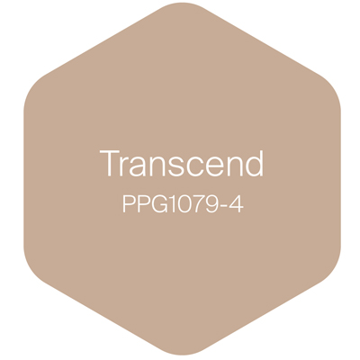
Transcend, a mid-tone oatmeal-colored hue that draws on earthy influences and nostalgia, grounds the palette. The antidote to an era of cool grays, this cozy neutral emulates the feeling of a warm latte on a cool morning or warm sand on a sunny summer day.
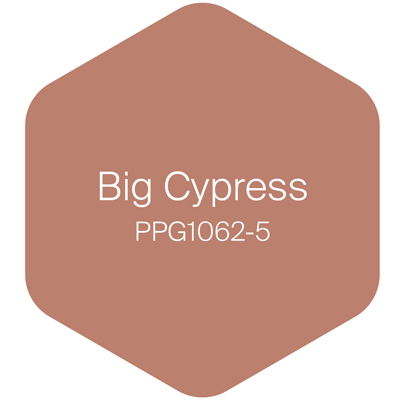
Big Cypress, a shaded ginger with persimmon undertones, is the equivalent of a big, comforting hug for your home.
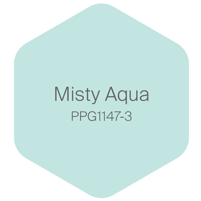
Misty Aqua, a watercolor cerulean blue, provides an unexpected pairing of freshness against the other warm, earthy tones.
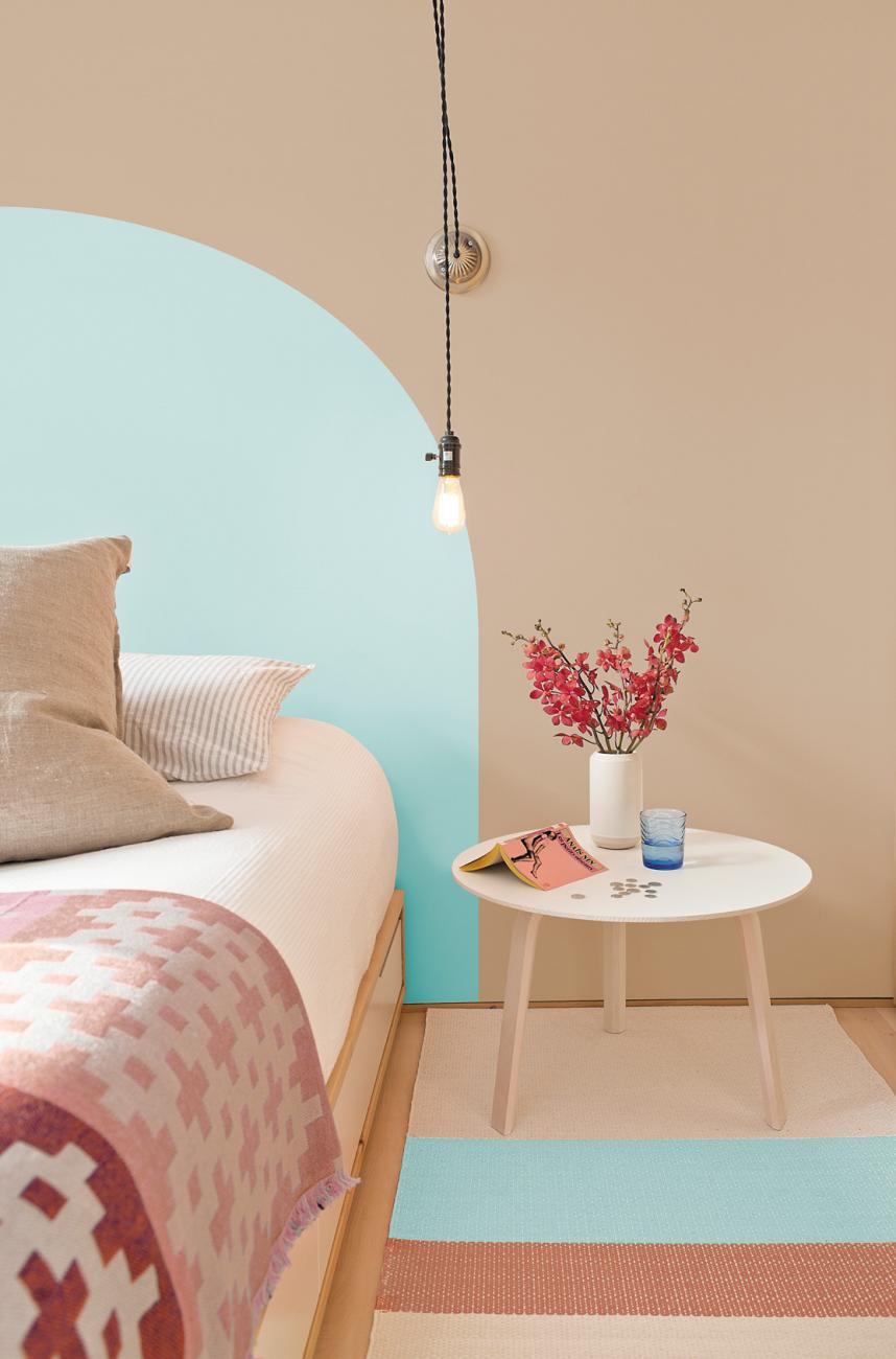
Used according to the 60-30-10 design rule — 60% of a room should be the dominant color, 30% as the secondary color and 10% as the accent — Transcend, Big Cypress and Misty Aqua pair well with greenery, blonde or natural brown-toned woods and layers of texture in the form of rattan, linen, velvet and woven textiles like pillows, blankets and rugs. With mindfulness front and center, this nurturing palette allows consumers to make space for comfort, support, relief and joy.
“When the world experiences events that cause unrest, anxiety and grief, we tend to naturally gravitate toward compassionate colors that allow us to create a personal retreat from the world,” said Schlotter. “These comfort colors are similar to comfort foods – both offering a certain sense of familiarity and normalcy when facing the unknown.”
The increasing need for kindness, human connection and mindfulness were recurring themes at PPG’s Global Color Workshop. This annual event brings together more than 30 PPG global color stylists from the automotive, consumer electronics, aerospace, and home paint and stain industries. Over the course of several days, the stylists analyze the runway, lifestyles, demographics, geographies, global events and cross-cultural societal inspirations to determine what colors will resonate and represent the PPG global color forecast, including the PPG Palette of the Year.
In addition to the Be Well palette, PPG color experts identified two additional color stories that will resonate in 2021:
Be True: Anchoring reality
This palette celebrates authenticity and connection by imitating an artisan’s touch and renewing traditional know-how by layering vintage-inspired colors and recycled and contemporary touches. The palette is a mixture of organic and heritage influences with warm, earthy tones combined with jewel box hues. Enchanting Eggplant, a rich maroon with chocolate undertones, grounds the palette alongside Gargoyle, a glass-bottle green, and Transcend.
Be Wild: Activating optimism
A mood-boosting combination of colors, these hues are a celebratory expression of individuality and reclaiming power. Included in the playful, expressive and creative palette is PPG’s Transcend, which brings an earthy element to French Lilac, an unexpected periwinkle, and Mediterranean Blue, a marine aqua-blue with a deep-water undertone.
")


