Michelle Lamb, international trend forecaster and editor of The Trend Curve™, scoured January’s Maison & Objet in Paris and February’s Ambiente in Frankfurt for styles sure to come our way. Here’s what she found.
Maison & Objet
In Paris, neutrals pursued new directions, texture’s popularity advanced yet again, and functionality made pieces irresistible.
Functionality
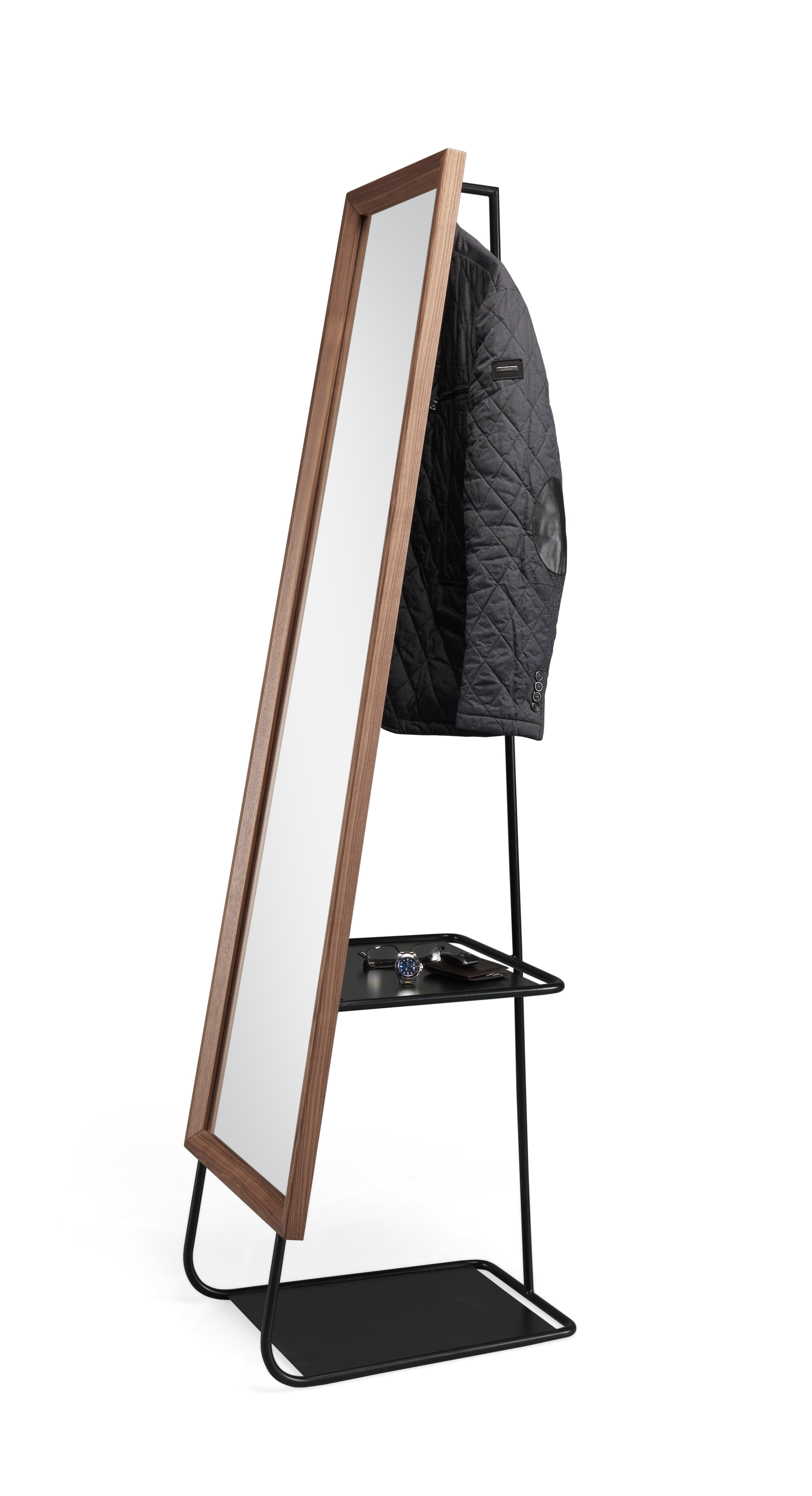
For many people, beauty is only half the reason to consider buying a piece. Functionality is the other must-have component. At Maison & Objet, a plethora of clever items emerged. A walnut coffee table had a removable metal tray built into the surface. Four stacked shelves fit into a grooved panel, allowing them to move left or right to accommodate taller items below. A pocket was sewn onto a leather headboard. And here, Wewood debuted Hide & Seek, a full-length mirror with hidden hanging and storage. www.we-wood.com
Piecing
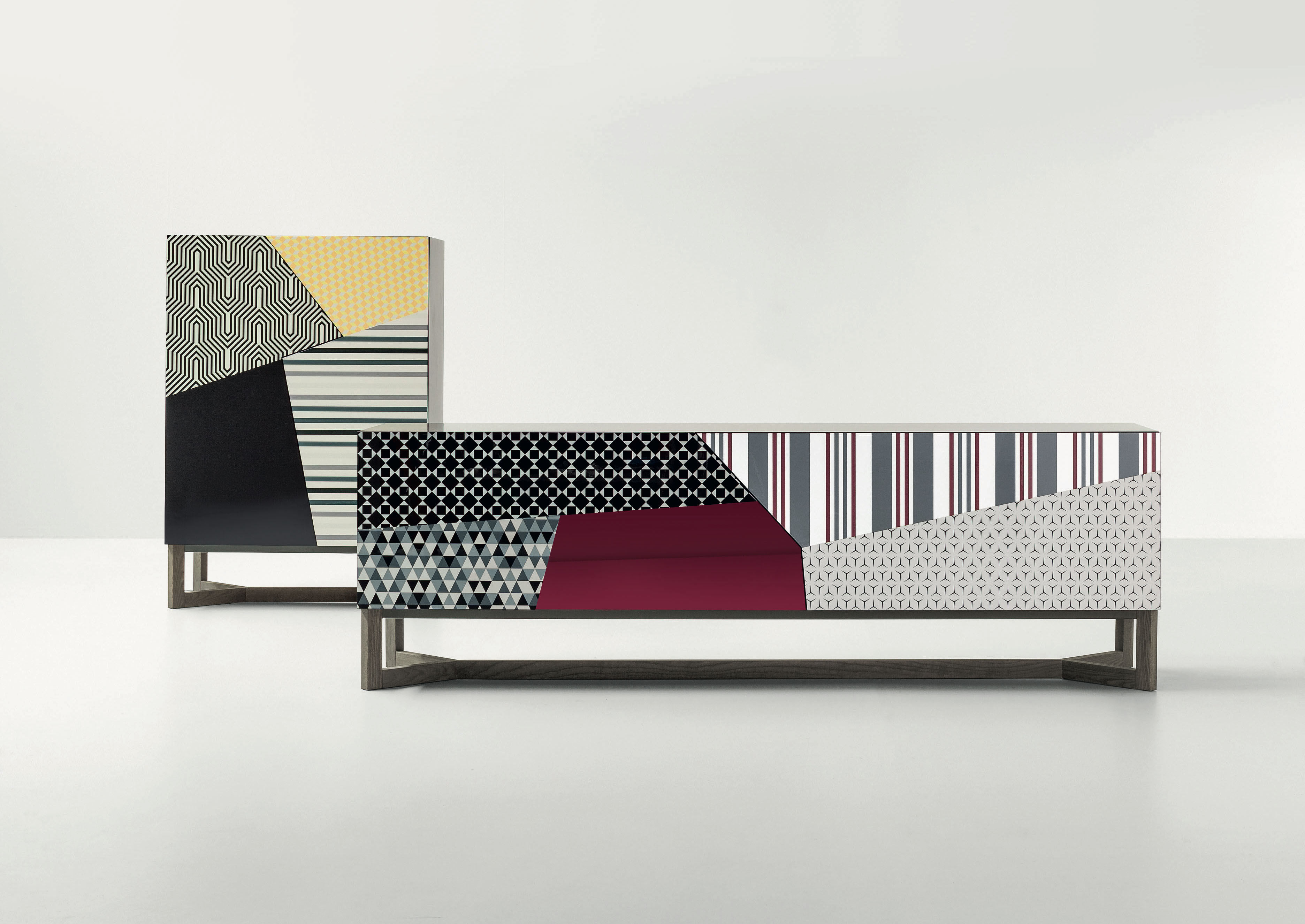
Say the word “patchwork” and the first thing that comes to mind is a country quilt. Don’t let those old associations keep you from embracing the new patchworks that emerged in Paris. Made of angular and irregularly shaped pieces, often with each one in a unique color or pattern, this new take is one of the most contemporary looks that the market has seen in years. Even better, it works for hard materials as well as soft. Bonaldo’s Doppler sideboard in a patchwork of patterns and colors illustrates this trend. www.bonaldo.it
Brown
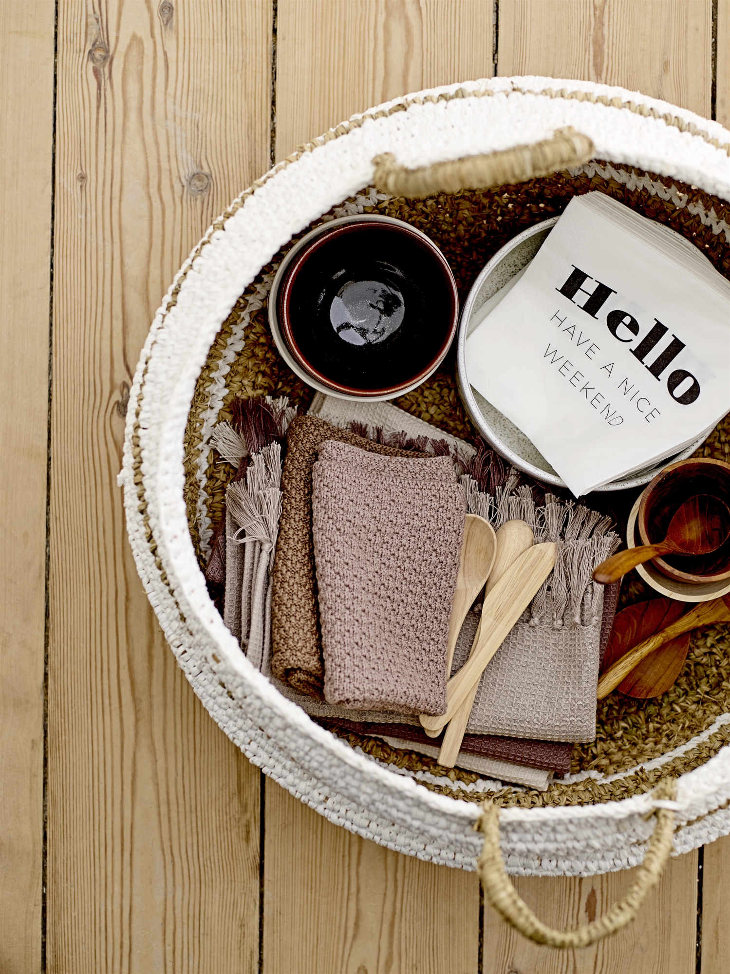
Browns grabbed the top neutral spot away from gray so firmly that there is now no question that the latter is “post-peak” for trend. Brown came in many types and values, and there was virtually no way to do it wrong. Above, Bloomingville shows how great browns can look together. www.bloomingville.com
Metallic
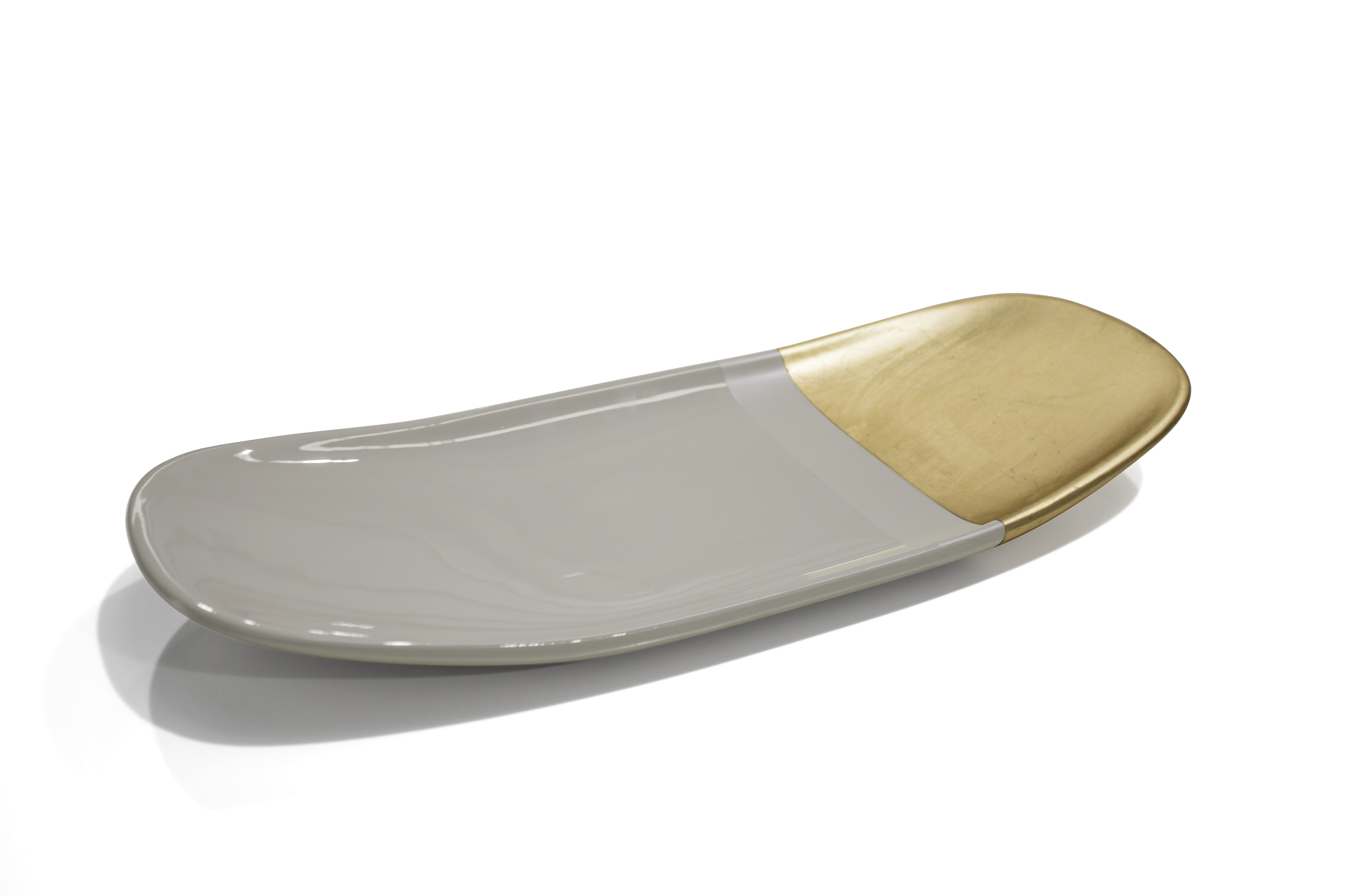
Metallic effects still looked great. This was especially true of gold, which had carved out a place for itself in the mainstream. Bronze was rising. But increasingly, each of these metallics looked best as part of a larger story — think matte-luster or two-tone contrast, both of which were directional in Paris. Jetclass showed the trend that combined matte and luster finishes. www.jetclassgroup.com
Going Buggy
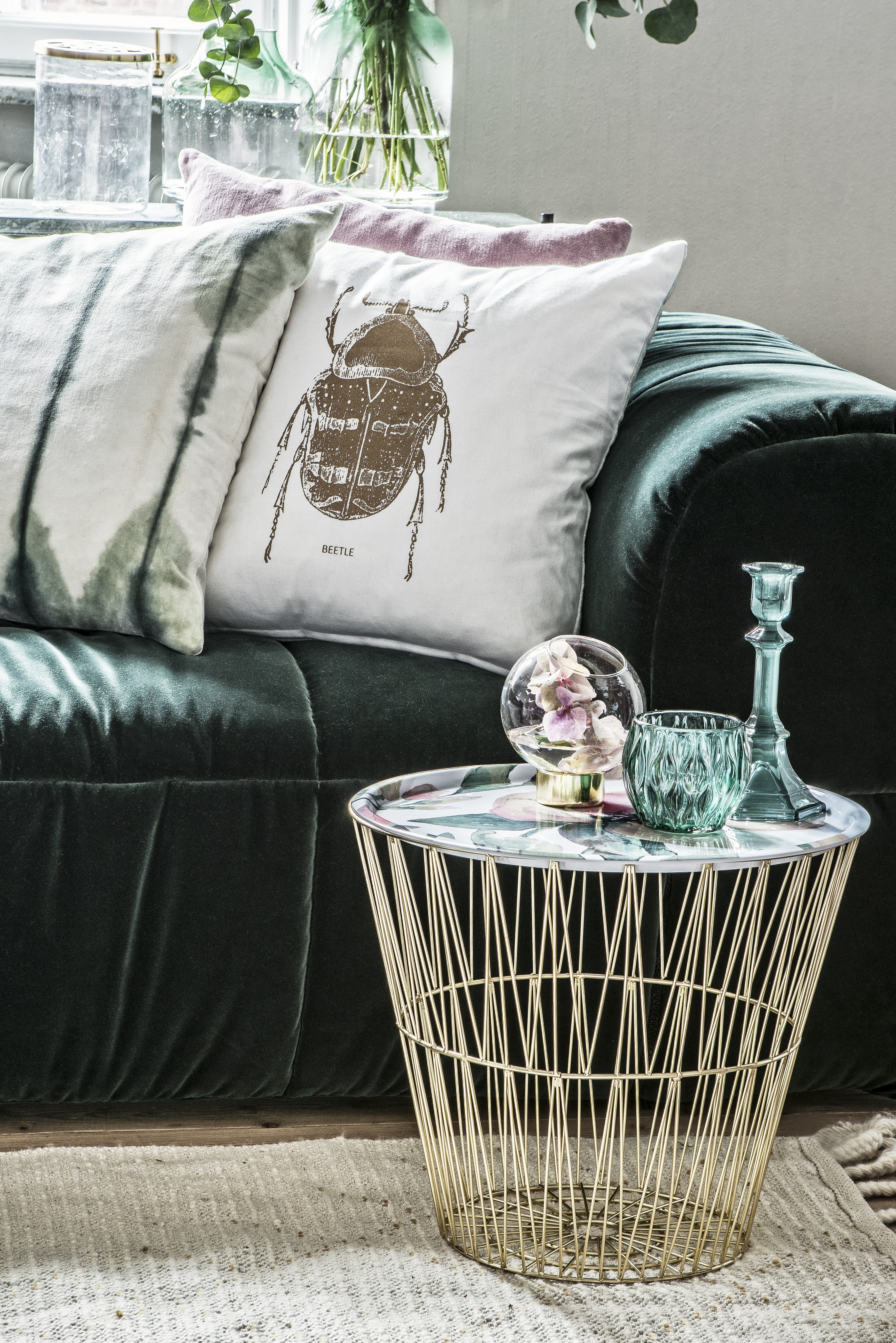
Entomology has returned to the realm of trend. Beetles had already seen an uptick in popularity by the time Maison & Objet arrived. The same was true for butterflies. At this fair, though, they really took off. These insects were joined by dragonflies and houseflies, which appeared for the first time. Cushion from Eightmood’s Nordic Space collection. www.eightmood.com
Green
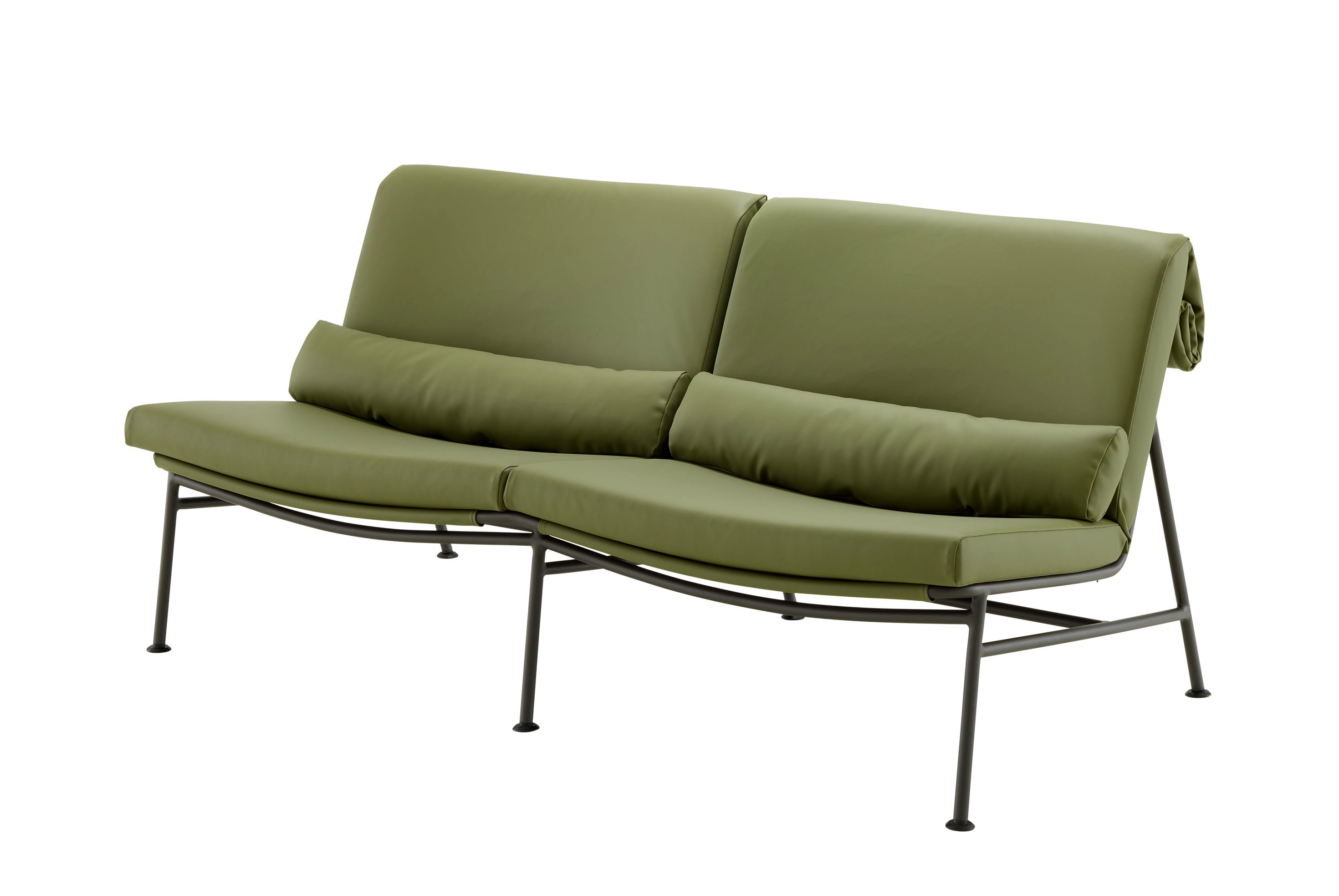
Those who have been unconvinced of the green family’s rise left Paris with a changed vision. Greens teamed with many other colors, but they were so popular that it was not unusual to see two shades used together. The most directional versions tipped toward warmth. Seating from Ligne Roset in olive green. www.ligne-roset.com
Ambiente
In Frankfurt, top trends found in assortments touched every aspect of product, from color and texture to materials and motifs.
Slate
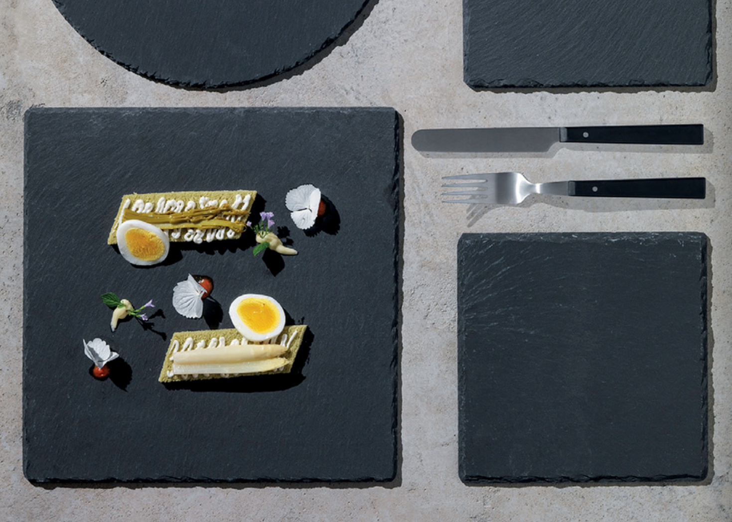
Stone has been a major trend for some time, with marble leading the way. But at Ambiente, the first signs of potential vulnerability appeared. They came in the form of slate, directed primarily to the table. Slate appeared in cheese boards, platters and paddles that hold glasses for flights of beer, whiskey or gin. The look was also mimicked in porcelain dinnerware. Just as importantly, the amount of slate used in visual display skyrocketed. This is certainly the stone to track beyond 2018. Slate platters from Tognana. www.tognana.com
Metallized Glass
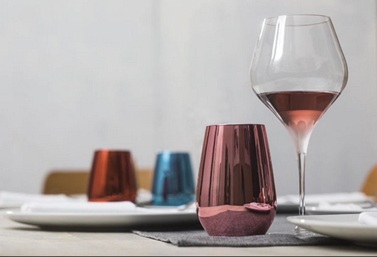
Just as in Paris, the metallic trend strengthened its hold with updated applications for functional as well as decorative items. Metallized glass was the primary vehicle for newness. Glass naturally conveys a reflective character, so adding metallic to it doubled the luster for platters, chargers and tumblers with outer coatings of matte or shiny metal. Gold, silver, copper and bronze were just a few of the choices. Layered metallic over glass also extended to reds, pinks, purples and blues. Schott Zwiesel’s Viña Shine metallized wine glass is shown here. www.marken.zwiesel-kristallglas.com
Dots
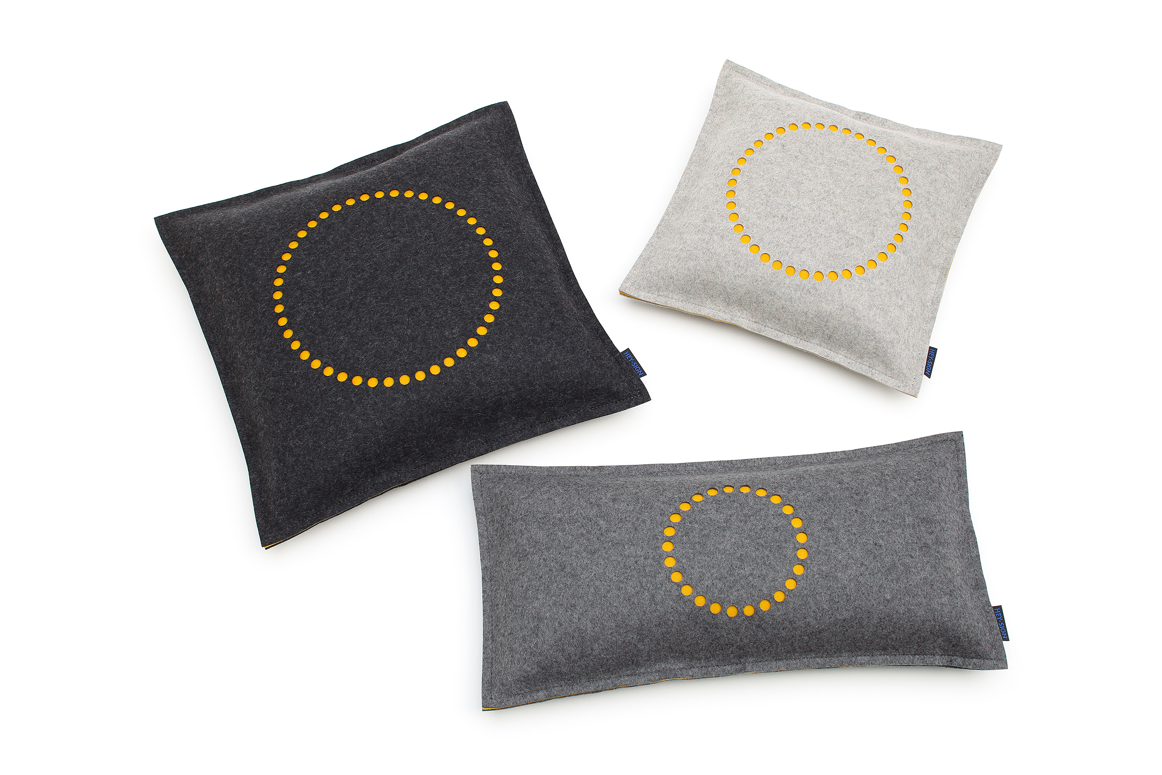
Diamonds, triangles and chevrons have had more than enough time at the top of the geometric lineup — now, dots follow. These elementary motifs took off fast in Frankfurt. The most popular versions favored a two-color approach, further simplifying the look. Another application involved perforated motifs done in materials like matte porcelain, where small round holes became instantly sophisticated and compelling. In felt, they looked positively playful as shown in Hey’s felt cushions. www.hey-sign.de
Neo-Traditional
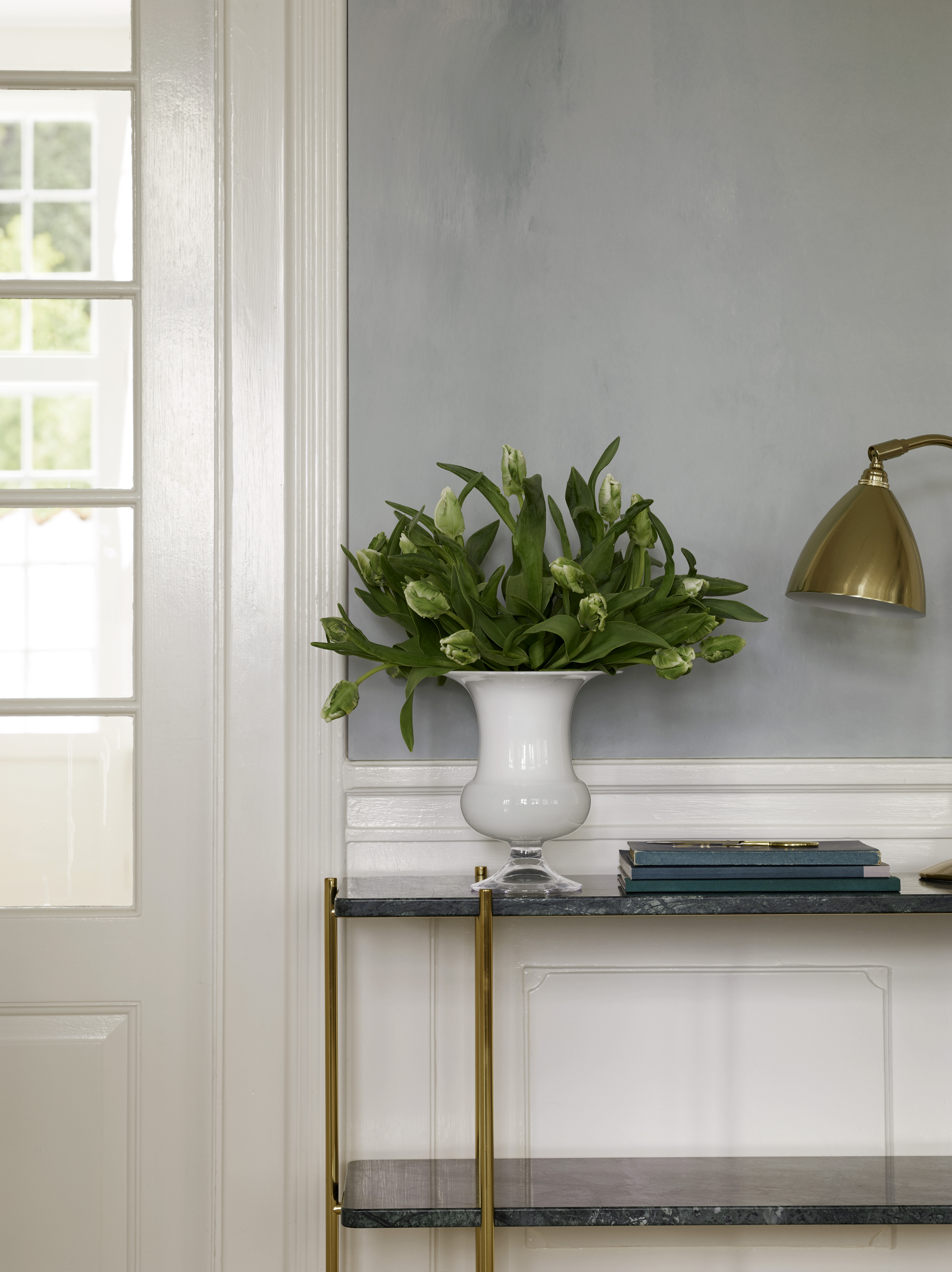
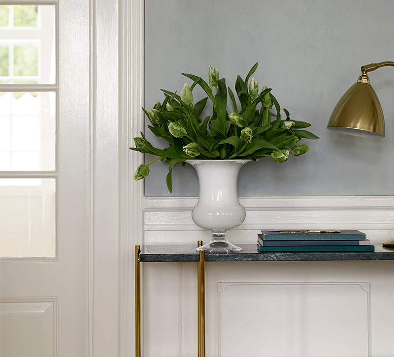
Even though contemporary style remains an important factor for decor, neo-traditional countertrends have been gathering momentum. Color and texture both play a role, as demonstrated by busts evocative of ancient Greek and Roman sculpture in colors like aqua and candelabra covered in flock. In Frankfurt, patterns like Greek keys turned in new directions or embraced directional dimension. Updated forms were another hallmark of the look, especially items like columns and urns. Streamlining these shapes, and interpreting them in mixed-media or two-tone combinations like Holmegaard’s vase here, was key. www.holmegaard.co
Textural Textiles
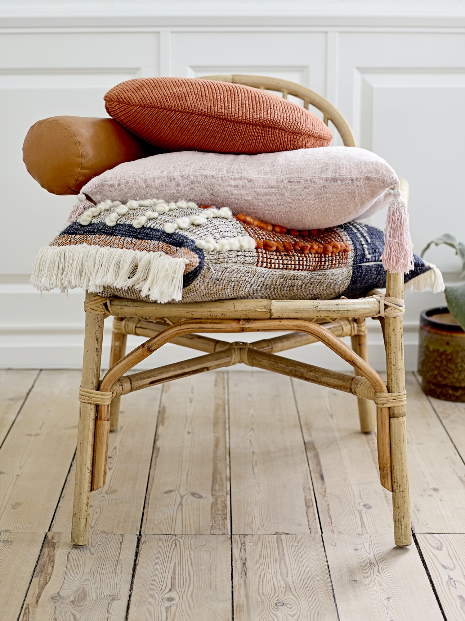
The interest in a textural character for fabrics surged dramatically, confirming that minimalism’s retreat is not quite ready to reverse. Textiles used dry and bulky yarns or they were coarsely woven; some cushions had fringed, knotted or shaggy compositions; and others featured large areas with embroidery or appliqués that really stood out because of their dimension. While the textural approach felt especially right for global trends, it was also featured in contemporary and garden-inspired collections. Bloomingville’s cushion introductions included those with pronounced texture. www.bloomingville.com
Facets, Phase II
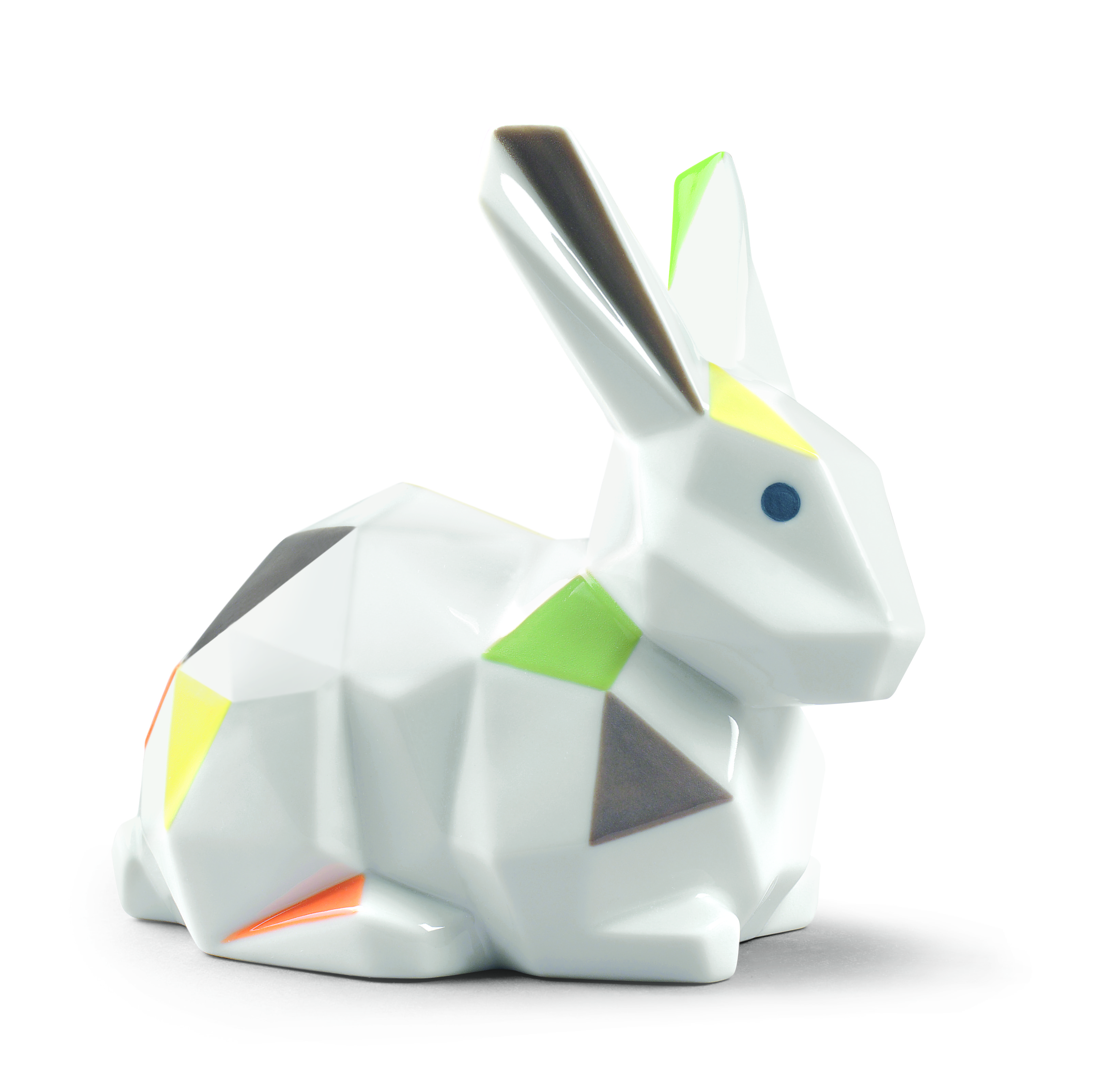
Pieces must be unique to attract attention. One way to accomplish this has been the use of faceted planes, a trend that has been visible in the market for the past two years. At this year’s Ambiente, facets got noticed in spite of their longevity. They were less predictable, with color applied irregularly, covering some planes and hopscotching over others, or they seemed to creep onto a smooth surface, combining angular and flat areas that were also differentiated by matte and shiny finishes. This more complicated approach reenergized the motif enough to keep it on the trend list throughout 2018. Rabbit from Lladro’s Origami collection. www.lladro.com
Two-Tone Looks
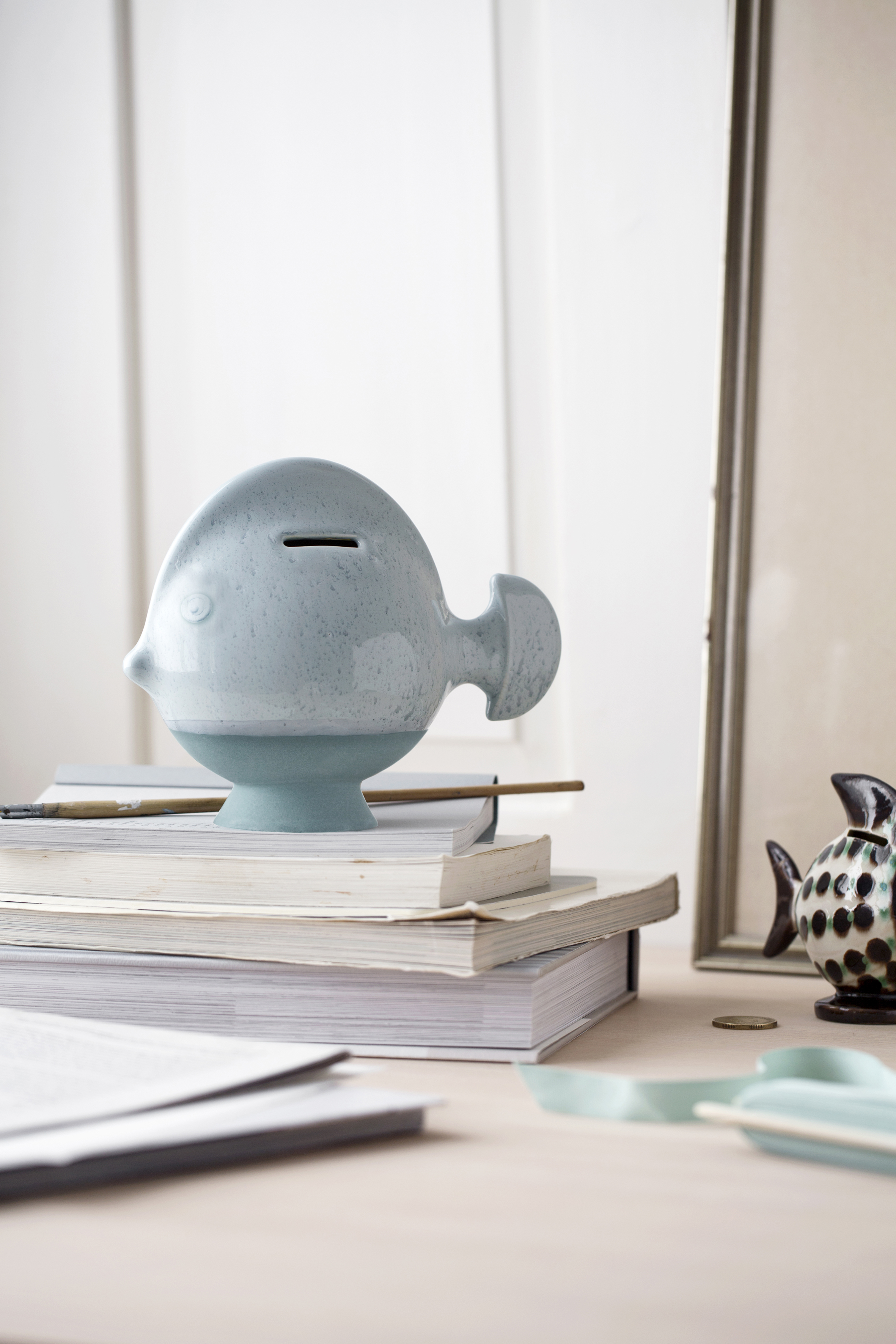
Whether the focus was on ceramic, glass or woven grasses, two-tone looks made them stand out. Never divided equally, color was most likely to combine with a natural material or a neutral ground. However, in some cases, two values of a single color were used, highlighting different textures in each one. Warm blue shades with lots of visual texture created a two-tone look at Kahler. www.kahlerdesign.com


