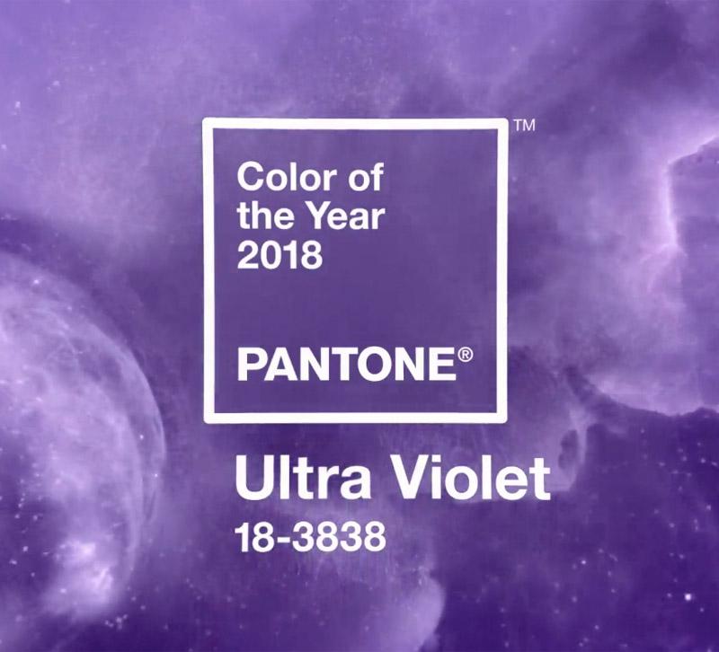
Pantone has chosen a bright, bold purple hue as its 2018 Color of the Year: Ultra Violet.
Dramatic and contemplative, the color evokes intrigue, communicates visionary thinking and brings to mind the mysteries of the cosmos.
“We are living in a time that requires inventiveness and imagination. It is this kind of creative inspiration that is indigenous to PANTONE 18-3838 Ultra-Violet, a blue-based purple that takes our awareness and potential to a higher level,” said Leatrice Eiseman, Executive Director of the Pantone Color Institute. “From exploring new technologies and the greater galaxy, to artistic expression and spiritual reflection, intuitive Ultra Violet lights the way to what is yet to come.”
Purples have long been symbolic of counterculture and artistic brilliance, with icons like Prince, David Bowie and Jimi Hendrix bringing shades of Ultra Violet to the forefront of pop culture. Ultra Violet encourages non-conformity and the pushing of boundaries.
Global Trend Ambassador for Maison & Objet Patti Carpenter says she’s thrilled with Pantone’s choice, calling it the “color of collaboration and coming together, visionary thinking and a place for the meeting of the minds; think red states and blue states and Hillary Clinton wearing purple when she offered her concession speech.”
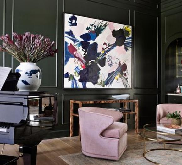
In home decor, Pantone says Ultra Violet can “transform a room into one of extraordinary self-expression, or conversely its polish can tone down a room with subdued, modern pairings.” The color makes a statement in any space, whether it’s traditional or modern.
Carpenter says Ultra Violet will pair well with the taupes and warm whites of this season for a fresh approach to decor.
“It is stunning in suede and velvet for that lush touch on seating,” she says. “It works well as a contemporary pop in geometric patterns in modern mid-tones. Add Ultra Violet as a sophisticated accent in ceramics and glass. As we spin the color wheel, Ultra Violet is ultra chic.”
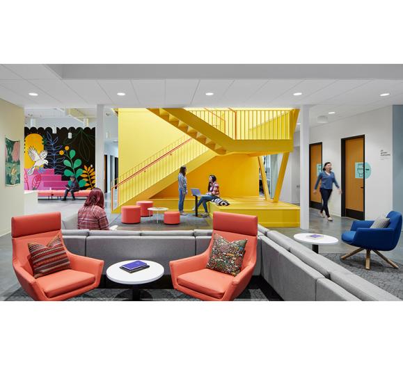
The Pantone statement also notes that purples like Ultra Violet are taking center stage in the hospitality industry as hotels use more color to entice travelers.
Vice President of the Pantone Color Institute Laurie Pressman said in the statement that the Pantone Color of the Year is a reflection of what's needed in our world today, not just a representation of what's trending.
“As individuals around the world become more fascinated with color and realize its ability to convey deep messages and meanings, designers and brands should feel empowered to use color to inspire and influence,” Pressman said.


