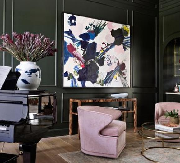
The similarities between fashion and home decor run deep, color palettes included. PANTONE® announced the PANTONE Fashion Color Report Fall 2017 edition, a comprehensive overview of fashion designers’ use of color in their seasonal collections at New York and London Fashion Weeks. Odds are, we'll be seeing these colors all over markets this year.
“There is a commonality between the colors we are seeing on the runway in New York and London.” says Leatrice Eiseman, Executive Director of the Pantone Color Institute. “However, individuality is evident and we are seeing a distinct difference between the shows in the two cities in the way these same colors are being combined.”
Color Palette for New York
“Bookended by a dynamic Grenadine red and a tawny Autumn Maple, the color palette for Fall 2017 leans more to warmth, “ says Eiseman. “While comforting, enveloping colors and ease are crucial to the seasonal feeling, standout shades include a pale pink Ballet Slipper, a refreshing Golden Lime and a bright Marina blue. These hues add a striking touch when paired with the classic autumnal shades of Navy Peony, Neutral Gray, Butterum and Tawny Port.”

PANTONE 17-1558 Grenadine A powerful, evocative, dynamic red, Grenadine is a confident and self-assured attention-getter.
PANTONE 19-1725 Tawny Port Taking the Red family to new depths, Tawny Port is elegant, sophisticated, and tasteful.
PANTONE 13-2808 Ballet Slipper Descended from the Red family but with a softer touch, Ballet Slipper is always flattering and reminiscent of the rosy glow of health.
PANTONE 16-1341 Butterum This snug, warming, and toasty shade is evocative of drinking a glass of Butterum by a roaring fire on a cool Fall evening.
PANTONE 19-4029 Navy Peony A mainstay for the season for both palettes, Navy Peony is a dependable and an anchoring shade. Solid and stable, the hue takes some of the load off of black as a go-to neutral.
PANTONE 17-4402 Neutral Gray The standard bearer of all neutrals, Neutral Gray shares the anchoring role with Navy Peony in this palette. It can be used as an accent or a head-to-toe statement shade.
PANTONE 19-4524 Shaded Spruce This is a green you might see in the forest – sheltering and protective as evergreen trees.
PANTONE 16-0543 Golden Lime Earthy tones with a twist, the golden undertones of Golden Lime makes this yellow-green shade a refreshing complement to Fall classics.
PANTONE 17-4041 Marina Cool with an enhanced vitality, Marina is the only truly cool color in the Fall palette that brings with it freshness and brightness.
PANTONE 17-1145 Autumn Maple A quintessential autumn color, Autumn Maple is tawny and russet, introducing warmth into the palette.
Color Palette for London
“Led by a vivid Flame Scarlet, the color palette for Fall 2017 is comprised of strong classics colors complemented by a few unpredictable shades for the autumn and winter seasons,” noted Eiseman. “Unexpected combinations such as Royal Lilac and Otter Brown or Lemon Curry with Bluebell are eye-arresting and create an unusual color dichotomy.”

PANTONE 18-1662 Flame Scarlet A vivid, powerful red, this strong shade leads the way in for Fall in London.
PANTONE 12-2904 Primrose Pink An embracing and gentle pale pink shade.
PANTONE 16-1331 Toast Toast brings a comforting, warmhearted presence to the autumn winter season.
PANTONE 14-4121 Bluebell This tranquil blue reflects connection and a soothing sense of peace.
PANTONE 18-3531 Royal Lilac An enchanting purple that provides a theatrical linkage to the other colors in the palette.
PANTONE 18-1018 Otter A country color that comes to the city, adding an earthy grounding and a sense of rootedness.
PANTONE 19-4029 Navy Peony A mainstay for the season, Navy Peony is a dependable and an anchoring shade. Solid and stable, the hue takes some of the load off of black as a go-to neutral.
PANTONE 16-1338 Copper Tan Copper Tan, a burnished shade known for its welcoming warmth.
PANTONE 15-0751 Lemon Curry Exotic and spicy, Lemon Curry adds a touch of piquancy to the seasonal color story.
PANTONE 16-0639 Golden Olive A staunch yet stately green Golden Olive provides sturdiness.


