TIP 1: Go with the flow
It used to be that kitchens were separated from the rest of the house by doors or a pass-through to the dining room. Because the kitchen was set apart, lighting didn’t necessarily need to integrate with other spaces. Now that the kitchen is open to the rest of the entertaining areas and seen from the family room, dining room, great room and even the entry, the illumination needs to blend in.
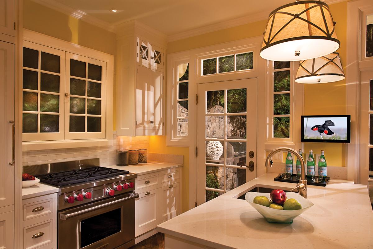
There is usually an island that comes between the work area of the kitchen and the other rooms. Hanging decorative fixtures above the island creates a visual sense of separation without interrupting the flow of the space. Typically, what we’ve been seeing in kitchen design is the use of two or three pendants spaced out equidistantly. Now, the trend is toward using one oversized light fixture that’s more linear in shape, or a cluster of light fixtures hung at various heights to create more of an artistic statement.
TIP 2: Blend without bending
Even though your need for effective task lighting in the kitchen must be met, there should be a balance of cohesive illumination in all areas. Enter light layering.
The pendant fixture(s) over the island is the decorative element. Ambient light can be introduced by adding linear LED lighting on top of the cabinets to create an inviting glow of illumination. Accent lighting can come in the form of interior illumination for glass cabinets or display niches.
The main lighting element, of course, is task lighting. This would come from linear LEDs mounted below the overhead cabinets to illuminate the countertops. I would recommend using this approach, as opposed to a series of puck lights, which would create distracting scallops along the backsplash. Keep in mind that high-gloss countertops, like polished granite, are very difficult to illuminate since they reflect the light.
So that this undercabinet lighting isn’t seen when people are sitting in other areas of the open layout, I recommend using an extruded aluminum channel that directs the light toward the backsplash at a 45-degree angle.
I would also have you consider installing a recessed linear LED in the ceiling parallel to the front face of the cabinetry. This will project an even wash of illumination onto the faces of the cabinets, as well as provide illumination inside the cabinets when the doors are opened up.
TIP 3: Color me comfortable
The last element to consider is the color of the light, along with its color quality. The kitchen needs to look like it’s visually integrated into the other spaces, so it’s important that the color temperature of light between rooms be consistent.
Warm-dimming technology can give you LED lighting that appears to get warmer in color when dimmed. I think this is great, but it can be on the pricey side, especially when it needs specialized controls. A more cost-effective solution would be to choose dimmable LED sources, in the same color temperature, for all the rooms that are part of the open plan. I tend to gravitate toward 2400K, then you can raise or lower the brightness based on activities.
One of the mistakes that people make is selecting all of their finishes, including paint colors, fabrics and tile, in a daylight situation.
I urge you to take a look at all of these under the color of light you selected for evening to see what they will look like in a nighttime setting. Since half your time is spent in the house after dark, you want to make sure that these color shifts are comfortable.
Also, don’t forget about CRI. This rating tells you how closely the light source comes to the color quality of incandescent lighting. Be sure to select something that has a CRI of 90 or higher. LED products last a long time, so you don’t want to be stuck with something for 17 years that doesn’t feel quite right. It’s like being caught in a bad relationship from which you can’t escape!

