The museums that I grew up with were visually exhausting. They had bright white walls on which they installed art with super saturated and often dense colors. As my eyes tried to adjust between the art and the walls, I got really tired. By the third gallery it was time to sit down and recharge. As an adult it was the perfect time for an espresso. Our eyes are just not accustomed to going between bright and dark over and over again. You know what it’s like to come from the bright daylight and enter an indoor space. It takes a while for your eyes to adjust. In a museum it is the same thing; this is what your eyes are trying to do repeatedly as you move from painting to painting.
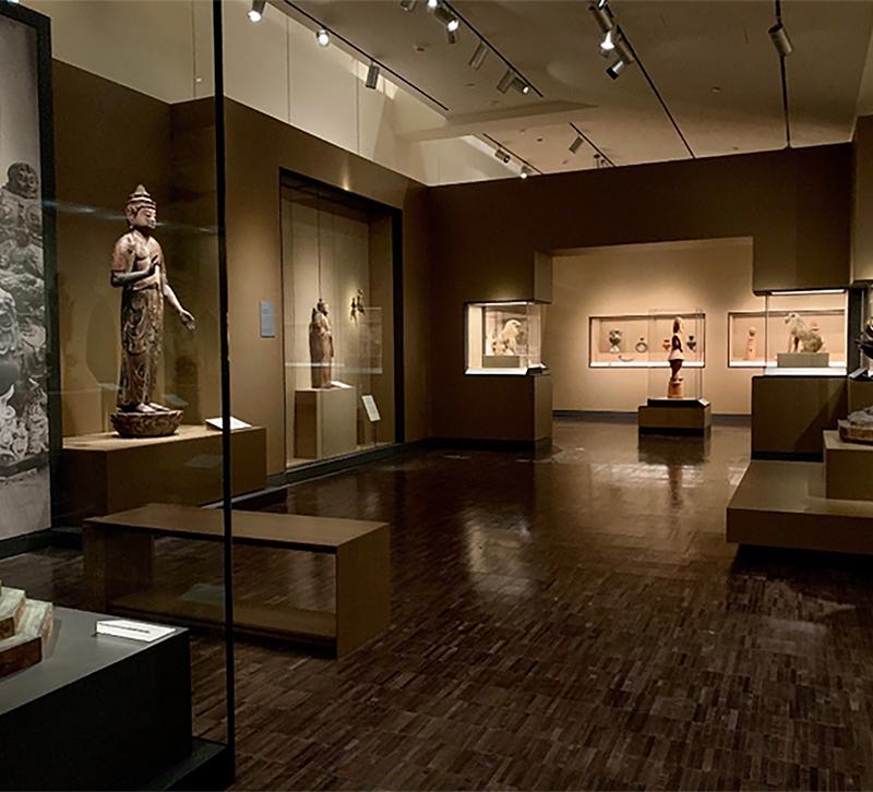
Museums are working hard to make themselves over, mitigating the contrast between dark and light surfaces. I recently visited the Asian Art Museum in San Francisco, which has just reopened after a five month closure. They made use of the Covid-19 shutdown and upgraded their spaces. Lighting-wise, some of it was successful…and some of it was not.
Museums were one of the first early adopters of LED lighting. Before, the go-to light source was halogen which has a color temperature of 3000K. The drawback is that halogens use 80 percent to 90 percent of the energy they consume, producing heat instead of light. In comparison, LEDs use only 10-20% of the energy consumed to create heat. The heat that halogens produced degraded the art over time. LEDs are much safer for the art.
Halogen, like all incandescents has a color rendering index (CRI) of 100, which is the gold standard. When LEDs first came onto the market they had a 75-80 CRI range, which produced a flat gray-green hue. Now LEDs have been improved to a 90 or higher CRI, giving a much better color. As LEDs last a long time there are many with a low CRI still in use. The downside to this is the older LEDs and newer LEDs with the improved CRI, when placed side by side, look pretty awful. This is what I was experiencing at the Asian Art Museum. It is better to bite the bullet and upgrade all of the lighting so that the CRIs are consistent. There are a lot of lighting techniques used in a museum setting that can be easily translated to residential and retail projects.
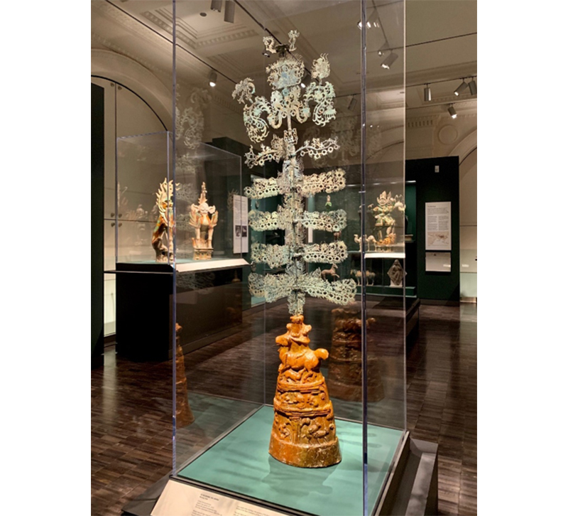
This piece has a real visual pop. The high CRI enhances the blue-green tones, as well as the warm tones of the base.
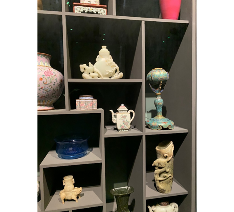
The lighting for this display case is less successful. First off, the CRI is around 80 so that colors are little more flat. Additionally, because the lighting is not integrated into the display case, all the objects have to be pulled towards the front. If each niche was illuminated, using linear LEDs,
these pieces would really come alive.
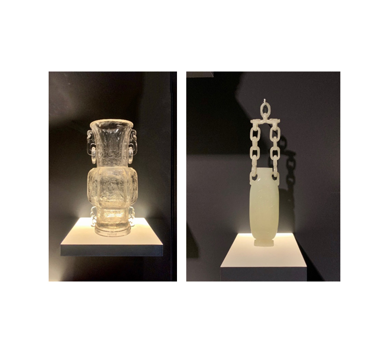
These two items have been placed on a luminous shelf. The transparent vessel on the left is greatly enhanced. The one on the right, because it is more opaque, does not benefit from this type of lighting. The intricate carving on the front is obscured.
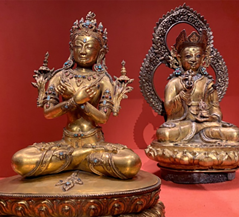
The background color works well with these two deities. The tonalites are similar so it is more visually relaxing to view them.
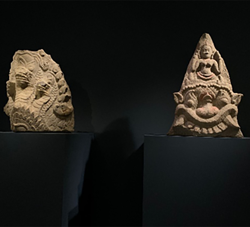
These stone figure are in high contrast to the background. It is dramatic but not inviting.
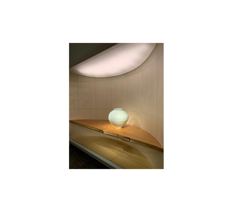
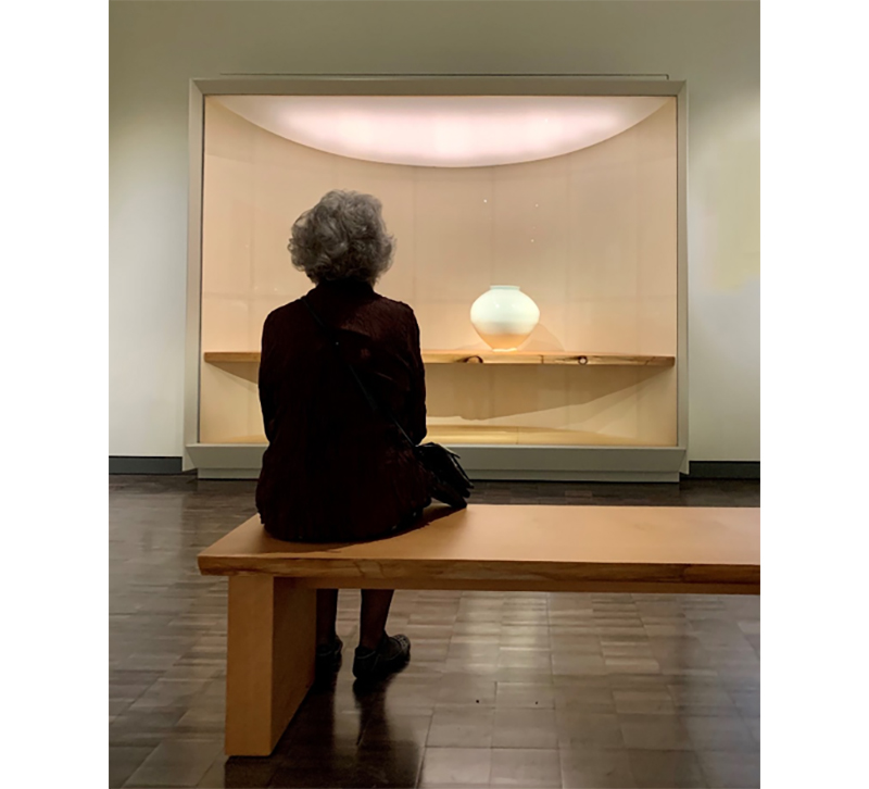
The above is my favorite display. The back wall is curved and covered with rice paper. There is a soft fill light coming from a luminous ceiling within the niche. A subtly dramatic accent light comes from a single track head mounted on the museum ceiling. It even has its own bench for viewing. It is glorious.
