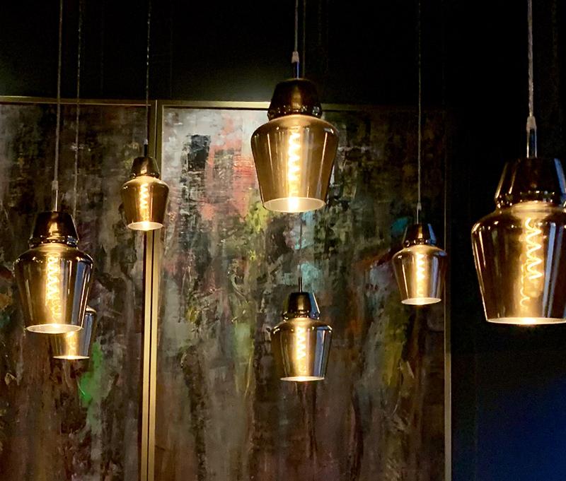
I really like the trend of hanging multiple fixtures in a space. Visually, something happens that turns the fixtures into more than just lighting. They become room dividers or can help make rooms with high ceilings appear more welcoming by creating a secondary ceiling line. They can also feel like artful architecture.
It used to be that people would use a statement chandelier or pendant to draw people into a space. While this can be effective, it does create a small island of light within a larger area. By spreading the lights throughout a space, the whole room becomes part of the visual ambience. For me, it’s the same experience I get when I go to an outdoor area that has multiple runs of string lights. They create the sense of an outdoor room with a ceiling which you can see through to the sky and stars. I like the idea of taking that concept to create an inside space with a more cozy feeling.
There’s something very comforting about glowing light. Maybe it’s our instinctive attraction to firelight and candlelight. I somehow feel safer in a room filled with a soft aura of illumination than one that is simply lit with directed light, used to accent objects in the room.
Layered Lighting
Recently I visited a restaurant in Knoxville, TN, and was surprised by how intriguing the lighting was. It was visually exciting in a subtle way and really drew me in. I had to study it for a while to better understand why it made me feel the way it did. Of course, to start out with there was a good design of light layering. That meant that there was an effective combination of task, accent, ambient and decorative lighting. Beyond that, there was an elevated sense of depth and dimension, through the use of clusters and multiples of light fixtures.
At the front of the restaurant was a lounge area. The ceilings were 14-16 feet high, but an array of gilded glass pendants were spread out across the entire area, hung at different heights of 8-9 feet up from the floor. These fixtures were using an LED version of old-fashioned Edison bulbs with coiled filaments, dimmed to a pleasing glow. The overall effect was amazingly welcoming.
In addition, there was a long row of curved booths running the length of one of the walls, each individually illuminated by a pine cone shaped pendant. A gold disc hung above each pendant reflected some of the ambient light coming off of the pendants and again giving a sense of a more humanizing ceiling line to the voluminous space.
Between the booths was a series of woven shades that had LED indirect lighting providing soft lighting from the base. This illumination raked up the screens, adding some visual texture and a sense of separation while still being somewhat transparent. The rough brick wall was brought into the visual mix by additional uplighting from below, showing some history of this rejuvenated building.
This concept works well in homes as well as businesses. It is fun to have a grouping of lighting elements, hung at various heights over the kitchen island, the dining room table, above a staircase or in a tall entry way.
Oh, and by the way the food at the restaurant was really good too.


