Decorative lighting fixture design falls out of fashion, just like clothing. What fascinates me is how a mid-century modern lighting designs have held on for so long. What makes them special? What makes them timeless. What allows them to blend beautifully into different architectural styles?
Personally, I love everything about mid-century design. That includes the architecture, the fashion, the art, and of course, the lighting. Not everybody is going to agree with me. Those who grew up in that period may not have such fond memories. I am all about that Mad Men look, Frank Sinatra’s Rat Pack…and of course the ultimate destination for 1960s design- Palm Springs.
It is inspiring to go down during Modernism Week in Palm Springs to be able to tour the homes that were built and lived in by the movie stars of that era. As well as those homes of movie stars from earlier eras, like Carmine Miranda, who went there after they retired from show business.
The architects of the time, like Albert Frey and Richard Neutra, were experimenting with building materials that were not necessarily associated with residential architecture. Some of them were designing their own light fixtures, while lighting manufacturers of the era were starting to create fixtures that had a decidedly futuristic architectural feel. There are some lighting fixture design lines from that era which continue on today, such as Louis Poulsen, Nelson and Noguchi, among others.
Many other modern day lighting manufacturers have created new luminaires that are evocative of mid-century design with a modern twist. Especially with the advent of flexible linear LEDs which allow the creation of fixtures that were at not possible back then, when only using traditional incandescent or fluorescent sources. It’s actually hard to find a line of light fixtures that doesn’t include a few luminaires with a design nod towards the 1960s. Why not? These styles sell, and they sell well.
One of their advantages is that they are not relegated to pure 1960s period architecture. They fit quite comfortably into Danish design, Japanese Modern, 400 year old Italian villas or Moorish mansion. And that’s just a few examples.
I wanted to go back to some of the earlier lighting fixtures from that era to show how these designs can still work today… and can be reworked using LED sources.
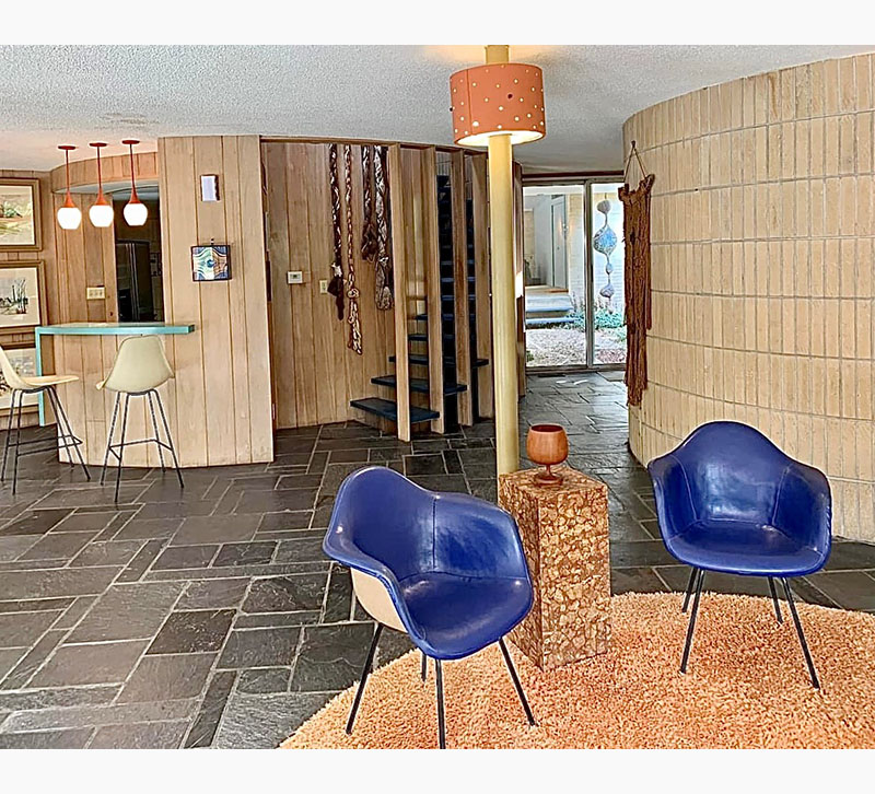
Take a look at the bones of this 1960s era home. The rounded walls are super cool, and even though the macramé and other piece of art may be dated, if you look out the sliding glass door, you can see a piece of wire sculpture that could very well be a piece by Ruth Asawa.
The row of pendant fixtures over the wet bar is not so different from what is being done today.
Also, take a look at the shaded light fixture which is integrated into the support pole in the center of the room. What if that were reimagined in a much larger and shallower drum shaped design in a perforated metal which projected light towards the ceiling?
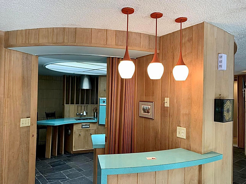
A closer look at the kitchen behind the wet bar shows how the burnt orange finish of the pendant lights plays off the turquoise finish of the countertops and appliances. A dropped ceiling detail allows for the installation of a large, circular luminous light. This is done with acrylic panels, and florescence. Imagine if the panels were removed and the perimeter of the recess was illuminated, using linear indirect LED lighting. Then in the center you could install an over-scale, drum shaped fixture, relating to the one in the main area which would provide both decorative and additional ambient light.
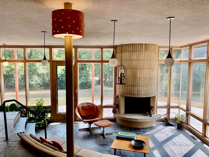
Taking a look in the other direction of the main living area, shows the sunken living room. Dependent fixtures provide most of the general illumination. The candle holder in the metal birdcage is pretty cool, but it might serve a better purpose somewhere else in the house. Imagine if there were linear LED lights installed below the two metal steps, as well as beneath the built-in sectional sofa and the elevated hearth. This would safely get people down into the area and also create a warm glow of illumination that would visually draw people into the space. Additionally, installing some landscape lighting to illuminate the greenery beyond the glass wall would keep the place feeling as expansive at night as it does during the day.
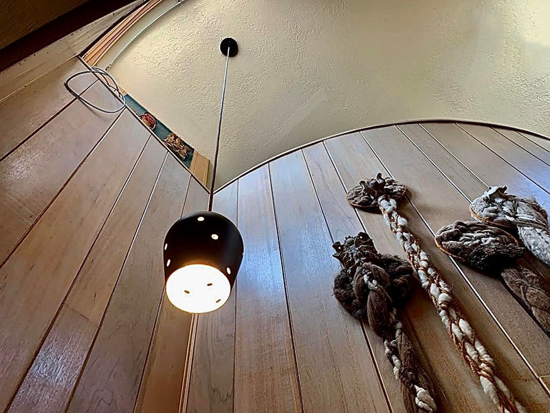
This pendant fixture that hangs over the staircase may be an original, but there are so many available on the market today that are inspired by this design. I am okay with the macramé “snakes” going into hibernation.
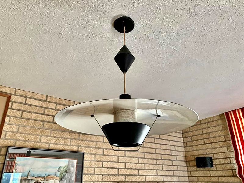
This black and white pendant fixture over the dining room table has two really great things going for it. First, it is on a pulley system, so it can be raised or lowered. The other attribute is that it provides indirect ambient light. The light source is hidden within the black conical shade at the base which projects light up onto the reflective white shade above. LEDs could easily replace the original incandescents. The illumination would be brighter, and the luminaire would not get overly hot.
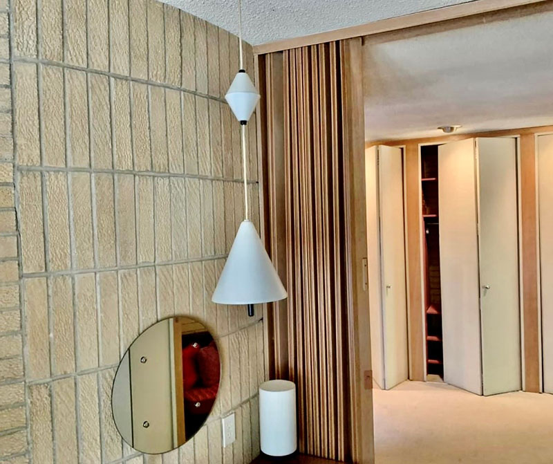
There is a vanity located in the corner of the main bedroom. Again, a pulley system allows you to place the light where you need it. If there was a matching one on the other side of the mirror. Then you would get really good cross illumination for applying makeup. The little conical light in the corner adds an additional glow from below.
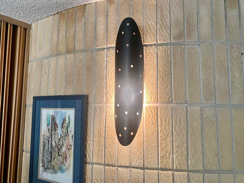
This a shield shaped wall scone is just great. It has a really good scale. The back lighting spreads illumination across the curved wall, while the perforated shade adds a little visual sparkle without glare. This one is 24 inches tall, but imagine it at 36 inches tall or even 48 inches. These could be real statement going down a long hallway or flanking the front door as you approach the house.
Each year, I see new designs being introduced by so many of the inventive lighting manufacturers that are out there. It is always heartening to see them holding onto some of their classic mid-century modern designs, as well as the addition of new designs inspired by Jet-Age design.


