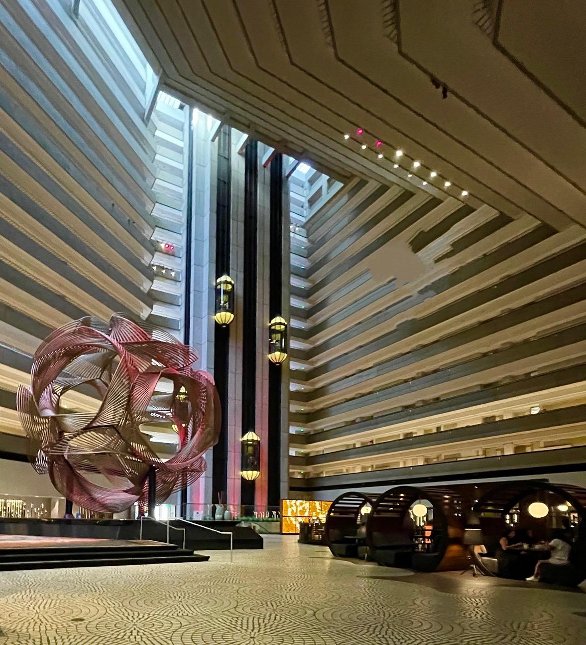
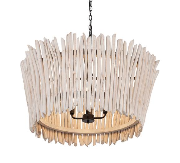
I recently made a visit to downtown San Francisco to take a look at the Hyatt Regency Hotel, located on San Francisco’s waterfront. It was designed by architect John Portman and built in 1973. For me, there is a retro futuristic feel to the architecture. Fun Fact: It was featured in the movie, High Anxiety, which was written and directed by Mel Brooks. It is a spoof of Alfred Hitchcock’s Vertigo. This San Francisco landmark has a soaring interior that reaches 20 stories. It reminds me of a reverse Aztec pyramid. It has the largest lobby in the world, a whopping 42,000 sq ft.
There had been an article in the newspaper that talked about how they had redone the interior lobby and I was interested to see. What had always been a negative to me was how insignificant I felt when entering the space. There simply was no human scale. I was pleased to see how inventive they had been to make this cavernous space feel more intimate. They had very inventively used lighting and structures to create the sense of a secondary ceiling which was much more in scale with the people that were using these public areas.
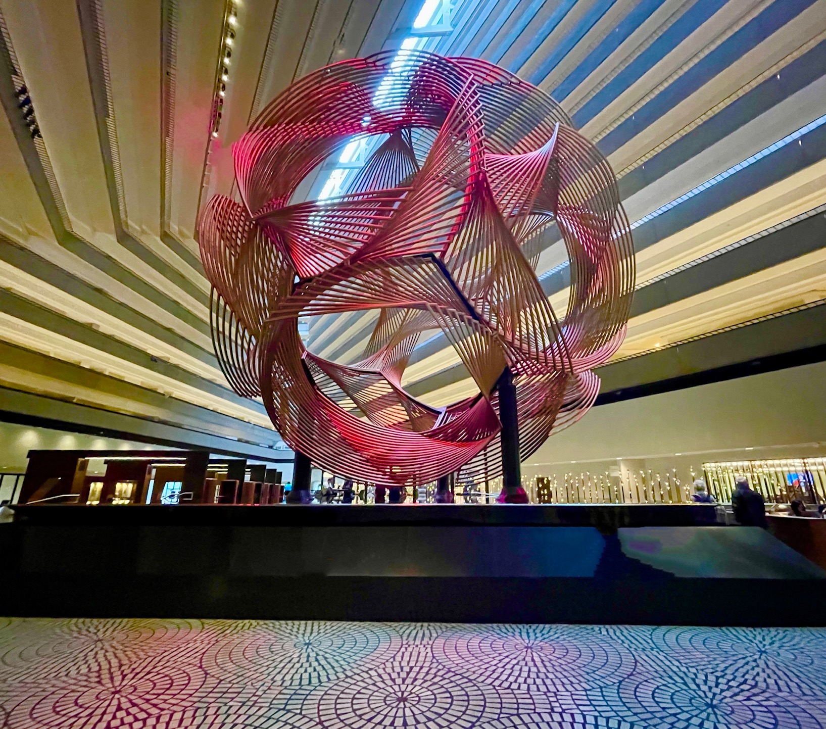
First off, some of the unique aspects which I really liked about the space were still there. This included the huge metal spherical sculpture in the center (shown above). It was created by Charles O. Perry and is called Eclipse. What they had added was color changing LEDs to illuminate it. That gave it a sense of movement which is a nice addition. Another fun detail is the glass elevators which hang off the wall so that you get a 180° view of the lobby as you ascend to your floor.
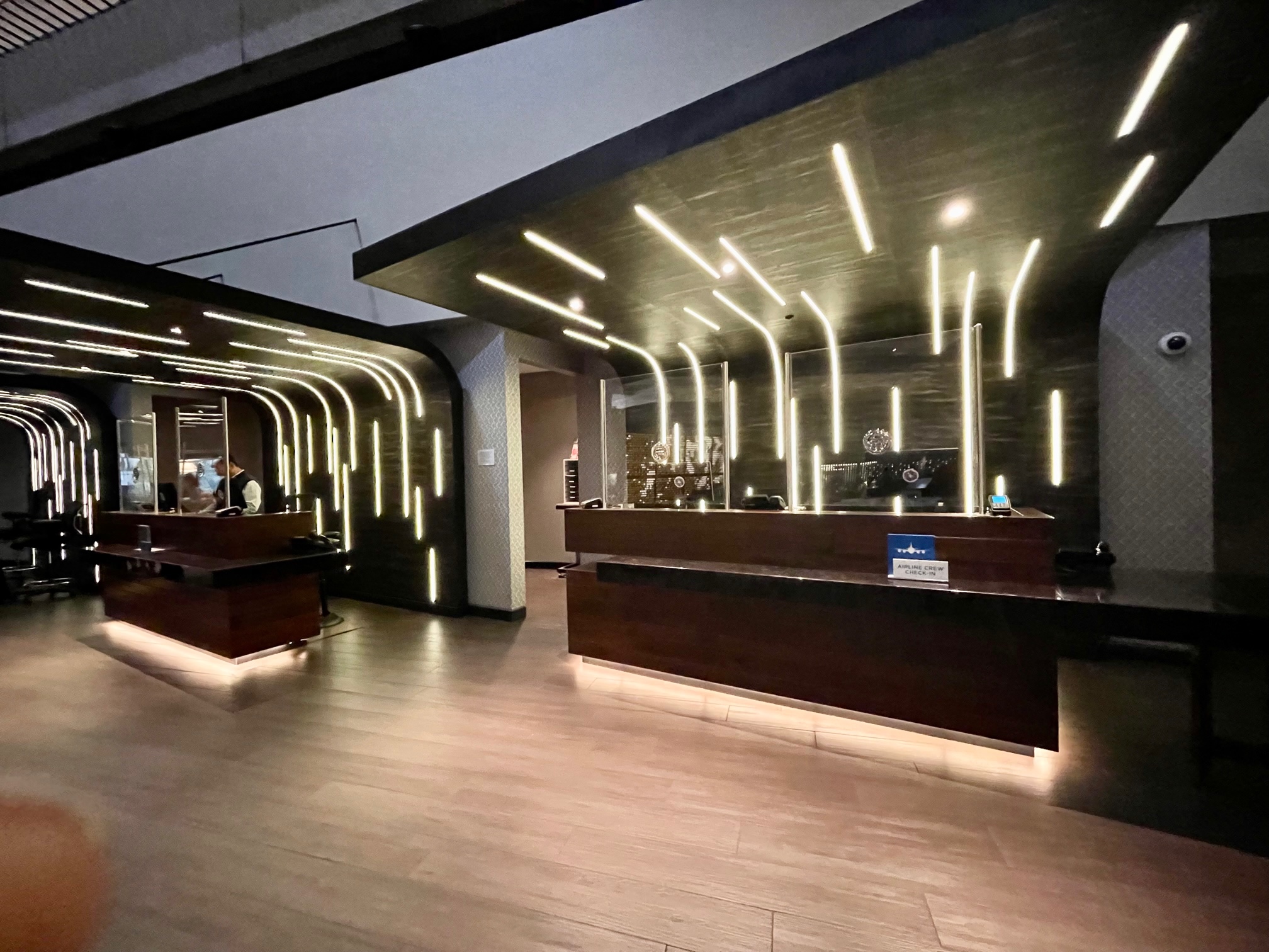
The reception area (shown above), which used to be a simple counter is now broken up into September 2022 modernistic kiosks. Striations of linear LEDs made them quite eye-catching. They were the first thing I noticed when walking in.
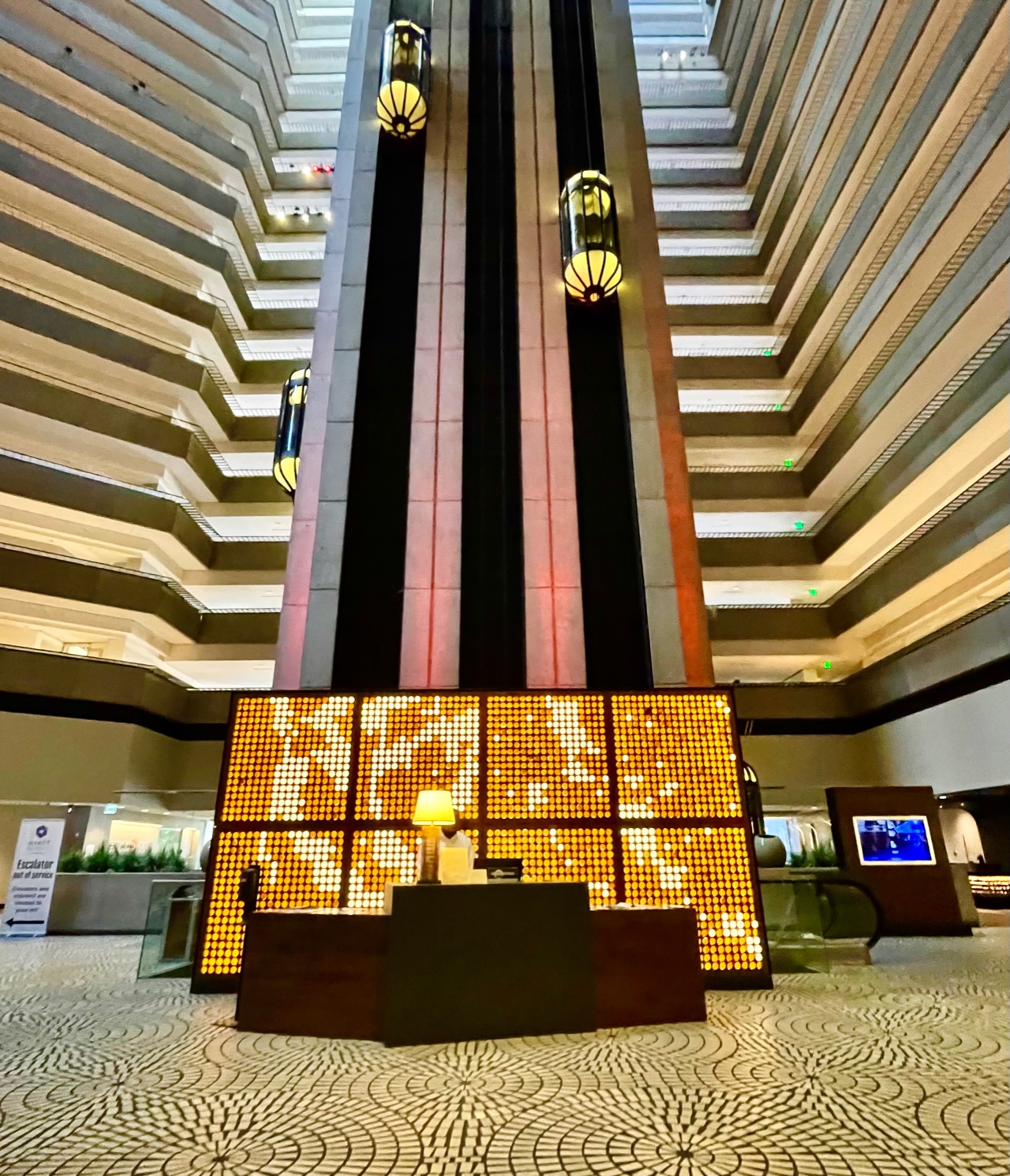
The concierge’s desk (shown above) was in front of a tall back-lit box of glowing LED light. It is located in front of the iconic glass elevators. It feels warm and inviting. It is easy to locate, and the light helps draw people in.
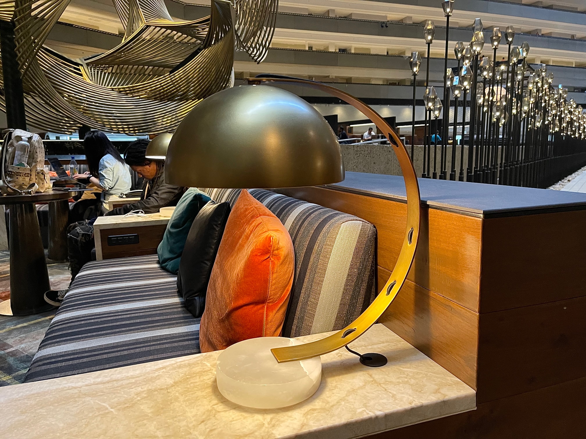
There are now three different seating areas in the lobby. The first one (a detail of which is shown above) is open to the sky, but the chairs are situated relatively close together so that there is more of a feeling of community. Interesting dome-shaped table lamps were used to project light down onto people’s laps for reading.
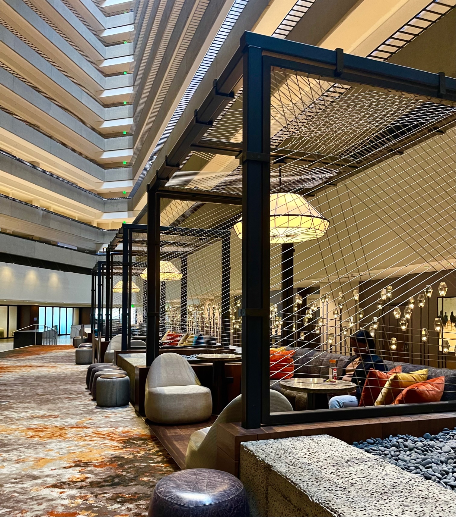
A second area (shown above) used open wooden structures with a crisscross steel cord detailing to create modernist gazebos. Each one had its own large scale pendant fixture.
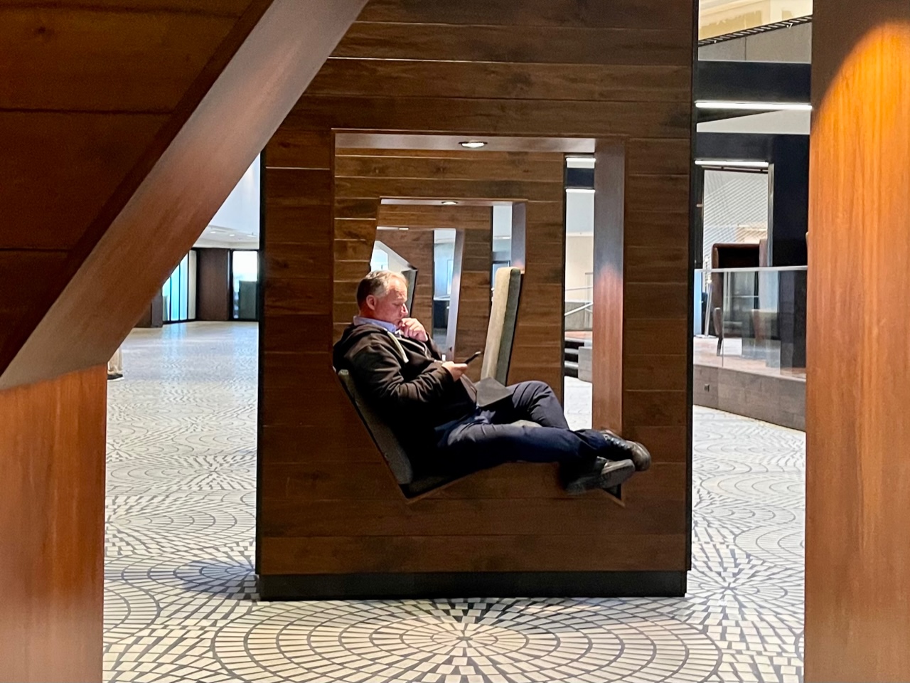
The third area (shown above) I found most interesting. These wooden structures have been built with an open area in the center where one person could sit. There was an overhead light, along with an outlet and a USB port for phones and laptops. I found them to be sculptural and quirky at the same time.
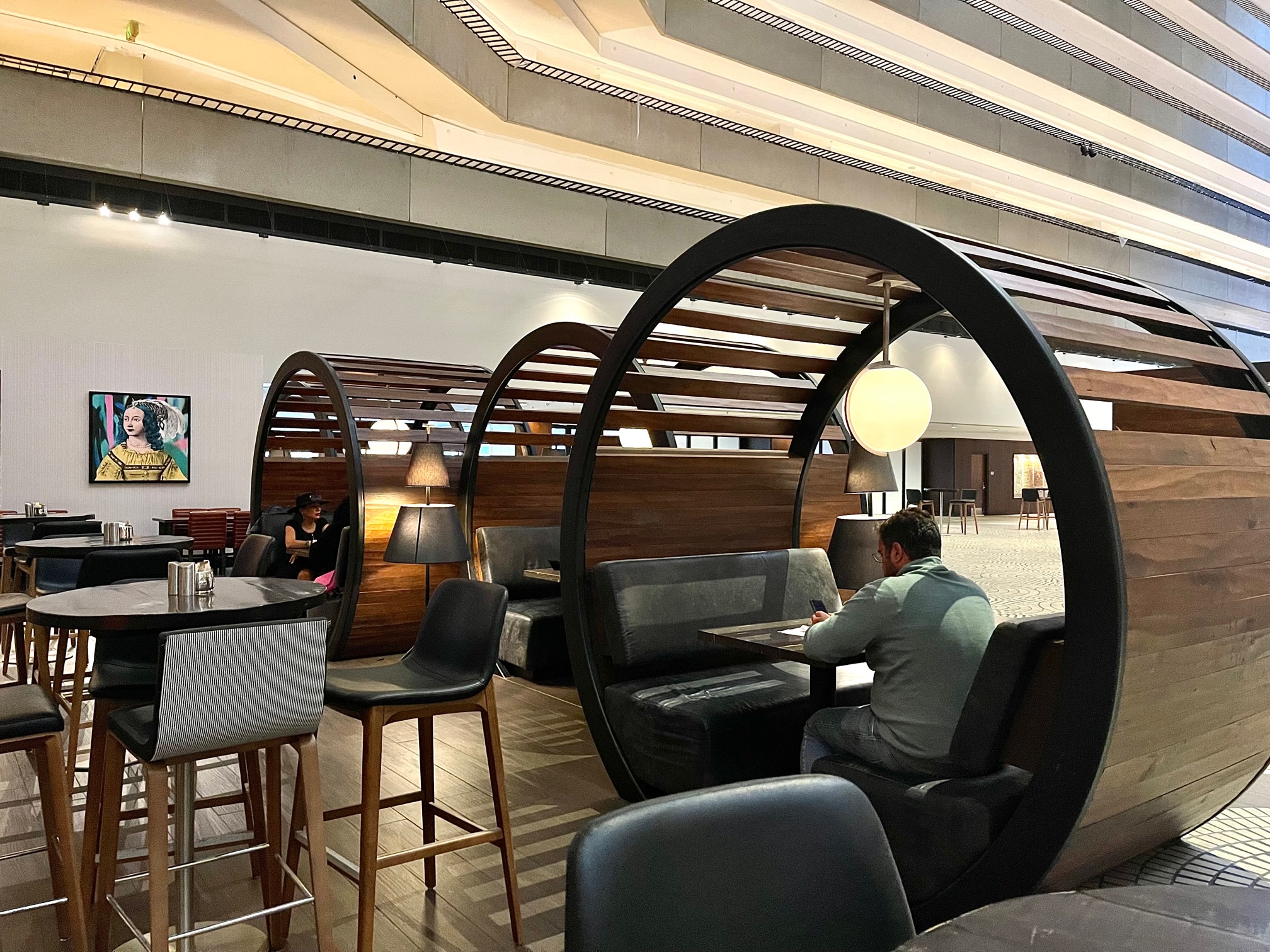
The restaurant (shown above) incorporates round wooden structures with open slats to create more intimate dining within this vaulted open space. Pendant fixtures are used here as well, along with floor lamps.
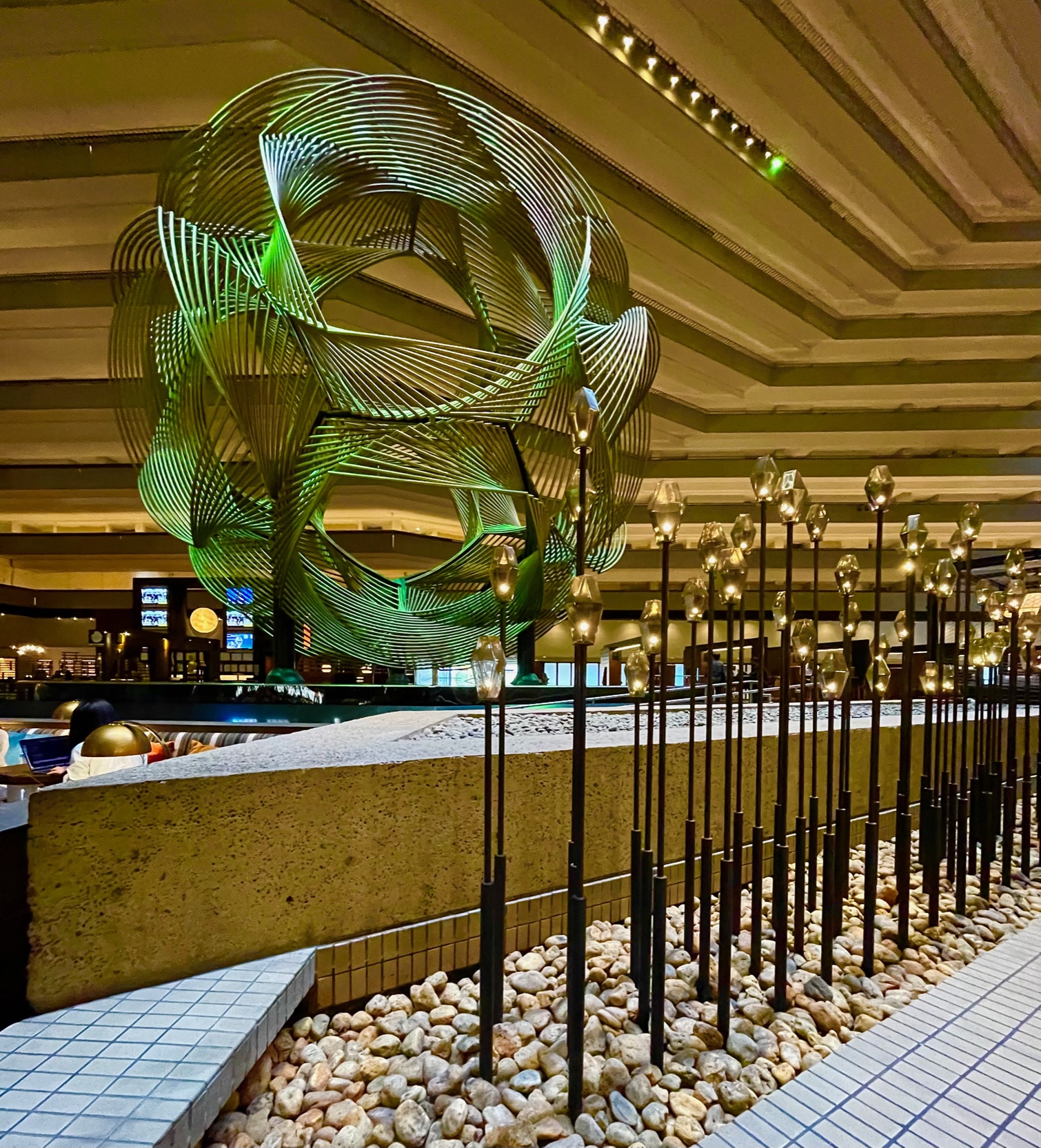
There is also an 180 foot garden of LED reeds (shown above) which also did a good job of helping to humanize the scale of the space. All in all, I think they did a really good job. They were very inventive in creating open air rooms within this huge space. It really allowed me to enjoy the scale and architecture from the comfort of a variety of cozy places.


