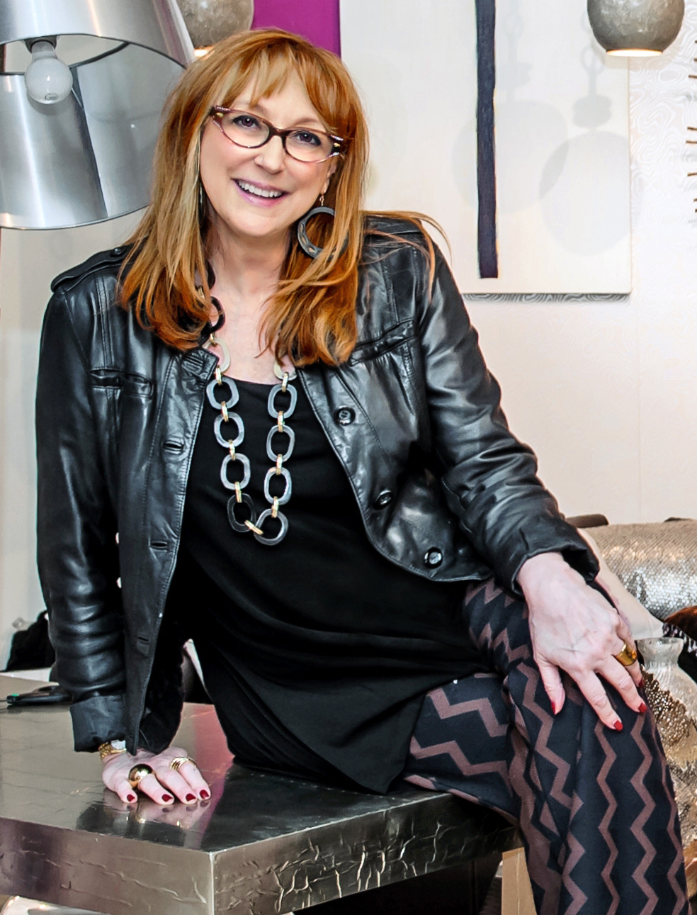
No matter what project she’s taking on – a celebrity home, a new line of luxury home furnishings or a charitable cause – designer Robin Baron of Robin Baron Design Inc. exudes positive energy. Take a peak into her design process with this Soho penthouse.
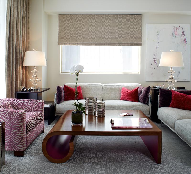
1. The color palette was definitely inspired by my clients. I do like to do neutrals with a pop of color. I think it sets a really good anchor for the room, and the pops of color add personality. The husband loved purples and pinks, but mostly the purple tones so that became our inspiration for the color palettes. Because it’s Soho in the middle of the art district, having a place that was modern chic with a lot of art influence was really important to the clients.
2. We all hear about color blocking, but I like texture blocking. I like the idea of playing texture on texture. That’s exactly what we did here. I took the same fabric on the sofa and pillows and just mixed it in, layering it one on top of the other, keeping the idea of popping the room, but not making it busy. So we did texture on the walls. We did texture on the rugs. We did texture on the pillows and on the sofas, but all mixed together, it doesn’t become overwhelming. It still has a serene look.
3. It’s really a balance between just the right amount of texture and color and too much, so I felt that playing with the colors in the same fabric was going to be interesting and allow me to do something that was more textured on the rug, do the shape of the coffee table, which is quite unusual and beautiful, and do the zebra on the chair, which is very bold. It’s really important for a designer or anybody doing a room to know that your eye has to be able to move through the room, to engage it, but you also have to have places for your eyes to rest. They can’t be bouncing off everything in the room because you won’t be able to really see anything. It’s just going to feel busy to you.
