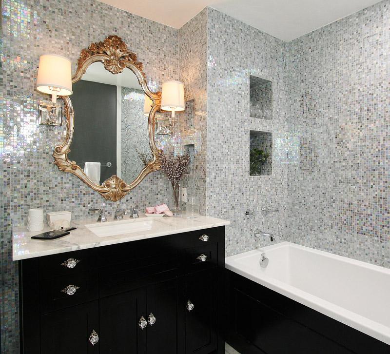
You can take the designer out of L.A., but you can’t take L.A. out of the designer. Even after her big move to Chattanooga, TN, interior designer Michelle Workman finds ways to infuse glamour into her designs. Here, Workman shares her insights on this West Hollywood condo’s master bathroom.
1. We didn’t have a lighting reflection problem in this bathroom. However in other bathrooms or rooms that had a mirrored wall, I have used lighting that has a woven/fabric shade to soften the bounce.
2. I find the bathroom to be one of the hardest rooms to accessorize, and as a result I tend to simplify by eliminating all of the kitsch and then go overboard with some fantastic antique mirror (as we did in this bathroom) or place a large-scale piece of art over the tub. I like a bit of bang in a small space and both art and antiques make a powerful statement.
3. We chose this tile for its sexy impact and if we only used it in the shower or around the tub it would have fallen flat and lost its “wow” factor. I am a big proponent of carrying through when making a statement. I’m not a fan of the accent wall and I often will suggest to clients to tile the entire bathroom — it just looks finished and polished, rather than a patchwork of tile and paint.
