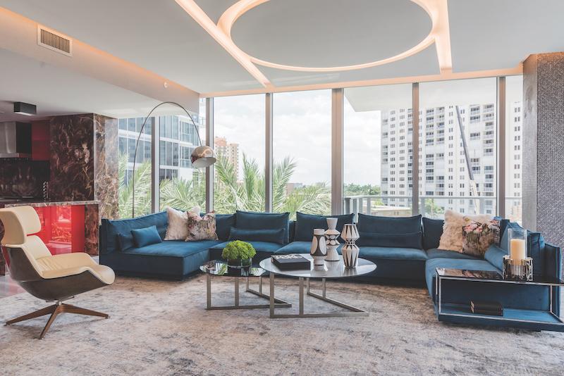
1. The inspiration for this luxury condo project began with two requests from the client that were non-negotiable: A Ferrari red kitchen and a teal sectional. From those requests, the final product emerged. Our client has a bold personality, which is reflected in his fearless use of color. Inspired by natural stone slabs, he is drawn to the unique features inherent to the product. In many rooms, we have designed around one or more stone slabs, from multi-colored marble to exotic blue agate. These slabs inform the aesthetic of each space. In this living room, our challenge was to seamlessly meld the red kitchen with the teal sectional, which was no easy task. In addition, red, black and cream slabs were incorporated into the kitchen along with a grey granite covering the fireplace in the living room. We accomplished this by designing pillows using Romo’s Black Edition Herbaria Jacquard fabric. Containing both red and teal, the fabric merges the colors from the kitchen and living room effortlessly. An item as simple as a throw pillow can be integral in linking two pieces together that otherwise may not work.
2. Often times, ceilings can be an area overlooked in design. But this can also be a powerful tool when it comes to creating drama and intrigue. Not only is a fabulous ceiling aesthetically pleasing, but in many instances dropped ceilings are functional as well, especially when working in a condo. In this living room, we had just one box to work with. Embedded in the concrete slab, the location did not relate to our furniture plan. Therefore, in order to illuminate the whole room, as well as to hide sprinkler pipes and speakers, we created a geometric ceiling detail accented with hidden LED lights. In each of our projects, we try to create at least one bespoke statement ceiling that is unique to that particular client. We do not repeat designs, but rather look to design something gorgeous and one-of-a-kind. I love the geometry of this ceiling and the incorporation of both curvilinear and linear elements.
3. To take a space from blah to beauteous, creating a room with a variety of finishes and textures is essential. In years past it was common to carry the same finishes throughout a room. If fixtures were gold in a bathroom for example, all hardware followed suit. If a library was designed in mahogany, then much of the other wood pieces were mahogany as well. When designing today, many of the “rules” that were common once before have become more relaxed, and mixing finishes is widely accepted. Gold can be mixed with matte black or brushed nickel. Varying wood species live in harmony in the same space. And varying textures add more depth to the room. Here, we selected textured fabrics using velvet, leather, wool and a ribbed corduroy. The tonal area rug, in wool and silk adds another element in both color and texture due to the cut and loop pile. While it takes a keen eye to mix colors, textures and finishes together, the effort is worth it. Rooms that utilize a variety of materials are more interesting in increase to the “wow” factor.


