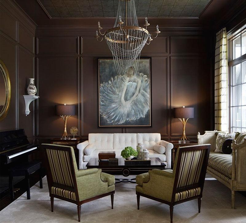
New Trad designer Corey Damen Jenkins kicked off 2018 with the debut of a new lighting collection for Hudson Valley Lighting, and he’s not slowing down. Here the Michigan-based designer explains how he updated this traditional sitting parlor to make it “classic, chic and without an expiration date.”
1. Daring design is all about the push and pull of various elements and that includes the competition between light and dark hues. In this situation, we painted the walls a rich, dark chocolate color. It was a bit of a sell for the client, but I convinced her that we’d keep the space visually balanced by infusing it with white, crème and lime green in the furnishings, bright artwork, mirrors and a neutral-colored rug. Plus, the parlor’s large windows let in tons of natural light so that played into the decision-making process for the color palette too.
2. A carefully edited room not only looks best; it’s also more functional. Many of my clients have small children, and cluttering surfaces with lots of stuff creates more opportunities for speedy little Tasmanian devils to break things. Also, it’s a pain to have to clean and dust a million tchotchkes and put them all back perfectly in snyc again. It’s the 21st century and we’re post-Recession. The days of showing off everything you own are over — no one cares! Restraint is a sign of class because it denotes humility: a choice to showcase only the best and most meaningful things life has given you.
3. The settee was previously owned by the client. Originally, it was covered in a mauve-colored damask silk — very dated 1990s fare. My client loved it, however, and it was in great condition. So, I decided to make it a major feature in the room by re-covering it in a medley of solid and patterned fabrics. The existing painted frame color was perfect for what we were doing, so I kept it as is. I’m glad we were able to reuse a cherished piece of furniture for the homeowner.
It was also a cost-effective choice.


