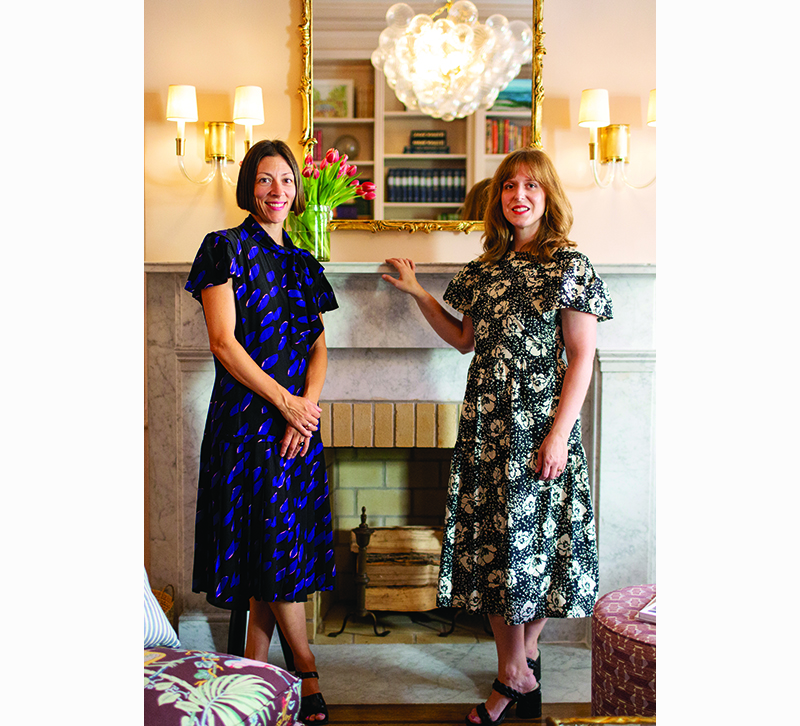
The Collyer’s Mansion design studio is led by owner Mauri Weakley and senior designer Laura Rucker, based in Brooklyn. Known for a buoyant use of color and pattern, they create whimsically layered spaces, calling upon a well curated line-up of artisans and craftsmen featured in their shop on Atlantic Avenue.
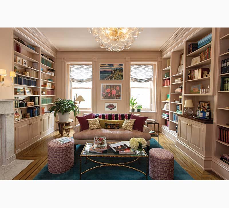
1. For this project, we had a woman of the world, patroness of the arts, bon vivant lady in mind. We imagined her traveling the world, collecting treasures and art. This is the room she would come home to, to relax in after a journey or a long day. A room to put up her feet and plan her next adventure or maybe share a glass of champagne with her friends. We really strived to create a beautiful room that felt designed but not stuffy, a space that felt truly lived in. At one point we had a pair of sunglasses on the mantel and almost wanted to leave them there…they felt so perfect! This room really tells her story and conjures this collected old New York feel.
2. The layering of colors, patterns, fabrics and furniture are really our wheelhouse. We wanted this space to feel like a jewel box and for the textiles to have the same collected feel of the goods and decor in the shelves. We began working with an assortment of fabrics that really played off the colors in the painting “Compass Island” by Bayard Hollins, which is the highest hanging piece of art between the windows. There are so many beautiful colors in this piece — the peacock blues, pinks and chartreuse greens were very much inspired by it. We slipcovered the pair of Clara slipper chairs in Utopia Goods “Paradise Cocoa” and we really felt that the colorful bird motif was a great bridge fabric that brought many of the colors in the room together. A vintage textile is draped across the back of the sofa, it’s a bit unexpected but really adds to that collected feel. Enveloping all the walls, millwork and ceiling in the solid sandy pink color created a beautiful canvas, and covering the floor with the rich vibrant peacock blue rug really allows all of the textiles to sing!
3. We LOVED this lighting fixture! It’s the crown jewel of the room. We loved that it’s grande yet airy. It feels old and found, and current and new all at the same time. There is also a bit of a swirl or squiggle motif in the room as well…the swirl in the baubles on the chandelier, the swirl in the Beata Heauman knobs we added to the cabinets, and the playful lines in the Rebecca Atwood fabric the Roman shades are made of. We really couldn’t envision this room with any other lighting fixture. It really felt like the perfect fit!


