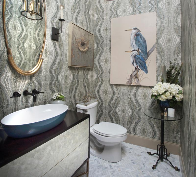
When Arianne Bellizaire creates a powder room, she designs for the current owner, not the next one. Discover the Baton Rouge, LA-based designer’s approach to packing a lot of style into a small space.
1. To illuminate the area above the vanity, I chose two Visual Comfort E.F. Chapman right-angle single sconces because I love the clean lines and the simplicity of the style, and the slim profile means that it won’t cover up too much of the wallpaper. Next, I wanted a large-scale statement piece to really kick the room up a notch. Enter this beautiful Hudson Valley Cresson pendant. I love the scale of this pendant — it’s 25.5 inches tall — and the combination of brass and black metal along with the opal accents found on all four sides.
2. I think wallpaper adds texture and interest to any room, especially a small space like the powder room. For this project, the print we chose was bold so we made sure we balanced that with a subtle colorway. We also let the paper have a prominent role by making sure the other elements we chose for the space weren’t too bold or “in your face.” The large scale of the print also helped us achieve just the right effect without it seeming too busy or jarring.
3. This project was actually one we did for a color challenge with Villeroy & Boch. The goal was to show off the different ways bold and vibrant color can be incorporated into a bathroom using their new Artis washbasins. I selected an oval version of the Artis washbasin in the beautiful shade of Ocean because the richness of the color reminds me of one of my favorite vacation destinations: the beach! Because of our innovative design, we won the competition!


