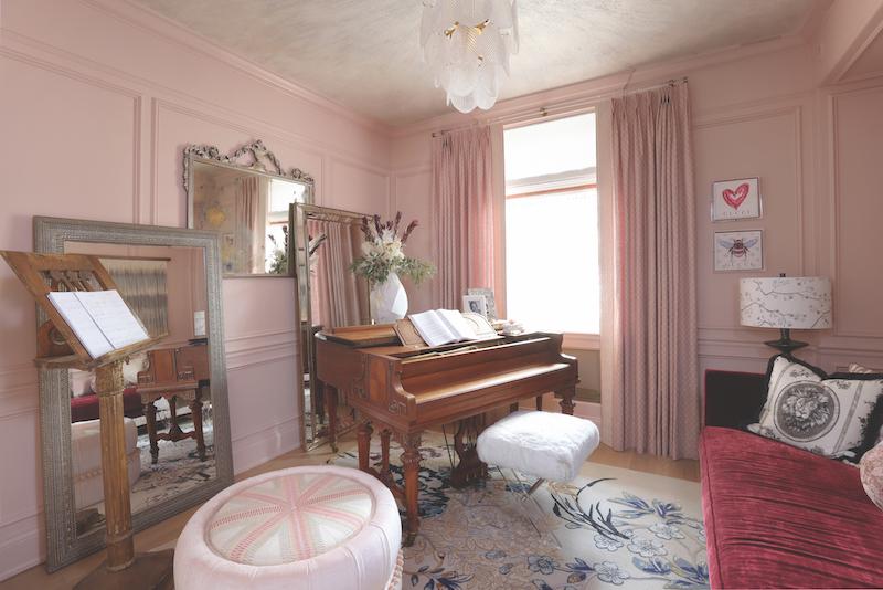
1. Architects Henry Corwith Dangler and David Adler designed this home — now the Adler on The Park Showcase House — as a row of city residences for a group of their close friends who were significant artists, architects and designers in Chicago society. We wanted to pay tribute to both the arts, and the architecture of the home, while also putting a modern twist on it. There’s very much a balance between the old and new. We incorporated a 1928 carved walnut piano, made in Chicago. That kind of kicked everything off given the history of the house. We had it oiled, and put extra little bits of gilding on it. We didn’t want it to be over the top, but we did want to celebrate the carvings. The piano was built in 1928, but it felt 1920s. We also liked that the light fixture felt 1920s. The house was built in 1915. We were also trying to dial up this “is it historic or is it modern?” feel. We wanted that to come together.
2. When we designed this room, we pictured our client in her late teens or early 20s. This is her room to express herself in. We were thinking it would be nice to be both youthful and inspirational in our designs. She loves fashion, as expressed in the wall art. Through our collaboration with The Vale Fabrics by Melinda Marquardt, we incorporated serpentine linen drapery panels and pillows. Melinda creates all these fabrics from her own drawings and sketches. The rug by HRI is also a beautiful wool with silk, and a one-of-a-kind item. Between Melinda’s fabrics, the piano and the rug, the room is almost like an art piece within itself.
3. We really pride ourselves on thinking through all five senses. Not just color, but light, acoustics and tactile aspects. If you don’t consider all of that, then it’s not necessarily a place that will be comfortable. We had the daybed reupholstered, for example — we love this ruby colored velvet. Even in the paint, you’ll notice the walls are matte but the moldings are painted semi-gloss. That then gets refracted against the ceiling, which is a flat with a metallic and quartz crystal beading on it. We had our upholsterer make our ottoman a modern shape, but with more traditional fabrics. Then we have an 18th-century conductor’s stand from Italy that we paired against the modern artwork.
