flexiblefullpage

Kathleen Walsh: A Downtown Vibe in an Uptown Manhattan Home

Kathleen Walsh Interiors stepped in to make the client's dream of a unique loft-like space a reality.

06/01/2020
Printer Friendly, PDF & Email
Kathleen Walsh Interiors
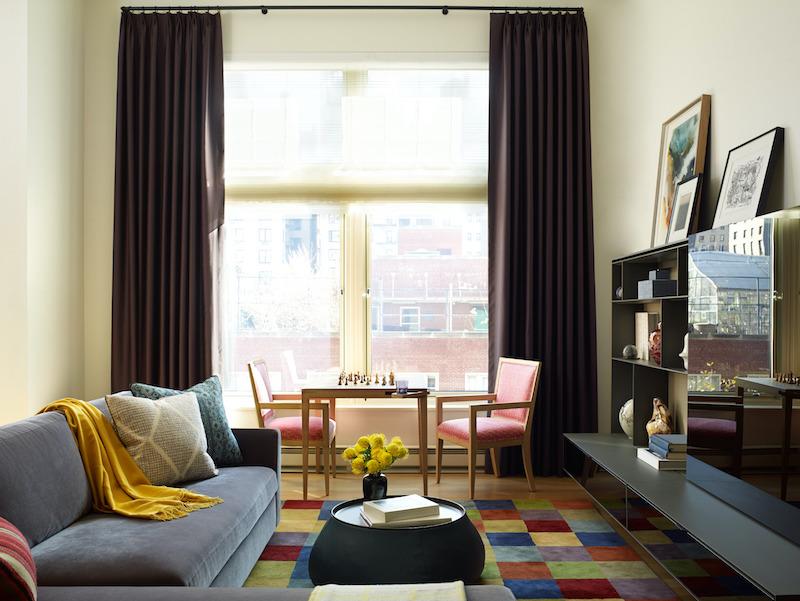
The family room with floor-to-ceiling windows on display. I love the natural light and how we mixed color and texture so seamlessly throughout this room.

In this New York City home, located in uptown Manhattan, the homeowners were looking for a unique aesthetic that mixed cultural influences. Kathleen Walsh Interiors stepped in to make the client's dream a reality. We asked Walsh about her goals and inspiration for the space.
 

Kathleen Walsh Interiors
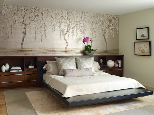
The master suite. The artwork hanging behind the bed is actually a custom, hand-painted wallpaper from the legendary Gracie Studio. I loved this subtle interpretation and the almost watery, or maybe hazy look it has—like a misty morning in a far-off locale.

What goals were you trying to meet for the client?

When the client came to us initially, they asked my team to create a “downtown” vibe in the uptown Manhattan space. First and foremost, we had to define what that meant for them. After some time together, including shopping trips and inspiration boards, we realized that the owners really loved a modern, eclectic aesthetic. With that in mind, we set out to use a globally modern mix of furnishings, including mixing Asian art and Middle Eastern rugs with Swedish influences. The end result? A home that is colorful, sophisticated, playful and welcoming to everyone.
Kathleen Walsh Interiors
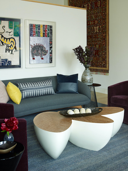
This is one of my favorite shots of the space. We sourced the table from Dennis Miller in NY, he represents Wendell Castle whose forms are a work of art unto themselves. We also used a favorite rug that the couple bought in Turkey as a wall tapestry.

What was the design inspiration for the project?

The project was largely inspired by the textiles and rugs that the couple already owned and had collected while traveling. The duo had also spent a few years living in Asia, so this helped inspire the design, as well. We were able to incorporate the beautiful, meaningful pieces they had collected over the years into this new home in a way that made sense for their life today. Subtle juxtapositions can be found throughout the project and make it truly special. For example: two pieces of Asian art hang above a Vladimir Kagan sofa and Wendell Castle Sizzle coffee table in the living room. In the elevator vestibule, an antique North Korean chest nestles beneath a sleek red console. I’m proud of “livably-modern” look we created. 
Kathleen Walsh Interiors
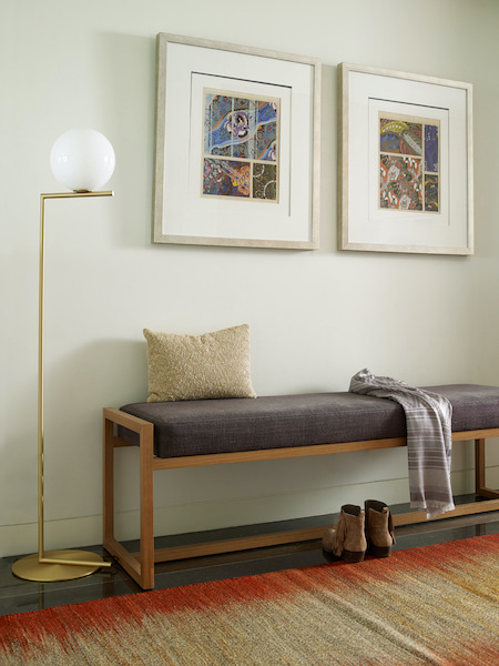
This entrance hallway is a beautiful, unexpected vignette where we mixed existing and new pieces. The lamp is from Flos and the bench is from Pucci. The art is collected.

What is your favorite part about the space?

I love that we helped create a home that feels true and unique to the owners. The entire look is a reflection of the people that live there. That is what is most important to me, in any project. Beyond that? I am obsessed with the 14-foot ceilings and giant windows on the main floor. They make the space feel more like a loft, as opposed to a classic Upper East Side apartment. It totally works with the design and makes the work we did all the more impactful.
Kathleen Walsh Interiors
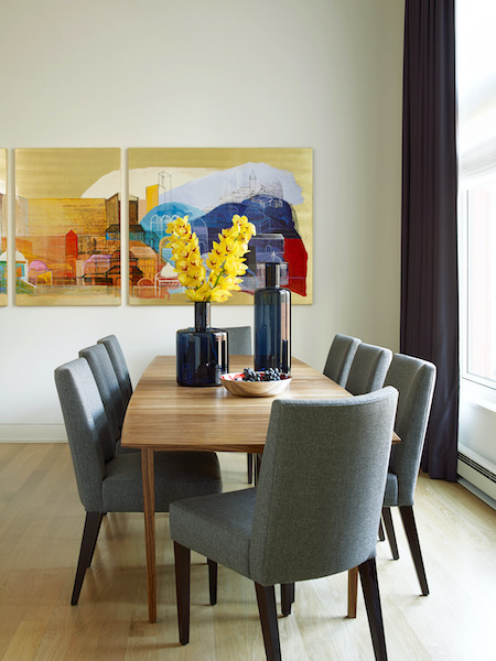
The kitchen and dining area. That large piece of colorful artwork was collected during one of the couple’s trips abroad.


Eurofase Lighting Furniture, Lighting Decor Cover July August
On Our Cover? Be the graphic for Behind the Scenes. This month, Eurofase!

Want to learn more about your colleagues and suppliers and the engines that drive their businesses? We're bringing that to you here in "Behind the Scenes." We're sharing the stories from home furnishings manufacturers and suppliers, retailers and designers that are designed to inspire and ignite your imagination for your next design project, retail customer and more! Learn about the beauty and inspiration behind designer projects, innovative insights from today's retailers both brick-and-mortar and ecommerce, as well as the stories behind your favorite or newfound furniture, lighting and home decor suppliers. 

What's new? What's exciting? What's working? We're sharing it all! Each month, our blog graphic will mirror our publication's cover. This month, cover art is courtesy of Sarreid Ltd. 

Interested in being featured on "Behind the Scenes"? Reach out to Diane Falvey (dfalvey@sgcmail.com) or Amy McIntosh (amcintosh@sgcmail.com) to set up a time to chat. 

leaderboard2