
")
With Pantone’s recent announcement of Living Coral as its 2019 Color of the Year, all the major paint companies have now made their picks. Here’s a roundup of the selections from Pantone, Sherwin-Williams, Behr, Benjamin Moore and Dutch Boy along with insight from Michelle Lamb, Editorial Director of The Trend Curve. “There isn't one bad color in the bunch,” she says. “In fact, while some feel newer than others, each one is immensely salable.”
Pantone: Living Coral
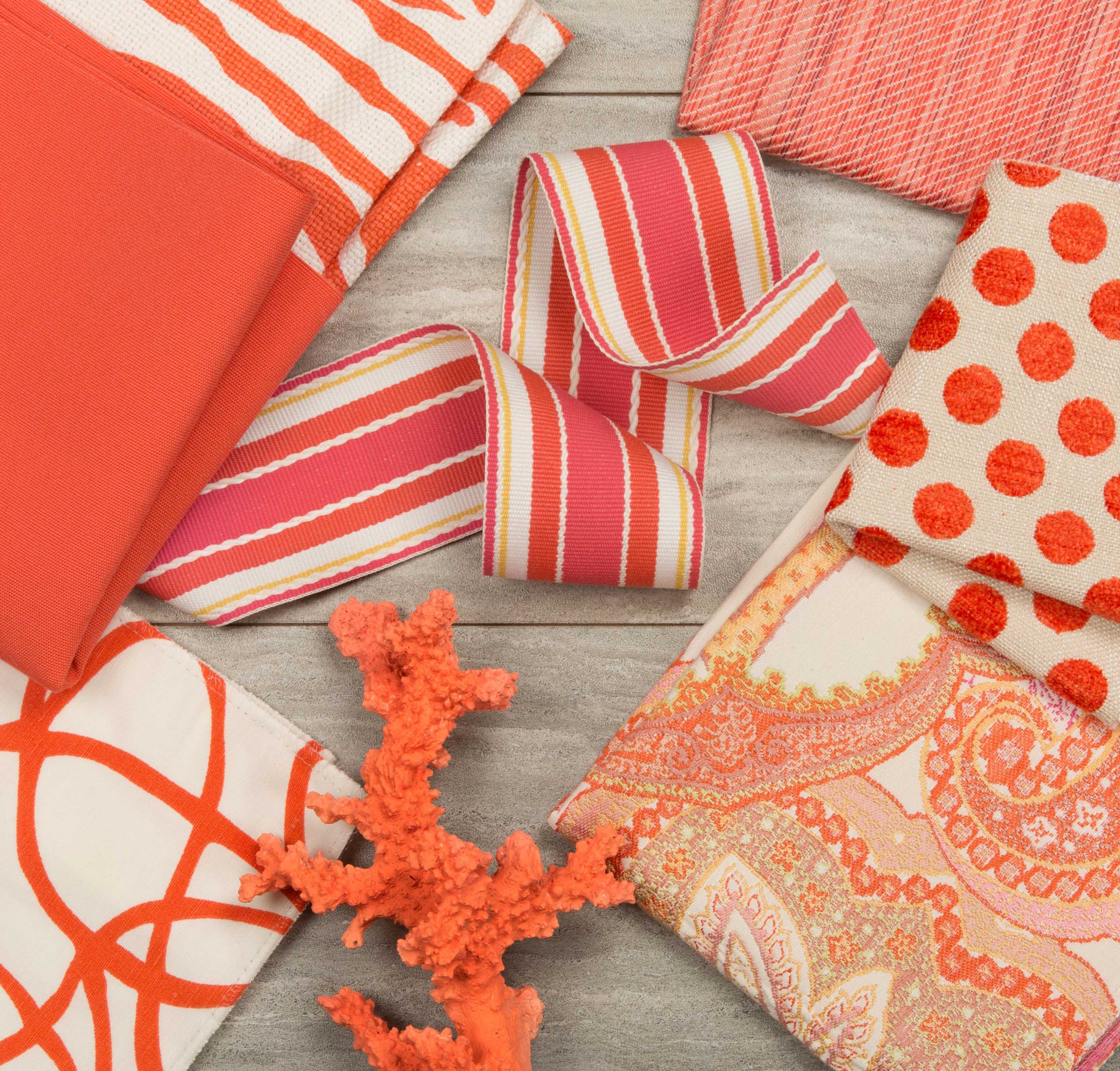
Living Coral 16-1546, a shade of orange with a golden undertone, symbolizes the innate need for optimism and joyful pursuits and is meant to embody playful expression, according to Pantone.
“As a color linked to tactility and human connection, Living Coral in shag rugs, cozy blankets and lush upholsteries create a warm, comforting and nurturing feeling in the home. With its ebullient nature, Living Coral adds a dramatic pop of color to any room setting whether in decorative accessories, tabletop or on the wall,” a Pantone statement said.
Michelle Lamb’s take: “Living Coral, Pantone's 2019 Color of the Year, is a fresh take on orange that is simultaneously energetic and livable. It reflects a growing interest in oranges of all kinds that is just becoming obvious to consumers. So many companies have showcased their Living-Coral-like colors since Pantone's announcement, confirming momentum for this color for the coming year.”
Sherwin-Williams: Cavern Clay
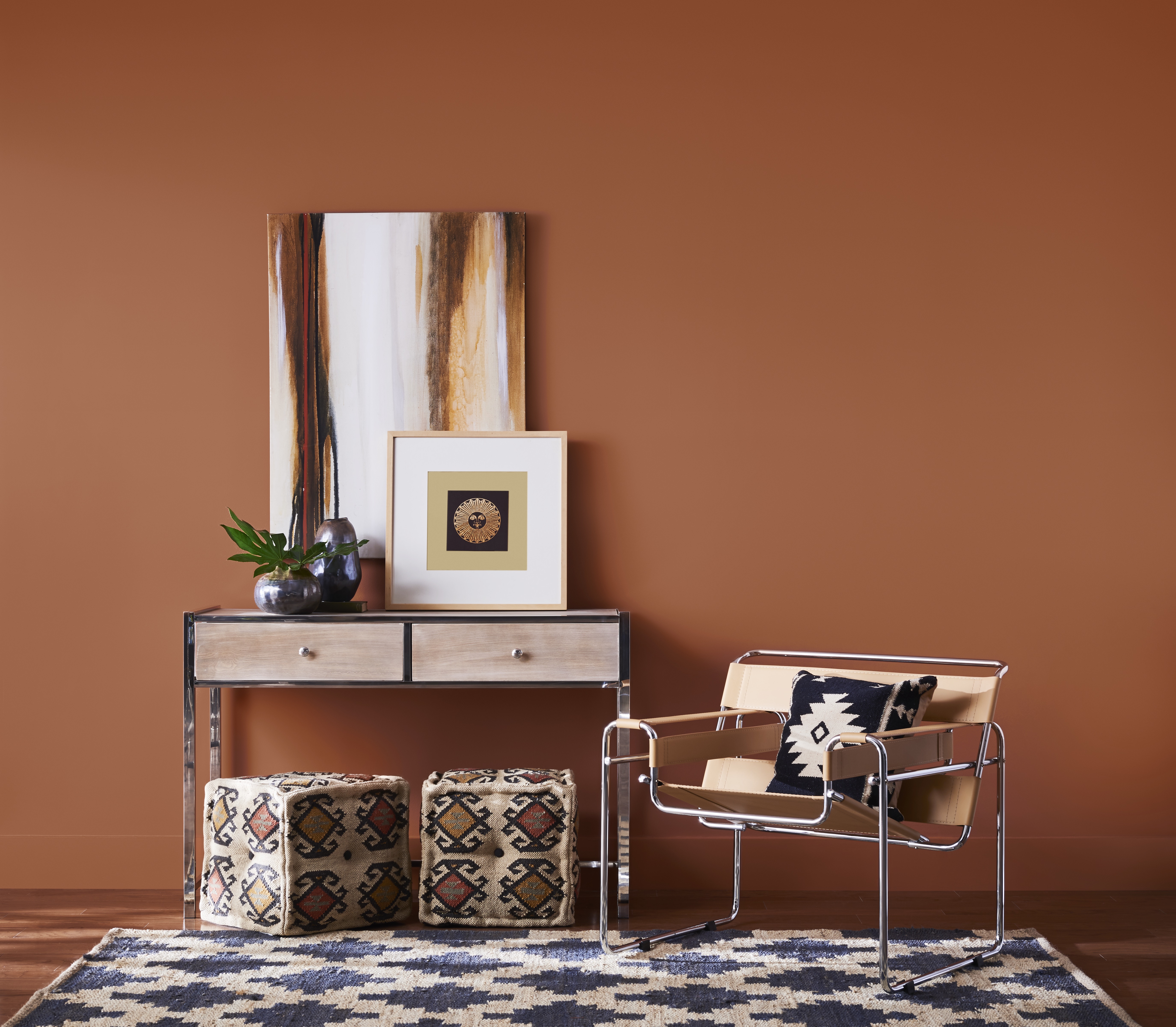
Cavern Clay SW 7701, a warm terracotta color, is a nod to Mid-Century Modern style with the soul of the American Southwest — together creating a desert modern aesthetic.
“We believe 2019 will be a renaissance of the 1970s—with a twist. In the coming year, we will embrace our pioneering spirits and artisan ingenuity,” says Sue Wadden, Director of Color Marketing, Sherwin-Williams in a statement. “Our 2019 Color of the Year, Cavern Clay, embodies renewal, simplicity and free-spirited, bohemian flair.”
Michelle Lamb’s take: “Sherwin-Williams' 2019 pick, Cavern Clay, shows how new (and increasingly important) oranges can offer a more sophisticated character. This color started emerging fast in the first half of 2018, appearing in palettes that are earthy, ethnic and traditional. That speaks to versatility. My forecast is for hues like Cavern Clay to continue building into 2020.”
Behr: Blueprint
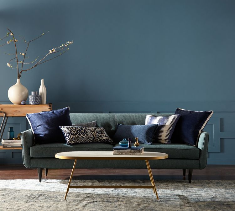
Blueprint S470-5 is a mid-tone blue. Warmer than denim and softer than navy, the company said in a statement that the color signifies "authenticity, confidence and timelessness."
“Much like the sketches builders rely on to bring an architectural design to life, Blueprint S470-5 lays a foundation for consumers to make their unique vision a reality,” said Erika Woelfel, Vice President of Color and Creative Services at Behr. “This universally appealing hue provides a steady stream of positivity and is poised to be an instant classic for years to come.”
Michelle Lamb’s take: “Behr's Blueprint comes from the blue color family, which means it has lots of potential. That's because blue is North America's favorite color family. This 2019 pick embraces the same kind of warmth that has made petrol colors bestsellers over the past year. Blueprint feels like an evolution of that hue. I think Blueprint is a winner.”
Benjamin Moore: Metropolitan-AF 690
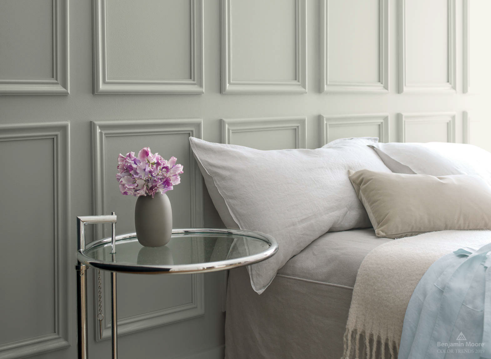
Metropolitan AF-690 is a stylish gray with cool undertones.
“Comforting, composed and effortlessly sophisticated, Metropolitan AF-690 exudes beauty and balance,” said Ellen O’Neill, Benjamin Moore Director of Strategic Design Intelligence. “It’s a color in the neutral spectrum that references a contemplative state of mind and design. Not arresting nor aggressive, this understated yet glamorous gray creates a soothing, impactful common ground.”
Michelle Lamb’s take: “Going with gray acknowledges that so many consumers still see gray as a trend, rather than the core color it has become. Gray still has massive appeal, and Metropolitan taps into that popularity well.”
Dutch Boy: Garden Patch
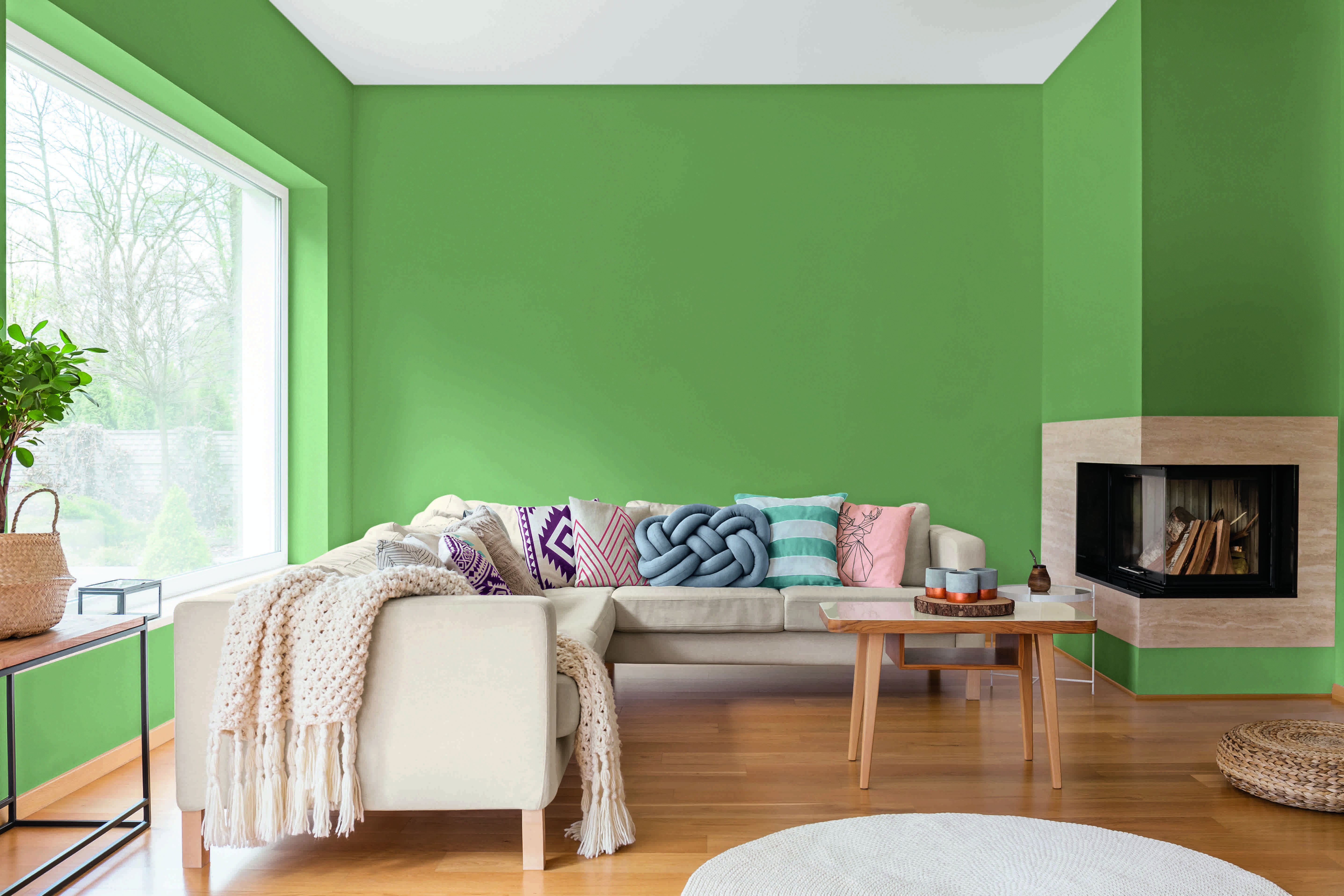
Garden Patch 326-5DB, a green that is not too deep and not too primary, is a nostalgic, botanical hue that stands out for its warm and calming effect. Paired with soft naturals and pops of warm colors, Garden Patch offers rejuvenation and peace at the end of the day.
“Garden Patch is a great color that can be used in all areas of the home,” said Rachel Skafidas, Color and Design Manager, Dutch Boy Paints. “When the Dutch Boy color team selects a color, we want it to be something the homeowner can use to transform just about any space.”
Michelle Lamb’s take: “Dutch Boy's selection of Garden Patch connects with an interest in greens that has been on the upswing for just over a year. One of the biggest drivers of green's advance has been floral designs, which are back in a big way in every style category. This 2019 selection is fresh enough to work in a myriad of floral situations.”
")


