While there are plenty who dream of white picket fences and rooms their families can grow into, a growing number of folks are perfectly happy forking over 30 percent of their income each month in exchange for the ability to “call the super” if the refrigerator goes kaput or pick up and leave for a work assignment in Paris should the opportunity arise.
According to a recent Pew Research report, the number of U.S. households that are renting grew by 7.6 million between 2006 and 2016. Today there are more than 43 million renters, which means more people are renting now than at any point in the last 50 years.
Renting has its advantages, but decorating and designing a temporary space can be a challenge, as Ajay Chopra showed us in the September 2017 issue. Renters face space constraints, rules about painting and putting holes in the walls as well as having to put up with design choices made by someone with questionable taste.
So how can you help clients make an impermanent residence look and, more importantly feel, like home sweet home? We searched high and low for design blogger’s best advice. Read their Instagram and Pinterest-worthy tips below.
Make the most of a boring bathroom
In her “Life in a Tiny Apartment” series on Reading My Tea Leaves, blogger Erin Boyle reveals that she typically chooses to ignore the things she doesn’t like about her rental.
“As a renter, it’s easy to feel like you’re living in someone else’s home, because, well, you are,” Boyle writes. “[But] In the past year or so, I’ve been moving slowly in the direction of paying more attention to these neglected spaces by adding in things that feel a bit more me and a bit less someone else.”
In other words, incorporating decorative accessories into notoriously ugly rental kitchens and bathrooms can help showcase things your clients love, rather than covering up what they don’t. In the kitchen, urge them to try new hand tabletop accessories like this Onyx partyware from Noir Furniture or upgrade to these gorgeous cleaning tools from Andrée Jardin. For added personality in the bath, adorn the counter with beautiful but useful pieces like these shining blue-green vases from Jamie Young.
Change out ugly light fixtures
Apartment Therapy lifestyle blogger Taryn Williford is full of great ideas for how to outfit a rental with upgrades you can take with you, but what caught our attention was her advice on replacing the light fixtures.
“This is a place to splurge,” Williford writes. “Replace your rental's overhead light with a fixture that you will love for years and years to come. The new hardware will look great, and choosing your own fixture will also give you control over the kind of light you want in your home.”
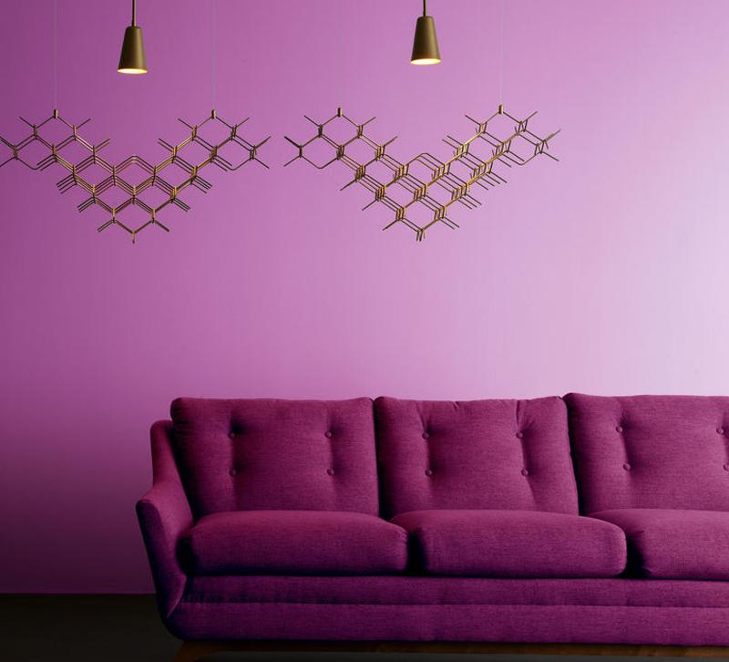
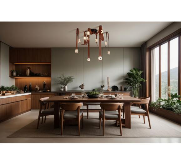
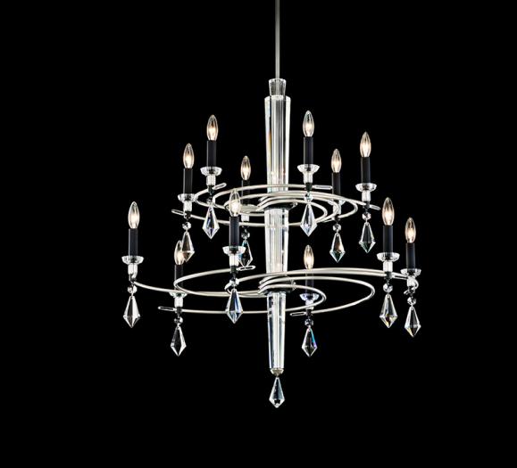
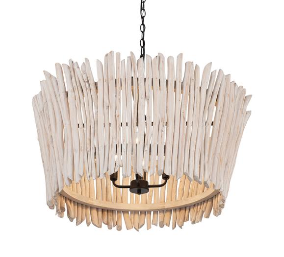
Try these apartment-friendly looks on for size in spaces like the dining room and living room: the Hook, Vine and Sinker pendant from Vermont Modern and the Amber Glow flush mount from Hinkley Lighting.
Reach for the (removable) wallpaper
Designer Emily Henderson’s focus on creating eclectic interiors on a budget means we trust her completely when she talks about wallpaper.
“I am no stranger to wallpaper,” Henderson writes on her company’s blog. “I love it, I use it, and I constantly find myself trying to get every single one of my clients to use it in their homes. But, wallpaper can be daunting to shop for, commit to and hang. Not to mention it may not be the right solution for everyone… cue renters, commitment phobes and squatters.”
Enter temporary wallpapers, a genius way to insert color and personality onto an otherwise dull wall (or four) and avoid a hefty fine from the landlord. For a feminine look in the bedroom, steer clients toward something like the Wildflower Strip Blush design from Graham & Blush or go graphic with the new Crosshatch wallpaper from Chasing Paper.
Add an entryway
Magazines (present company included) and social media sites are brimming with photos of breathtaking interiors and stunning products for the home, but, acknowledges Geneva Vanderzeil on her blog A Pair & A Spare, recreating those looks requires a fair amount of space, something many apartments lack.
“The challenge, therefore, is how to take inspiration and make that work in your space,” Vanderzeil writes. “Take for example, the ‘entryway.’ “In the real world, we don’t have [one] — you literally open the door into the dining room, and with a quick 180-degree sweep of the head you’ve seen every room in the house.”
Vanderzeil’s solution? Fake one with a few key elements: a hardworking mirror like the Drop Series mirror/wall shelf from Skram and a place (like these ALAKA wall hooks from Retegui) for hanging your hat.
What are your favorite ideas for decorating an apartment? Share with us in the comments.

