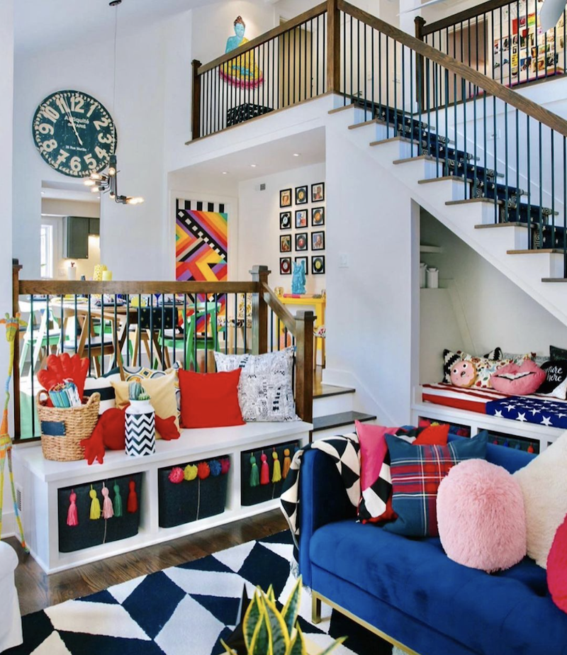
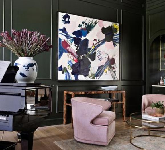
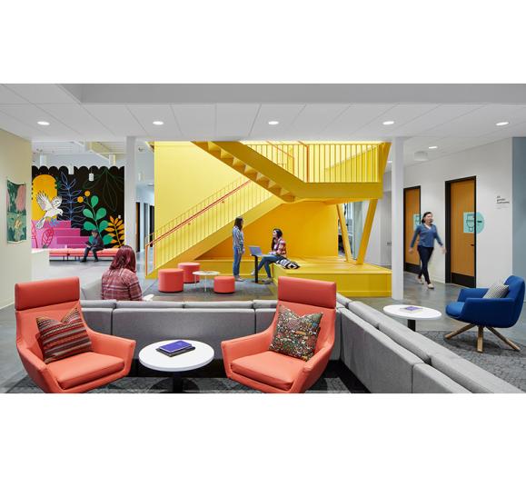
Maximalism is a style rooted in personality. Its bold, distinctive nature means it won’t be everyone’s cup of tea, but those who gravitate toward it tend to go big in their design, patterns, palettes and textures. It allows for an eclectic and creative expression of personality, ideally done in a way that is cohesive and thoughtful.
“When I hear the term ‘maximalism’ as a trend, I think of bold, loud design that doesn’t hesitate to mix materials, patterns and styles,” says Jessica Phillips, Vice President of Marketing for Phillips Collection. “Whereas ‘minimalism’ is clean, muted and light, ‘maximalism’ is colorful, exciting and excessive.”
Because of its dramatic, divisive nature, maximalism will likely not be a trend that takes the design industry by storm, the way Mid-Century Modern or farmhouse styles have in the past, but for a certain client or customer, it’s exactly what they’re looking for. For Jonathan Michael Parks, Chief Marketing Officer for John-Richard, maximalism isn’t a trend; it’s a way of life.
“The English have been designing maximalist homes for 100 years,” he says. “I’ll use Diana Vreeland as an example from here in the U.S. She awoke her senses with layers of red walls with beautifully curated patterned wall coverings and layered in textured fabrics with clean lined furniture and colorful objects. That is very much what is happening in today’s world with those who want a maximalist aesthetic. The only difference is that now we can combine our layers with contemporary furniture versus the old traditional from the past. Maximalism isn’t a trend. It’s how someone lives and collects.”
In the last year, homeowners have taken stock of their surroundings and their belongings. As we spend more time surrounded by our personal items, we’ve had an opportunity to curate a decor style that speaks to our personalities and is something we want to look at every day. For some, that means paring back and displaying a curated selection of objects. For maximalists, that means the opposite.
“With the pandemic, a lot of people shifted toward DIYs and ordering new furniture and home decor items to redesign their places to carry more of their own personality,” says Alyson Martin, Director of Marketing for Eurofase. “People are being inspired by more dramatic, bold and vibrant settings. Maximalism helps us embrace that very complexity.”
Finding a Balance in Maximalism
But how does one design in a maximalist style in a way that does not overwhelm the space? With so many design elements — colors, patterns, objects — a maximalist room can quickly become chaotic and claustrophobic without the trained eye of a professional.
One key to a cohesive maximalist space is balance, says Martin, to achieve what she calls “modern maximalism,” keeping all of a person’s favorite items visible. Employing this in a small space can provide a “larger than life” feel.
“To achieve this without being overwhelming, aim for a place that is comfortable and full of elements that you love,” she says. “Add wall art, plants, patterns and textures — plus a statement lighting fixture to be the main focus. It can be crystal, glass, metal, anything that is grand.” While a dramatic statement lighting piece works in a maximalist space, Martin also suggests that more modern, sleek pieces can also work well, particularly if there are other bold elements at play in the room. A simple yet luxurious lighting fixture can provide that balance against heavy patterns and bright colors elsewhere in the space.
Parks says layering complementary colors and patterns can help achieve this balanced look, making a maximalist space a bit easier on the eyes.
“Modern lines of simple textured upholstered furniture along with a lacquered media/book piece mixed with subtle patterned wall coverings blended with small curated collectibles is a bit more purist without overwhelming the space,” he says.
This balance of color and personality are key to a maximalist space, according to Parks. The sofa should complement the color of the wall coverings. The scale of the casegoods should not overwhelm the room, but can have texture to add visual interest. Personal collectibles can and should be used to personalize the space and add a storytelling element. This personalization extends to the art, the selection of which can vary widely from client to client.
“If you love colorful art, use it,” Parks says. “If you have black and white line art, frame it in a colorful moulding that works with the colors of the room.”
Picking Product
The layered look is also translated in John-Richard’s products, Parks says. Texture in the furnishings only adds to the textured look of maximalist spaces.
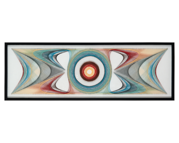
“Our casegood pieces are very graphic, textured and layered,” he says. “For example, we build texture in our casegood fronts by applying multiple layers of materials, whether it be glass, lacquer over veneer, or sand with layers of glue to build up textural moments. We love playing with graphics and turning some of our case pieces into actual works of art.” The company also has large-scale art pieces made from objects like torn watercolor paper, thread and pushpins, providing layers and patterns that work well in a maximalist environment.
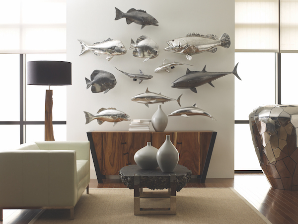
For Phillips Collection, whose tagline is, “Every piece a conversation,” these larger-than-life, whimsical moments have always been at the heart of the company’s aesthetic. Their sculptures, accessories and wall decor are designed to spark interest, fitting in well with a maximalist aesthetic.
“For us as a brand, we’ve never been afraid to be ‘too much’ in terms of what we describe as conversation pieces,” says Phillips. “When you add a Phillips Collection piece to a room — any room — you are going to get people talking.”
In lighting, Eurofase carries a mix of options that meet any maximalist approach. Whether the goal is to install something large and dramatic to stand out or something modern and sleek to let the rest of the furnishings shine, the company’s commitment to luxury makes its products suitable for maximalist decor.
“If there has been one theme that Eurofase has stuck to from the very beginning, it is luxury,” Martin says. “All pieces that we build are carefully curated in a way that allows every customer to visualize their selected fixture in their home.”
When combining furniture, lighting, decorative accessories and personal collectibles in a maximalist space, the end result is ultimately about the feel of the space. According to Phillips, working in increments; playing with scale, color and patterns; and making tweaks until you find something that works can all be helpful in creating that perfect maximalist aesthetic.
“The safest way is to always start small,” Phillips says. “It’s much easier to add than to take away. Designate a wall and go bold — with color or art. Or select a console or chair that really stands out from the rest of the room. If you fall in love with the experience you have when you see that, keep going. There are no rules these days.”


