Everywhere I go now I see color being used and misused in commercial environments. In some instances the mistake is obvious and a small fix would greatly improve the situation. In other situations it so bad it’s hard to know where to begin. Then there are those rare cases where someone has broken the rules with positive results. Recently, a trip to Key West, FL revealed a few of these situations.
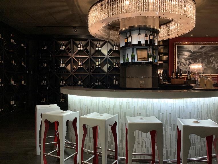
On Duval Street, the main drag in Key West, there is this very upscale establishment. Inside are three semicircular bars, spaced out evenly within the space. Each one has a custom circular chandelier installed above. They are alluringly warm in color and sparkly, which really draw you into the space. The lighting below the bar top, on the other hand, is cool and frosty. My guess is that the color temperature of the linear LED lighting was 4000 K with a CRI of about 80, which makes the light of the slightly greenish in tone. This illumination feels very clinical, not inviting all. If the bar lighting was changed over to a 2400 K LED with a CRI of 90 or higher, the feeling of the place would be much more welcoming. Having the newly install lights on a dimming system would allow for a balance of lumen output from both a chandelier in the bar lighting.
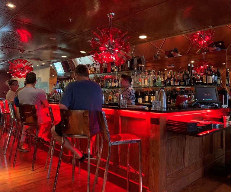
The Saint Hotel in Key West has a bar right off of the lobby. The large scale blown glass chandeliers, installed over the bar, are red in color with 2700 K screw-in LED bulbs providing the light source. The bar top on the underside is illuminated with red linear LEDs. The bar back is highlighted with 2700 K recessed dimmable down lights. If someone had told me this was the design concept before I went in to see it I would’ve said that it was going to be a total disaster. Yet, it works. And it works well. The red hue is complementary to skin tones and everyone looks well rested. The place has a speakeasy feel to it with a touch of old Hollywood. This is one of those instances were absolutely wrong feels perfectly right.
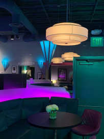
The Tropic Cinema was built in 2004, styled after the movie theaters in 1930s. Inside, the place has a decidedly Art Deco feel, with glass block, rounded corners, and three-dimensional wall moldings. The tall booths in the concession area are fitted with frosted panels which are up lit with hot pink linear LEDS. The wall sconces sport a cerulean blue color, while the pendant fixtures use a 2400 K LED source. There is something a little 1980s about the lighting, but it is kind of fun.
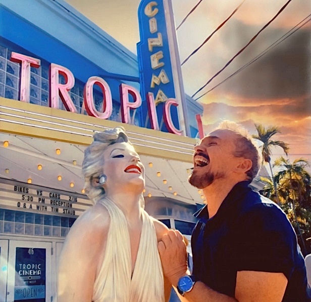
This is a shot me of sharing a laugh with Marilyn Monroe out in front of the Tropic Cinema. You just never know we’re going meet in Key West.

