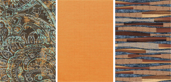
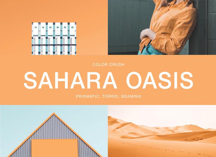
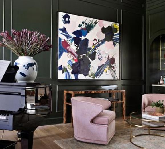
Who says sandy hues have to be dull? We’re giving grit a whole new look with the creamy appeal of Sahara Oasis. Elevating an atmosphere that may otherwise seem rugged or abrasive, this sorbet orange introduces an unexpected clean and crisp element, creating a polished and sophisticated look. Inspired by a desert landscape, Sahara Oasis can be layered with various textures to reinforce the juxtaposition between the sand’s rough, dry surface and the dunes' smooth, fluid appearance against the horizon from afar. We also love this hue paired with complementary colors like a freshwater blue, as shown in the images above. See our favorite Sahara Oasis palettes below!
Luxor Palette

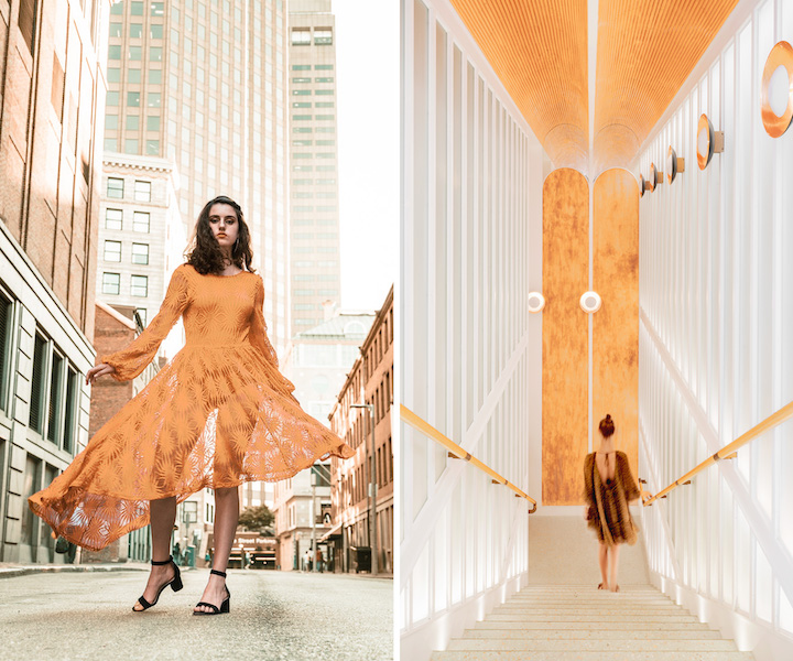
Sahara Oasis brings nature’s rough beauty to a traditional and polished look. Similar to the ancient Egyptian city, this palette layers subtle, monochromatic shifts of color, such as soft white and muted neutrals with peachy undertones, to give this palette a natural feel, while Sahara Oasis adds a burst of energy. A pop of minty sage and olive green create a refreshing element of cool contrast. Dress up an outfit with these colors for a confidence boost or use them in a minimal design concept to boast style and class.
Cleopatra Palette

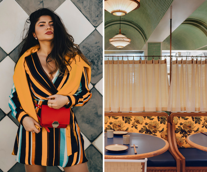
The Cleopatra Palette features vibrant yet earthy hues to introduce a clean element to this otherwise rugged color story. Featuring a leafy sage green, indigo and clay brown, these nature-inspired tones are balanced with turquoise blue and cool slate gray to lift the palette. Use this color combination for a rich, eye-catching outfit that will channel those inner-royalty vibes or for designing a space that draws inspiration from ancient design.
Love Sahara Oasis as much as we do?
Use Pantone 1485 C and the Stacy Garcia products below!
