As a lighting designer, I try to integrate the illumination elements into the architecture as much as possible. Too many times we are brought onto a project after the architectural plans have been completed. The earlier we can get in on a project the more we can collaborate with the architect, contractor and interior designer to create something that is more cohesive and seamless. When that happens, the final result lets the people, architecture and objects within a space become the primary focus and not the sources of illumination. If we come in the end of the project it means we’re just tacking something on. It could be so much better.
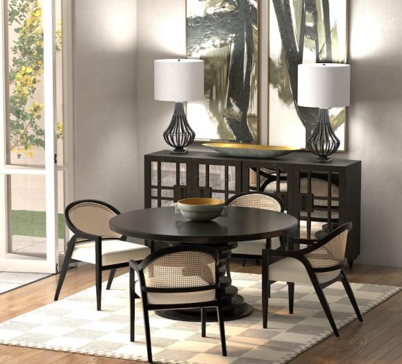
When creating a design, it’s very important for lighting designers to see how the space is going to be used. That means we need a furniture plan, whether it’s residential or commercial. A lighting layout for an empty space is at best generic. It is hard to enhance what we can’t see. It doesn’t have to be the final selection of furniture, but we do need to see where the pieces will be placed in where potential art will be located. Here is a good example: If I were shown an empty dining room, the natural instinct would be to center a chandelier or a pendant in the room. If a buffet or a console it is placed on one wall, then the dining room table gets pushed off center. This means that the decorative fixture will not be centered over the table, which means an added expense for moving the junction box.
Also, we need to see door swings. We want to make sure that switches, dimmers or control panels do not end up behind the door as you are entering a room. If the doors swing gets changed during construction then the lighting designer, as a part of the team, needs to be given that information so that they can update the layout. This happens more often than you think. For example, say an interior designer decides to put a big armoire on a wall and needs the door to be flipped so that it doesn’t hit the piece of furniture as people enter. If that information doesn’t get to the lighting designer, then the controls end up on the wrong side of the doors swing,
Additionally, we need to see elevations and reflective ceiling plans so that beams, skylights, HVAC systems, sprinkler heads, ceiling heights, window heights and door heights are taken into account. All of these are essential in creating a lighting plan that integrates seamlessly with the other architectural elements.
Bottom line is that well integrated lighting adds to the visual experience of the space, allowing the architectural elements, the art…and especially the people to be the center of attention.
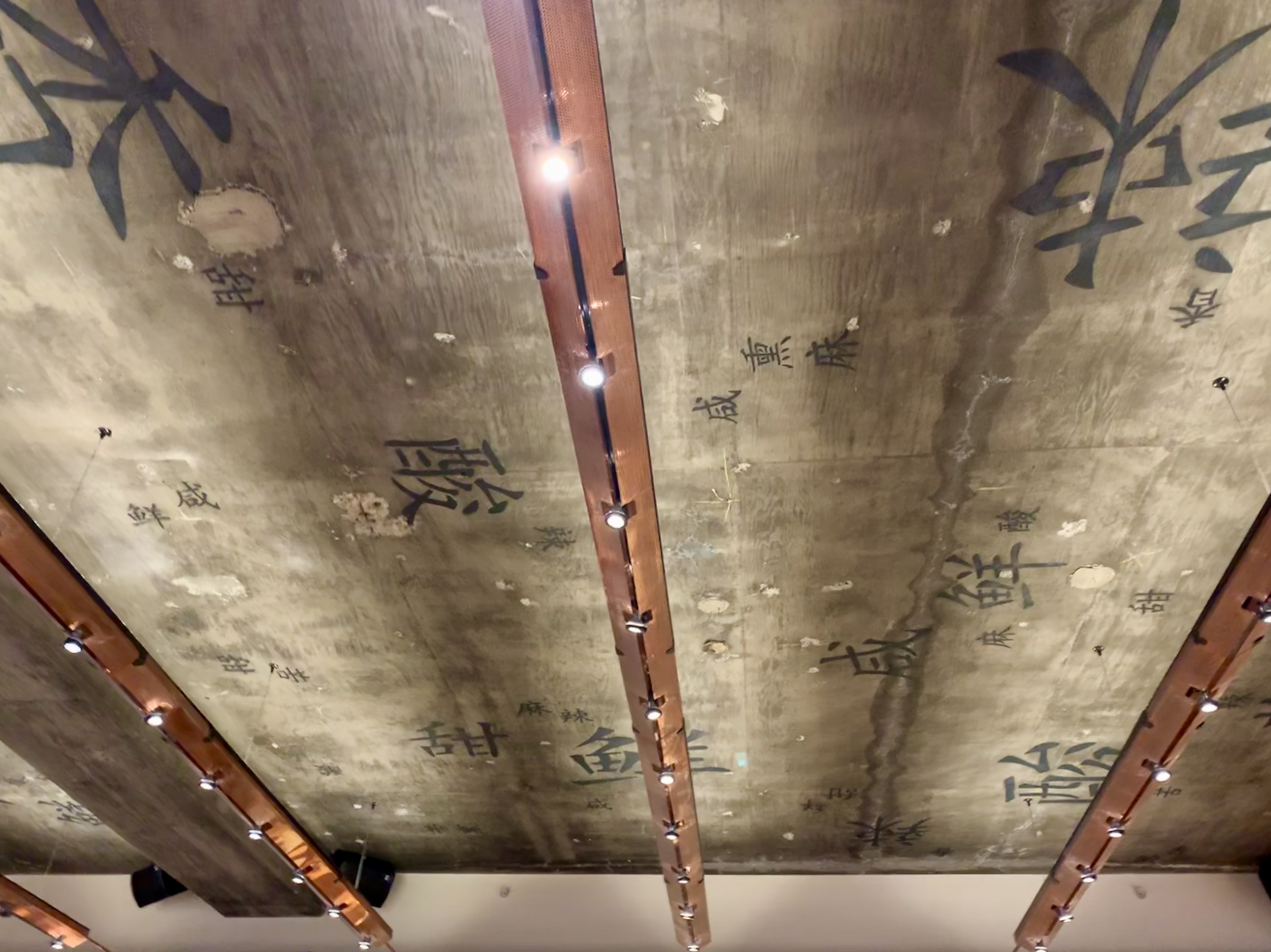
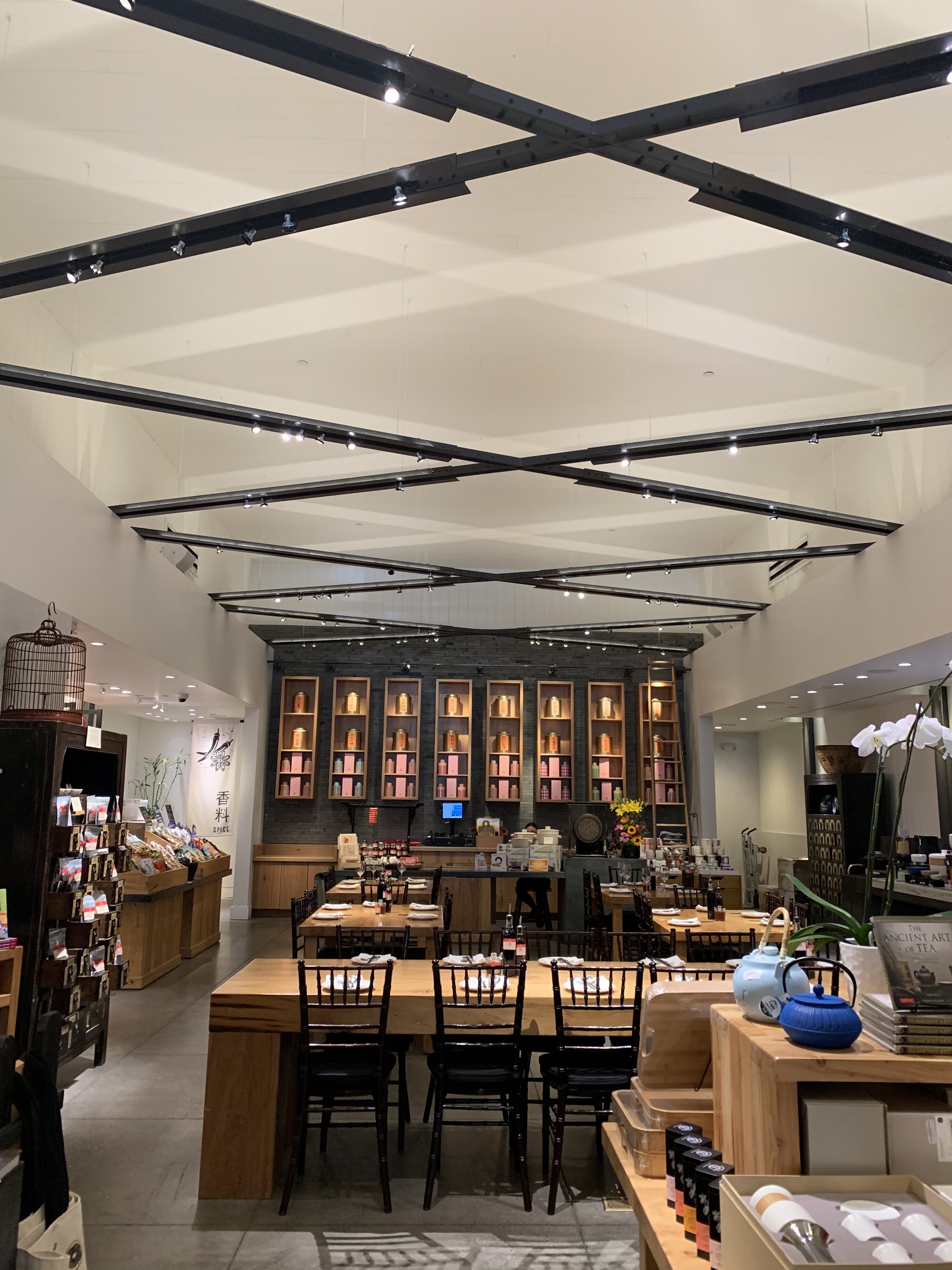
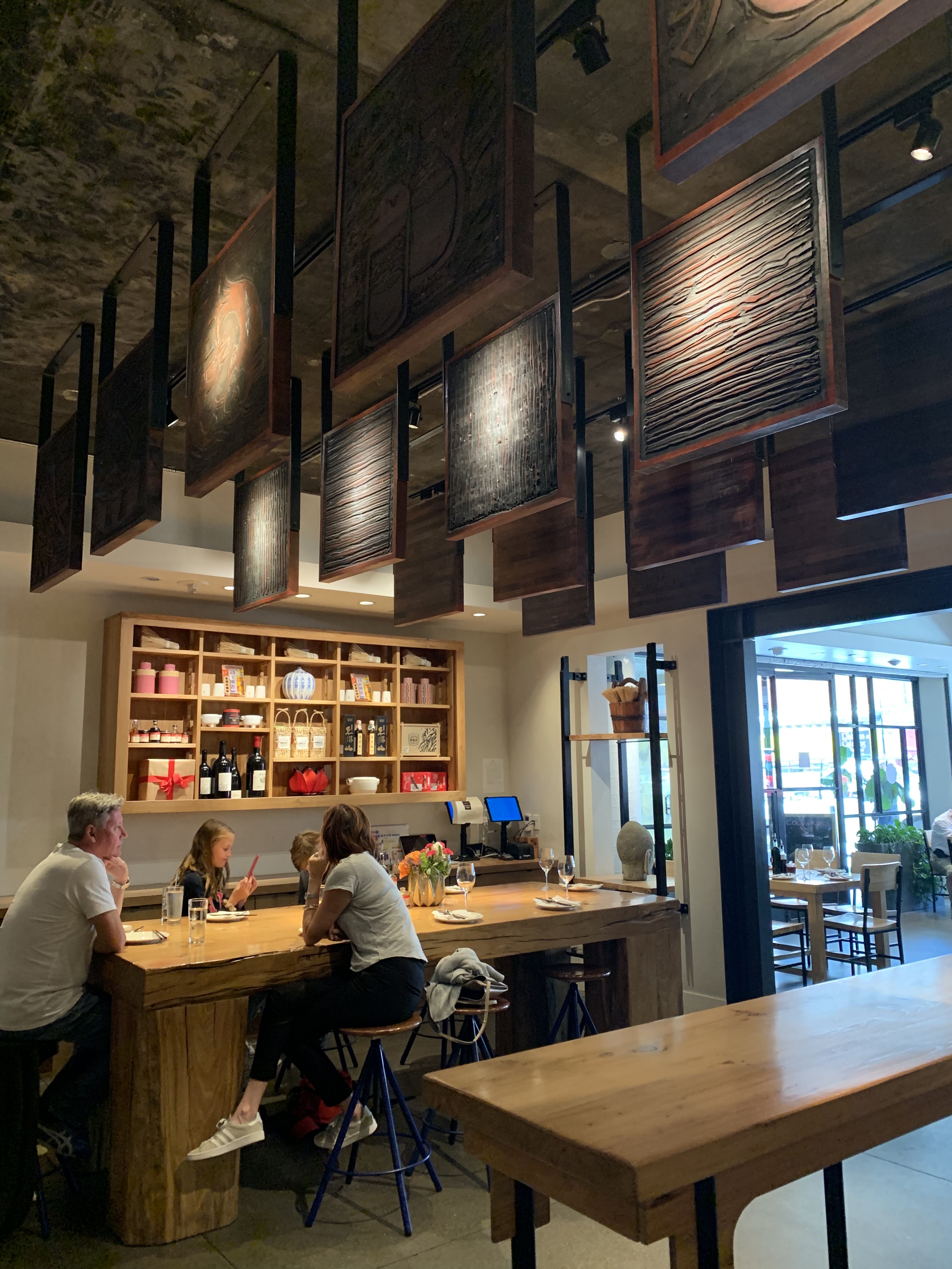
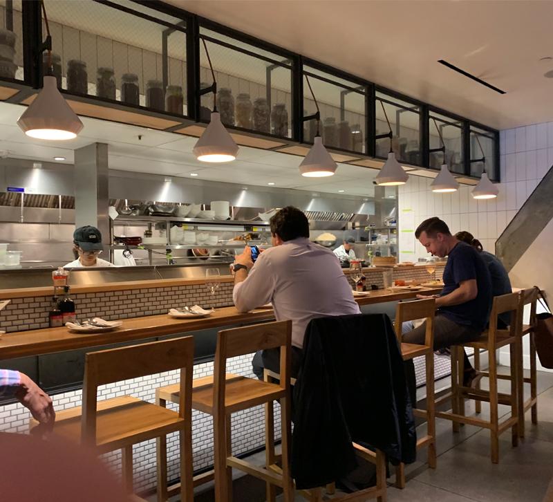
There’s a hot spot in San Francisco called China Live, which is both a restaurant and retail space. The food is fantastic, but I also noticed that my friends looked really good. It took me a few minutes to understand what was going on. Looking upwards, I saw that a series of linear troughs had been suspended from the concrete ceiling. Along the underside of these fixtures was a series of adjustable accent lights, using LED MR16’s. Then, tucked into the trough on top, was linear LED lighting, fitted with a spread lens which providing both ambient light for the space; along with a way to accent the Chinese calligraphy on the ceiling. For me, the lighting was is delicious as the food.
