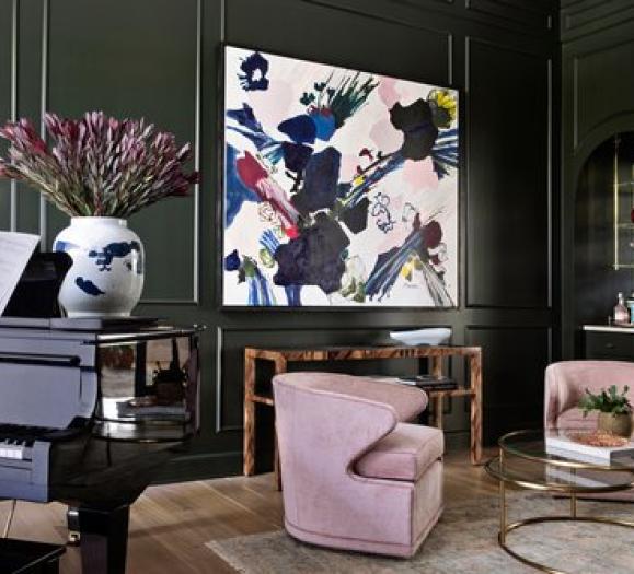
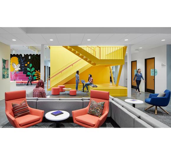
Can it already be autumn? How quickly we find ourselves transitioning to another season in the midst of these constantly transforming times. Seems we had just settled into spring when summer blossomed bringing with it the tentative return to the outdoors. We craved the comfort that being outside brought to us. Clean fresh air, an explosion of natural color, room to stretch our limbs and even time to play. This was time that was essential in the midst of a global pandemic.
Now the cool winds of change remind us that 2020 marches on. It’s now easier to navigate our situations as we have become more comfortable with things that seemed so unusual just six months ago. We’ve become more adept at managing our time as we work from home. Time with family, teaching our children, preparing meals, discovering our local communities, new ways of shopping and entertaining. Even being connected has a new meaning. “Zooming” shifted from meaning to move or travel very quickly to being stationary for hours on end.
In the midst of this re-framing, it’s impossible to see our creative community in person. As trade shows moved online we were offered a digital edition of the September 2020 Maison & Objet. We enjoyed an unprecedented event featuring a comprehensive program for all those eager to explore new trends, discover new gems and make new connections despite being separated by the miles.
I am struck by the effects of this pandemic on our current trends. Nature has risen to take the influential lead. We seek a fundamental foundation upon which to rebuild, renew, restructure and regenerate.
Overcast
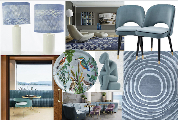
A new and nuanced blue-grey recalling a disturbance in the skies above. Overcast offers the expectation of hope and optimism. This moody color represents the trust we put in blue and in ourselves, representing potential and prescience. The refreshing rain will come to rejuvenate and new life will spring up. Seen in rounded simple forms, curved to offer comfort and calm. This is a color of resilience and renewal.
Watercolor
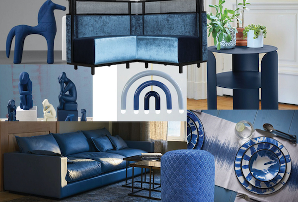
A new blue-casted deep turquoise that refreshes and inspires. Drawn from the cool watery tones of clean, fresh lakes, calm Caribbean seas and deep oceanic water. Restful and reinvigorating, we know we can begin again. A color that recalls a clean slate, like water on the sand, creating a blank canvas. Watercolor is waiting for a new story to be painted.
Forest Bathing
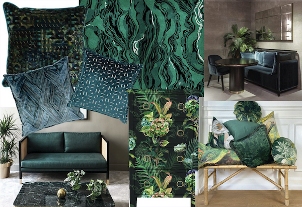
Greens found in the deepest parts of the forest refresh us. Brushed with a bit of the brightness of blue, this botanical hue has a hint of the depths of the jungle when the sun dapples on layers of lush leaves. Take a tropical turn, get outside and bathe yourself in forest fronds that are larger than life and heal the soul.
Dried Herbs
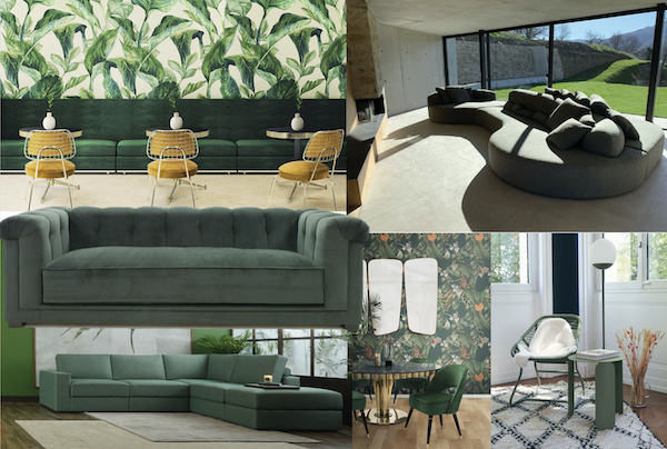
Nature gave us herbs for healing and revitalization. Parsley, sage, rosemary and thyme along with basil and bay leaf and many others, now grow in our gardens adding the necessary spice to our lives. Cooking with and for our families moves center stage as time for meals together takes on deeper and more profound meaning. Mindful rituals of preparing and sharing food return us to our roots. Sanded and sueded finishes, dry and matte, recall the very herbs that mother nature has provided.
Golden Hour
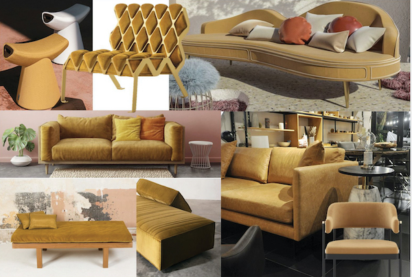
That time at the beginning of the day and the end of the day when the light shines perfectly, that is the Golden Hour. The outdoors comes alive and is seen in its best light. Nature’s colors are never truer. This warm golden yellow with a slight red cast is that perfect yellow for these times when we need to see and be our best. Held to that higher standard we rise to the occasion.
Clay Court
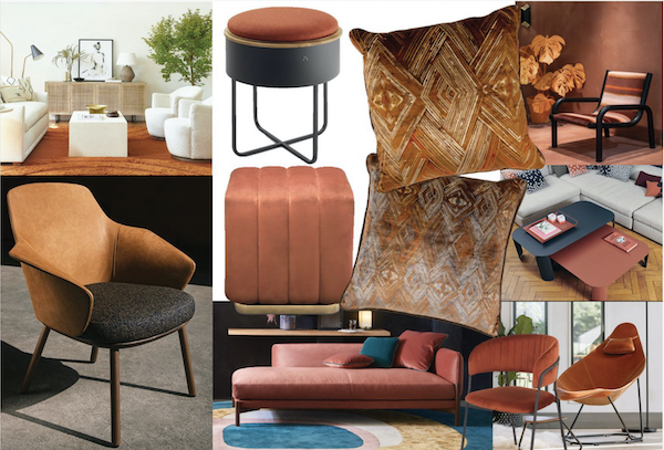
As essential as the earth beneath us, this reddened clay color is both kind and kindred. Like the terra cotta that has covered us and contained our food since ancient times, this warmed tone has an inner glow and resilience. Reminding us of the protective properties that shield us from the elements, this tangible tone is a building block for the palette and can anchor any stylish living space. As a part of the orange family, this is a color of vibrant warmth and enthusiasm.
Pipeline
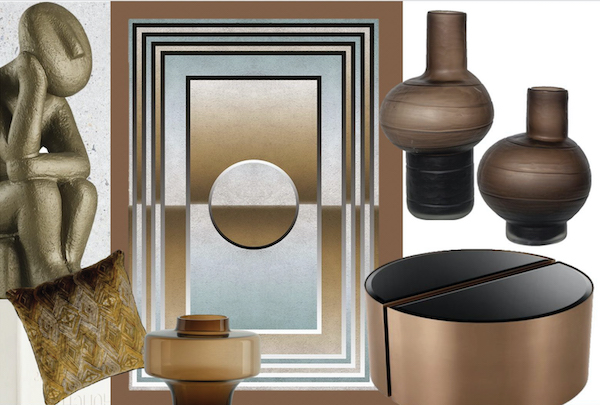
This stylish shade recalls the reliable metal pipes that intersect unseen beneath us. It resonates with an earthy endurance and has a coppery cast that imbues this tone with solidity and stability. Whether cast on carpets or coffee tables, it anchors every space with an elemental elegance. Firmly ensconced on the warm side of the neutrals, Pipeline is a conduit for sophistication this season.higher standard we rise to the occasion.
Nature's Bounty
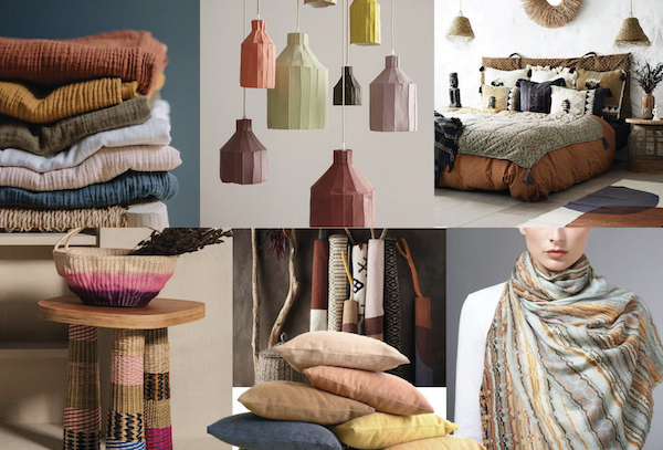
As we return to the craftsmanship of handmade quality products, this palette of Nature’s Bounty is assuring. Drawn from the colors of the earth extracted through time and technique, these subtle shades are created in collaboration with Nature. Earthy shades of colors created from tea to timber, berries to beetles will create products that call to the ancient connections within us all. Older techniques yield a palette of colors that run the range of all of Nature’s bounty.
Pandemic Palette
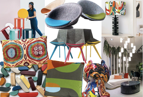
This palette of Pandemic buoyant brights is optimistic through its clash of chaotic colors all working together. Rich ripe reds, rusts and saffron yellows add warmth beside the bright coolness of teal and turquoise, all grounded in gray and navy blue. Use this palette to pop on pillows and accent pieces. Prints recalling patchwork, pop art and swirls are a confident and cheerful addition to any space.


