This week, Dallas Market Center saw a ton of interior designers flowing in and out of IHDC and the World Trade Center for Dallas Design Week. From seminars to panel discussions to networking parties, there's been plenty to take in and even more to learn.
Couldn't make it to Dallas? Fear not! Here are three designer tips from this week's seminars.
Every designer needs a signature style
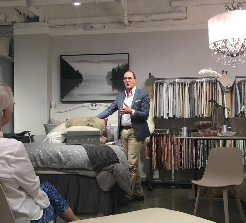
No matter what project he's working on, interior designer Paul Thompson incorporates two key elements into his designs: original artwork and great bathroom lighting.
Art, he said at a talk in the Daniel Stuart Studio showroom, is one of those elements that clients don't often think about, but it always has an unexpected impact. The art doesn't have to be priceless. It just has to speak to the homeowner. In the bathroom, good lighting sets the confidence level for the person using it. Though pendants and sconces above the mirror may look great, remember that the best light for applying makeup comes from the sides of the mirror.
"You should walk out of the bathroom thinking, 'I can do this,'" he said.
Treat your Instagram followers like your tribe
Designer and author Michelle Nussbaumer loves to travel the world. Recently, she took a trip to Africa and posted photos to her Instagram account. In the comments, her followers living in Africa asked her to grab coffee and meet up.
Social media is all about communicating, so if you're social with your followers, they'll be social with you. When people comment on your posts, answer them back and build a community. When you post, ask a question of your followers to encourage conversation and chime in when you get people talking.
Down the line, your tribe might recommend you for projects for their friends or buy products when you get your first licensing deal.
Don't build it; suggest it
Over his decades-long career, Barry Dixon's worked on home both brand new and hundreds of years old. His current home in Virginia is among the latter group, so when he was designing it, he couldn't just knock down any wall he wanted. Some of them were two feet thick.
But Dixon still wanted to separate large rooms in his home, so he used sheer hanging fabrics and screens to suggest walls rather than add them. The screens add a decretive element to the room, and the sheer fabric allows for a little bit of privacy and for light to still filter through the fabric.
Were you at Dallas Design Week? Share with us what you learned in the comments!


