

The 2018 Color of the Year announcements from paint companies have started to roll in, and from the looks of it, 2018 is going to be one expressive year. From brooding black-blue to confident red, the predictions so far represent a warming trend and a move toward bolder, richer and deeper hues.
Sherwin-Williams just announced its choice — an evocative, blue-green shade called Oceanside SW 6496. We spoke with Michelle Lamb, Editorial Director of The Trend Curve in Eden Prairie, MN to get her expert insight on where the color fits in the 2018 design landscape. Read on for the scoop on Oceanside as well as a roundup on 2018 Color of the Year choices from PPG, Dutch Boy, Glidden and Benjamin Moore.
Sherwin-Williams
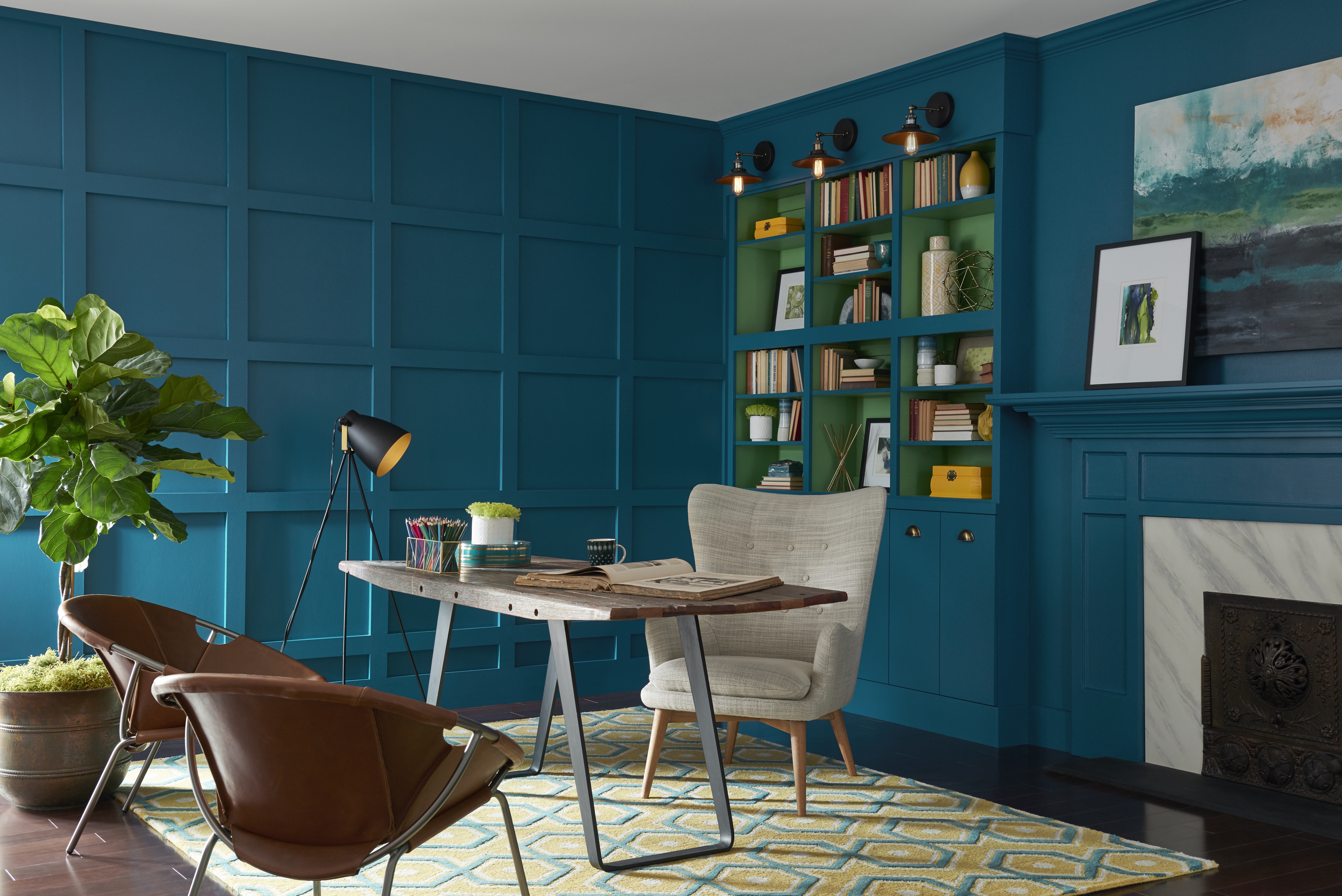
The Sherwin-Williams 2018 Color of the Year pick, Oceanside, balances depth with accessibility. Lamb says the comforting color is a strong choice and fits the trend of warming blues and an overall palette that’s trending toward warmth. She adds that deep, saturated values like Oceanside have been gaining steam for a while and will continue to take hold in 2018. She calls this palette “moody deeps.”
For Lamb, this trend reflects the darkness many people have been feeling over the past year and their desire to express that along with some hope.
“They’re not willing to go over the edge and they’re not willing to be defeated by it, so we’ll see these dark colors — and maybe they’re enhanced by a gold metallic or a floral pattern on a dark ground,” Lamb says. “We’re not saying this is terrible and I can never recover from it, we’re saying I don’t really like what’s happening at this moment but I also have a reason to feel optimistic. Even with these dark colors, we can express both.”
Lamb adds that Oceanside will work beautifully with greys and browns and everything in between. In 2018, Lamb says we can expect to see the use of analogous blues, like Oceanside and a navy, side by side. The color also complements the trending tropical style as well as farm-to-table and hygge movements, she says.
PPG
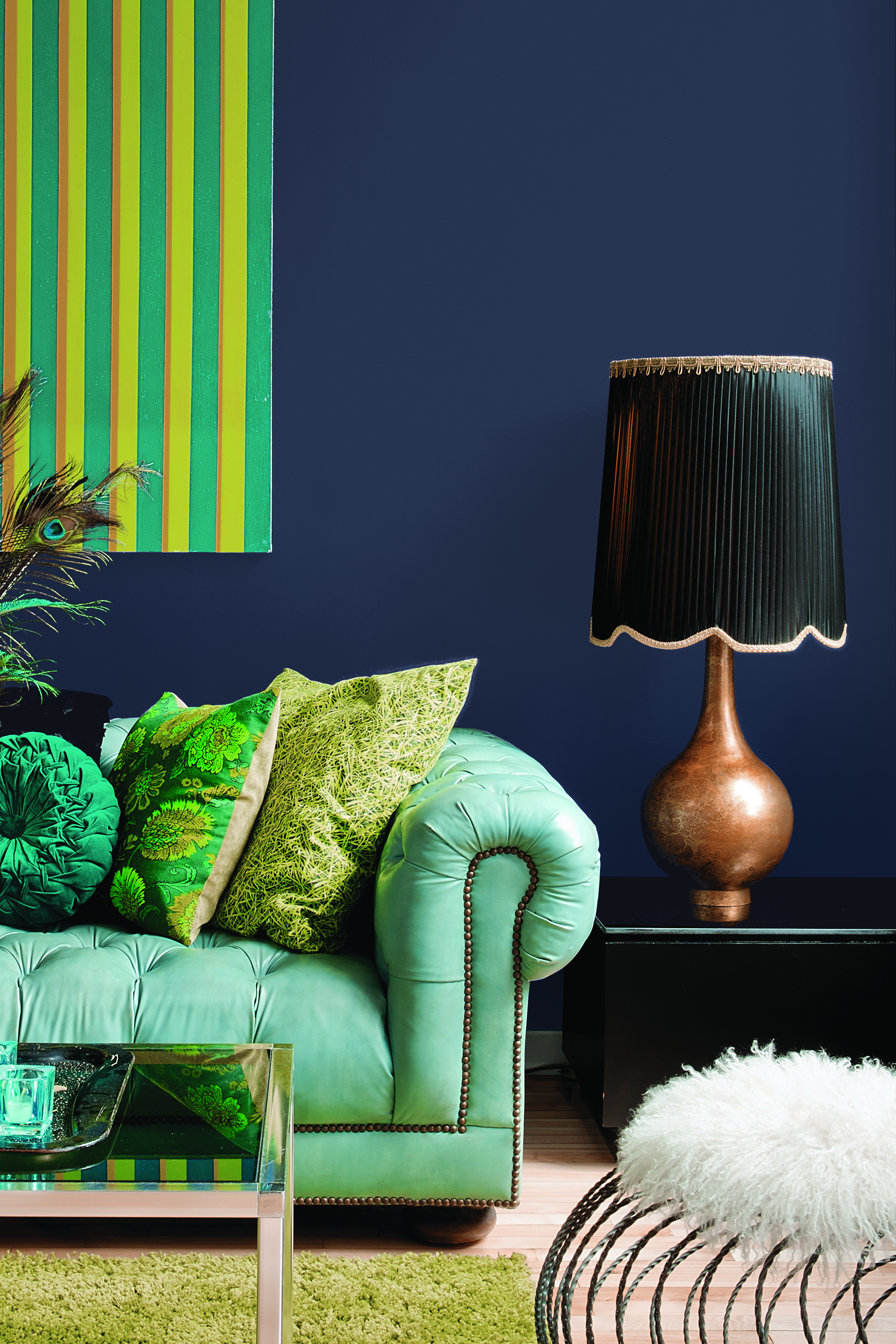
PPG’s 2018 choice is Black Flame, a blend of black and navy that allows decor elements in a space to pop. This color choice reflects a society facing overstimulation and the desire to take refuge.
“Black creates the silence we crave in an information-heavy world, while the navy offers possibility and a deep hopefulness,” PPG Senior Color Marketing Manager Dee Schlotter said in a statement. “The blend of two colors makes it incredibly versatile.”
The company suggests using Black Flame on a statement wall, with a matte finish on a ceiling, with a high gloss on a naturally-lit staircase, on cabinets and on interior and exterior doors. When paired with whites, blush pinks and pastels, this color brings a modern luxe vibe to a space.
Dutch Boy
Dutch Boy’s pick is Sandstone Tint, a light greige with warm undertones. This pick reflects the warming of color choices, including neutrals. According to a Dutch Boy statement, Sandstone Tint nods to the simplicity of the past while also making a modern, color-confident statement that looks to the future.
"We chose Sandstone Tint as the 2018 Color of the Year as it captures the essence of our ever-evolving world,” said Rachel Skafidas, Color and Design Manager at Dutch Boy Paints. “Its adaptability is another reason we love it so much: it can serve as a blank canvas for bold or neutral color pairings and everything in-between.”
The color serves as a neutral backdrop that allows colorful decor to pop and pairs well with weathered wood, hand-crafted terracotta and metallic accessories.
Glidden
For 2018, Glidden offers a no-fuss shade of black: Deep Onyx. Misty Yeomans, PPG Color Marketing Manager for Glidden says while using a black paint on walls or decor may seem intimidating, it’s an easy way to create a low-key, easygoing look.
“Black can be overlooked as a neutral color, but it works well on an accent wall or as an alternative to white paint on doors, trim and cabinets,” Yeomans said. “The sense of ease and authenticity it brings to a home can’t be denied. Just like a little black dress, Deep Onyx is a classic, timeless staple.”
Benjamin Moore
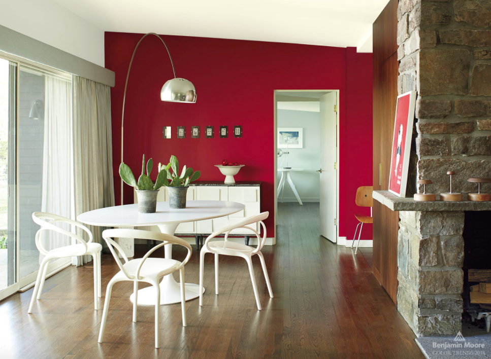
Benjamin Moore brings the heat with it’s 2018 pick, a bold red called Caliente AF-290. The vibrant, confident shade offers another head-turning alternative to neutrals.
Ellen O’Neill, Director of Strategic Design Intelligence at Benjamin Moore, said the radiant, passionate color evokes the sensation of “red carpet treatment.”
“Whether used as one note or on four walls, the spirited personality of red turns heads signaling surprise and adventure,” she said. “The eye can’t help but follow its bold strokes.”
")


