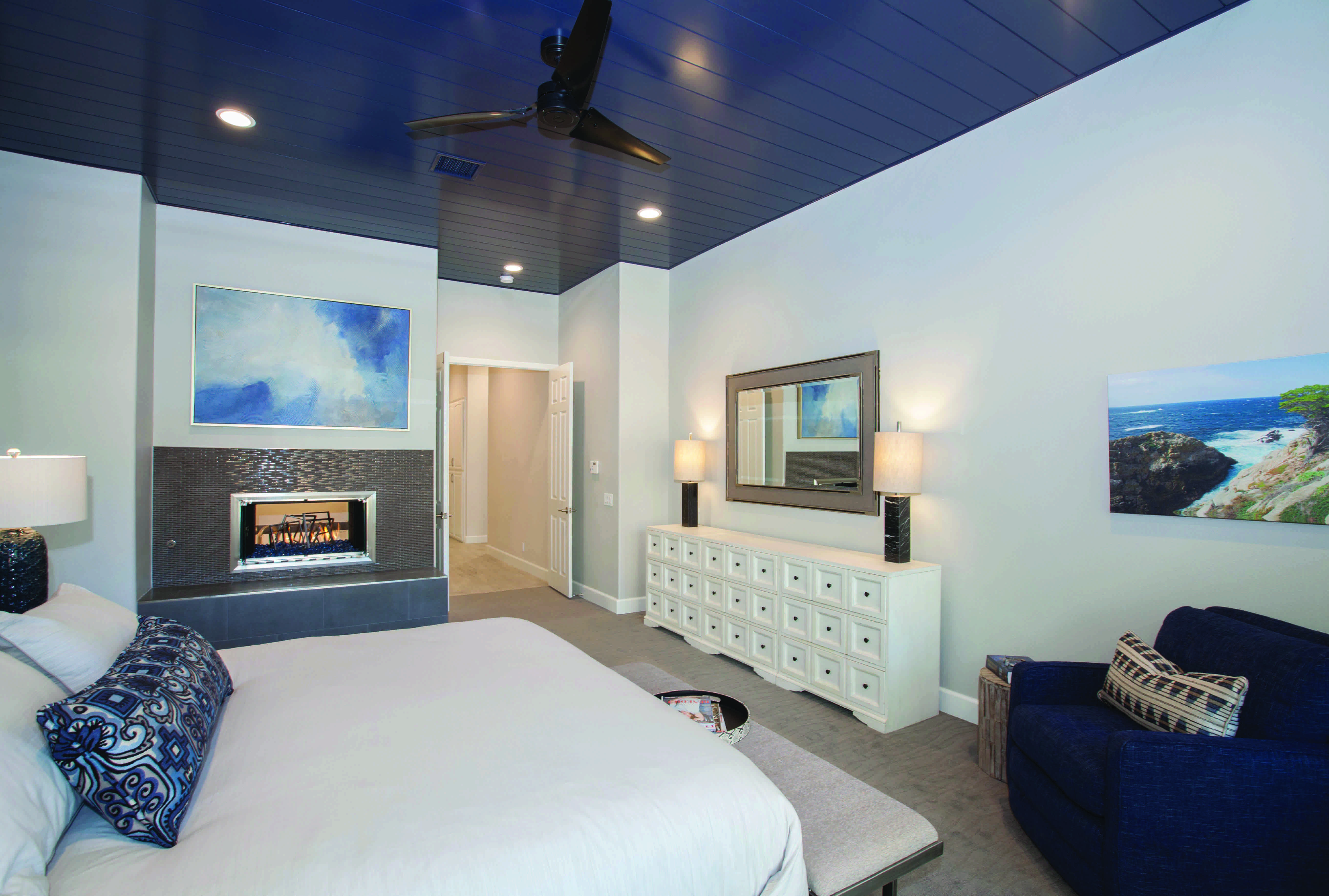
The Interior Design Society (IDS) named the winners of its 2017 Designer of the Year competition in Savannah, GA, during its annual conference on May 2. Award recipients were selected by an expert panel of judges that included: designer Robin Baron; designer Barclay Butera; Furniture, Lighting & Decor’s Nicole Davis; Designers Today’s Jane Dagmi; Universal Design Institute’s Richard Duncan; Design Works International’s Nancy Fire; Zuo Modern’s Serena Martin; Rizzy Home’s Molly Mays; Phillips Collection’s Jason Phillips; designer Natalie Reddell; designer Jennifer Wagner Schmidt; and designer Jackie Von Tobel.
Below, we show you the winning projects and honorees, along with commentary about what made these spaces so special.
Dining Room
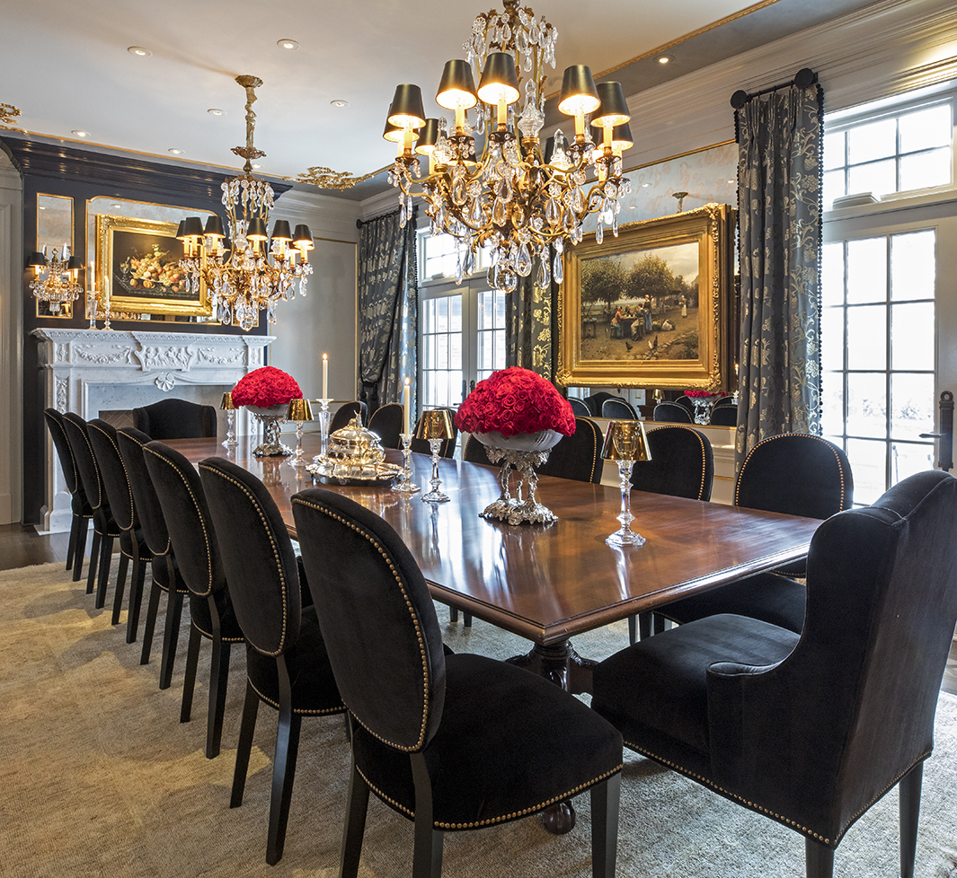
Kara Karpenske, Kamarron Design, Blaine, MN
This ornate dining room was in serious need of an update. The dated drapery and yellowing walls were weighing down the beauty of a space with truly great bones.
If you had to summarize this project in just a few words, what would you say?
Karpenske says: The room’s original bones of millwork and moulding played perfectly into the design transformation and allowed the space to remain an anchored room in this grand lakeside mansion. By using black, reflective finishes such as lacquer, mirror and gold lamé, the transformation was bold even though key pieces of furniture remained. The perfect final touch: 1,000 preserved red roses for the lady of the house.
Bathroom $30,000 and Below
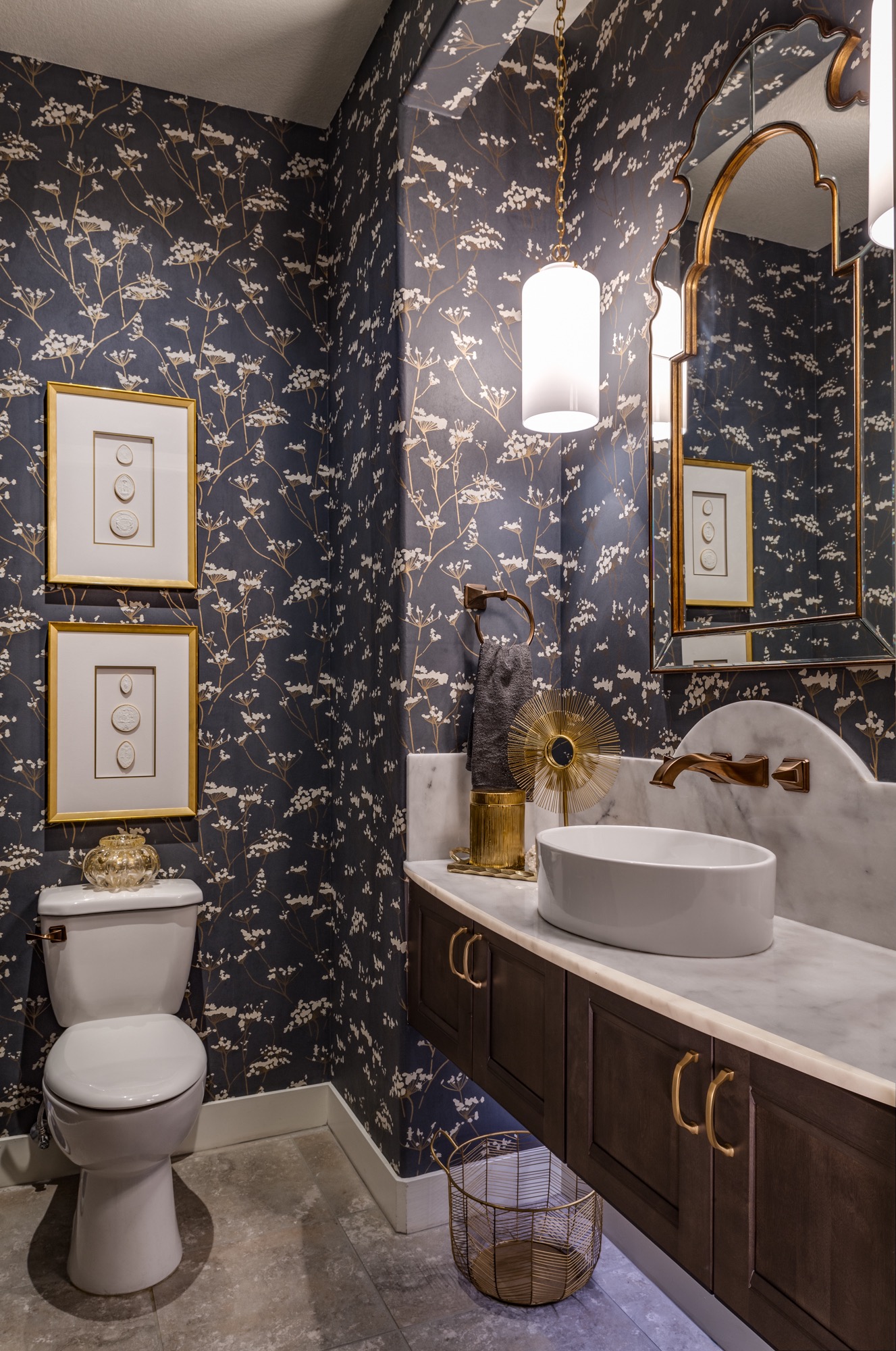
Michele Youell, Natural Domain Interiors, Henderson, NV
The client had a few general requests for this powder room: replace the pedestal sink; add more storage, keep the floor tile and create an aesthetic that would “wow” her guests.
What’s your favorite detail of this project and why?
Youell says: From a practical side, the new marble countertop and backsplash on a floating cabinet is a favorite. All females love lots of countertop space, right? We started out with a very plain builder basic bathroom with a lonely pedestal sink and transformed the room into an elegant, magical moment. We did not have much room for the countertop (18 inches on the sides), so we gave it a bow front and matched that curve with the exaggerated curved backsplash.
Bathroom $30,000 and Above
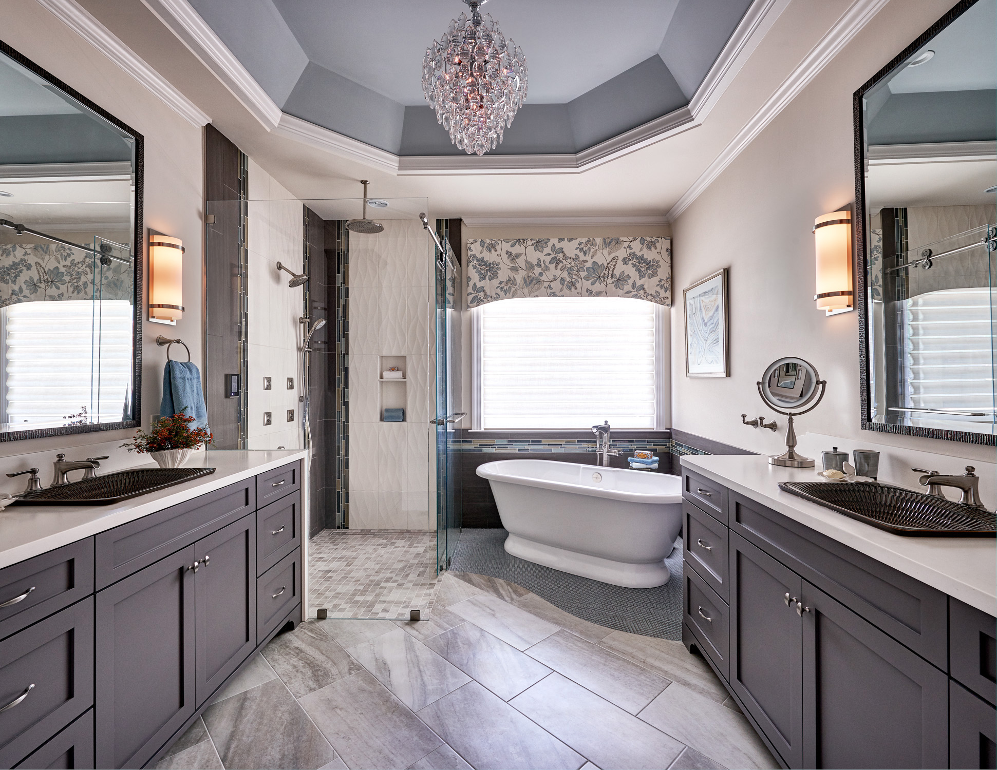
Starr Miller, Starr Miller Interior Design, Cornelius, NC
This complete master bathroom renovation brought texture and spa-like features to an incredibly dated space. The design brought in texture, a soft color palette, high-tech DTV shower controls with enhanced audio, better lighting, custom cabinetry, level shower entry and loads of other upgrades.
If you had to summarize this project in just a few words, what would you say?
Miller says: The homeowners had divergent aesthetic wish lists. The husband wanted a dark and contrasting look with interesting textures. The wife requested some light colors with a blue anchor. She wanted no yellow, sallow colors. We accomplished both with a balance in all of the finishes and very intricate tile manipulation. The art, crystal chandelier and window treatment add a tranquil softness.
Bedroom $30,000 and Below
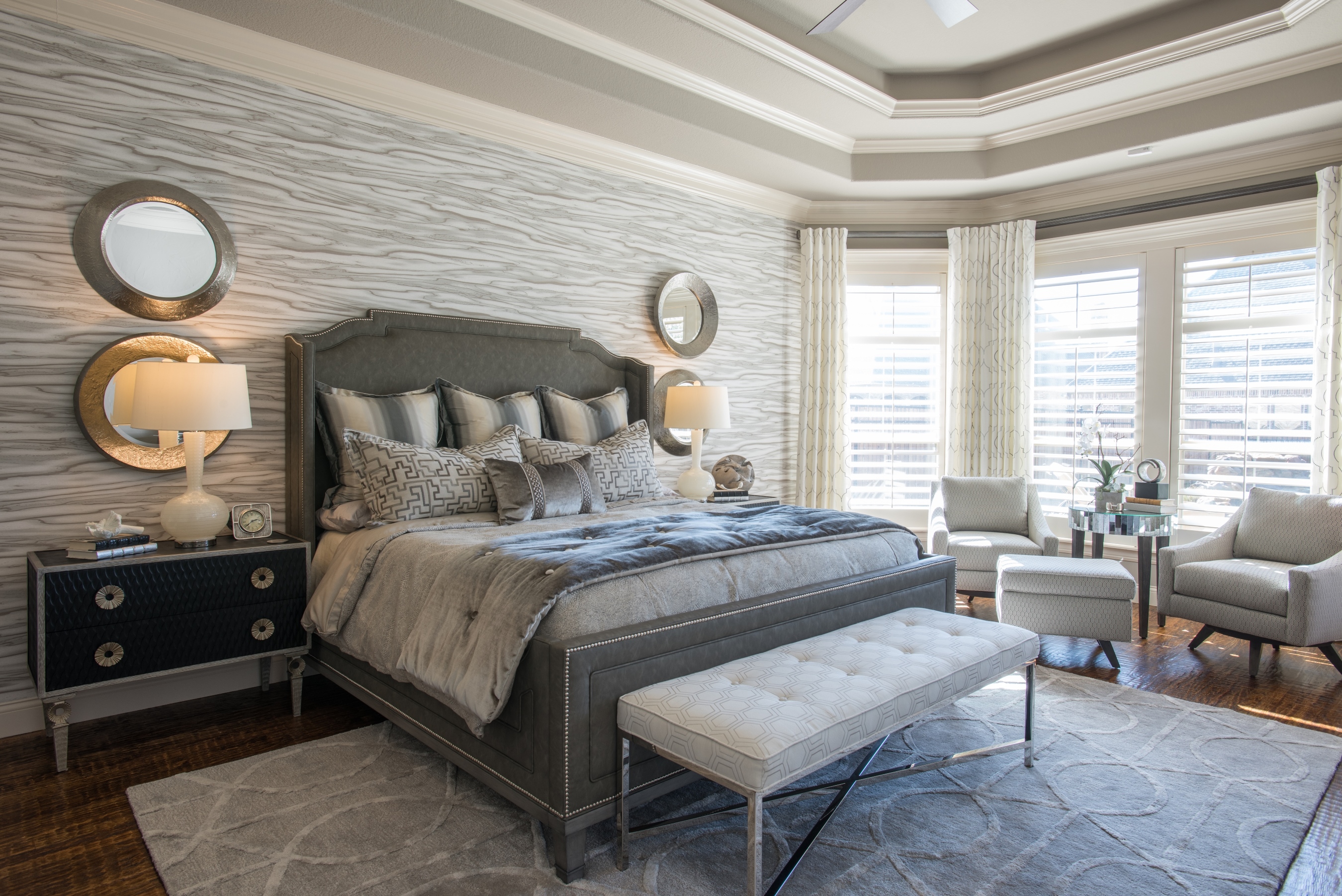
Linda Baker and Lisa Sorensen, Baker Design Group, Carrollton, TX
Ready to turn their spacious master into a true retreat, this busy couple sought to bring life, depth and function to their once utilitarian bedroom. A wash of perfectly balanced gray sets the stage for a monochromatic oasis and a watery, wood-inspired wallcovering steals the show. In juxtaposition to the wavy abstract lines, clean straight lines and circles mix throughout the space in mirrors, hardware and textile patterns.
What was the biggest challenge of this project and why?
Baker and Sorensen say: The room was long and felt very empty. We brought larger-scale pieces, such as the wide bedside chests, to ground the functions of the space without cluttering the room. The swivel chairs also create their own nook while offering flexibility to relate to both the bed area and the TV wall. The wallpaper anchoring on the wall also brings the space in to become more intimate and less expansive.
Bedroom $30,000 and Above
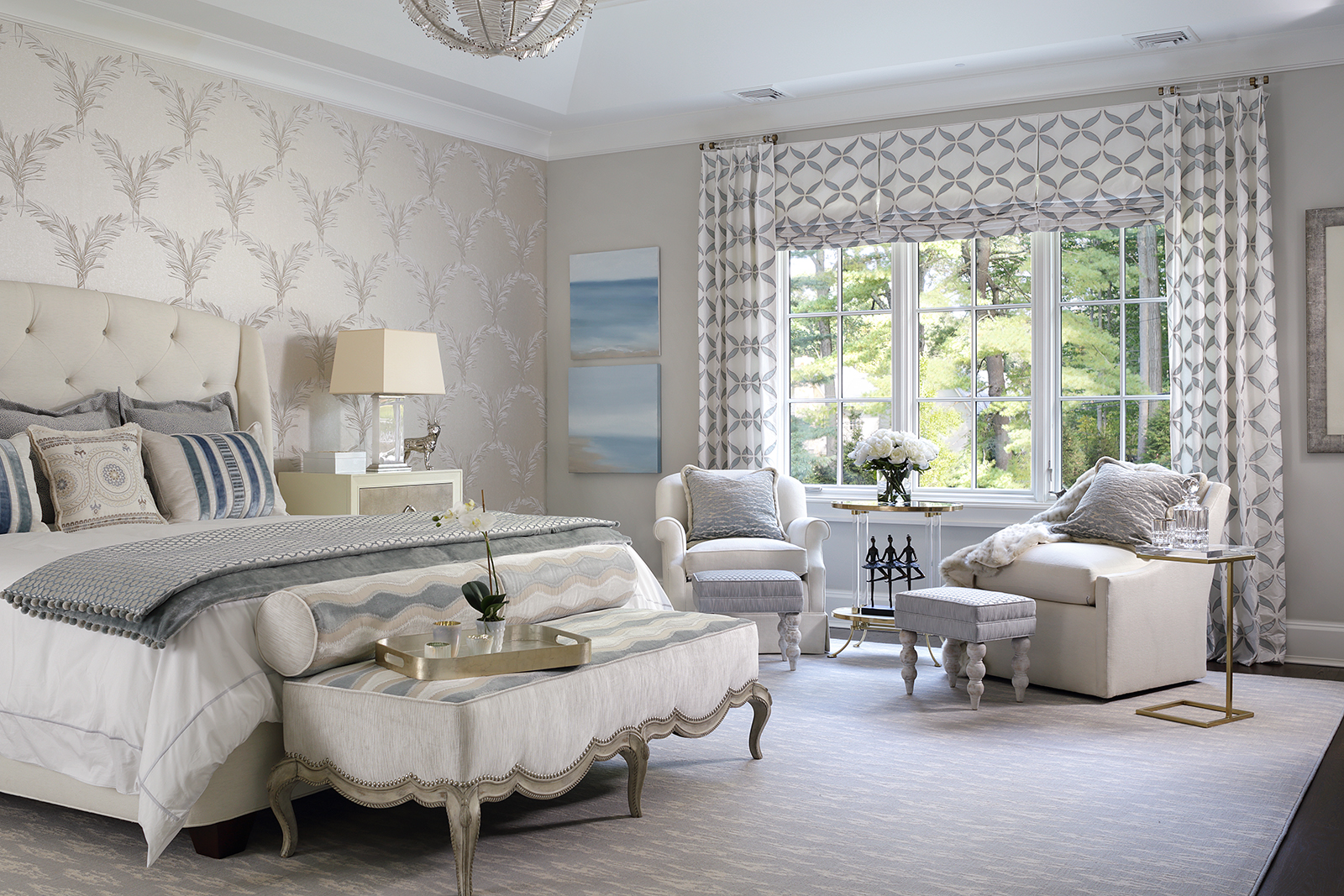
Jodie O’Connor, Jodie O’Designs, Whippany, NJ
The design concept for this space was to create a relaxing guest bedroom that would serve as a restful retreat for friends and relatives — a room that was beautiful to the eye as well as soft to the touch. Every fabric chosen reflected soft beauty. Dreamy blues with crisp white, feminine touches mixed in with a few masculine pieces lends a perfect balance.
What’s your favorite detail of this project and why?
O’Connor says: The chandelier. I love the detail of the blown glass plumes that emulate feathers. It’s so light and airy, like a bird in flight. I knew it would be perfect for the bedroom space and I designed the room around it.
Kitchen $50,000 and Below
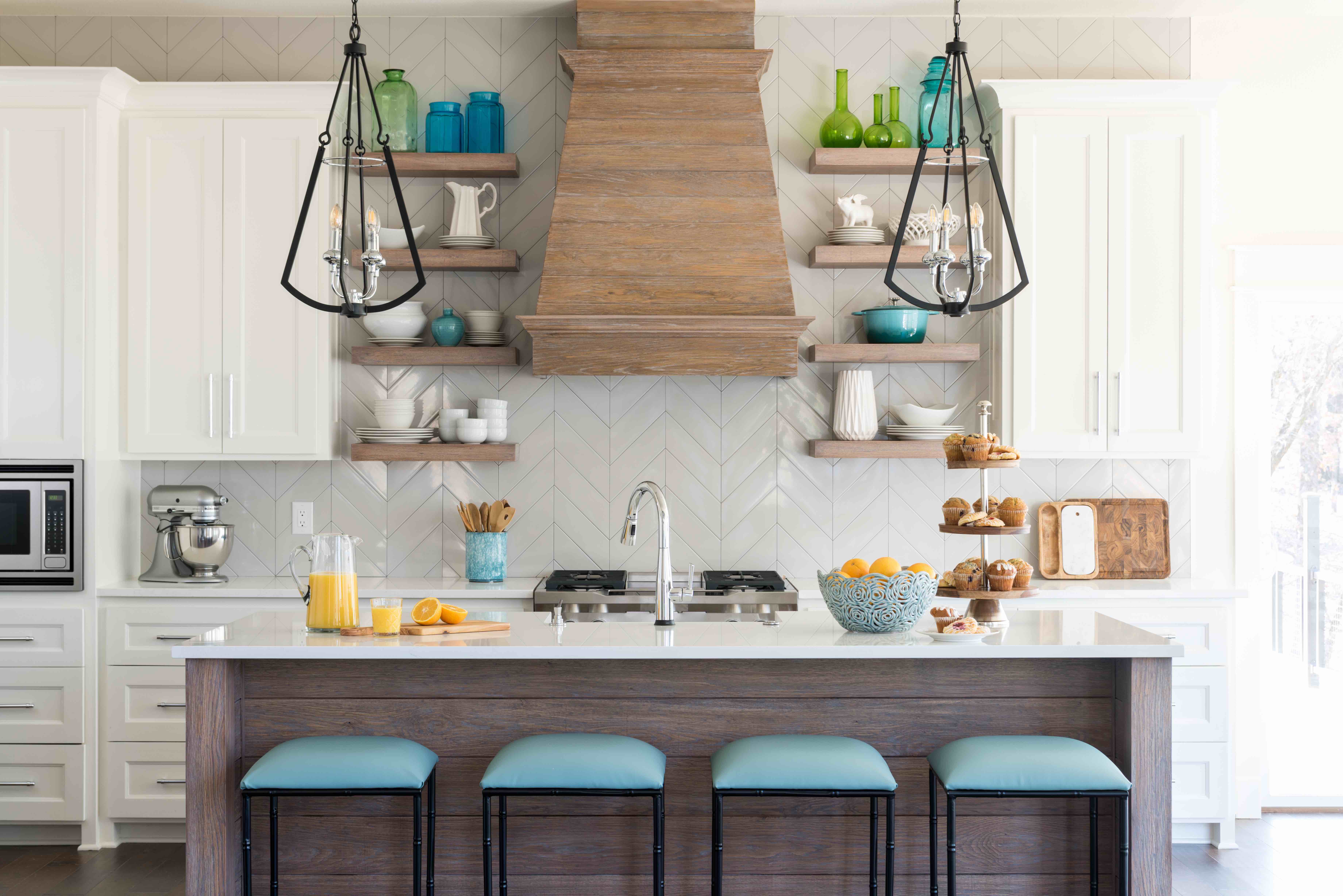
Staci Steidley, Studio Steidley, Carrollton, TX
Positioned on the edge of Lake Texoma on the Oklahoma-Texas border, this new-build home became the perfect getaway for an empty-nester couple. Recently retired, the couple longed for a cozy home off the lake that incorporated ample room for their large family to gather. Drawn to an open concept, the clients enlisted Studio Steidley to navigate interior finishes for one of the most important rooms in any home — the kitchen.
If you had to summarize this project in just a few words, what would you say?
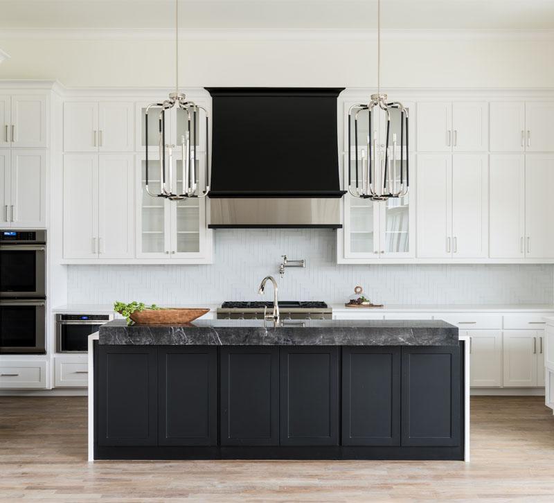
Steidley says: In designing the kitchen of this modern farmhouse lake retreat, we blended rustic and modern elements and neutral finishes with pops of color. We designed a chef’s kitchen with a budget and focused our dollars in areas with maximum impact. The combination of the sleek white cabinets with the wire brushed oak vent hood created a striking contrast in style and texture.
Kitchen $50,000 and Above
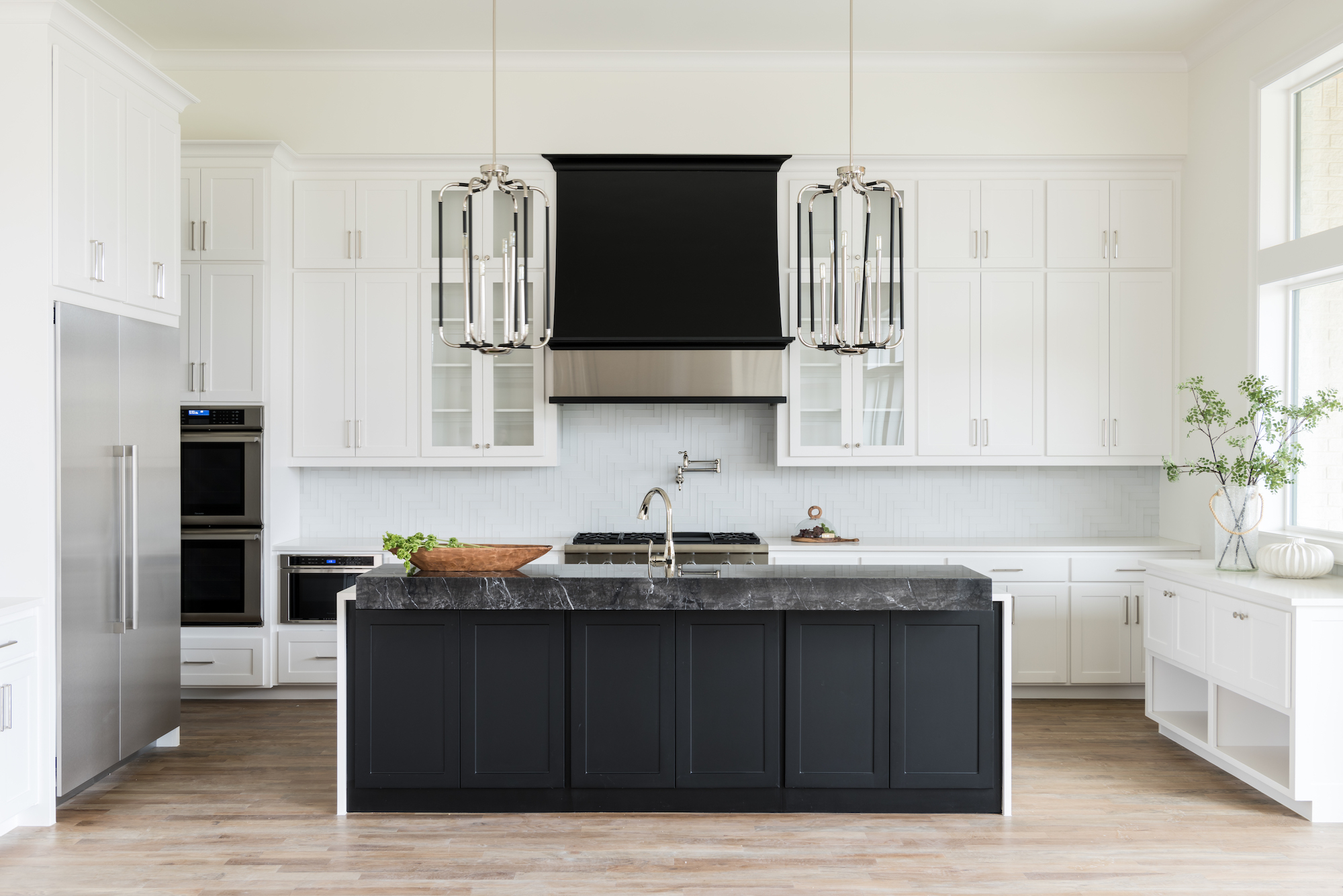
Traci Connell, Traci Connell Interiors, Dallas, TX
The vision for this project was to appeal to the younger clients of today. The lucky client of this modern kitchen entrusted Connell’s firm to create a space that would never grow old.
If you had to summarize this project in just a few words, what would you say?
Connell says: In an area where Olde World design was extremely prominent for many years, we designed this spectacular kitchen to be a direct contrast to the layers and layers of browns. We chose a stark black-and-white design. Gone are the days that everyone tries to darken up their floors, and in are the years ahead of bright, light and alive with neutral contrasts.
Living Room $30,000 and Below
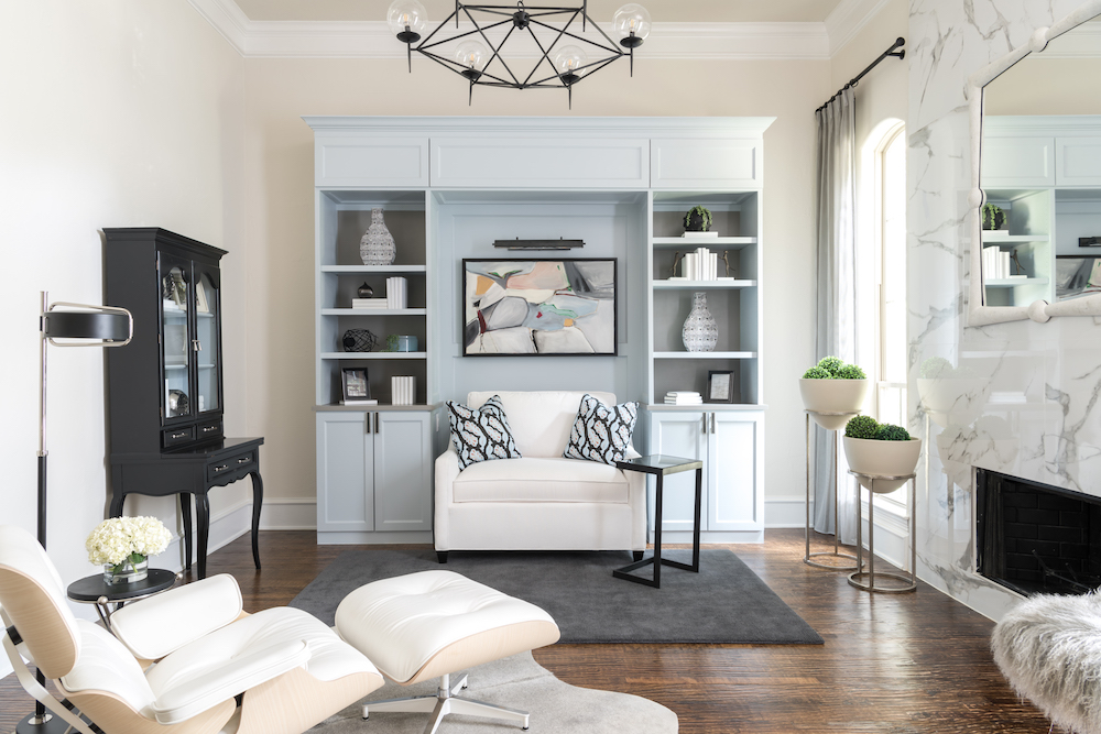
Traci Connell, Traci Connell Interiors, Dallas, TX
California causal is what this client describes as her ideal style as the designers viewed her current living room of traditional greens and gold with heavy stained accents. From spa-like blues to creams and textures, the mixed styles of modern and transitional gave this highly traditional space quite the facelift.
Love the marble wall! Can you explain what that is and how you came up with the idea?
Connell says: From what used to be a dark and seemingly dingy area, by removing old stone and adding a new marble fireplace and opening up the windows with light treatments, the aesthetics of the space bring life. By recreating a fireplace facade from old-world stone to modern-day marble slab, the superior craftsmanship was completed in a way that only skillful tactics could show. It opened a new theme throughout the space and lifted a weight off of the space that allowed it to feel lighter, airier and younger by 20 years.
Living Room $30,000 and Above
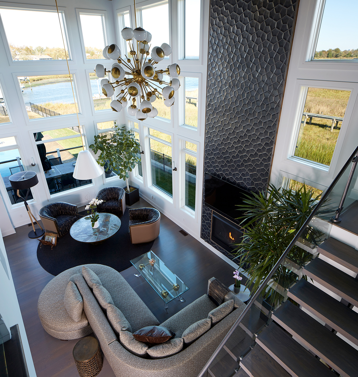
Charles Pavarini III, Pavarini Design, New York, NY
This newly married couple in their 60’s wanted a waterfront home where their blended family could join them to enjoy weekends. A black-and-white color scheme draws in the beauty of the outside and enhances the drama of the color in the couple’s extensive art collection.
The thread of geometric details, inspired by origami, marries the interior design with the contemporary architecture. The soaring dimensional-tile fireplace wall is the first introduction to the Asian folded-paper geometric influence in the house, while a custom designed wave-shaped sofa subtly brings the ocean into the room by giving a water view to every seat.
The living room sputnik chandelier brings a hip Mid-Century vibe, while the seating area’s clean cone shape focuses the light over a vintage bronze coffee table with inlaid Asian imagery.
Additional Awards
Window Treatments
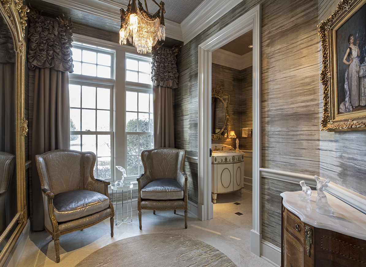
1st Place: Kara Karpenske, Kamarron Design, Blaine, MN
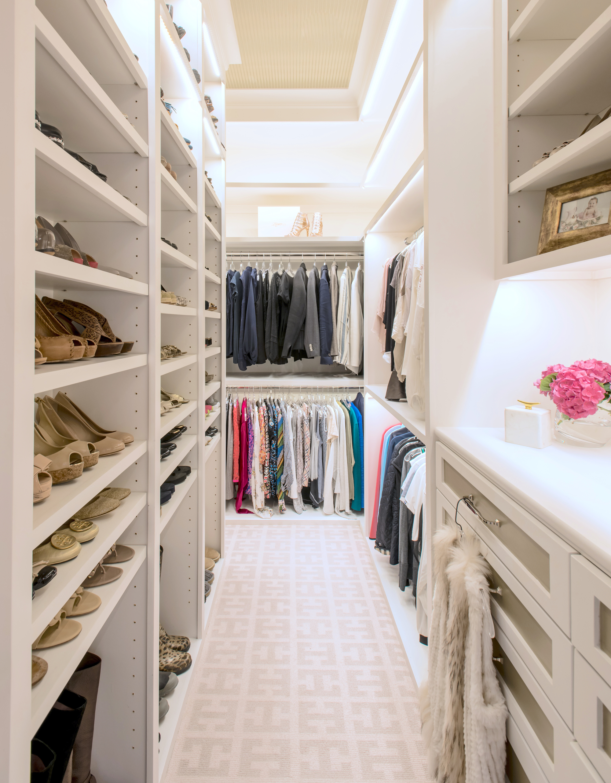
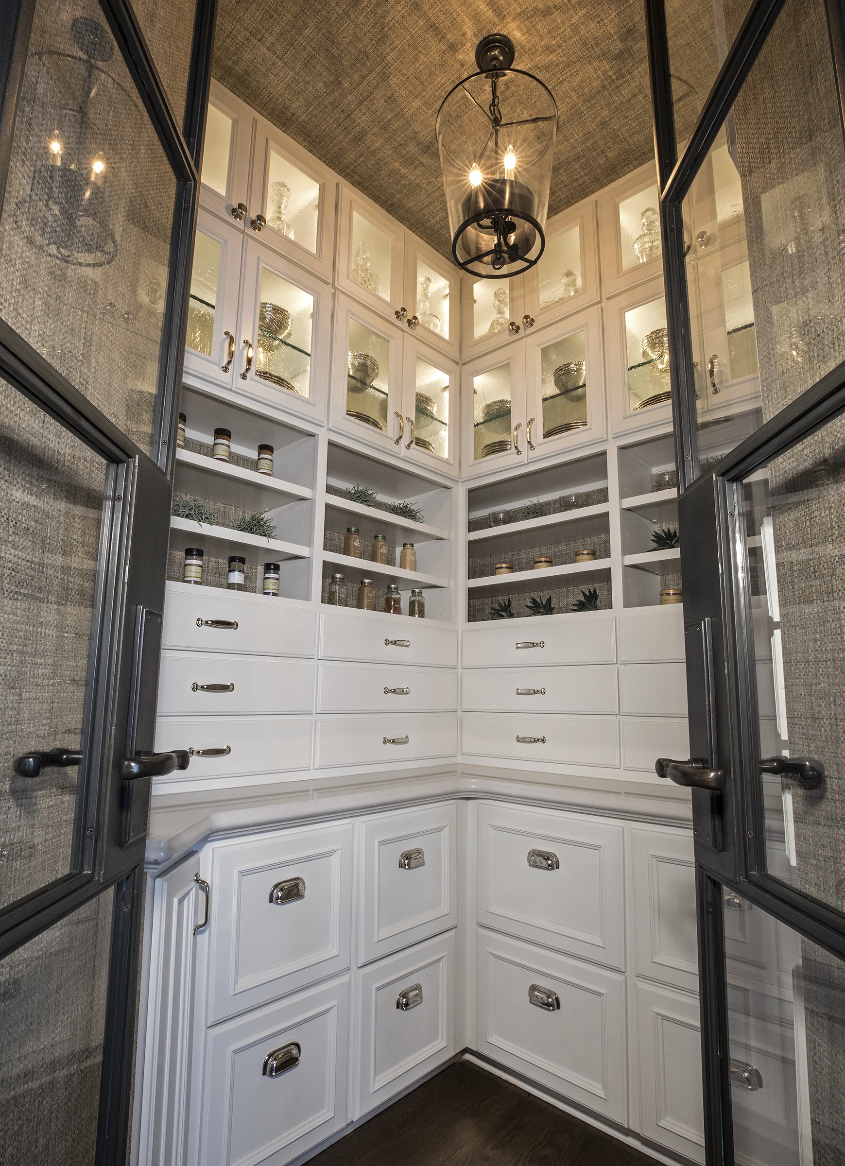
Closets
1st Place (TIE): Traci Connell, Traci Connell Interiors, Dallas TX (top)
1st Place (TIE): Kara Karpenske, Kamarron Design, Blaine, MN
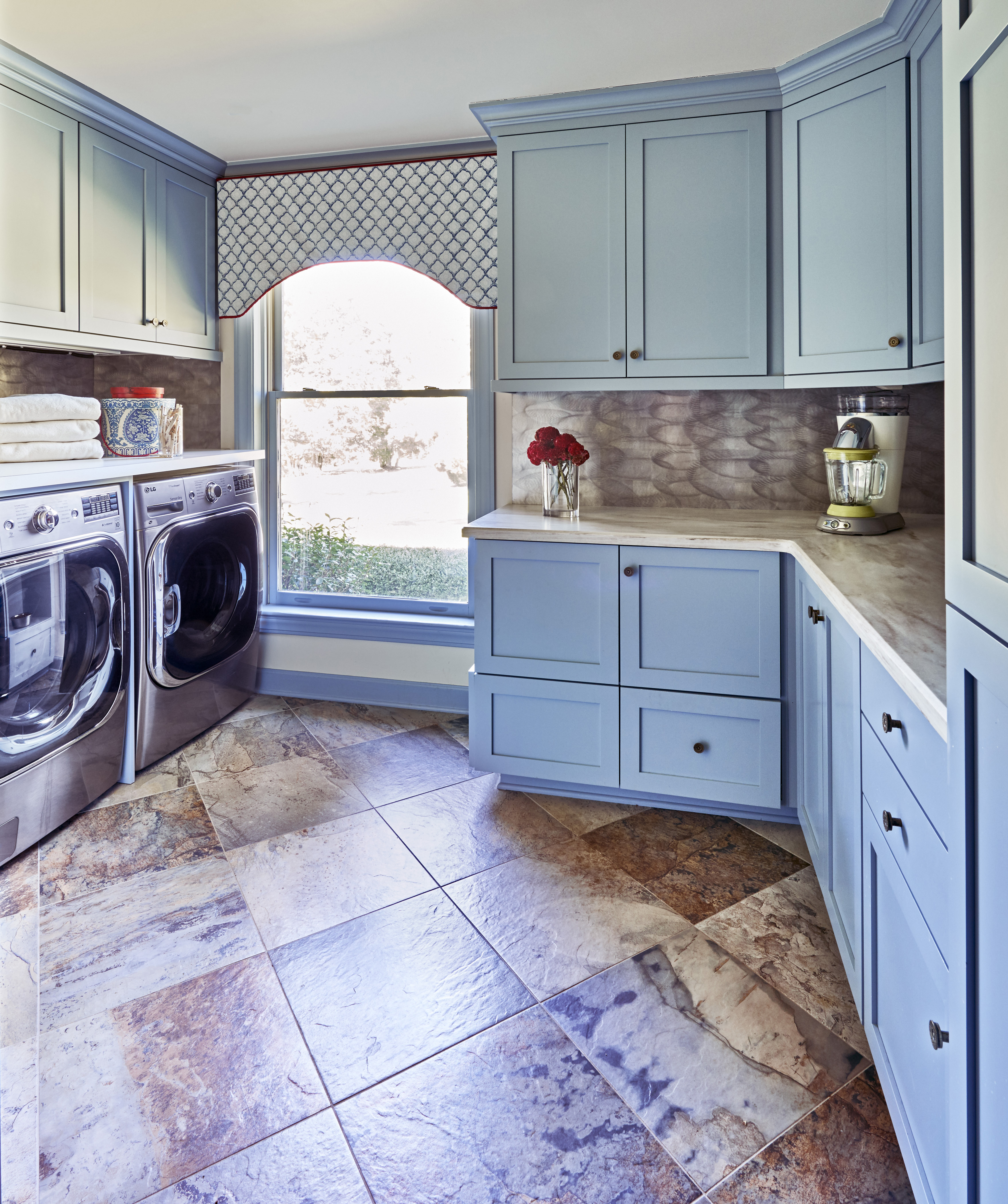
Laundry/Craft Rooms
1st Place: Starr Miller, Starr Miller Interior Design, Cornelius, NC
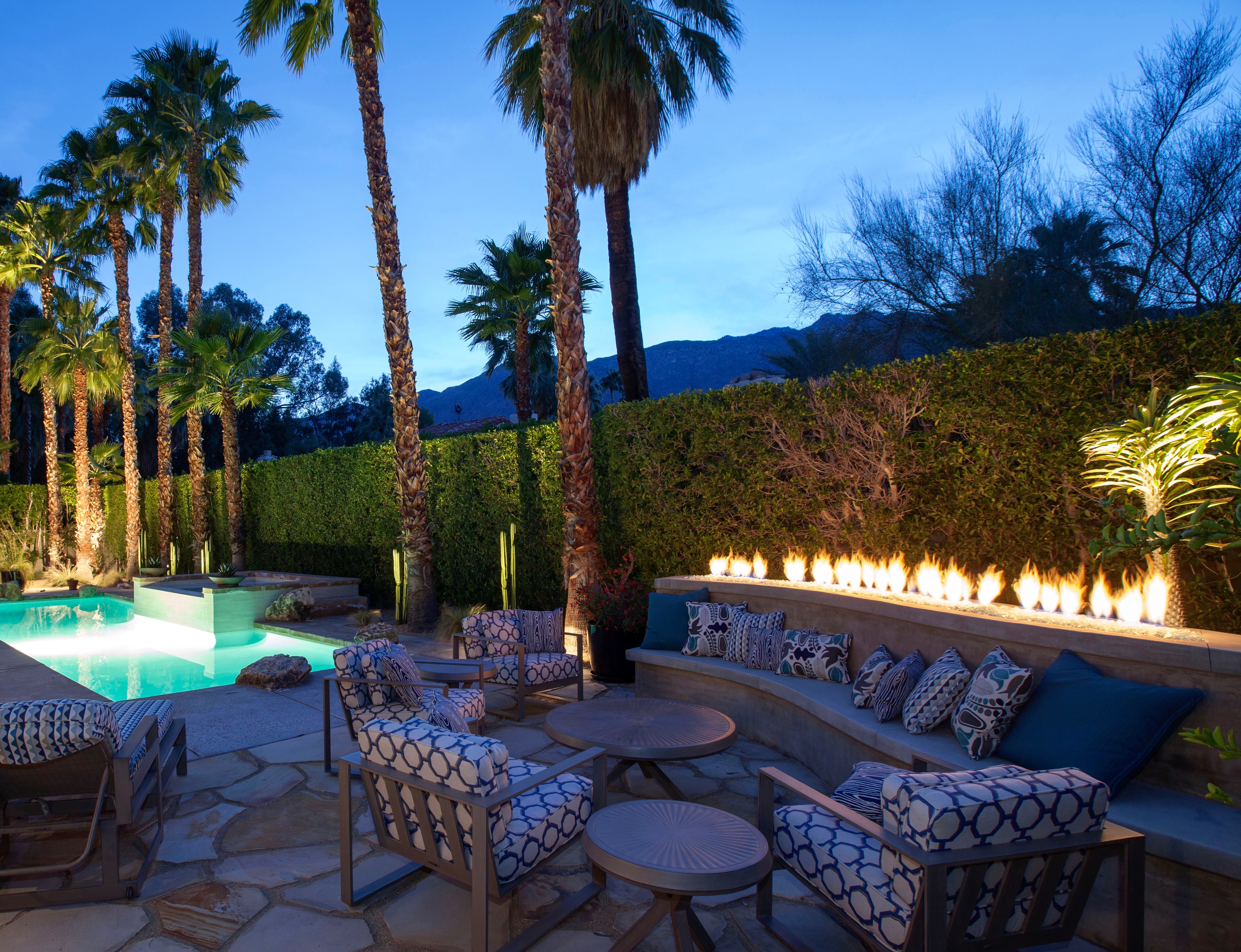
Outdoor Spaces
1st Place: Design Vision Studio, Palm Desert, CA
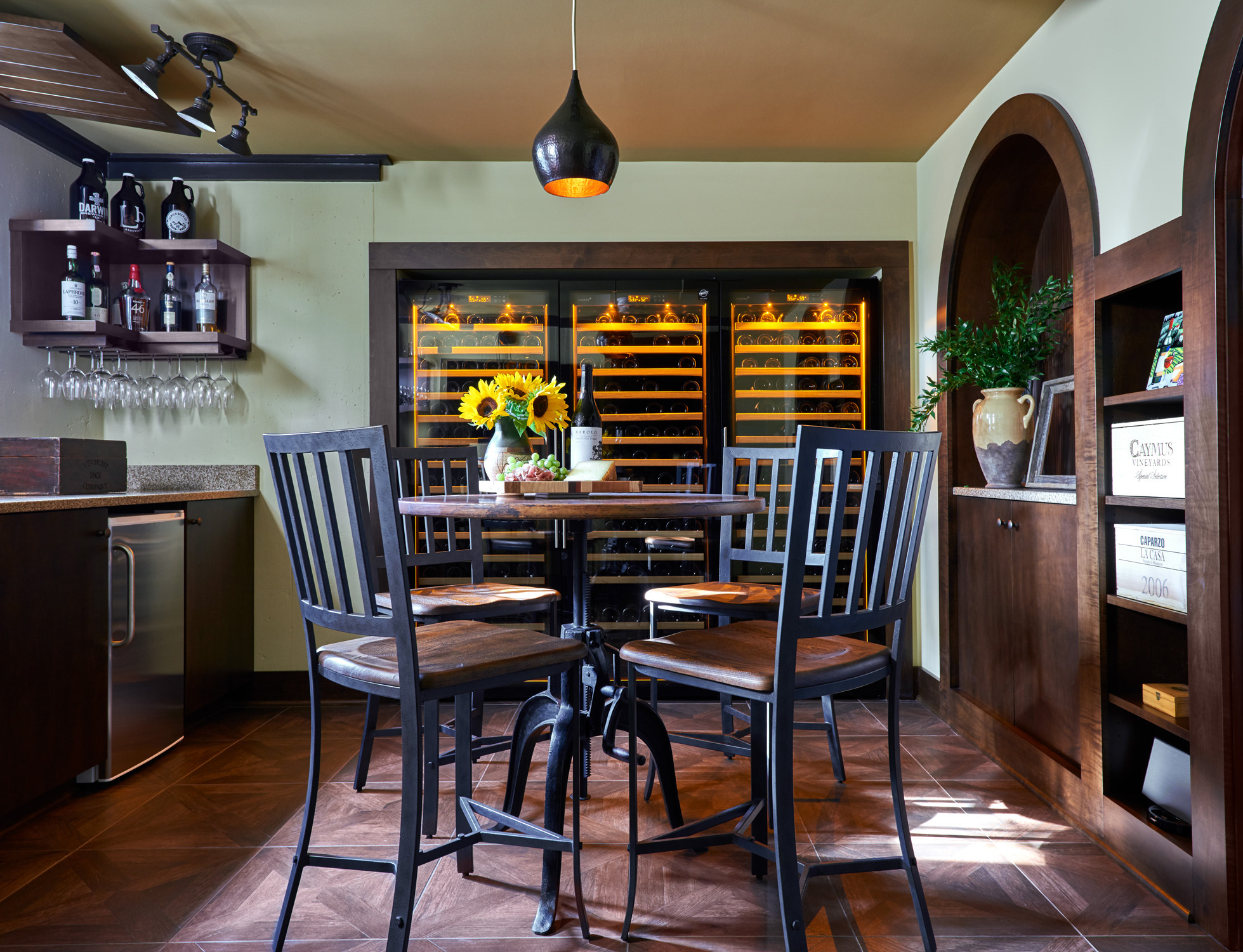
Wine Rooms
1st Place: Starr Miller, Starr Miller Interior Design, Cornelius, NC
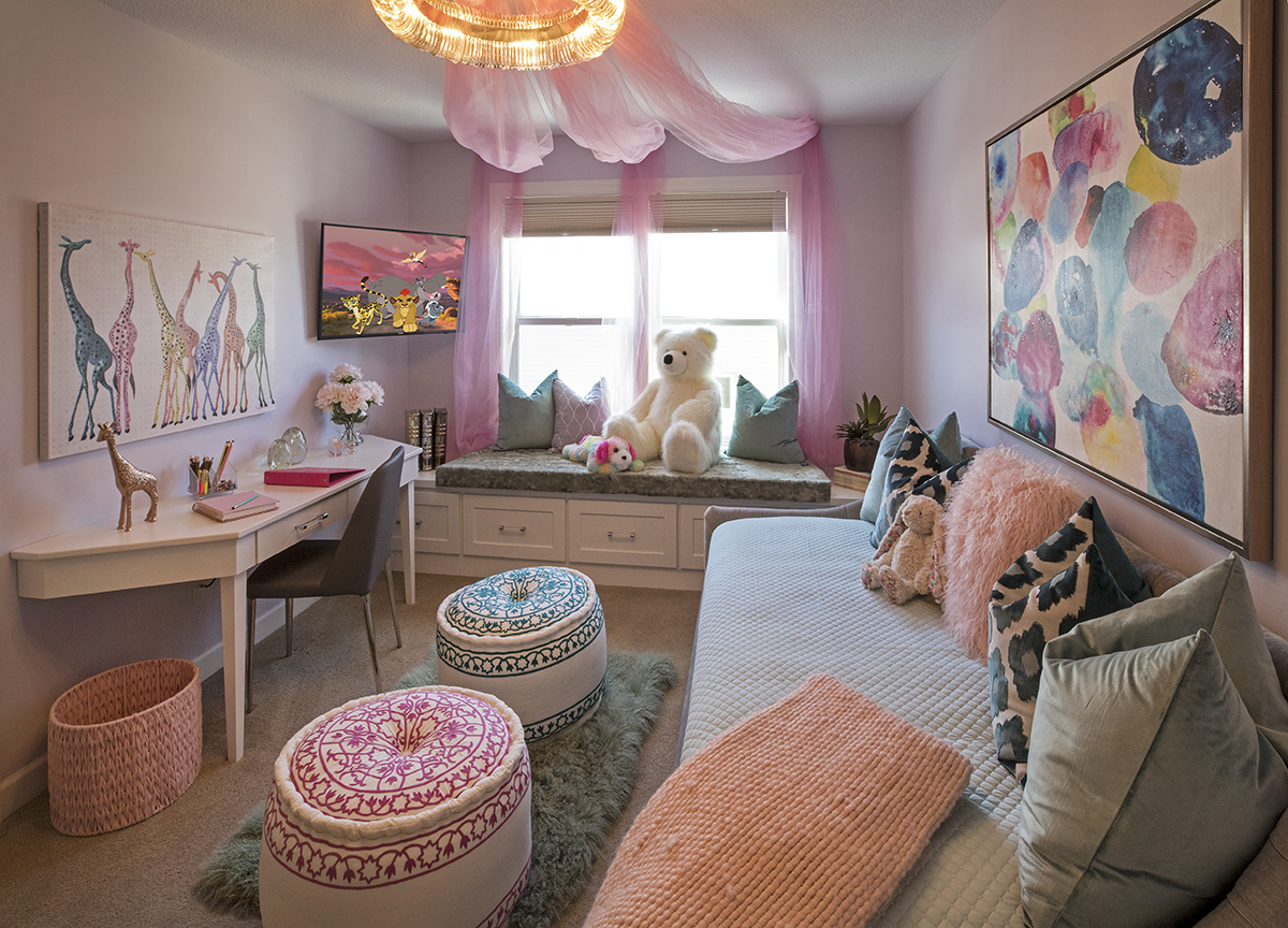
Children’s Areas
1st Place, Kara Karpenske, Kamarron Design, Blaine, MN
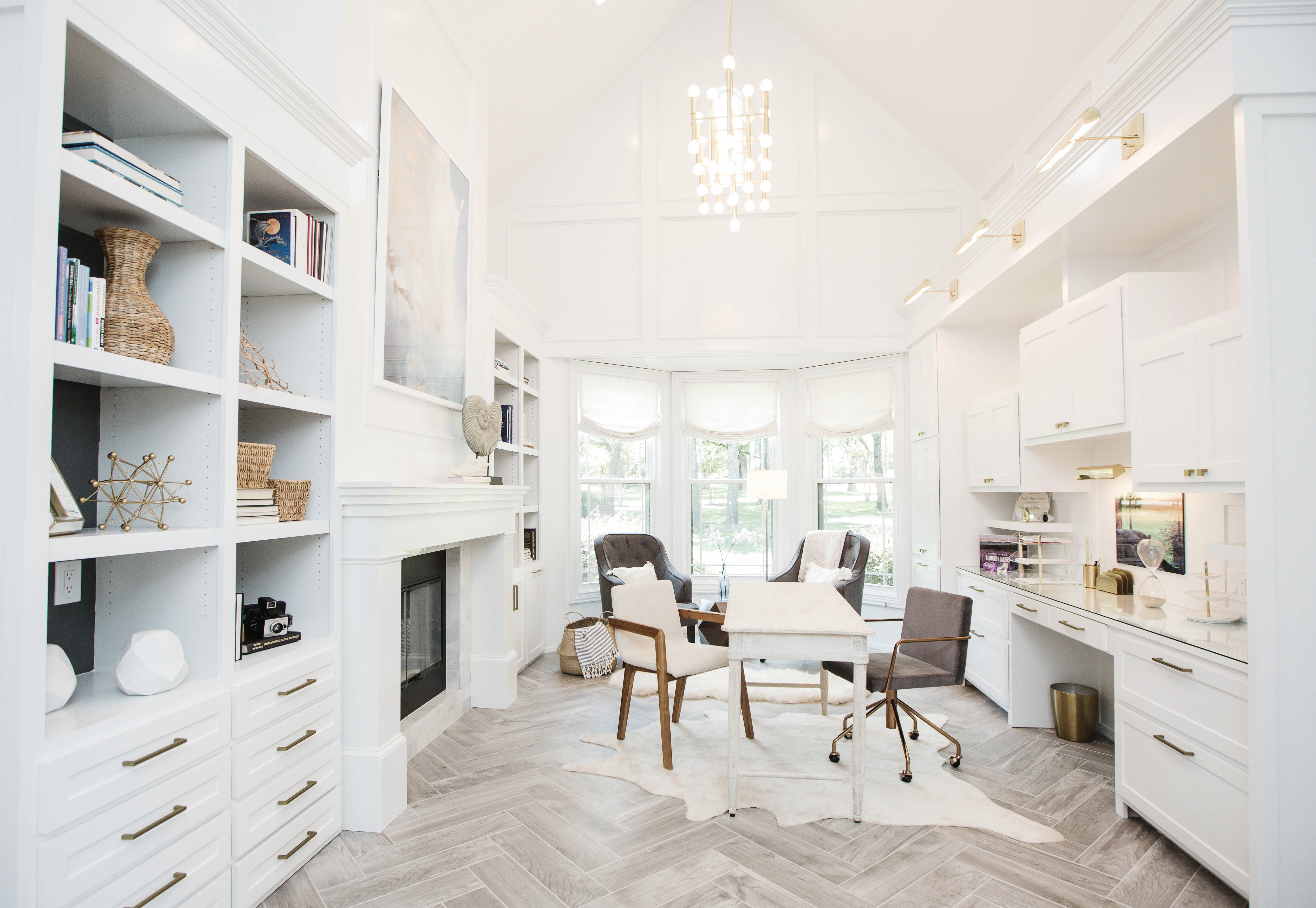
Home Office
1st Place: Ginger Curtis, Urbanology Designs, Dallas, TX
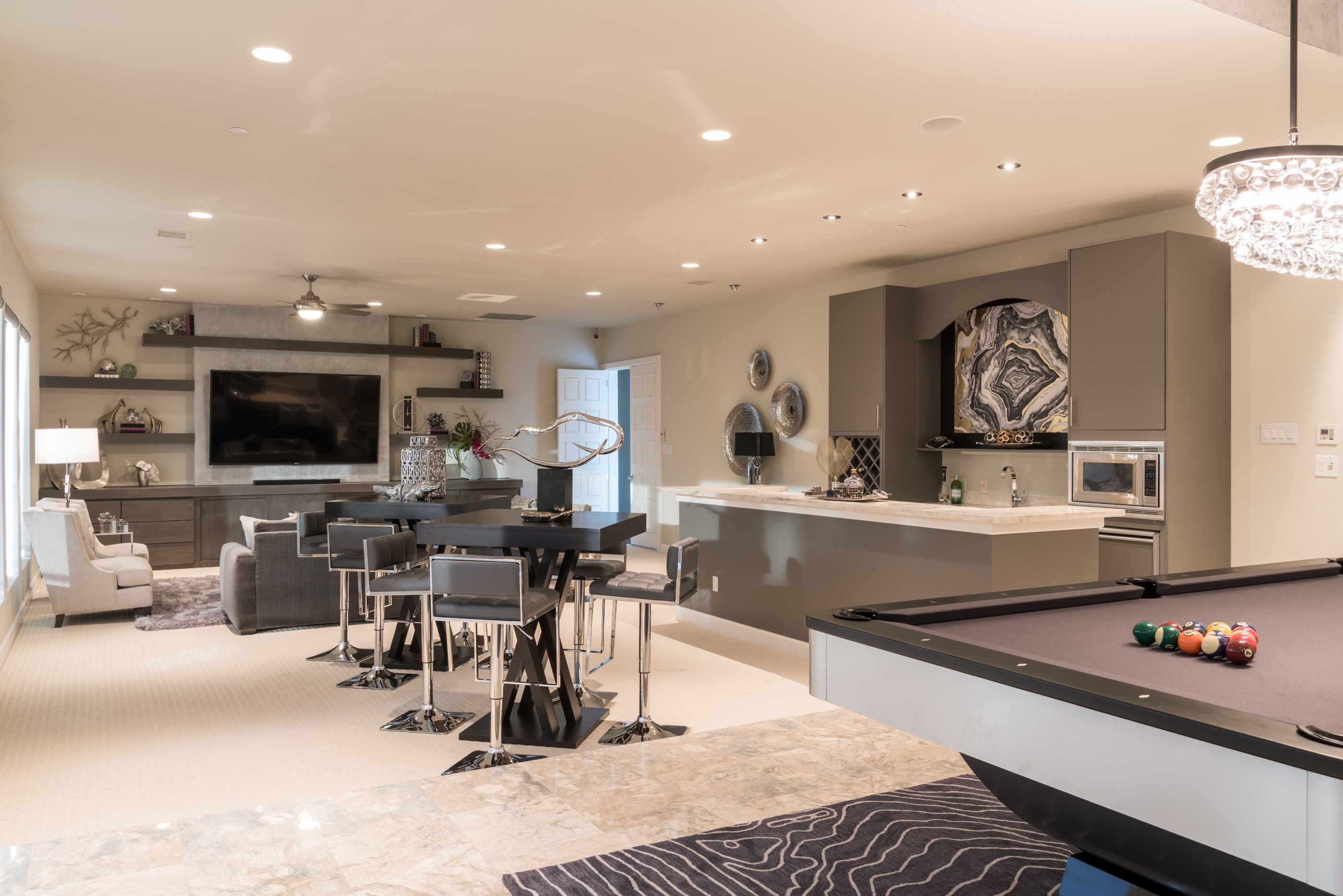
Recreation Spaces
1st Place: Baker Design Group, Carrollton, TX
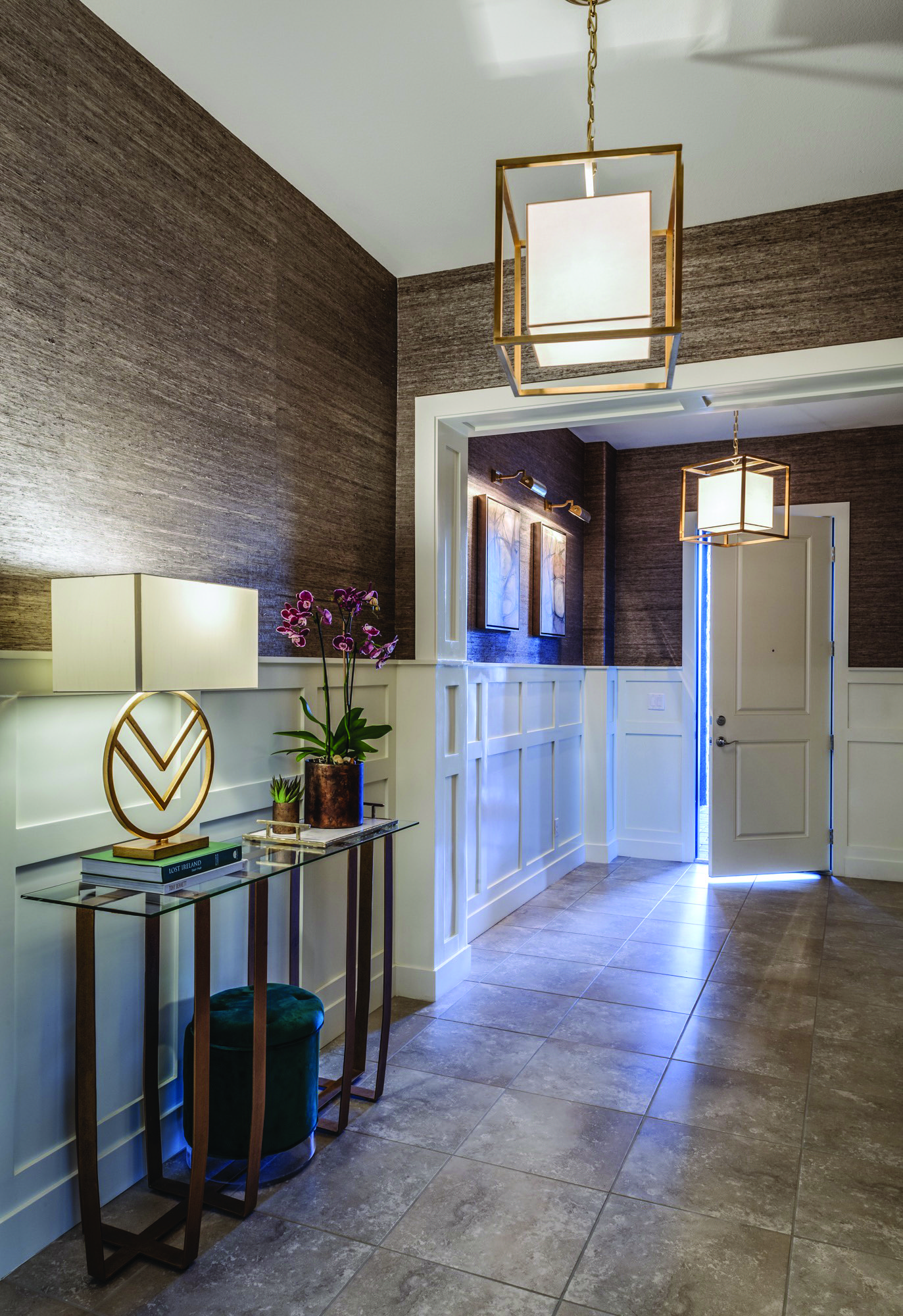
Entry Wall / Foyer
1st Place: Michele Youell, Natural Domain Interiors, Henderson, NV
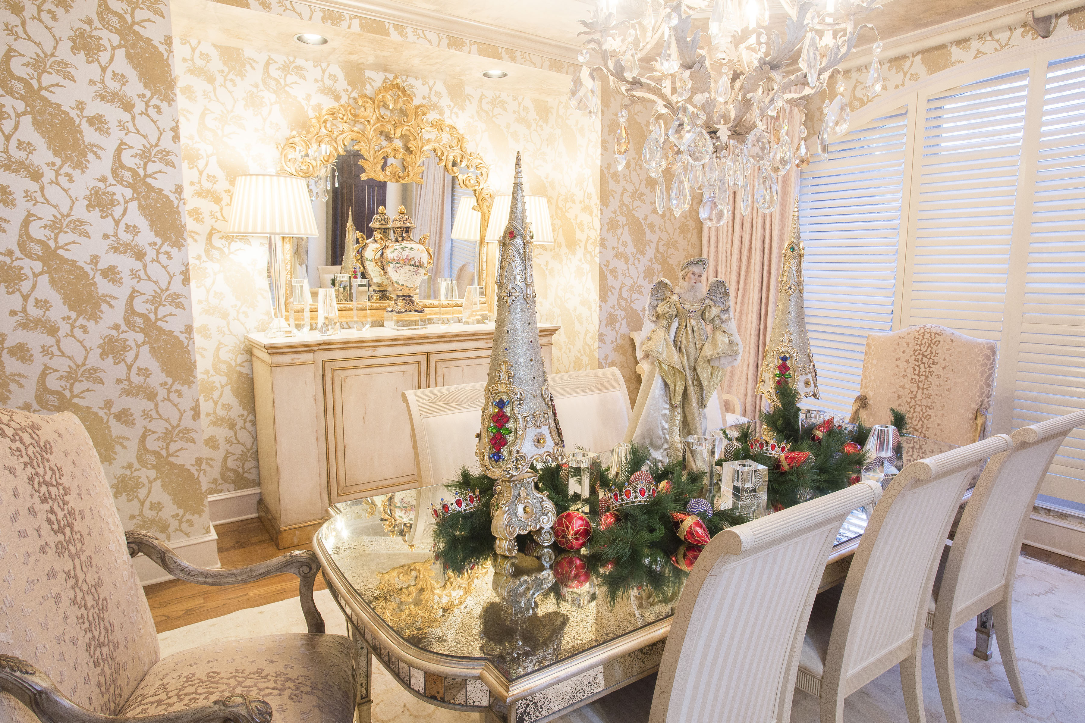
Holiday Design
1st Place: Shayla Copas, Shayla Copas Interiors, Little Rock, AR
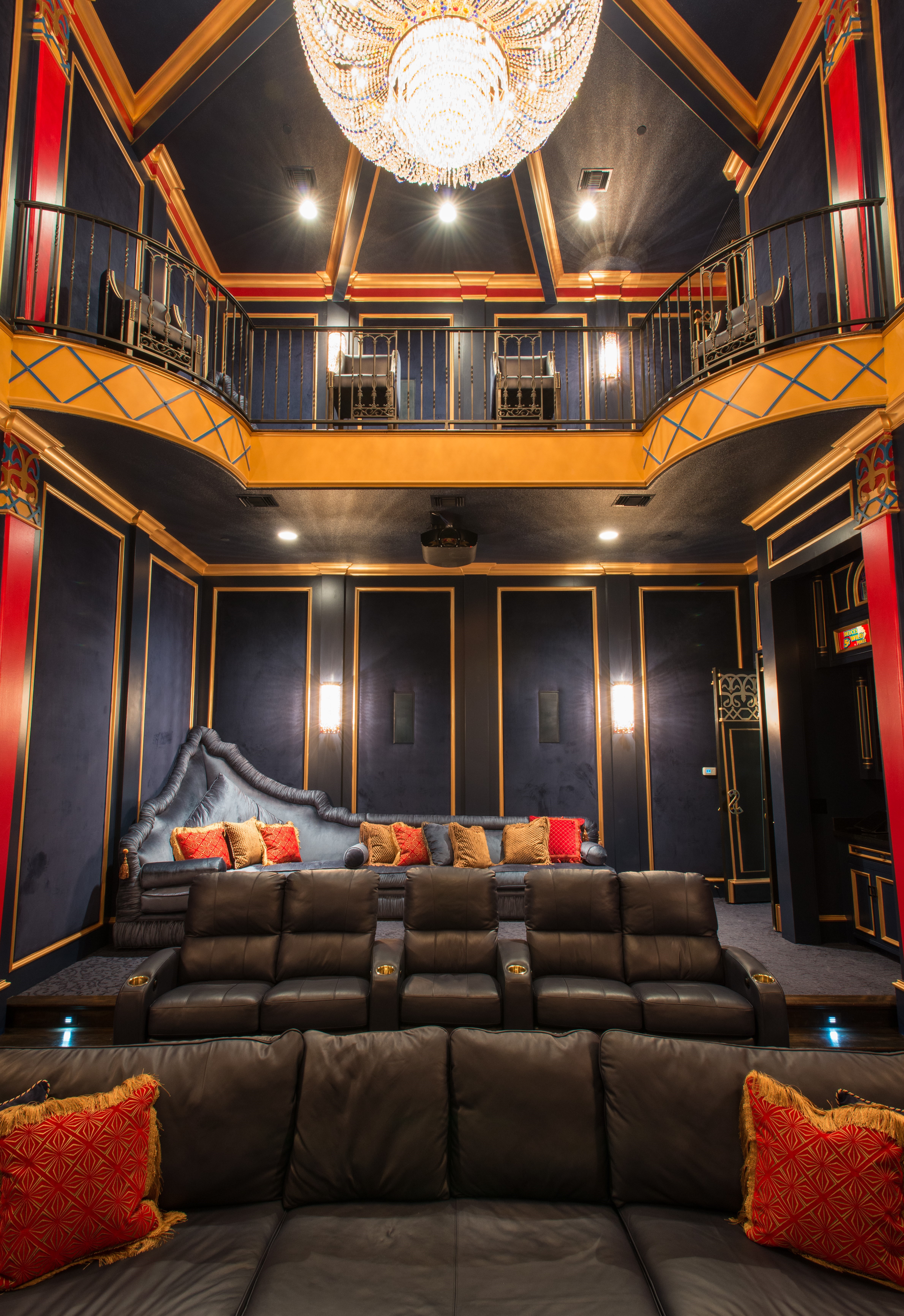
Original Design
1st Place: Barbara Owens,
Owens Interiors, Rockwall, TX
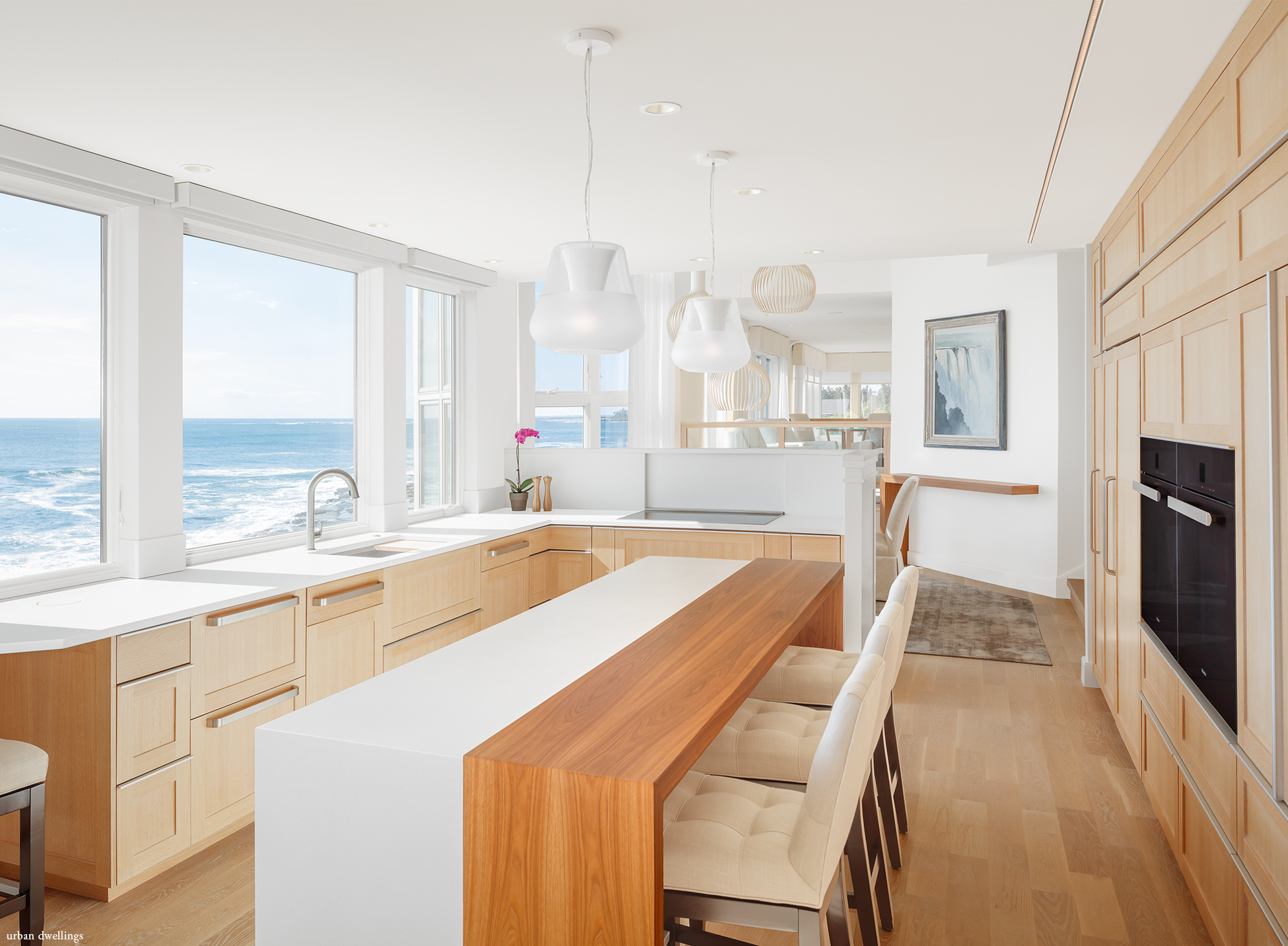
Whole Home
1st Place: Tracy Davis,
Urban Dwellings, Portland, ME
Universal Design
1st Place: Jan Cregier, Interior Expressions by Jan, St. Charles, IL
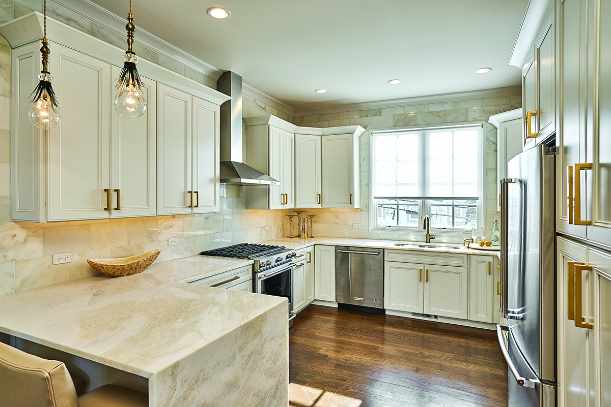
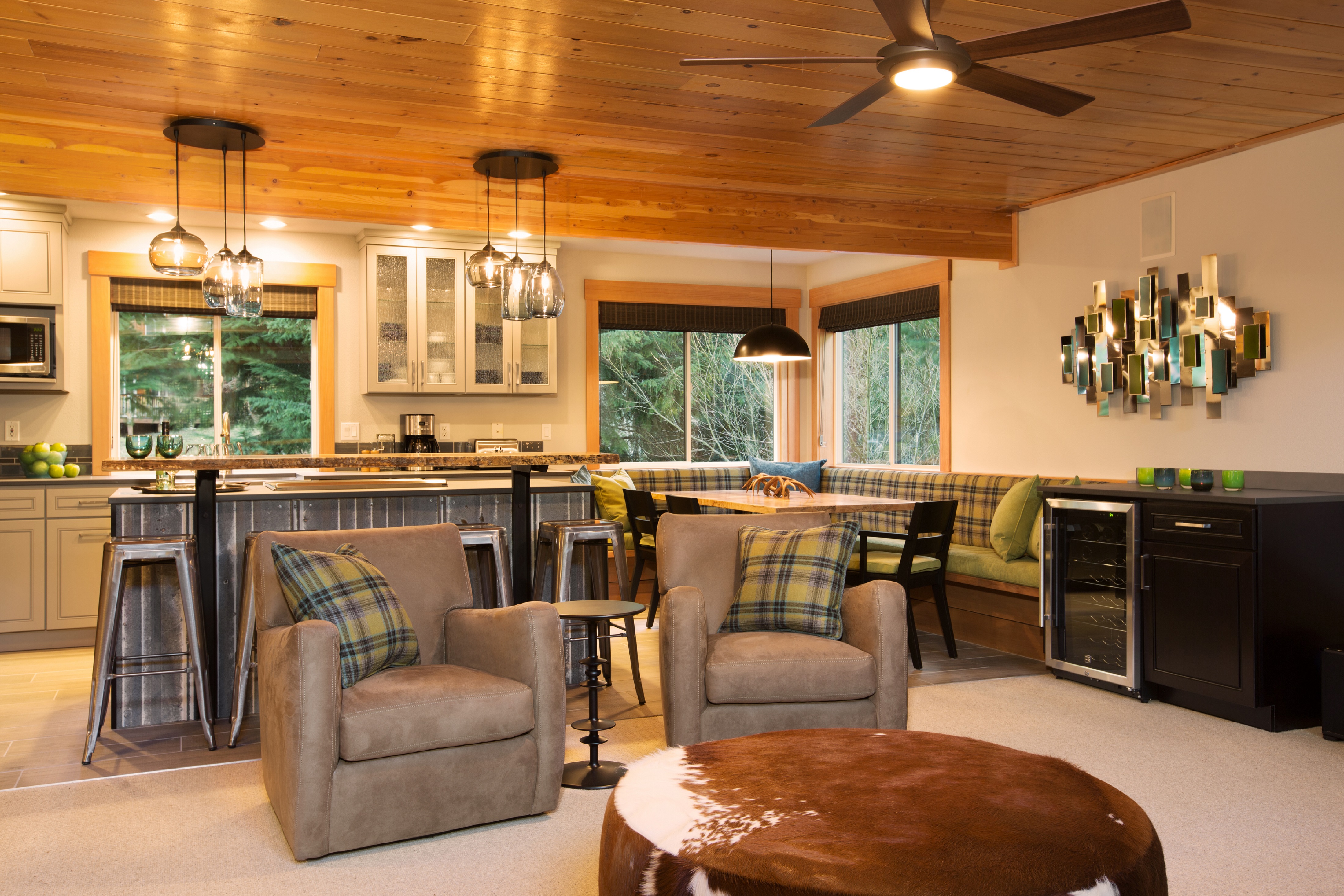
Sustainable Design
1st Place: Kerry McHugh Upton, Quincy Home, Olympia, WA
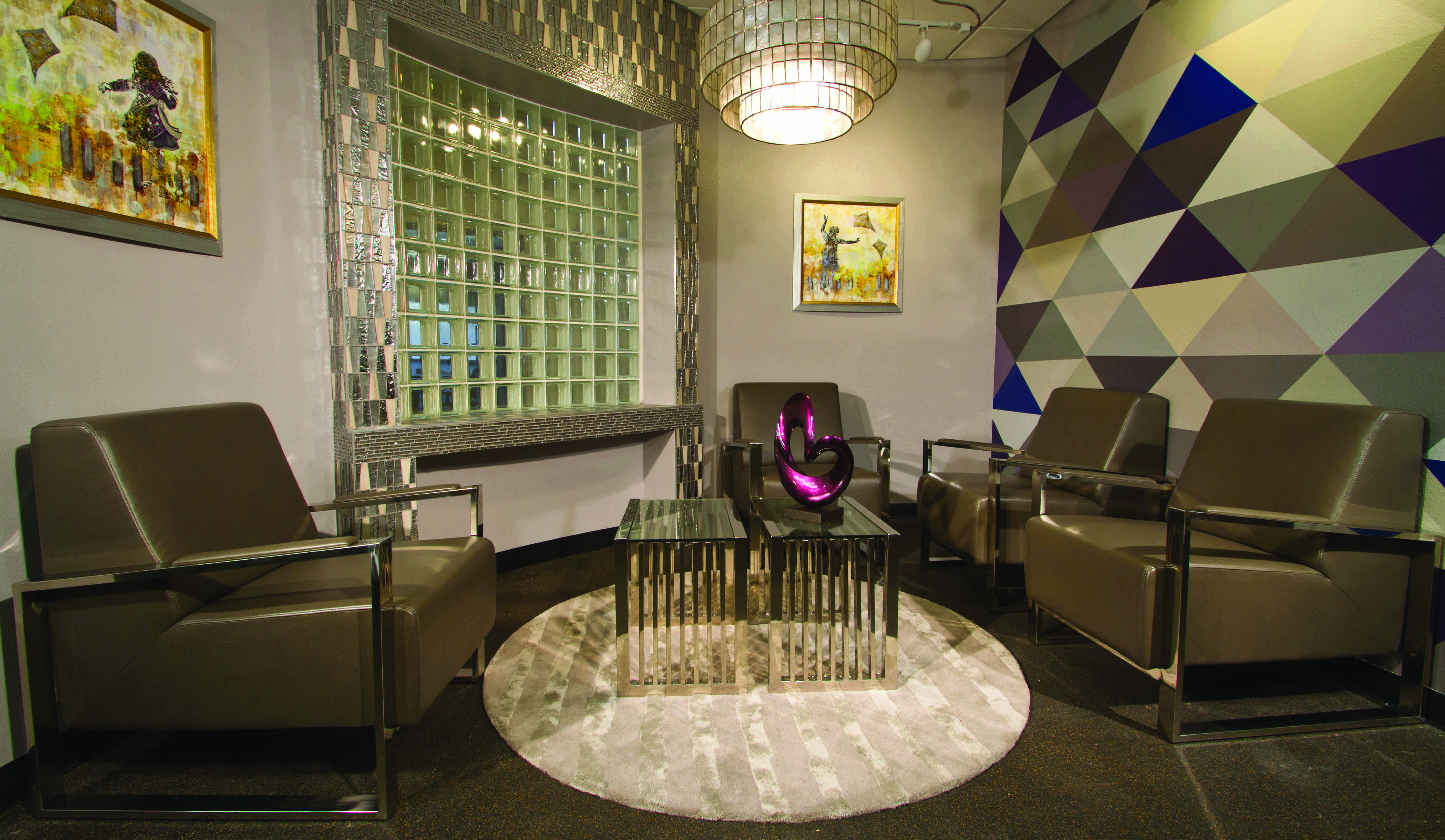
Individual Impact Award
1st Place: Kimberly Joi McDonald, Designing Joi, Las Vegas, NV
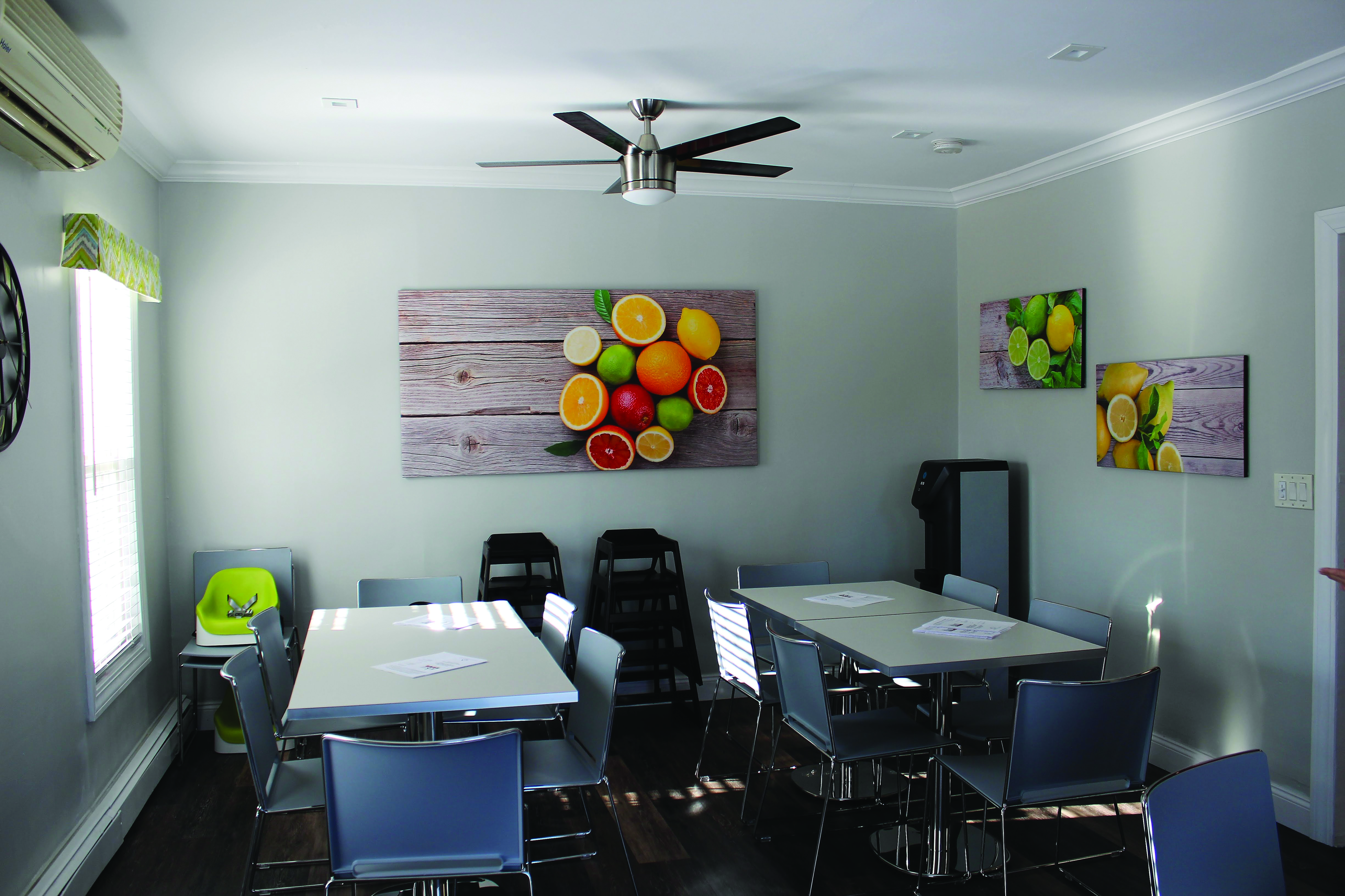
Group Impact Award
1st Place: IDS Student
Malloy Chapter
Designer’s Choice Vendor Award
Sherwin-Williams

Sherwin-Williams Sponsor Award
1st Place: Design Vision Studio, Palm Desert, CA
